Magnetic Button
Three pill buttons attract toward the pointer inside an invisible radius, their labels leading slightly for parallax, flood with colour from the entry point, and spring back with an elastic snap on leave.
- Buttons
- gsap
- beginner
- light perf
- mobile: degraded
- reduced-motion ✓
AI prompt
Recreate this effect with any AI tool
Paste into Claude, Cursor, v0, Lovable or Bolt. 1331 words of exact values — rewritten live as you tune the Playground.
### EFFECT: Magnetic Button
**What it does (visual):** A dark stage with a small title top-left and three pill buttons centred in the middle: an outlined hairline pill ("View the archive"), a large primary pill in the accent colour #d4ff3a ("Start a project →") and a 64px circular icon button ("↓"). Each button sits inside an invisible halo 48–72px (× 1) wider than itself. When the pointer enters a halo, the button starts drifting toward the pointer — it moves 0.3 of the distance between its centre and the pointer, and its label moves 0.5, so the text leads the pill slightly (a parallax feel). Movement is smooth and slightly lagged (0.6s `power3.out` catch-up). When the pointer actually crosses onto the pill, a circle of the opposite colour blooms from exactly the point where the pointer entered and floods the pill in 0.5s (the accent pill floods with the page background and its label turns #d4ff3a; the outlined pill floods with the text colour; the icon circle floods #d4ff3a); the label colour inverts and the arrow nudges 4px right. When the pointer leaves the pill, the circle shrinks back toward the exit point; when it leaves the halo, the button and label spring back to rest over 1s with the `elastic.out(1, 0.4)` ease (a visible elastic wobble by default). On touch devices the buttons are static with a simple pressed state.

**Tech stack:**
- GSAP 3.13+ core only (`gsap.quickTo`, `elastic.out`).
- CDN: `<script src="https://cdn.jsdelivr.net/npm/gsap@3/dist/gsap.min.js"></script>`
- npm: `npm i gsap` → `import gsap from "gsap";`
- Fonts: a sans for the labels (demo uses Inter Tight 500), a serif for the stage title, a mono for the hint.

**HTML structure:**
```html
<section class="mag-stage">
  <header class="mag-stage__head"><p class="mag-stage__label">Button · Magnetic</p><h1 class="mag-stage__title">Buttons that lean in</h1></header>
  <div class="mag-stage__row">
    <div class="mag mag--outline" data-radius="48">
      <button class="mag__btn mag__btn--outline" type="button"><span class="mag__fill" aria-hidden="true"></span><span class="mag__label">View the archive</span></button>
    </div>
    <div class="mag mag--primary" data-radius="72">
      <button class="mag__btn mag__btn--primary" type="button"><span class="mag__fill" aria-hidden="true"></span><span class="mag__label">Start a project <span class="mag__arrow" aria-hidden="true">→</span></span></button>
    </div>
    <div class="mag mag--icon" data-radius="56">
      <button class="mag__btn mag__btn--icon" type="button" aria-label="Scroll to next section"><span class="mag__fill" aria-hidden="true"></span><span class="mag__label" aria-hidden="true">↓</span></button>
    </div>
  </div>
  <p class="mag-stage__hint">Approach a button slowly — it starts moving before you touch it.</p>
</section>
```
`.mag` is the magnetic zone (the halo), `.mag__btn` the visible pill, `.mag__fill` the colour circle, `.mag__label` the text that leads.

**CSS requirements:**
- `.mag-stage`: `min-height: 100vh; display: grid; grid-template-rows: auto 1fr auto; padding: 2.5rem 6vw; overflow: hidden;` `.mag-stage__row`: `display: flex; flex-wrap: wrap; align-items: center; justify-content: center; gap: .5rem 1rem;`
- `.mag`: `position: relative; display: inline-flex; padding: var(--radius, 48px);` — JS copies `data-radius × 1` into `--radius`; the padding IS the attraction radius.
- `.mag__btn`: `position: relative; display: inline-flex; align-items: center; justify-content: center; gap: .6em; border-radius: 999px; overflow: hidden; isolation: isolate; white-space: nowrap; font-weight: 500; will-change: transform; transition: color .35s cubic-bezier(.2,.7,.2,1);` Focus: `outline: 2px solid var(--accent, #d4ff3a); outline-offset: 4px` on `:focus-visible`.
- `.mag__label`: `position: relative; z-index: 1; display: inline-flex; gap: .5em; will-change: transform;` `.mag__arrow { transition: transform .35s }`, `.is-hover .mag__arrow { transform: translateX(4px) }`.
- `.mag__fill`: `position: absolute; left: 0; top: 0; width: var(--fill-size); height: var(--fill-size); border-radius: 50%; transform: translate(-50%, -50%) scale(0); pointer-events: none; z-index: 0;` — JS sets `--fill-size` to `ceil(max(width, height) × 2.2)px`.
- Variants: `.mag__btn--primary { padding: 1.25rem 2.5rem; font-size: 1.05rem; background: var(--accent, #d4ff3a); color: var(--bg) }` fill `background: var(--bg)` (the page colour floods the accent pill), `.is-hover { color: var(--accent, #d4ff3a) }`. `.mag__btn--outline { padding: 1rem 1.9rem; font-size: .95rem; border: 1px solid color-mix(in srgb, var(--text) 28%, transparent) }` fill `var(--text)`, `.is-hover { color: var(--bg) }`. `.mag__btn--icon { width: 64px; height: 64px; background: var(--surface); border: 1px solid var(--line) }` fill `var(--accent, #d4ff3a)`, `.is-hover { color: var(--bg) }`.
- `@media (hover: none), (pointer: coarse)`: `.mag { padding: .25rem }`, `.mag__fill { display: none }`, `.mag__btn:active { transform: scale(.97) }`.
- Under 768px: column layout for the row, stage padding `1.5rem 5vw`.

**Animation spec (exact values):**
1. Constants: `BUTTON_STRENGTH = 0.3`, `LABEL_STRENGTH = 0.5`, `RADIUS_SCALE = 1`, `FOLLOW = { duration: 0.6, ease: 'power3.out' }`, `RELEASE = { duration: 1, ease: 'elastic.out(1, 0.4)' }`.
2. Entrance: `gsap.from('.mag-stage__title', { y: 30, opacity: 0, duration: 1, ease: 'power3.out', delay: 0.1 })`; `gsap.from('.mag', { y: 24, opacity: 0, duration: 0.9, ease: 'power3.out', stagger: 0.08, delay: 0.25 })` (animate the zone, not the button, so it never fights the magnet).
3. Setup per zone: `--radius` = `data-radius × 1` px; `--fill-size = ceil(max(btn.offsetWidth, btn.offsetHeight) * 2.2)`; `gsap.set(fill, { xPercent: -50, yPercent: -50, x: 0, y: 0, scale: 0 })`.
4. Inside `gsap.matchMedia().add('(hover: hover) and (pointer: fine)', …)` only:
   - Zone `pointerenter` → create setters: `bx = gsap.quickTo(btn, 'x', FOLLOW)`, `by = gsap.quickTo(btn, 'y', FOLLOW)`, `lx = gsap.quickTo(label, 'x', FOLLOW)`, `ly = gsap.quickTo(label, 'y', FOLLOW)`.
   - Zone `pointermove` → `cx = clientX − buttonCentreX`, `cy = clientY − buttonCentreY`; `bx(cx * 0.3); by(cy * 0.3); lx(cx * (0.5 − 0.3)); ly(cy * (0.5 − 0.3))` (so the label's total travel is 0.5 of the offset).
   - Zone `pointerleave` → kill all four `setter.tween`s, then `gsap.to([btn, label], { x: 0, y: 0, duration: 1, ease: 'elastic.out(1, 0.4)', overwrite: true })`.
   - Button `pointerenter` → local entry point `(x, y)` relative to the button's top-left; `btn.classList.add('is-hover')`; `gsap.killTweensOf(fill)`; `gsap.set(fill, { x, y })`; `gsap.fromTo(fill, { scale: 0 }, { scale: 1, duration: 0.5, ease: 'expo.out' })`.
   - Button `pointerleave` → exit point `(x, y)`; remove `is-hover`; `gsap.killTweensOf(fill)`; `gsap.to(fill, { x, y, scale: 0, duration: 0.45, ease: 'power2.inOut' })`.

**Interaction:** Hover-driven. Entering the halo starts the pull before the pointer reaches the pill; the pill follows at 0.3, the label at 0.5. Crossing onto the pill floods it from the entry point and inverts the label colour (CSS transition 0.35s). Leaving the pill drains the fill toward the exit point; leaving the halo releases the magnet with the `elastic.out(1, 0.4)` return. Click works normally (no preventDefault). Keyboard users see a 2px #d4ff3a focus ring 4px outside the pill.

**Responsive behavior:** `gsap.matchMedia('(hover: hover) and (pointer: fine)')` means no listeners are attached on touch or stylus-coarse devices; CSS collapses the halo, hides the fill and gives `:active` a 0.97 scale. Under 768px the three buttons stack vertically and the hint aligns left. Pill sizes are in rem so they scale with root font size; nothing is wider than 375px.

**Accessibility:** With `prefers-reduced-motion: reduce` no JS magnet or fill runs; CSS gives each variant an instant hover state (primary → page-background fill with #d4ff3a label, outline → filled, icon → #d4ff3a) with transitions disabled. Buttons are real `<button>`s; the icon button carries an `aria-label`; fills and arrows are `aria-hidden`. The hover colour inversion keeps contrast ≥ 7:1 in both themes.

**Performance rules:** Only `transform` is animated (`x`, `y`, `scale`); `will-change: transform` sits on `.mag__btn`, `.mag__label` and `.mag__fill`. `quickTo` setters reuse a single tween per property; they are killed on leave and recreated on enter so a plain `gsap.to` never overwrites a live quickTo. Everything is inside `gsap.context()`; `ctx.revert()` removes the listeners (via the matchMedia cleanup) and restores transforms on unmount.

**Customization knobs:**
- `data-radius` per button (48/72/56) × `RADIUS_SCALE` (1) — how far away the pull starts.
- `BUTTON_STRENGTH` (0.3) / `LABEL_STRENGTH` (0.5) — 0.15/0.25 is subtle, 0.5/0.7 is cartoonish.
- `FOLLOW.duration` (0.6) — lag of the pull; `RELEASE.ease` — `elastic.out(1, 0.4)` (current); `elastic.out(1, 0.4)` wobbles, `back.out(2)` overshoots once.
- Accent colour (`#d4ff3a`) — primary pill, icon fill, focus ring.
- Fill timings: bloom 0.5s `expo.out`, drain 0.45s `power2.inOut`; fill colour per variant via the `.mag__fill` background.
- `--fill-size` multiplier (2.2) — raise to 2.6 for very wide pills.

**Acceptance criteria:**
- [ ] Button begins moving when the pointer enters the halo, before touching the pill.
- [ ] Label visibly leads the pill (travels further) during the pull.
- [ ] Fill circle starts exactly at the pointer's entry point and fully covers the pill, including corners.
- [ ] Leaving the halo produces a `elastic.out(1, 0.4)` return that settles within ~1s with no residual offset.
- [ ] Touch devices and reduced-motion users get static buttons with a working hover/pressed state.
- [ ] No console errors; focus ring visible via keyboard.Add this effect to my existing site/section: **Magnetic Button**. Wrap each of my existing buttons in a `.mag` zone (`display: inline-flex; padding: var(--radius)` with `data-radius` 48–72px multiplied by 1) and add a `.mag__fill` circle (absolute, diameter 2.2× the button's longest side, `border-radius: 50%`, scaled to 0) and a `.mag__label` span around the text. With GSAP, inside `gsap.matchMedia('(hover: hover) and (pointer: fine)')`: on zone `pointerenter` create `gsap.quickTo` setters for `x`/`y` on the button and label (`duration: 0.6, ease: 'power3.out'`); on zone `pointermove` feed them `offset × 0.3` (button) and `offset × (0.5 − 0.3)` (label, so it totals 0.5) where offset is pointer minus button centre; on zone `pointerleave` kill the quickTo tweens and `gsap.to([btn, label], { x: 0, y: 0, duration: 1, ease: 'elastic.out(1, 0.4)', overwrite: true })`. On button `pointerenter` set the fill's `x/y` to the local entry point and `fromTo scale 0 → 1` (0.5s `expo.out`), toggling an `is-hover` class that inverts the label colour; on `pointerleave` tween the fill to the exit point and `scale: 0` (0.45s `power2.inOut`). Under `prefers-reduced-motion` and on touch, skip the JS and keep a CSS hover/pressed state. Wrap in `gsap.context()` and revert on unmount. Keep my button colours (accent `#d4ff3a`), copy and fonts.### EFFECT (React / Next.js): Magnetic Button
Build **Magnetic Button** as a self-contained React component for a Next.js App Router project (also valid in Vite + React). Follow the specification below exactly; the vanilla reference implementation at the end is the source of truth for values and structure.
**Setup**
- `npm i gsap @gsap/react`
- File: `components/MagneticButton.tsx`, first line `"use client";` (GSAP touches the DOM).
- Imports:
```tsx
"use client";
import { useRef } from "react";
import gsap from "gsap";
import { useGSAP } from "@gsap/react";
gsap.registerPlugin(useGSAP);
export default function MagneticButton() {
const scope = useRef<HTMLDivElement>(null);
useGSAP(() => {
// 1. query elements inside `scope.current` (never document-wide)
// 2. wait for document.fonts.ready before any SplitText
// 3. build the timeline / ScrollTriggers exactly as in the specification
// 4. return nothing — useGSAP reverts everything automatically on unmount
}, { scope });
return (
<div ref={scope} className="mag-stage">
{/* markup from the HTML structure section, class → className */}
</div>
);
}
```
**React-specific rules**
- Everything GSAP-related lives inside `useGSAP(() => {...}, { scope })`; it handles cleanup (`ctx.revert()`) on unmount and in React Strict Mode double-invocation.
- Use refs or `gsap.utils.selector(scope)` instead of `document.querySelector`.
- Event listeners added inside useGSAP must use `contextSafe` (`const { contextSafe } = useGSAP({ scope })`) so their tweens are reverted too.
- ScrollTrigger: call `ScrollTrigger.refresh()` after images/fonts load; if the page uses Lenis, sync it once at the app root (`lenis.on('scroll', ScrollTrigger.update)`).
- Styles: copy the CSS requirements into a CSS Module (`MagneticButton.module.css`) or Tailwind; keep the class names so the spec maps 1:1.
- Respect `prefers-reduced-motion` with `gsap.matchMedia()` as in the spec.
---
### EFFECT: Magnetic Button
**What it does (visual):** A dark stage with a small title top-left and three pill buttons centred in the middle: an outlined hairline pill ("View the archive"), a large primary pill in the accent colour #d4ff3a ("Start a project →") and a 64px circular icon button ("↓"). Each button sits inside an invisible halo 48–72px (× 1) wider than itself. When the pointer enters a halo, the button starts drifting toward the pointer — it moves 0.3 of the distance between its centre and the pointer, and its label moves 0.5, so the text leads the pill slightly (a parallax feel). Movement is smooth and slightly lagged (0.6s `power3.out` catch-up). When the pointer actually crosses onto the pill, a circle of the opposite colour blooms from exactly the point where the pointer entered and floods the pill in 0.5s (the accent pill floods with the page background and its label turns #d4ff3a; the outlined pill floods with the text colour; the icon circle floods #d4ff3a); the label colour inverts and the arrow nudges 4px right. When the pointer leaves the pill, the circle shrinks back toward the exit point; when it leaves the halo, the button and label spring back to rest over 1s with the `elastic.out(1, 0.4)` ease (a visible elastic wobble by default). On touch devices the buttons are static with a simple pressed state.
**Tech stack:**
- GSAP 3.13+ core only (`gsap.quickTo`, `elastic.out`).
- CDN: `<script src="https://cdn.jsdelivr.net/npm/gsap@3/dist/gsap.min.js"></script>`
- npm: `npm i gsap` → `import gsap from "gsap";`
- Fonts: a sans for the labels (demo uses Inter Tight 500), a serif for the stage title, a mono for the hint.
**HTML structure:**
```html
<section class="mag-stage">
<header class="mag-stage__head"><p class="mag-stage__label">Button · Magnetic</p><h1 class="mag-stage__title">Buttons that lean in</h1></header>
<div class="mag-stage__row">
<div class="mag mag--outline" data-radius="48">
<button class="mag__btn mag__btn--outline" type="button"><span class="mag__fill" aria-hidden="true"></span><span class="mag__label">View the archive</span></button>
</div>
<div class="mag mag--primary" data-radius="72">
<button class="mag__btn mag__btn--primary" type="button"><span class="mag__fill" aria-hidden="true"></span><span class="mag__label">Start a project <span class="mag__arrow" aria-hidden="true">→</span></span></button>
</div>
<div class="mag mag--icon" data-radius="56">
<button class="mag__btn mag__btn--icon" type="button" aria-label="Scroll to next section"><span class="mag__fill" aria-hidden="true"></span><span class="mag__label" aria-hidden="true">↓</span></button>
</div>
</div>
<p class="mag-stage__hint">Approach a button slowly — it starts moving before you touch it.</p>
</section>
```
`.mag` is the magnetic zone (the halo), `.mag__btn` the visible pill, `.mag__fill` the colour circle, `.mag__label` the text that leads.
**CSS requirements:**
- `.mag-stage`: `min-height: 100vh; display: grid; grid-template-rows: auto 1fr auto; padding: 2.5rem 6vw; overflow: hidden;` `.mag-stage__row`: `display: flex; flex-wrap: wrap; align-items: center; justify-content: center; gap: .5rem 1rem;`
- `.mag`: `position: relative; display: inline-flex; padding: var(--radius, 48px);` — JS copies `data-radius × 1` into `--radius`; the padding IS the attraction radius.
- `.mag__btn`: `position: relative; display: inline-flex; align-items: center; justify-content: center; gap: .6em; border-radius: 999px; overflow: hidden; isolation: isolate; white-space: nowrap; font-weight: 500; will-change: transform; transition: color .35s cubic-bezier(.2,.7,.2,1);` Focus: `outline: 2px solid var(--accent, #d4ff3a); outline-offset: 4px` on `:focus-visible`.
- `.mag__label`: `position: relative; z-index: 1; display: inline-flex; gap: .5em; will-change: transform;` `.mag__arrow { transition: transform .35s }`, `.is-hover .mag__arrow { transform: translateX(4px) }`.
- `.mag__fill`: `position: absolute; left: 0; top: 0; width: var(--fill-size); height: var(--fill-size); border-radius: 50%; transform: translate(-50%, -50%) scale(0); pointer-events: none; z-index: 0;` — JS sets `--fill-size` to `ceil(max(width, height) × 2.2)px`.
- Variants: `.mag__btn--primary { padding: 1.25rem 2.5rem; font-size: 1.05rem; background: var(--accent, #d4ff3a); color: var(--bg) }` fill `background: var(--bg)` (the page colour floods the accent pill), `.is-hover { color: var(--accent, #d4ff3a) }`. `.mag__btn--outline { padding: 1rem 1.9rem; font-size: .95rem; border: 1px solid color-mix(in srgb, var(--text) 28%, transparent) }` fill `var(--text)`, `.is-hover { color: var(--bg) }`. `.mag__btn--icon { width: 64px; height: 64px; background: var(--surface); border: 1px solid var(--line) }` fill `var(--accent, #d4ff3a)`, `.is-hover { color: var(--bg) }`.
- `@media (hover: none), (pointer: coarse)`: `.mag { padding: .25rem }`, `.mag__fill { display: none }`, `.mag__btn:active { transform: scale(.97) }`.
- Under 768px: column layout for the row, stage padding `1.5rem 5vw`.
**Animation spec (exact values):**
1. Constants: `BUTTON_STRENGTH = 0.3`, `LABEL_STRENGTH = 0.5`, `RADIUS_SCALE = 1`, `FOLLOW = { duration: 0.6, ease: 'power3.out' }`, `RELEASE = { duration: 1, ease: 'elastic.out(1, 0.4)' }`.
2. Entrance: `gsap.from('.mag-stage__title', { y: 30, opacity: 0, duration: 1, ease: 'power3.out', delay: 0.1 })`; `gsap.from('.mag', { y: 24, opacity: 0, duration: 0.9, ease: 'power3.out', stagger: 0.08, delay: 0.25 })` (animate the zone, not the button, so it never fights the magnet).
3. Setup per zone: `--radius` = `data-radius × 1` px; `--fill-size = ceil(max(btn.offsetWidth, btn.offsetHeight) * 2.2)`; `gsap.set(fill, { xPercent: -50, yPercent: -50, x: 0, y: 0, scale: 0 })`.
4. Inside `gsap.matchMedia().add('(hover: hover) and (pointer: fine)', …)` only:
- Zone `pointerenter` → create setters: `bx = gsap.quickTo(btn, 'x', FOLLOW)`, `by = gsap.quickTo(btn, 'y', FOLLOW)`, `lx = gsap.quickTo(label, 'x', FOLLOW)`, `ly = gsap.quickTo(label, 'y', FOLLOW)`.
- Zone `pointermove` → `cx = clientX − buttonCentreX`, `cy = clientY − buttonCentreY`; `bx(cx * 0.3); by(cy * 0.3); lx(cx * (0.5 − 0.3)); ly(cy * (0.5 − 0.3))` (so the label's total travel is 0.5 of the offset).
- Zone `pointerleave` → kill all four `setter.tween`s, then `gsap.to([btn, label], { x: 0, y: 0, duration: 1, ease: 'elastic.out(1, 0.4)', overwrite: true })`.
- Button `pointerenter` → local entry point `(x, y)` relative to the button's top-left; `btn.classList.add('is-hover')`; `gsap.killTweensOf(fill)`; `gsap.set(fill, { x, y })`; `gsap.fromTo(fill, { scale: 0 }, { scale: 1, duration: 0.5, ease: 'expo.out' })`.
- Button `pointerleave` → exit point `(x, y)`; remove `is-hover`; `gsap.killTweensOf(fill)`; `gsap.to(fill, { x, y, scale: 0, duration: 0.45, ease: 'power2.inOut' })`.
**Interaction:** Hover-driven. Entering the halo starts the pull before the pointer reaches the pill; the pill follows at 0.3, the label at 0.5. Crossing onto the pill floods it from the entry point and inverts the label colour (CSS transition 0.35s). Leaving the pill drains the fill toward the exit point; leaving the halo releases the magnet with the `elastic.out(1, 0.4)` return. Click works normally (no preventDefault). Keyboard users see a 2px #d4ff3a focus ring 4px outside the pill.
**Responsive behavior:** `gsap.matchMedia('(hover: hover) and (pointer: fine)')` means no listeners are attached on touch or stylus-coarse devices; CSS collapses the halo, hides the fill and gives `:active` a 0.97 scale. Under 768px the three buttons stack vertically and the hint aligns left. Pill sizes are in rem so they scale with root font size; nothing is wider than 375px.
**Accessibility:** With `prefers-reduced-motion: reduce` no JS magnet or fill runs; CSS gives each variant an instant hover state (primary → page-background fill with #d4ff3a label, outline → filled, icon → #d4ff3a) with transitions disabled. Buttons are real `<button>`s; the icon button carries an `aria-label`; fills and arrows are `aria-hidden`. The hover colour inversion keeps contrast ≥ 7:1 in both themes.
**Performance rules:** Only `transform` is animated (`x`, `y`, `scale`); `will-change: transform` sits on `.mag__btn`, `.mag__label` and `.mag__fill`. `quickTo` setters reuse a single tween per property; they are killed on leave and recreated on enter so a plain `gsap.to` never overwrites a live quickTo. Everything is inside `gsap.context()`; `ctx.revert()` removes the listeners (via the matchMedia cleanup) and restores transforms on unmount.
**Customization knobs:**
- `data-radius` per button (48/72/56) × `RADIUS_SCALE` (1) — how far away the pull starts.
- `BUTTON_STRENGTH` (0.3) / `LABEL_STRENGTH` (0.5) — 0.15/0.25 is subtle, 0.5/0.7 is cartoonish.
- `FOLLOW.duration` (0.6) — lag of the pull; `RELEASE.ease` — `elastic.out(1, 0.4)` (current); `elastic.out(1, 0.4)` wobbles, `back.out(2)` overshoots once.
- Accent colour (`#d4ff3a`) — primary pill, icon fill, focus ring.
- Fill timings: bloom 0.5s `expo.out`, drain 0.45s `power2.inOut`; fill colour per variant via the `.mag__fill` background.
- `--fill-size` multiplier (2.2) — raise to 2.6 for very wide pills.
**Acceptance criteria:**
- [ ] Button begins moving when the pointer enters the halo, before touching the pill.
- [ ] Label visibly leads the pill (travels further) during the pull.
- [ ] Fill circle starts exactly at the pointer's entry point and fully covers the pill, including corners.
- [ ] Leaving the halo produces a `elastic.out(1, 0.4)` return that settles within ~1s with no residual offset.
- [ ] Touch devices and reduced-motion users get static buttons with a working hover/pressed state.
- [ ] No console errors; focus ring visible via keyboard.
---
**Reference implementation (vanilla, converts 1:1 — same class names, same values):**
```html
<section class="mag-stage">
<header class="mag-stage__head">
<p class="mag-stage__label">Button · Magnetic</p>
<h1 class="mag-stage__title">Buttons that lean in</h1>
</header>
<div class="mag-stage__row">
<div class="mag mag--outline" data-radius="48">
<button class="mag__btn mag__btn--outline" type="button">
<span class="mag__fill" aria-hidden="true"></span>
<span class="mag__label">View the archive</span>
</button>
</div>
<div class="mag mag--primary" data-radius="72">
<button class="mag__btn mag__btn--primary" type="button">
<span class="mag__fill" aria-hidden="true"></span>
<span class="mag__label">Start a project <span class="mag__arrow" aria-hidden="true">→</span></span>
</button>
</div>
<div class="mag mag--icon" data-radius="56">
<button class="mag__btn mag__btn--icon" type="button" aria-label="Scroll to next section">
<span class="mag__fill" aria-hidden="true"></span>
<span class="mag__label" aria-hidden="true">↓</span>
</button>
</div>
</div>
<p class="mag-stage__hint">Approach a button slowly — it starts moving before you touch it.</p>
</section>
```
```css
.mag-stage { position: relative; min-height: 100vh; display: grid; grid-template-rows: auto 1fr auto; padding: 2.5rem 6vw; background: var(--bg); color: var(--text); overflow: hidden; }
.mag-stage__label { font-family: var(--font-mono); font-size: 11px; text-transform: uppercase; letter-spacing: .14em; color: var(--muted); margin-bottom: 1rem; }
.mag-stage__title { font-family: var(--font-display); font-weight: 300; font-size: clamp(2.25rem, 5vw, 4.5rem); letter-spacing: -0.04em; line-height: .95; }
.mag-stage__hint { font-family: var(--font-mono); font-size: 11px; text-transform: uppercase; letter-spacing: .14em; color: var(--muted); text-align: right; }
.mag-stage__row { display: flex; flex-wrap: wrap; align-items: center; justify-content: center; gap: .5rem 1rem; }
/* The invisible attraction zone — padding = radius (set from data-radius by JS) */
.mag { position: relative; display: inline-flex; padding: var(--radius, 48px); }
.mag__btn {
position: relative; display: inline-flex; align-items: center; justify-content: center; gap: .6em;
border-radius: 999px; overflow: hidden; isolation: isolate; -webkit-tap-highlight-color: transparent;
font-family: var(--font-sans); font-weight: 500; letter-spacing: -0.01em; white-space: nowrap;
will-change: transform; transition: color .35s cubic-bezier(.2,.7,.2,1);
}
.mag__btn:focus-visible { outline: 2px solid var(--knob-accent, var(--accent)); outline-offset: 4px; }
.mag__label { position: relative; z-index: 1; display: inline-flex; align-items: center; gap: .5em; will-change: transform; }
.mag__arrow { display: inline-block; transition: transform .35s cubic-bezier(.2,.7,.2,1); }
.mag__btn.is-hover .mag__arrow { transform: translateX(4px); }
/* Fill circle: positioned at the pointer's entry point, scaled 0 → 1 by JS */
.mag__fill { position: absolute; left: 0; top: 0; width: var(--fill-size, 400px); height: var(--fill-size, 400px); border-radius: 50%; transform: translate(-50%, -50%) scale(0); pointer-events: none; z-index: 0; will-change: transform; }
/* Primary — lime pill, floods with the page background, label flips to lime */
.mag__btn--primary { padding: 1.25rem 2.5rem; font-size: 1.05rem; background: var(--knob-accent, var(--accent)); color: var(--bg); }
.mag__btn--primary .mag__fill { background: var(--bg); }
.mag__btn--primary.is-hover { color: var(--knob-accent, var(--accent)); }
/* Outlined — hairline pill, floods with text colour, label inverts */
.mag__btn--outline { padding: 1rem 1.9rem; font-size: .95rem; border: 1px solid color-mix(in srgb, var(--text) 28%, transparent); color: var(--text); }
.mag__btn--outline .mag__fill { background: var(--text); }
.mag__btn--outline.is-hover { color: var(--bg); }
/* Icon — 64px circle on surface, floods lime */
.mag__btn--icon { width: 64px; height: 64px; padding: 0; font-size: 1.35rem; background: var(--surface); border: 1px solid var(--line); color: var(--text); }
.mag__btn--icon .mag__fill { background: var(--knob-accent, var(--accent)); }
.mag__btn--icon.is-hover { color: var(--bg); }
/* Touch / no-hover fallback: static buttons with a plain pressed state */
@media (hover: none), (pointer: coarse) {
.mag { padding: .25rem; }
.mag__btn:active { transform: scale(.97); }
.mag__fill { display: none; }
}
@media (max-width: 767px) {
.mag-stage { padding: 1.5rem 5vw; }
.mag-stage__row { flex-direction: column; }
.mag-stage__hint { text-align: left; }
}
@media (prefers-reduced-motion: reduce) {
.mag__btn, .mag__label { will-change: auto; transition: none; }
.mag__fill { display: none; }
.mag__btn--primary:hover { background: var(--bg); color: var(--knob-accent, var(--accent)); box-shadow: inset 0 0 0 1px var(--line); }
.mag__btn--outline:hover { background: var(--text); color: var(--bg); }
.mag__btn--icon:hover { background: var(--knob-accent, var(--accent)); color: var(--bg); }
}
```
```js
// Magnetic Button — pills that lean toward the pointer, flood from the entry point and spring back.
// Defaults — overridable from the MOTION/LAB Playground via MotionLab.knob()
const DEFAULTS = { buttonStrength: 0.3, labelStrength: 0.5, radiusScale: 1, followDuration: 0.6, releaseEase: 'elastic.out(1, 0.4)', accent: '#d4ff3a' };
const K = (id) => window.MotionLab?.knob(id, DEFAULTS[id]) ?? DEFAULTS[id];
const reduced = matchMedia('(prefers-reduced-motion: reduce)').matches;
const stage = document.querySelector('.mag-stage');
const zones = gsap.utils.toArray('.mag');
let ctx;
function build() {
ctx?.revert();
const accent = String(K('accent')).toLowerCase();
if (accent !== DEFAULTS.accent) stage.style.setProperty('--knob-accent', accent); else stage.style.removeProperty('--knob-accent');
const BUTTON_STRENGTH = K('buttonStrength'); // button follows this share of the pointer offset
const LABEL_STRENGTH = K('labelStrength'); // label follows this share in total (so it leads the pill)
const FOLLOW = { duration: K('followDuration'), ease: 'power3.out' };
const RELEASE = { duration: 1, ease: K('releaseEase') };
const radiusScale = K('radiusScale');
ctx = gsap.context(() => {
gsap.from('.mag-stage__title', { y: 30, opacity: 0, duration: 1, ease: 'power3.out', delay: 0.1 });
gsap.from('.mag', { y: 24, opacity: 0, duration: 0.9, ease: 'power3.out', stagger: 0.08, delay: 0.25 });
// Attraction radius → zone padding, fill diameter → 2.2 × longest side.
zones.forEach((zone) => {
const btn = zone.querySelector('.mag__btn');
zone.style.setProperty('--radius', Math.round((Number(zone.dataset.radius) || 48) * radiusScale) + 'px');
const size = Math.ceil(Math.max(btn.offsetWidth, btn.offsetHeight) * 2.2);
btn.style.setProperty('--fill-size', size + 'px');
gsap.set(btn.querySelector('.mag__fill'), { xPercent: -50, yPercent: -50, x: 0, y: 0, scale: 0 });
});
if (reduced) return; // CSS provides a motionless hover state
const mm = gsap.matchMedia();
mm.add('(hover: hover) and (pointer: fine)', () => {
const cleanups = zones.map((zone) => {
const btn = zone.querySelector('.mag__btn');
const label = btn.querySelector('.mag__label');
const fill = btn.querySelector('.mag__fill');
let setters = null;
const localPoint = (e) => {
const r = btn.getBoundingClientRect();
return { x: e.clientX - r.left, y: e.clientY - r.top, cx: e.clientX - (r.left + r.width / 2), cy: e.clientY - (r.top + r.height / 2) };
};
// Zone: magnetic pull
const onZoneEnter = () => {
setters = {
bx: gsap.quickTo(btn, 'x', FOLLOW), by: gsap.quickTo(btn, 'y', FOLLOW),
lx: gsap.quickTo(label, 'x', FOLLOW), ly: gsap.quickTo(label, 'y', FOLLOW),
};
};
const onZoneMove = (e) => {
if (!setters) onZoneEnter();
const { cx, cy } = localPoint(e);
setters.bx(cx * BUTTON_STRENGTH); setters.by(cy * BUTTON_STRENGTH);
setters.lx(cx * (LABEL_STRENGTH - BUTTON_STRENGTH)); setters.ly(cy * (LABEL_STRENGTH - BUTTON_STRENGTH));
};
const onZoneLeave = () => {
if (setters) { Object.values(setters).forEach((s) => s.tween.kill()); setters = null; }
gsap.to([btn, label], { x: 0, y: 0, ...RELEASE, overwrite: true });
};
// Button: fill circle from the entry point, collapses toward the exit point
const onBtnEnter = (e) => {
const { x, y } = localPoint(e);
btn.classList.add('is-hover');
gsap.killTweensOf(fill);
gsap.set(fill, { x, y });
gsap.fromTo(fill, { scale: 0 }, { scale: 1, duration: 0.5, ease: 'expo.out' });
};
const onBtnLeave = (e) => {
const { x, y } = localPoint(e);
btn.classList.remove('is-hover');
gsap.killTweensOf(fill);
gsap.to(fill, { x, y, scale: 0, duration: 0.45, ease: 'power2.inOut' });
};
zone.addEventListener('pointerenter', onZoneEnter);
zone.addEventListener('pointermove', onZoneMove);
zone.addEventListener('pointerleave', onZoneLeave);
btn.addEventListener('pointerenter', onBtnEnter);
btn.addEventListener('pointerleave', onBtnLeave);
return () => {
zone.removeEventListener('pointerenter', onZoneEnter);
zone.removeEventListener('pointermove', onZoneMove);
zone.removeEventListener('pointerleave', onZoneLeave);
btn.removeEventListener('pointerenter', onBtnEnter);
btn.removeEventListener('pointerleave', onBtnLeave);
if (setters) Object.values(setters).forEach((s) => s.tween.kill());
gsap.killTweensOf([btn, label, fill]);
gsap.set([btn, label], { x: 0, y: 0 });
btn.classList.remove('is-hover');
};
});
return () => cleanups.forEach((fn) => fn());
});
});
}
build();
// Playground: rebuild with the new values
window.addEventListener('ml:knobs', build);
window.MotionLab?.onCleanup(() => ctx?.revert());
```
### EFFECT (single HTML file): Magnetic Button
Produce **one self-contained `index.html`** (inline `<style>` and `<script type="module">`, no build step) that implements **Magnetic Button** exactly as specified below. Libraries load from jsDelivr:

```html
<!doctype html>
<html lang="en">
<head>
  <meta charset="utf-8">
  <meta name="viewport" content="width=device-width, initial-scale=1">
  <title>Magnetic Button</title>
  <link href="https://fonts.googleapis.com/css2?family=Fraunces:ital,opsz,wght@0,9..144,300..600;1,9..144,300..600&family=Inter+Tight:wght@300..700&family=JetBrains+Mono:wght@400;500&display=swap" rel="stylesheet">
  <style>
    :root{--bg:#0a0a0a;--surface:#121212;--line:rgba(255,255,255,.08);--text:#ededed;--muted:#8a8a8a;--accent:#d4ff3a;--font-display:"Fraunces",Georgia,serif;--font-sans:"Inter Tight",system-ui,sans-serif;--font-mono:"JetBrains Mono",ui-monospace,monospace}
    *,*::before,*::after{box-sizing:border-box;margin:0;padding:0}
    body{background:var(--bg);color:var(--text);font-family:var(--font-sans);-webkit-font-smoothing:antialiased;overflow-x:hidden}
    /* + the CSS requirements below */
  </style>
  <script src="https://cdn.jsdelivr.net/npm/gsap@3/dist/gsap.min.js"></script>
</head>
<body>
  <!-- markup from the HTML structure section -->
  <script type="module">
    // the JS from the animation spec (window.MotionLab is optional — keep the ?. guards or remove them)
  </script>
</body>
</html>
```

The file must open directly from a local server (`npx serve .`) with zero console errors, work at 375px and 1440px, and honour `prefers-reduced-motion`.

---

### EFFECT: Magnetic Button
**What it does (visual):** A dark stage with a small title top-left and three pill buttons centred in the middle: an outlined hairline pill ("View the archive"), a large primary pill in the accent colour #d4ff3a ("Start a project →") and a 64px circular icon button ("↓"). Each button sits inside an invisible halo 48–72px (× 1) wider than itself. When the pointer enters a halo, the button starts drifting toward the pointer — it moves 0.3 of the distance between its centre and the pointer, and its label moves 0.5, so the text leads the pill slightly (a parallax feel). Movement is smooth and slightly lagged (0.6s `power3.out` catch-up). When the pointer actually crosses onto the pill, a circle of the opposite colour blooms from exactly the point where the pointer entered and floods the pill in 0.5s (the accent pill floods with the page background and its label turns #d4ff3a; the outlined pill floods with the text colour; the icon circle floods #d4ff3a); the label colour inverts and the arrow nudges 4px right. When the pointer leaves the pill, the circle shrinks back toward the exit point; when it leaves the halo, the button and label spring back to rest over 1s with the `elastic.out(1, 0.4)` ease (a visible elastic wobble by default). On touch devices the buttons are static with a simple pressed state.

**Tech stack:**
- GSAP 3.13+ core only (`gsap.quickTo`, `elastic.out`).
- CDN: `<script src="https://cdn.jsdelivr.net/npm/gsap@3/dist/gsap.min.js"></script>`
- npm: `npm i gsap` → `import gsap from "gsap";`
- Fonts: a sans for the labels (demo uses Inter Tight 500), a serif for the stage title, a mono for the hint.

**HTML structure:**
```html
<section class="mag-stage">
  <header class="mag-stage__head"><p class="mag-stage__label">Button · Magnetic</p><h1 class="mag-stage__title">Buttons that lean in</h1></header>
  <div class="mag-stage__row">
    <div class="mag mag--outline" data-radius="48">
      <button class="mag__btn mag__btn--outline" type="button"><span class="mag__fill" aria-hidden="true"></span><span class="mag__label">View the archive</span></button>
    </div>
    <div class="mag mag--primary" data-radius="72">
      <button class="mag__btn mag__btn--primary" type="button"><span class="mag__fill" aria-hidden="true"></span><span class="mag__label">Start a project <span class="mag__arrow" aria-hidden="true">→</span></span></button>
    </div>
    <div class="mag mag--icon" data-radius="56">
      <button class="mag__btn mag__btn--icon" type="button" aria-label="Scroll to next section"><span class="mag__fill" aria-hidden="true"></span><span class="mag__label" aria-hidden="true">↓</span></button>
    </div>
  </div>
  <p class="mag-stage__hint">Approach a button slowly — it starts moving before you touch it.</p>
</section>
```
`.mag` is the magnetic zone (the halo), `.mag__btn` the visible pill, `.mag__fill` the colour circle, `.mag__label` the text that leads.

**CSS requirements:**
- `.mag-stage`: `min-height: 100vh; display: grid; grid-template-rows: auto 1fr auto; padding: 2.5rem 6vw; overflow: hidden;` `.mag-stage__row`: `display: flex; flex-wrap: wrap; align-items: center; justify-content: center; gap: .5rem 1rem;`
- `.mag`: `position: relative; display: inline-flex; padding: var(--radius, 48px);` — JS copies `data-radius × 1` into `--radius`; the padding IS the attraction radius.
- `.mag__btn`: `position: relative; display: inline-flex; align-items: center; justify-content: center; gap: .6em; border-radius: 999px; overflow: hidden; isolation: isolate; white-space: nowrap; font-weight: 500; will-change: transform; transition: color .35s cubic-bezier(.2,.7,.2,1);` Focus: `outline: 2px solid var(--accent, #d4ff3a); outline-offset: 4px` on `:focus-visible`.
- `.mag__label`: `position: relative; z-index: 1; display: inline-flex; gap: .5em; will-change: transform;` `.mag__arrow { transition: transform .35s }`, `.is-hover .mag__arrow { transform: translateX(4px) }`.
- `.mag__fill`: `position: absolute; left: 0; top: 0; width: var(--fill-size); height: var(--fill-size); border-radius: 50%; transform: translate(-50%, -50%) scale(0); pointer-events: none; z-index: 0;` — JS sets `--fill-size` to `ceil(max(width, height) × 2.2)px`.
- Variants: `.mag__btn--primary { padding: 1.25rem 2.5rem; font-size: 1.05rem; background: var(--accent, #d4ff3a); color: var(--bg) }` fill `background: var(--bg)` (the page colour floods the accent pill), `.is-hover { color: var(--accent, #d4ff3a) }`. `.mag__btn--outline { padding: 1rem 1.9rem; font-size: .95rem; border: 1px solid color-mix(in srgb, var(--text) 28%, transparent) }` fill `var(--text)`, `.is-hover { color: var(--bg) }`. `.mag__btn--icon { width: 64px; height: 64px; background: var(--surface); border: 1px solid var(--line) }` fill `var(--accent, #d4ff3a)`, `.is-hover { color: var(--bg) }`.
- `@media (hover: none), (pointer: coarse)`: `.mag { padding: .25rem }`, `.mag__fill { display: none }`, `.mag__btn:active { transform: scale(.97) }`.
- Under 768px: column layout for the row, stage padding `1.5rem 5vw`.

**Animation spec (exact values):**
1. Constants: `BUTTON_STRENGTH = 0.3`, `LABEL_STRENGTH = 0.5`, `RADIUS_SCALE = 1`, `FOLLOW = { duration: 0.6, ease: 'power3.out' }`, `RELEASE = { duration: 1, ease: 'elastic.out(1, 0.4)' }`.
2. Entrance: `gsap.from('.mag-stage__title', { y: 30, opacity: 0, duration: 1, ease: 'power3.out', delay: 0.1 })`; `gsap.from('.mag', { y: 24, opacity: 0, duration: 0.9, ease: 'power3.out', stagger: 0.08, delay: 0.25 })` (animate the zone, not the button, so it never fights the magnet).
3. Setup per zone: `--radius` = `data-radius × 1` px; `--fill-size = ceil(max(btn.offsetWidth, btn.offsetHeight) * 2.2)`; `gsap.set(fill, { xPercent: -50, yPercent: -50, x: 0, y: 0, scale: 0 })`.
4. Inside `gsap.matchMedia().add('(hover: hover) and (pointer: fine)', …)` only:
   - Zone `pointerenter` → create setters: `bx = gsap.quickTo(btn, 'x', FOLLOW)`, `by = gsap.quickTo(btn, 'y', FOLLOW)`, `lx = gsap.quickTo(label, 'x', FOLLOW)`, `ly = gsap.quickTo(label, 'y', FOLLOW)`.
   - Zone `pointermove` → `cx = clientX − buttonCentreX`, `cy = clientY − buttonCentreY`; `bx(cx * 0.3); by(cy * 0.3); lx(cx * (0.5 − 0.3)); ly(cy * (0.5 − 0.3))` (so the label's total travel is 0.5 of the offset).
   - Zone `pointerleave` → kill all four `setter.tween`s, then `gsap.to([btn, label], { x: 0, y: 0, duration: 1, ease: 'elastic.out(1, 0.4)', overwrite: true })`.
   - Button `pointerenter` → local entry point `(x, y)` relative to the button's top-left; `btn.classList.add('is-hover')`; `gsap.killTweensOf(fill)`; `gsap.set(fill, { x, y })`; `gsap.fromTo(fill, { scale: 0 }, { scale: 1, duration: 0.5, ease: 'expo.out' })`.
   - Button `pointerleave` → exit point `(x, y)`; remove `is-hover`; `gsap.killTweensOf(fill)`; `gsap.to(fill, { x, y, scale: 0, duration: 0.45, ease: 'power2.inOut' })`.

**Interaction:** Hover-driven. Entering the halo starts the pull before the pointer reaches the pill; the pill follows at 0.3, the label at 0.5. Crossing onto the pill floods it from the entry point and inverts the label colour (CSS transition 0.35s). Leaving the pill drains the fill toward the exit point; leaving the halo releases the magnet with the `elastic.out(1, 0.4)` return. Click works normally (no preventDefault). Keyboard users see a 2px #d4ff3a focus ring 4px outside the pill.

**Responsive behavior:** `gsap.matchMedia('(hover: hover) and (pointer: fine)')` means no listeners are attached on touch or stylus-coarse devices; CSS collapses the halo, hides the fill and gives `:active` a 0.97 scale. Under 768px the three buttons stack vertically and the hint aligns left. Pill sizes are in rem so they scale with root font size; nothing is wider than 375px.

**Accessibility:** With `prefers-reduced-motion: reduce` no JS magnet or fill runs; CSS gives each variant an instant hover state (primary → page-background fill with #d4ff3a label, outline → filled, icon → #d4ff3a) with transitions disabled. Buttons are real `<button>`s; the icon button carries an `aria-label`; fills and arrows are `aria-hidden`. The hover colour inversion keeps contrast ≥ 7:1 in both themes.

**Performance rules:** Only `transform` is animated (`x`, `y`, `scale`); `will-change: transform` sits on `.mag__btn`, `.mag__label` and `.mag__fill`. `quickTo` setters reuse a single tween per property; they are killed on leave and recreated on enter so a plain `gsap.to` never overwrites a live quickTo. Everything is inside `gsap.context()`; `ctx.revert()` removes the listeners (via the matchMedia cleanup) and restores transforms on unmount.

**Customization knobs:**
- `data-radius` per button (48/72/56) × `RADIUS_SCALE` (1) — how far away the pull starts.
- `BUTTON_STRENGTH` (0.3) / `LABEL_STRENGTH` (0.5) — 0.15/0.25 is subtle, 0.5/0.7 is cartoonish.
- `FOLLOW.duration` (0.6) — lag of the pull; `RELEASE.ease` — `elastic.out(1, 0.4)` (current); `elastic.out(1, 0.4)` wobbles, `back.out(2)` overshoots once.
- Accent colour (`#d4ff3a`) — primary pill, icon fill, focus ring.
- Fill timings: bloom 0.5s `expo.out`, drain 0.45s `power2.inOut`; fill colour per variant via the `.mag__fill` background.
- `--fill-size` multiplier (2.2) — raise to 2.6 for very wide pills.

**Acceptance criteria:**
- [ ] Button begins moving when the pointer enters the halo, before touching the pill.
- [ ] Label visibly leads the pill (travels further) during the pull.
- [ ] Fill circle starts exactly at the pointer's entry point and fully covers the pill, including corners.
- [ ] Leaving the halo produces a `elastic.out(1, 0.4)` return that settles within ~1s with no residual offset.
- [ ] Touch devices and reduced-motion users get static buttons with a working hover/pressed state.
- [ ] No console errors; focus ring visible via keyboard.

---

**Reference implementation (use these exact values and class names):**

```html
<section class="mag-stage">
  <header class="mag-stage__head">
    <p class="mag-stage__label">Button · Magnetic</p>
    <h1 class="mag-stage__title">Buttons that lean in</h1>
  </header>

  <div class="mag-stage__row">
    <div class="mag mag--outline" data-radius="48">
      <button class="mag__btn mag__btn--outline" type="button">
        <span class="mag__fill" aria-hidden="true"></span>
        <span class="mag__label">View the archive</span>
      </button>
    </div>

    <div class="mag mag--primary" data-radius="72">
      <button class="mag__btn mag__btn--primary" type="button">
        <span class="mag__fill" aria-hidden="true"></span>
        <span class="mag__label">Start a project <span class="mag__arrow" aria-hidden="true">→</span></span>
      </button>
    </div>

    <div class="mag mag--icon" data-radius="56">
      <button class="mag__btn mag__btn--icon" type="button" aria-label="Scroll to next section">
        <span class="mag__fill" aria-hidden="true"></span>
        <span class="mag__label" aria-hidden="true">↓</span>
      </button>
    </div>
  </div>

  <p class="mag-stage__hint">Approach a button slowly — it starts moving before you touch it.</p>
</section>
```

```css
.mag-stage { position: relative; min-height: 100vh; display: grid; grid-template-rows: auto 1fr auto; padding: 2.5rem 6vw; background: var(--bg); color: var(--text); overflow: hidden; }
.mag-stage__label { font-family: var(--font-mono); font-size: 11px; text-transform: uppercase; letter-spacing: .14em; color: var(--muted); margin-bottom: 1rem; }
.mag-stage__title { font-family: var(--font-display); font-weight: 300; font-size: clamp(2.25rem, 5vw, 4.5rem); letter-spacing: -0.04em; line-height: .95; }
.mag-stage__hint { font-family: var(--font-mono); font-size: 11px; text-transform: uppercase; letter-spacing: .14em; color: var(--muted); text-align: right; }

.mag-stage__row { display: flex; flex-wrap: wrap; align-items: center; justify-content: center; gap: .5rem 1rem; }

/* The invisible attraction zone — padding = radius (set from data-radius by JS) */
.mag { position: relative; display: inline-flex; padding: var(--radius, 48px); }

.mag__btn {
  position: relative; display: inline-flex; align-items: center; justify-content: center; gap: .6em;
  border-radius: 999px; overflow: hidden; isolation: isolate; -webkit-tap-highlight-color: transparent;
  font-family: var(--font-sans); font-weight: 500; letter-spacing: -0.01em; white-space: nowrap;
  will-change: transform; transition: color .35s cubic-bezier(.2,.7,.2,1);
}
.mag__btn:focus-visible { outline: 2px solid var(--knob-accent, var(--accent)); outline-offset: 4px; }
.mag__label { position: relative; z-index: 1; display: inline-flex; align-items: center; gap: .5em; will-change: transform; }
.mag__arrow { display: inline-block; transition: transform .35s cubic-bezier(.2,.7,.2,1); }
.mag__btn.is-hover .mag__arrow { transform: translateX(4px); }

/* Fill circle: positioned at the pointer's entry point, scaled 0 → 1 by JS */
.mag__fill { position: absolute; left: 0; top: 0; width: var(--fill-size, 400px); height: var(--fill-size, 400px); border-radius: 50%; transform: translate(-50%, -50%) scale(0); pointer-events: none; z-index: 0; will-change: transform; }

/* Primary — lime pill, floods with the page background, label flips to lime */
.mag__btn--primary { padding: 1.25rem 2.5rem; font-size: 1.05rem; background: var(--knob-accent, var(--accent)); color: var(--bg); }
.mag__btn--primary .mag__fill { background: var(--bg); }
.mag__btn--primary.is-hover { color: var(--knob-accent, var(--accent)); }

/* Outlined — hairline pill, floods with text colour, label inverts */
.mag__btn--outline { padding: 1rem 1.9rem; font-size: .95rem; border: 1px solid color-mix(in srgb, var(--text) 28%, transparent); color: var(--text); }
.mag__btn--outline .mag__fill { background: var(--text); }
.mag__btn--outline.is-hover { color: var(--bg); }

/* Icon — 64px circle on surface, floods lime */
.mag__btn--icon { width: 64px; height: 64px; padding: 0; font-size: 1.35rem; background: var(--surface); border: 1px solid var(--line); color: var(--text); }
.mag__btn--icon .mag__fill { background: var(--knob-accent, var(--accent)); }
.mag__btn--icon.is-hover { color: var(--bg); }

/* Touch / no-hover fallback: static buttons with a plain pressed state */
@media (hover: none), (pointer: coarse) {
  .mag { padding: .25rem; }
  .mag__btn:active { transform: scale(.97); }
  .mag__fill { display: none; }
}
@media (max-width: 767px) {
  .mag-stage { padding: 1.5rem 5vw; }
  .mag-stage__row { flex-direction: column; }
  .mag-stage__hint { text-align: left; }
}
@media (prefers-reduced-motion: reduce) {
  .mag__btn, .mag__label { will-change: auto; transition: none; }
  .mag__fill { display: none; }
  .mag__btn--primary:hover { background: var(--bg); color: var(--knob-accent, var(--accent)); box-shadow: inset 0 0 0 1px var(--line); }
  .mag__btn--outline:hover { background: var(--text); color: var(--bg); }
  .mag__btn--icon:hover { background: var(--knob-accent, var(--accent)); color: var(--bg); }
}
```

```js
// Magnetic Button — pills that lean toward the pointer, flood from the entry point and spring back.

// Defaults — overridable from the MOTION/LAB Playground via MotionLab.knob()
const DEFAULTS = { buttonStrength: 0.3, labelStrength: 0.5, radiusScale: 1, followDuration: 0.6, releaseEase: 'elastic.out(1, 0.4)', accent: '#d4ff3a' };
const K = (id) => window.MotionLab?.knob(id, DEFAULTS[id]) ?? DEFAULTS[id];

const reduced = matchMedia('(prefers-reduced-motion: reduce)').matches;
const stage = document.querySelector('.mag-stage');
const zones = gsap.utils.toArray('.mag');

let ctx;
function build() {
  ctx?.revert();
  const accent = String(K('accent')).toLowerCase();
  if (accent !== DEFAULTS.accent) stage.style.setProperty('--knob-accent', accent); else stage.style.removeProperty('--knob-accent');
  const BUTTON_STRENGTH = K('buttonStrength');  // button follows this share of the pointer offset
  const LABEL_STRENGTH = K('labelStrength');    // label follows this share in total (so it leads the pill)
  const FOLLOW = { duration: K('followDuration'), ease: 'power3.out' };
  const RELEASE = { duration: 1, ease: K('releaseEase') };
  const radiusScale = K('radiusScale');

  ctx = gsap.context(() => {
    gsap.from('.mag-stage__title', { y: 30, opacity: 0, duration: 1, ease: 'power3.out', delay: 0.1 });
    gsap.from('.mag', { y: 24, opacity: 0, duration: 0.9, ease: 'power3.out', stagger: 0.08, delay: 0.25 });

    // Attraction radius → zone padding, fill diameter → 2.2 × longest side.
    zones.forEach((zone) => {
      const btn = zone.querySelector('.mag__btn');
      zone.style.setProperty('--radius', Math.round((Number(zone.dataset.radius) || 48) * radiusScale) + 'px');
      const size = Math.ceil(Math.max(btn.offsetWidth, btn.offsetHeight) * 2.2);
      btn.style.setProperty('--fill-size', size + 'px');
      gsap.set(btn.querySelector('.mag__fill'), { xPercent: -50, yPercent: -50, x: 0, y: 0, scale: 0 });
    });

    if (reduced) return; // CSS provides a motionless hover state

    const mm = gsap.matchMedia();
    mm.add('(hover: hover) and (pointer: fine)', () => {
      const cleanups = zones.map((zone) => {
        const btn = zone.querySelector('.mag__btn');
        const label = btn.querySelector('.mag__label');
        const fill = btn.querySelector('.mag__fill');
        let setters = null;

        const localPoint = (e) => {
          const r = btn.getBoundingClientRect();
          return { x: e.clientX - r.left, y: e.clientY - r.top, cx: e.clientX - (r.left + r.width / 2), cy: e.clientY - (r.top + r.height / 2) };
        };

        // Zone: magnetic pull
        const onZoneEnter = () => {
          setters = {
            bx: gsap.quickTo(btn, 'x', FOLLOW), by: gsap.quickTo(btn, 'y', FOLLOW),
            lx: gsap.quickTo(label, 'x', FOLLOW), ly: gsap.quickTo(label, 'y', FOLLOW),
          };
        };
        const onZoneMove = (e) => {
          if (!setters) onZoneEnter();
          const { cx, cy } = localPoint(e);
          setters.bx(cx * BUTTON_STRENGTH); setters.by(cy * BUTTON_STRENGTH);
          setters.lx(cx * (LABEL_STRENGTH - BUTTON_STRENGTH)); setters.ly(cy * (LABEL_STRENGTH - BUTTON_STRENGTH));
        };
        const onZoneLeave = () => {
          if (setters) { Object.values(setters).forEach((s) => s.tween.kill()); setters = null; }
          gsap.to([btn, label], { x: 0, y: 0, ...RELEASE, overwrite: true });
        };

        // Button: fill circle from the entry point, collapses toward the exit point
        const onBtnEnter = (e) => {
          const { x, y } = localPoint(e);
          btn.classList.add('is-hover');
          gsap.killTweensOf(fill);
          gsap.set(fill, { x, y });
          gsap.fromTo(fill, { scale: 0 }, { scale: 1, duration: 0.5, ease: 'expo.out' });
        };
        const onBtnLeave = (e) => {
          const { x, y } = localPoint(e);
          btn.classList.remove('is-hover');
          gsap.killTweensOf(fill);
          gsap.to(fill, { x, y, scale: 0, duration: 0.45, ease: 'power2.inOut' });
        };

        zone.addEventListener('pointerenter', onZoneEnter);
        zone.addEventListener('pointermove', onZoneMove);
        zone.addEventListener('pointerleave', onZoneLeave);
        btn.addEventListener('pointerenter', onBtnEnter);
        btn.addEventListener('pointerleave', onBtnLeave);

        return () => {
          zone.removeEventListener('pointerenter', onZoneEnter);
          zone.removeEventListener('pointermove', onZoneMove);
          zone.removeEventListener('pointerleave', onZoneLeave);
          btn.removeEventListener('pointerenter', onBtnEnter);
          btn.removeEventListener('pointerleave', onBtnLeave);
          if (setters) Object.values(setters).forEach((s) => s.tween.kill());
          gsap.killTweensOf([btn, label, fill]);
          gsap.set([btn, label], { x: 0, y: 0 });
          btn.classList.remove('is-hover');
        };
      });
      return () => cleanups.forEach((fn) => fn());
    });
  });
}
build();

// Playground: rebuild with the new values
window.addEventListener('ml:knobs', build);
window.MotionLab?.onCleanup(() => ctx?.revert());
```
### EFFECT (Framer & Webflow notes): Magnetic Button

**Framer**
- Implement as a **Code Component** (Assets → Code → New component) when the effect owns its own markup (hero, gallery, section), or as a **Code Override** when it should animate existing Framer layers.
- Code Component: paste the React version (`"use client"` is not needed in Framer; keep `useGSAP` with a `scope` ref). Install `gsap` and `@gsap/react` from the package panel. Expose the customization knobs as `addPropertyControls` (numbers/colors/enums) so they are editable on the canvas.
- Code Override: `export function withMagneticButton(Component) { return (props) => { const ref = useRef(null); useGSAP(() => { /* spec */ }, { scope: ref }); return <Component ref={ref} {...props} /> } }` and apply it to the layer in the right-hand panel.
- Framer already smooth-scrolls; do **not** add Lenis.
- Preview in the Framer preview window, not the canvas (GSAP runs at runtime only).

**Webflow**
- Build the markup in the Designer with **exactly the class names from the HTML structure section** (prefix `mag-stage`), so the script finds the elements.
- Styles: either recreate the CSS requirements as Webflow classes or paste the CSS in **Page settings → Custom code → Inside <head>** inside `<style>`.
- Scripts: **Page settings → Before </body>**:
```html
<script src="https://cdn.jsdelivr.net/npm/gsap@3/dist/gsap.min.js"></script>
<script type="module">
  // paste the JS from the animation spec; remove the optional window.MotionLab?.… lines
</script>
```
- Native alternative: parts that are pure show/hide, fade or move can be Webflow Interactions (IX2); keep the timeline sequencing in code — IX2 cannot do stagger/ease control at this precision.
- Custom code only runs on the **published** site or in Preview, never on the Designer canvas.
- Webflow's own smooth scroll is off by default; if you add Lenis, sync it: `lenis.on('scroll', ScrollTrigger.update)`.

---

### EFFECT: Magnetic Button
**What it does (visual):** A dark stage with a small title top-left and three pill buttons centred in the middle: an outlined hairline pill ("View the archive"), a large primary pill in the accent colour #d4ff3a ("Start a project →") and a 64px circular icon button ("↓"). Each button sits inside an invisible halo 48–72px (× 1) wider than itself. When the pointer enters a halo, the button starts drifting toward the pointer — it moves 0.3 of the distance between its centre and the pointer, and its label moves 0.5, so the text leads the pill slightly (a parallax feel). Movement is smooth and slightly lagged (0.6s `power3.out` catch-up). When the pointer actually crosses onto the pill, a circle of the opposite colour blooms from exactly the point where the pointer entered and floods the pill in 0.5s (the accent pill floods with the page background and its label turns #d4ff3a; the outlined pill floods with the text colour; the icon circle floods #d4ff3a); the label colour inverts and the arrow nudges 4px right. When the pointer leaves the pill, the circle shrinks back toward the exit point; when it leaves the halo, the button and label spring back to rest over 1s with the `elastic.out(1, 0.4)` ease (a visible elastic wobble by default). On touch devices the buttons are static with a simple pressed state.

**Tech stack:**
- GSAP 3.13+ core only (`gsap.quickTo`, `elastic.out`).
- CDN: `<script src="https://cdn.jsdelivr.net/npm/gsap@3/dist/gsap.min.js"></script>`
- npm: `npm i gsap` → `import gsap from "gsap";`
- Fonts: a sans for the labels (demo uses Inter Tight 500), a serif for the stage title, a mono for the hint.

**HTML structure:**
```html
<section class="mag-stage">
  <header class="mag-stage__head"><p class="mag-stage__label">Button · Magnetic</p><h1 class="mag-stage__title">Buttons that lean in</h1></header>
  <div class="mag-stage__row">
    <div class="mag mag--outline" data-radius="48">
      <button class="mag__btn mag__btn--outline" type="button"><span class="mag__fill" aria-hidden="true"></span><span class="mag__label">View the archive</span></button>
    </div>
    <div class="mag mag--primary" data-radius="72">
      <button class="mag__btn mag__btn--primary" type="button"><span class="mag__fill" aria-hidden="true"></span><span class="mag__label">Start a project <span class="mag__arrow" aria-hidden="true">→</span></span></button>
    </div>
    <div class="mag mag--icon" data-radius="56">
      <button class="mag__btn mag__btn--icon" type="button" aria-label="Scroll to next section"><span class="mag__fill" aria-hidden="true"></span><span class="mag__label" aria-hidden="true">↓</span></button>
    </div>
  </div>
  <p class="mag-stage__hint">Approach a button slowly — it starts moving before you touch it.</p>
</section>
```
`.mag` is the magnetic zone (the halo), `.mag__btn` the visible pill, `.mag__fill` the colour circle, `.mag__label` the text that leads.

**CSS requirements:**
- `.mag-stage`: `min-height: 100vh; display: grid; grid-template-rows: auto 1fr auto; padding: 2.5rem 6vw; overflow: hidden;` `.mag-stage__row`: `display: flex; flex-wrap: wrap; align-items: center; justify-content: center; gap: .5rem 1rem;`
- `.mag`: `position: relative; display: inline-flex; padding: var(--radius, 48px);` — JS copies `data-radius × 1` into `--radius`; the padding IS the attraction radius.
- `.mag__btn`: `position: relative; display: inline-flex; align-items: center; justify-content: center; gap: .6em; border-radius: 999px; overflow: hidden; isolation: isolate; white-space: nowrap; font-weight: 500; will-change: transform; transition: color .35s cubic-bezier(.2,.7,.2,1);` Focus: `outline: 2px solid var(--accent, #d4ff3a); outline-offset: 4px` on `:focus-visible`.
- `.mag__label`: `position: relative; z-index: 1; display: inline-flex; gap: .5em; will-change: transform;` `.mag__arrow { transition: transform .35s }`, `.is-hover .mag__arrow { transform: translateX(4px) }`.
- `.mag__fill`: `position: absolute; left: 0; top: 0; width: var(--fill-size); height: var(--fill-size); border-radius: 50%; transform: translate(-50%, -50%) scale(0); pointer-events: none; z-index: 0;` — JS sets `--fill-size` to `ceil(max(width, height) × 2.2)px`.
- Variants: `.mag__btn--primary { padding: 1.25rem 2.5rem; font-size: 1.05rem; background: var(--accent, #d4ff3a); color: var(--bg) }` fill `background: var(--bg)` (the page colour floods the accent pill), `.is-hover { color: var(--accent, #d4ff3a) }`. `.mag__btn--outline { padding: 1rem 1.9rem; font-size: .95rem; border: 1px solid color-mix(in srgb, var(--text) 28%, transparent) }` fill `var(--text)`, `.is-hover { color: var(--bg) }`. `.mag__btn--icon { width: 64px; height: 64px; background: var(--surface); border: 1px solid var(--line) }` fill `var(--accent, #d4ff3a)`, `.is-hover { color: var(--bg) }`.
- `@media (hover: none), (pointer: coarse)`: `.mag { padding: .25rem }`, `.mag__fill { display: none }`, `.mag__btn:active { transform: scale(.97) }`.
- Under 768px: column layout for the row, stage padding `1.5rem 5vw`.

**Animation spec (exact values):**
1. Constants: `BUTTON_STRENGTH = 0.3`, `LABEL_STRENGTH = 0.5`, `RADIUS_SCALE = 1`, `FOLLOW = { duration: 0.6, ease: 'power3.out' }`, `RELEASE = { duration: 1, ease: 'elastic.out(1, 0.4)' }`.
2. Entrance: `gsap.from('.mag-stage__title', { y: 30, opacity: 0, duration: 1, ease: 'power3.out', delay: 0.1 })`; `gsap.from('.mag', { y: 24, opacity: 0, duration: 0.9, ease: 'power3.out', stagger: 0.08, delay: 0.25 })` (animate the zone, not the button, so it never fights the magnet).
3. Setup per zone: `--radius` = `data-radius × 1` px; `--fill-size = ceil(max(btn.offsetWidth, btn.offsetHeight) * 2.2)`; `gsap.set(fill, { xPercent: -50, yPercent: -50, x: 0, y: 0, scale: 0 })`.
4. Inside `gsap.matchMedia().add('(hover: hover) and (pointer: fine)', …)` only:
   - Zone `pointerenter` → create setters: `bx = gsap.quickTo(btn, 'x', FOLLOW)`, `by = gsap.quickTo(btn, 'y', FOLLOW)`, `lx = gsap.quickTo(label, 'x', FOLLOW)`, `ly = gsap.quickTo(label, 'y', FOLLOW)`.
   - Zone `pointermove` → `cx = clientX − buttonCentreX`, `cy = clientY − buttonCentreY`; `bx(cx * 0.3); by(cy * 0.3); lx(cx * (0.5 − 0.3)); ly(cy * (0.5 − 0.3))` (so the label's total travel is 0.5 of the offset).
   - Zone `pointerleave` → kill all four `setter.tween`s, then `gsap.to([btn, label], { x: 0, y: 0, duration: 1, ease: 'elastic.out(1, 0.4)', overwrite: true })`.
   - Button `pointerenter` → local entry point `(x, y)` relative to the button's top-left; `btn.classList.add('is-hover')`; `gsap.killTweensOf(fill)`; `gsap.set(fill, { x, y })`; `gsap.fromTo(fill, { scale: 0 }, { scale: 1, duration: 0.5, ease: 'expo.out' })`.
   - Button `pointerleave` → exit point `(x, y)`; remove `is-hover`; `gsap.killTweensOf(fill)`; `gsap.to(fill, { x, y, scale: 0, duration: 0.45, ease: 'power2.inOut' })`.

**Interaction:** Hover-driven. Entering the halo starts the pull before the pointer reaches the pill; the pill follows at 0.3, the label at 0.5. Crossing onto the pill floods it from the entry point and inverts the label colour (CSS transition 0.35s). Leaving the pill drains the fill toward the exit point; leaving the halo releases the magnet with the `elastic.out(1, 0.4)` return. Click works normally (no preventDefault). Keyboard users see a 2px #d4ff3a focus ring 4px outside the pill.

**Responsive behavior:** `gsap.matchMedia('(hover: hover) and (pointer: fine)')` means no listeners are attached on touch or stylus-coarse devices; CSS collapses the halo, hides the fill and gives `:active` a 0.97 scale. Under 768px the three buttons stack vertically and the hint aligns left. Pill sizes are in rem so they scale with root font size; nothing is wider than 375px.

**Accessibility:** With `prefers-reduced-motion: reduce` no JS magnet or fill runs; CSS gives each variant an instant hover state (primary → page-background fill with #d4ff3a label, outline → filled, icon → #d4ff3a) with transitions disabled. Buttons are real `<button>`s; the icon button carries an `aria-label`; fills and arrows are `aria-hidden`. The hover colour inversion keeps contrast ≥ 7:1 in both themes.

**Performance rules:** Only `transform` is animated (`x`, `y`, `scale`); `will-change: transform` sits on `.mag__btn`, `.mag__label` and `.mag__fill`. `quickTo` setters reuse a single tween per property; they are killed on leave and recreated on enter so a plain `gsap.to` never overwrites a live quickTo. Everything is inside `gsap.context()`; `ctx.revert()` removes the listeners (via the matchMedia cleanup) and restores transforms on unmount.

**Customization knobs:**
- `data-radius` per button (48/72/56) × `RADIUS_SCALE` (1) — how far away the pull starts.
- `BUTTON_STRENGTH` (0.3) / `LABEL_STRENGTH` (0.5) — 0.15/0.25 is subtle, 0.5/0.7 is cartoonish.
- `FOLLOW.duration` (0.6) — lag of the pull; `RELEASE.ease` — `elastic.out(1, 0.4)` (current); `elastic.out(1, 0.4)` wobbles, `back.out(2)` overshoots once.
- Accent colour (`#d4ff3a`) — primary pill, icon fill, focus ring.
- Fill timings: bloom 0.5s `expo.out`, drain 0.45s `power2.inOut`; fill colour per variant via the `.mag__fill` background.
- `--fill-size` multiplier (2.2) — raise to 2.6 for very wide pills.

**Acceptance criteria:**
- [ ] Button begins moving when the pointer enters the halo, before touching the pill.
- [ ] Label visibly leads the pill (travels further) during the pull.
- [ ] Fill circle starts exactly at the pointer's entry point and fully covers the pill, including corners.
- [ ] Leaving the halo produces a `elastic.out(1, 0.4)` return that settles within ~1s with no residual offset.
- [ ] Touch devices and reduced-motion users get static buttons with a working hover/pressed state.
- [ ] No console errors; focus ring visible via keyboard.
Source
Full source code
<section class="mag-stage">
  <header class="mag-stage__head">
    <p class="mag-stage__label">Button · Magnetic</p>
    <h1 class="mag-stage__title">Buttons that lean in</h1>
  </header>

  <div class="mag-stage__row">
    <div class="mag mag--outline" data-radius="48">
      <button class="mag__btn mag__btn--outline" type="button">
        <span class="mag__fill" aria-hidden="true"></span>
        <span class="mag__label">View the archive</span>
      </button>
    </div>

    <div class="mag mag--primary" data-radius="72">
      <button class="mag__btn mag__btn--primary" type="button">
        <span class="mag__fill" aria-hidden="true"></span>
        <span class="mag__label">Start a project <span class="mag__arrow" aria-hidden="true">→</span></span>
      </button>
    </div>

    <div class="mag mag--icon" data-radius="56">
      <button class="mag__btn mag__btn--icon" type="button" aria-label="Scroll to next section">
        <span class="mag__fill" aria-hidden="true"></span>
        <span class="mag__label" aria-hidden="true">↓</span>
      </button>
    </div>
  </div>

  <p class="mag-stage__hint">Approach a button slowly — it starts moving before you touch it.</p>
</section>
.mag-stage { position: relative; min-height: 100vh; display: grid; grid-template-rows: auto 1fr auto; padding: 2.5rem 6vw; background: var(--bg); color: var(--text); overflow: hidden; }
.mag-stage__label { font-family: var(--font-mono); font-size: 11px; text-transform: uppercase; letter-spacing: .14em; color: var(--muted); margin-bottom: 1rem; }
.mag-stage__title { font-family: var(--font-display); font-weight: 300; font-size: clamp(2.25rem, 5vw, 4.5rem); letter-spacing: -0.04em; line-height: .95; }
.mag-stage__hint { font-family: var(--font-mono); font-size: 11px; text-transform: uppercase; letter-spacing: .14em; color: var(--muted); text-align: right; }

.mag-stage__row { display: flex; flex-wrap: wrap; align-items: center; justify-content: center; gap: .5rem 1rem; }

/* The invisible attraction zone — padding = radius (set from data-radius by JS) */
.mag { position: relative; display: inline-flex; padding: var(--radius, 48px); }

.mag__btn {
  position: relative; display: inline-flex; align-items: center; justify-content: center; gap: .6em;
  border-radius: 999px; overflow: hidden; isolation: isolate; -webkit-tap-highlight-color: transparent;
  font-family: var(--font-sans); font-weight: 500; letter-spacing: -0.01em; white-space: nowrap;
  will-change: transform; transition: color .35s cubic-bezier(.2,.7,.2,1);
}
.mag__btn:focus-visible { outline: 2px solid var(--knob-accent, var(--accent)); outline-offset: 4px; }
.mag__label { position: relative; z-index: 1; display: inline-flex; align-items: center; gap: .5em; will-change: transform; }
.mag__arrow { display: inline-block; transition: transform .35s cubic-bezier(.2,.7,.2,1); }
.mag__btn.is-hover .mag__arrow { transform: translateX(4px); }

/* Fill circle: positioned at the pointer's entry point, scaled 0 → 1 by JS */
.mag__fill { position: absolute; left: 0; top: 0; width: var(--fill-size, 400px); height: var(--fill-size, 400px); border-radius: 50%; transform: translate(-50%, -50%) scale(0); pointer-events: none; z-index: 0; will-change: transform; }

/* Primary — lime pill, floods with the page background, label flips to lime */
.mag__btn--primary { padding: 1.25rem 2.5rem; font-size: 1.05rem; background: var(--knob-accent, var(--accent)); color: var(--bg); }
.mag__btn--primary .mag__fill { background: var(--bg); }
.mag__btn--primary.is-hover { color: var(--knob-accent, var(--accent)); }

/* Outlined — hairline pill, floods with text colour, label inverts */
.mag__btn--outline { padding: 1rem 1.9rem; font-size: .95rem; border: 1px solid color-mix(in srgb, var(--text) 28%, transparent); color: var(--text); }
.mag__btn--outline .mag__fill { background: var(--text); }
.mag__btn--outline.is-hover { color: var(--bg); }

/* Icon — 64px circle on surface, floods lime */
.mag__btn--icon { width: 64px; height: 64px; padding: 0; font-size: 1.35rem; background: var(--surface); border: 1px solid var(--line); color: var(--text); }
.mag__btn--icon .mag__fill { background: var(--knob-accent, var(--accent)); }
.mag__btn--icon.is-hover { color: var(--bg); }

/* Touch / no-hover fallback: static buttons with a plain pressed state */
@media (hover: none), (pointer: coarse) {
  .mag { padding: .25rem; }
  .mag__btn:active { transform: scale(.97); }
  .mag__fill { display: none; }
}
@media (max-width: 767px) {
  .mag-stage { padding: 1.5rem 5vw; }
  .mag-stage__row { flex-direction: column; }
  .mag-stage__hint { text-align: left; }
}
@media (prefers-reduced-motion: reduce) {
  .mag__btn, .mag__label { will-change: auto; transition: none; }
  .mag__fill { display: none; }
  .mag__btn--primary:hover { background: var(--bg); color: var(--knob-accent, var(--accent)); box-shadow: inset 0 0 0 1px var(--line); }
  .mag__btn--outline:hover { background: var(--text); color: var(--bg); }
  .mag__btn--icon:hover { background: var(--knob-accent, var(--accent)); color: var(--bg); }
}
// Magnetic Button — pills that lean toward the pointer, flood from the entry point and spring back.

// Defaults — overridable from the MOTION/LAB Playground via MotionLab.knob()
const DEFAULTS = { buttonStrength: 0.3, labelStrength: 0.5, radiusScale: 1, followDuration: 0.6, releaseEase: 'elastic.out(1, 0.4)', accent: '#d4ff3a' };
const K = (id) => window.MotionLab?.knob(id, DEFAULTS[id]) ?? DEFAULTS[id];

const reduced = matchMedia('(prefers-reduced-motion: reduce)').matches;
const stage = document.querySelector('.mag-stage');
const zones = gsap.utils.toArray('.mag');

let ctx;
function build() {
  ctx?.revert();
  const accent = String(K('accent')).toLowerCase();
  if (accent !== DEFAULTS.accent) stage.style.setProperty('--knob-accent', accent); else stage.style.removeProperty('--knob-accent');
  const BUTTON_STRENGTH = K('buttonStrength');  // button follows this share of the pointer offset
  const LABEL_STRENGTH = K('labelStrength');    // label follows this share in total (so it leads the pill)
  const FOLLOW = { duration: K('followDuration'), ease: 'power3.out' };
  const RELEASE = { duration: 1, ease: K('releaseEase') };
  const radiusScale = K('radiusScale');

  ctx = gsap.context(() => {
    gsap.from('.mag-stage__title', { y: 30, opacity: 0, duration: 1, ease: 'power3.out', delay: 0.1 });
    gsap.from('.mag', { y: 24, opacity: 0, duration: 0.9, ease: 'power3.out', stagger: 0.08, delay: 0.25 });

    // Attraction radius → zone padding, fill diameter → 2.2 × longest side.
    zones.forEach((zone) => {
      const btn = zone.querySelector('.mag__btn');
      zone.style.setProperty('--radius', Math.round((Number(zone.dataset.radius) || 48) * radiusScale) + 'px');
      const size = Math.ceil(Math.max(btn.offsetWidth, btn.offsetHeight) * 2.2);
      btn.style.setProperty('--fill-size', size + 'px');
      gsap.set(btn.querySelector('.mag__fill'), { xPercent: -50, yPercent: -50, x: 0, y: 0, scale: 0 });
    });

    if (reduced) return; // CSS provides a motionless hover state

    const mm = gsap.matchMedia();
    mm.add('(hover: hover) and (pointer: fine)', () => {
      const cleanups = zones.map((zone) => {
        const btn = zone.querySelector('.mag__btn');
        const label = btn.querySelector('.mag__label');
        const fill = btn.querySelector('.mag__fill');
        let setters = null;

        const localPoint = (e) => {
          const r = btn.getBoundingClientRect();
          return { x: e.clientX - r.left, y: e.clientY - r.top, cx: e.clientX - (r.left + r.width / 2), cy: e.clientY - (r.top + r.height / 2) };
        };

        // Zone: magnetic pull
        const onZoneEnter = () => {
          setters = {
            bx: gsap.quickTo(btn, 'x', FOLLOW), by: gsap.quickTo(btn, 'y', FOLLOW),
            lx: gsap.quickTo(label, 'x', FOLLOW), ly: gsap.quickTo(label, 'y', FOLLOW),
          };
        };
        const onZoneMove = (e) => {
          if (!setters) onZoneEnter();
          const { cx, cy } = localPoint(e);
          setters.bx(cx * BUTTON_STRENGTH); setters.by(cy * BUTTON_STRENGTH);
          setters.lx(cx * (LABEL_STRENGTH - BUTTON_STRENGTH)); setters.ly(cy * (LABEL_STRENGTH - BUTTON_STRENGTH));
        };
        const onZoneLeave = () => {
          if (setters) { Object.values(setters).forEach((s) => s.tween.kill()); setters = null; }
          gsap.to([btn, label], { x: 0, y: 0, ...RELEASE, overwrite: true });
        };

        // Button: fill circle from the entry point, collapses toward the exit point
        const onBtnEnter = (e) => {
          const { x, y } = localPoint(e);
          btn.classList.add('is-hover');
          gsap.killTweensOf(fill);
          gsap.set(fill, { x, y });
          gsap.fromTo(fill, { scale: 0 }, { scale: 1, duration: 0.5, ease: 'expo.out' });
        };
        const onBtnLeave = (e) => {
          const { x, y } = localPoint(e);
          btn.classList.remove('is-hover');
          gsap.killTweensOf(fill);
          gsap.to(fill, { x, y, scale: 0, duration: 0.45, ease: 'power2.inOut' });
        };

        zone.addEventListener('pointerenter', onZoneEnter);
        zone.addEventListener('pointermove', onZoneMove);
        zone.addEventListener('pointerleave', onZoneLeave);
        btn.addEventListener('pointerenter', onBtnEnter);
        btn.addEventListener('pointerleave', onBtnLeave);

        return () => {
          zone.removeEventListener('pointerenter', onZoneEnter);
          zone.removeEventListener('pointermove', onZoneMove);
          zone.removeEventListener('pointerleave', onZoneLeave);
          btn.removeEventListener('pointerenter', onBtnEnter);
          btn.removeEventListener('pointerleave', onBtnLeave);
          if (setters) Object.values(setters).forEach((s) => s.tween.kill());
          gsap.killTweensOf([btn, label, fill]);
          gsap.set([btn, label], { x: 0, y: 0 });
          btn.classList.remove('is-hover');
        };
      });
      return () => cleanups.forEach((fn) => fn());
    });
  });
}
build();

// Playground: rebuild with the new values
window.addEventListener('ml:knobs', build);
window.MotionLab?.onCleanup(() => ctx?.revert());
 light
light Animated Gradient Border Button
Three button variants share a 1px conic-gradient ring that orbits forever via a GSAP-tweened --angle; hovering triples the orbit speed, sweeps a highlight across the face and rolls the label up to a second copy. Active presses scale to 0.97.
- gsap
- css-only
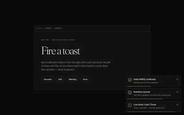 light
light Toast Notification Micro-interaction
Four triggers spawn stacked toasts bottom-right: each slides in from x 40 with a back.out overshoot while earlier toasts shift up via Flip, an icon draws itself with DrawSVG, a hairline counts down 4s (pausing on hover) and dismissal re-flows the stack.
- gsap
- flip
- svg
 light
light Blend-Mode Cursor
A white disc in mix-blend-mode: difference trails the pointer with a 0.12 lerp, inverting headlines, a lime block and an image as it passes, swelling from 24px to 120px over links with a tiny label and pulsing a ring on click.
- gsap
 Featured medium
 Image Trail Following Cursor
Moving the pointer across a dark stage leaves a trail of grainy gradient tiles: every 40px of travel a new tile blooms under the cursor with a slight twist, hangs for 0.6s and dissolves, stacking above the last.
- gsap
- canvas2d