Shared-Element Flip Transition
Clicking one of six thumbnails records its position with Flip.getState, reparents it into a full-screen detail layout and morphs it there in 0.9s power3.inOut while the other tiles scale away; Close or Escape morphs it back.
- Page Transitions
- gsap
- flip
- advanced
- light perf
- mobile: full
- reduced-motion ✓
AI prompt
Recreate this effect with any AI tool
Paste into Claude, Cursor, v0, Lovable or Bolt. 1532 words of exact values — rewritten live as you tune the Playground.
### EFFECT: Shared-Element Flip Transition
**What it does (visual):** A dark page shows a small serif headline and a 3×2 grid of six 4:3 thumbnails — each a rich gradient (a deep base colour with a bright highlight orb and fine grain) with a serif title and a mono index in its bottom corners. Clicking a thumbnail does not open a new box: the thumbnail's artwork itself grows and travels. Over 0.9s (`power3.inOut`), it slides and scales from its grid slot into the left ~57% of the viewport, its 14px corners squaring off as it goes, until it fills the left column of a full-screen detail layout edge to edge. While it travels, the five other thumbnails fade to 0 and shrink to 0.92× (0.5s, slightly staggered), the page background fades in behind to hide the grid, and in the right column a mono category line in the accent colour (`#d4ff3a`), a large serif title, a paragraph and a small "Press Esc or Close" hint rise 40px into place and fade in, staggered 80ms, starting halfway through the morph. A pill "Close" button sits top-right and receives focus. Pressing Escape or Close reverses it: the text drops away in 0.3s, the artwork shrinks and travels back to its exact grid slot (0.9s, corners rounding back to 14px) while the backdrop fades and the other thumbnails scale back to full; focus returns to the thumbnail that was opened. About 1.2s after the fonts load, the demo opens and closes the third tile once by itself so the morph can be seen immediately.

**Tech stack:**
- GSAP 3.13+ with the Flip plugin (free since 3.13).
- CDN: `<script src="https://cdn.jsdelivr.net/npm/gsap@3/dist/gsap.min.js"></script>` + `<script src="https://cdn.jsdelivr.net/npm/gsap@3/dist/Flip.min.js"></script>`
- npm: `npm i gsap` → `import gsap from "gsap"; import { Flip } from "gsap/Flip"; gsap.registerPlugin(Flip);`
- Fonts: variable serif for titles (demo uses Fraunces 300), sans for copy, mono for meta.

**HTML structure:**
```html
<section class="sef">
  <header class="sef__head">
    <p class="sef__eyebrow">Page transition · GSAP Flip</p>
    <h1 class="sef__title">Open a frame, stay in the room.</h1>
  </header>
  <ul class="sef__grid" role="list">
    <li class="sef__cell">
      <button class="sef__tile" type="button" data-title="Tide Tables" data-meta="Photography · 2026" data-copy="Forty mornings on the same estuary…">
        <div class="sef__art" style="--a:#1c3b5a;--b:#0a0a0a;--c:#e0b07a"></div>   <!-- the shared element -->
        <span class="sef__label"><span>Tide Tables</span><span>01</span></span>
      </button>
    </li>
    <!-- five more .sef__cell with their own --a/--c colours -->
  </ul>
  <div class="sef__detail" role="dialog" aria-modal="true" aria-labelledby="sef-detail-title" hidden>
    <div class="sef__detail-bg" aria-hidden="true"></div>   <!-- the fading backdrop, separate from the dialog -->
    <div class="sef__detail-media"></div>          <!-- .sef__art is moved in here -->
    <div class="sef__detail-body">
      <p class="sef__detail-meta sef__detail-rise"></p>
      <h2 class="sef__detail-title sef__detail-rise" id="sef-detail-title"></h2>
      <p class="sef__detail-copy sef__detail-rise"></p>
      <p class="sef__detail-hint sef__detail-rise">Press <kbd>Esc</kbd> or Close to return</p>
    </div>
    <button class="sef__close" type="button">Close</button>
  </div>
</section>
```

**CSS requirements:**
- `.sef__grid`: `display: grid; grid-template-columns: repeat(3, minmax(0, 1fr)); gap: 1.25rem; max-width: 1100px; margin: 0 auto;`
- `.sef__tile`: `position: relative; display: block; width: 100%; aspect-ratio: 4 / 3; border-radius: 14px; background: var(--surface, #121212);` — the `aspect-ratio` keeps the slot open after the art leaves.
- `.sef__art` (shared element, identical positioning in both layouts): `position: absolute; inset: 0; border-radius: 14px; background: radial-gradient(90% 70% at 70% 25%, var(--c) 0%, transparent 55%), radial-gradient(120% 90% at 20% 90%, var(--a) 0%, transparent 65%), linear-gradient(160deg, color-mix(in srgb, var(--a) 70%, #000) 0%, var(--b) 100%);` + an `::after` grain layer (inline SVG `feTurbulence` data-URI, `opacity: .32`, no blend mode — blending would force a re-raster of the huge layer every frame). **No CSS `transition` on `transform`** — Flip owns the transform; a transition would smooth and lag every frame. `.sef__art.is-flipping { will-change: transform; }` is toggled by JS only while travelling.
- `.sef__detail-media .sef__art { border-radius: 0; }` — this is the value Flip animates *to*.
- `.sef__label`: absolute bottom corners, serif `clamp(1.1rem, 1.8vw, 1.5rem)`, `pointer-events: none`.
- `.sef__detail`: `position: fixed; inset: 0; z-index: 20; display: grid; grid-template-columns: minmax(0, 1.15fr) minmax(0, .85fr);` with `[hidden] { display: none; }`. `.sef__detail-bg`: `position: absolute; inset: 0; background: var(--bg, #0a0a0a); opacity: 0;` — the backdrop is a separate element because fading the dialog itself would fade the travelling artwork too. `.sef__detail-media { position: relative; min-height: 0; }`, `.sef__detail-body { position: relative; }`. `.sef__detail-body { display: flex; flex-direction: column; justify-content: center; gap: 1.25rem; padding: 4.5rem; }`.
- `.sef__detail-meta`: mono 11px uppercase, `color: var(--accent, #d4ff3a)`. `.sef__detail-title`: serif 300, `clamp(2.4rem, 5vw, 5rem); letter-spacing: -0.04em;`. `.sef__detail-copy`: `max-width: 40ch; color: var(--muted);`.
- `.sef__close`: `position: absolute; top: 1.25rem; right: 1.25rem;` outlined pill, inverts on hover, `2px solid var(--accent)` focus ring.
- `.sef__cell { will-change: transform, opacity; }` (they scale/fade).

**Animation spec (exact values):**
1. `gsap.registerPlugin(Flip); gsap.ticker.lagSmoothing(0);` (the morph stays on wall time even when the first paint is heavy). Shared constants: `DURATION = 0.9`, `EASE = 'power3.inOut'`, `SCALE = true` (Flip's `scale` option). A `busy` flag and an `open` reference (the tile currently expanded).
2. **Open** `openTile(tile)`:
   - Fill `.sef__detail-title/meta/copy` from `data-title/meta/copy`.
   - `const state = Flip.getState(art, { props: 'borderRadius' })` — recorded **before** anything moves.
   - `detail.hidden = false; media.appendChild(art); art.classList.add('is-flipping');` — the element is now in the detail layout (`inset: 0` of the media column, radius 0) and promoted to its own layer.
   - Timeline (`onComplete`: `art.classList.remove('is-flipping'); busy = false; closeBtn.focus()`):
     - `.add(Flip.from(state, { duration: 0.9, ease: 'power3.inOut', absolute: true, scale: true, props: 'borderRadius' }), 0)` — position, size (as scale when `scale: true`, else real width/height) and border-radius 14px → 0 morph from the recorded grid slot to the detail column.
     - `.to('.sef__detail-bg', { opacity: 1, duration: 0.9, ease: 'power2.inOut' }, 0)` — backdrop fades in over the grid.
     - `.to(tile.querySelector('.sef__label'), { opacity: 0, duration: 0.2 }, 0)`.
     - `.to(otherCells, { opacity: 0, scale: 0.92, duration: 0.5, ease: 'power2.out', stagger: 0.03 }, 0)` — never touch the clicked tile's own cell (an opacity/transform there would create a stacking context).
     - `.fromTo('.sef__detail-rise', { y: 40, opacity: 0 }, { y: 0, opacity: 1, duration: 0.8, ease: 'power3.out', stagger: 0.08 }, 0.9 * 0.5)`.
3. **Close** `closeDetail()`:
   - `const state = Flip.getState(art, { props: 'borderRadius' })`; `tile.prepend(art)`; add `is-flipping`; `gsap.set(art, { zIndex: 30 })` so it travels above the still-fading backdrop.
   - Timeline (`onComplete`: `detail.hidden = true; gsap.set(art, { clearProps: 'zIndex' }); open = null; busy = false; tile.focus()`):
     - `.to('.sef__detail-rise', { y: 40 * 0.5, opacity: 0, duration: 0.3, ease: 'power2.in', stagger: 0.03 }, 0)`
     - `.add(Flip.from(state, { duration: 0.9, ease: 'power3.inOut', absolute: true, scale: true, props: 'borderRadius' }), 0)` — back to the slot, radius 0 → 14px.
     - `.to('.sef__detail-bg', { opacity: 0, duration: 0.7, ease: 'power2.inOut' }, 0.2)`
     - `.to(otherCells, { opacity: 1, scale: 1, duration: 0.6, ease: 'power3.out', stagger: 0.02, clearProps: 'transform,opacity' }, 0.3)`
     - `.to(label, { opacity: 1, duration: 0.3 }, 0.6)`
4. Entrance (decorative): `gsap.from('.sef__eyebrow, .sef__title', { y: 24, opacity: 0, duration: 1, ease: 'power3.out', stagger: 0.08 })` and `gsap.from('.sef__cell', { y: 30, opacity: 0, duration: 0.9, ease: 'power3.out', stagger: 0.05, delay: 0.1, clearProps: 'all' })`.
5. Demo autoplay: after `document.fonts.ready`, `setTimeout(() => openTile(tiles[2]), 1200)` and `setTimeout(closeDetail, 4200)`, both cancelled on the first pointerdown/click/keydown.

**Interaction:** Click a tile → open (0.9s). Click Close or press Escape → close (0.9s). Clicks during an animation are ignored (`busy`). Hovering a tile dims its label to 70% over 0.3s. Focus moves to Close on open and back to the originating tile on close.

**Responsive behavior:** No `gsap.matchMedia()` branches — Flip measures the live layout, so the same code morphs into whatever the detail grid is. Under 768px the thumbnail grid is 2 columns and the detail layout becomes `grid-template-columns: 1fr; grid-template-rows: 46vh 1fr; overflow-y: auto`, so the artwork morphs into a 46vh banner with the copy below it.

**Accessibility:** `prefers-reduced-motion: reduce` → every duration is multiplied by 0 (`D = 0`), so the element is simply reparented and the detail appears/disappears instantly with no motion; the autoplay is skipped. Tiles are `<button>`s with visible focus rings; the detail is `role="dialog" aria-modal="true" aria-labelledby` the title; Escape closes; focus is managed both ways. Decorative art is unlabeled; the title text is real text, not an image.

**Performance rules:** Flip runs with `absolute: true` (no reflow of either layout during the morph) and `scale: true` (`true` = transforms only, never width/height). Only `transform`, `opacity` and `border-radius` change. `will-change: transform` is on the cells and, via `.is-flipping`, on the shared element only while it travels; `clearProps` removes inline styles after the close so the grid returns to pure CSS. Everything is inside `gsap.context()` and reverted on unmount; timers and listeners are cleared.

**Customization knobs:**
- `DURATION` (0.9) / `EASE` (`'power3.inOut'`) — the morph; try `'expo.inOut'` for a punchier arrival.
- `scale: true` — `false` animates real width/height (crisper for text inside the shared element, costlier).
- Sibling fade `scale: 0.92` and `stagger: 0.03`.
- Copy rise distance (40px) and accent colour (`#d4ff3a`) for the category line and focus rings.
- Detail column ratio `1.15fr / .85fr` and the `border-radius` pair (14px → 0).
- `AUTOPLAY` — set `false` in production.

**Acceptance criteria:**
- [ ] The clicked artwork itself travels from its slot to the detail column; nothing fades out and re-appears.
- [ ] Corner radius animates 14px → 0 on open and back on close.
- [ ] Other tiles fade/scale away during the open and return on close; the empty slot keeps its size.
- [ ] Escape and Close both reverse the morph; focus returns to the originating tile.
- [ ] Reduced-motion users see instant open/close; no layout shift; no console errors.Add this effect to my existing site/section: **Shared-Element Flip Transition**. Keep my thumbnail grid; make each thumbnail a `<button>` whose image is a `position: absolute; inset: 0` element (the shared element), and add a hidden fixed `.sef__detail` dialog (`grid-template-columns: 1.15fr .85fr`) containing a separate `.sef__detail-bg` backdrop (`opacity: 0`), a media column and a copy column. On click: `Flip.getState(image, { props: 'borderRadius' })`, unhide the dialog, `appendChild` the image into the media column, then `Flip.from(state, { duration: 0.9, ease: 'power3.inOut', absolute: true, scale: true, props: 'borderRadius' })` while tweening the backdrop to `opacity: 1` (0.9s), the other tiles to `opacity: 0, scale: 0.92` (0.5s, stagger .03) and the copy `from { y: 40, opacity: 0 }` (0.8s `power3.out`, stagger .08, starting halfway through the morph). On Close/Escape record the state again, move the image back, give it a temporary `zIndex: 30` and `Flip.from` with the same settings while fading the backdrop out and restoring the tiles; return focus to the tile. Guard with a `busy` flag, collapse all durations to 0 for `prefers-reduced-motion`, wrap in `gsap.context()` and revert on unmount. Do not change my colours, fonts or grid.### EFFECT (React / Next.js): Shared-Element Flip Transition
Build **Shared-Element Flip Transition** as a self-contained React component for a Next.js App Router project (also valid in Vite + React). Follow the specification below exactly; the vanilla reference implementation at the end is the source of truth for values and structure.
**Setup**
- `npm i gsap @gsap/react`
- File: `components/SharedElementFlipTransition.tsx`, first line `"use client";` (GSAP touches the DOM).
- Imports:
```tsx
"use client";
import { useRef } from "react";
import gsap from "gsap";
import { Flip } from "gsap/Flip";
import { useGSAP } from "@gsap/react";
gsap.registerPlugin(useGSAP, Flip);
export default function SharedElementFlipTransition() {
const scope = useRef<HTMLDivElement>(null);
useGSAP(() => {
// 1. query elements inside `scope.current` (never document-wide)
// 2. wait for document.fonts.ready before any SplitText
// 3. build the timeline / ScrollTriggers exactly as in the specification
// 4. return nothing — useGSAP reverts everything automatically on unmount
}, { scope });
return (
<div ref={scope} className="sef">
{/* markup from the HTML structure section, class → className */}
</div>
);
}
```
**React-specific rules**
- Everything GSAP-related lives inside `useGSAP(() => {...}, { scope })`; it handles cleanup (`ctx.revert()`) on unmount and in React Strict Mode double-invocation.
- Use refs or `gsap.utils.selector(scope)` instead of `document.querySelector`.
- Event listeners added inside useGSAP must use `contextSafe` (`const { contextSafe } = useGSAP({ scope })`) so their tweens are reverted too.
- ScrollTrigger: call `ScrollTrigger.refresh()` after images/fonts load; if the page uses Lenis, sync it once at the app root (`lenis.on('scroll', ScrollTrigger.update)`).
- Styles: copy the CSS requirements into a CSS Module (`SharedElementFlipTransition.module.css`) or Tailwind; keep the class names so the spec maps 1:1.
- Respect `prefers-reduced-motion` with `gsap.matchMedia()` as in the spec.
---
### EFFECT: Shared-Element Flip Transition
**What it does (visual):** A dark page shows a small serif headline and a 3×2 grid of six 4:3 thumbnails — each a rich gradient (a deep base colour with a bright highlight orb and fine grain) with a serif title and a mono index in its bottom corners. Clicking a thumbnail does not open a new box: the thumbnail's artwork itself grows and travels. Over 0.9s (`power3.inOut`), it slides and scales from its grid slot into the left ~57% of the viewport, its 14px corners squaring off as it goes, until it fills the left column of a full-screen detail layout edge to edge. While it travels, the five other thumbnails fade to 0 and shrink to 0.92× (0.5s, slightly staggered), the page background fades in behind to hide the grid, and in the right column a mono category line in the accent colour (`#d4ff3a`), a large serif title, a paragraph and a small "Press Esc or Close" hint rise 40px into place and fade in, staggered 80ms, starting halfway through the morph. A pill "Close" button sits top-right and receives focus. Pressing Escape or Close reverses it: the text drops away in 0.3s, the artwork shrinks and travels back to its exact grid slot (0.9s, corners rounding back to 14px) while the backdrop fades and the other thumbnails scale back to full; focus returns to the thumbnail that was opened. About 1.2s after the fonts load, the demo opens and closes the third tile once by itself so the morph can be seen immediately.
**Tech stack:**
- GSAP 3.13+ with the Flip plugin (free since 3.13).
- CDN: `<script src="https://cdn.jsdelivr.net/npm/gsap@3/dist/gsap.min.js"></script>` + `<script src="https://cdn.jsdelivr.net/npm/gsap@3/dist/Flip.min.js"></script>`
- npm: `npm i gsap` → `import gsap from "gsap"; import { Flip } from "gsap/Flip"; gsap.registerPlugin(Flip);`
- Fonts: variable serif for titles (demo uses Fraunces 300), sans for copy, mono for meta.
**HTML structure:**
```html
<section class="sef">
<header class="sef__head">
<p class="sef__eyebrow">Page transition · GSAP Flip</p>
<h1 class="sef__title">Open a frame, stay in the room.</h1>
</header>
<ul class="sef__grid" role="list">
<li class="sef__cell">
<button class="sef__tile" type="button" data-title="Tide Tables" data-meta="Photography · 2026" data-copy="Forty mornings on the same estuary…">
<div class="sef__art" style="--a:#1c3b5a;--b:#0a0a0a;--c:#e0b07a"></div> <!-- the shared element -->
<span class="sef__label"><span>Tide Tables</span><span>01</span></span>
</button>
</li>
<!-- five more .sef__cell with their own --a/--c colours -->
</ul>
<div class="sef__detail" role="dialog" aria-modal="true" aria-labelledby="sef-detail-title" hidden>
<div class="sef__detail-bg" aria-hidden="true"></div> <!-- the fading backdrop, separate from the dialog -->
<div class="sef__detail-media"></div> <!-- .sef__art is moved in here -->
<div class="sef__detail-body">
<p class="sef__detail-meta sef__detail-rise"></p>
<h2 class="sef__detail-title sef__detail-rise" id="sef-detail-title"></h2>
<p class="sef__detail-copy sef__detail-rise"></p>
<p class="sef__detail-hint sef__detail-rise">Press <kbd>Esc</kbd> or Close to return</p>
</div>
<button class="sef__close" type="button">Close</button>
</div>
</section>
```
**CSS requirements:**
- `.sef__grid`: `display: grid; grid-template-columns: repeat(3, minmax(0, 1fr)); gap: 1.25rem; max-width: 1100px; margin: 0 auto;`
- `.sef__tile`: `position: relative; display: block; width: 100%; aspect-ratio: 4 / 3; border-radius: 14px; background: var(--surface, #121212);` — the `aspect-ratio` keeps the slot open after the art leaves.
- `.sef__art` (shared element, identical positioning in both layouts): `position: absolute; inset: 0; border-radius: 14px; background: radial-gradient(90% 70% at 70% 25%, var(--c) 0%, transparent 55%), radial-gradient(120% 90% at 20% 90%, var(--a) 0%, transparent 65%), linear-gradient(160deg, color-mix(in srgb, var(--a) 70%, #000) 0%, var(--b) 100%);` + an `::after` grain layer (inline SVG `feTurbulence` data-URI, `opacity: .32`, no blend mode — blending would force a re-raster of the huge layer every frame). **No CSS `transition` on `transform`** — Flip owns the transform; a transition would smooth and lag every frame. `.sef__art.is-flipping { will-change: transform; }` is toggled by JS only while travelling.
- `.sef__detail-media .sef__art { border-radius: 0; }` — this is the value Flip animates *to*.
- `.sef__label`: absolute bottom corners, serif `clamp(1.1rem, 1.8vw, 1.5rem)`, `pointer-events: none`.
- `.sef__detail`: `position: fixed; inset: 0; z-index: 20; display: grid; grid-template-columns: minmax(0, 1.15fr) minmax(0, .85fr);` with `[hidden] { display: none; }`. `.sef__detail-bg`: `position: absolute; inset: 0; background: var(--bg, #0a0a0a); opacity: 0;` — the backdrop is a separate element because fading the dialog itself would fade the travelling artwork too. `.sef__detail-media { position: relative; min-height: 0; }`, `.sef__detail-body { position: relative; }`. `.sef__detail-body { display: flex; flex-direction: column; justify-content: center; gap: 1.25rem; padding: 4.5rem; }`.
- `.sef__detail-meta`: mono 11px uppercase, `color: var(--accent, #d4ff3a)`. `.sef__detail-title`: serif 300, `clamp(2.4rem, 5vw, 5rem); letter-spacing: -0.04em;`. `.sef__detail-copy`: `max-width: 40ch; color: var(--muted);`.
- `.sef__close`: `position: absolute; top: 1.25rem; right: 1.25rem;` outlined pill, inverts on hover, `2px solid var(--accent)` focus ring.
- `.sef__cell { will-change: transform, opacity; }` (they scale/fade).
**Animation spec (exact values):**
1. `gsap.registerPlugin(Flip); gsap.ticker.lagSmoothing(0);` (the morph stays on wall time even when the first paint is heavy). Shared constants: `DURATION = 0.9`, `EASE = 'power3.inOut'`, `SCALE = true` (Flip's `scale` option). A `busy` flag and an `open` reference (the tile currently expanded).
2. **Open** `openTile(tile)`:
- Fill `.sef__detail-title/meta/copy` from `data-title/meta/copy`.
- `const state = Flip.getState(art, { props: 'borderRadius' })` — recorded **before** anything moves.
- `detail.hidden = false; media.appendChild(art); art.classList.add('is-flipping');` — the element is now in the detail layout (`inset: 0` of the media column, radius 0) and promoted to its own layer.
- Timeline (`onComplete`: `art.classList.remove('is-flipping'); busy = false; closeBtn.focus()`):
- `.add(Flip.from(state, { duration: 0.9, ease: 'power3.inOut', absolute: true, scale: true, props: 'borderRadius' }), 0)` — position, size (as scale when `scale: true`, else real width/height) and border-radius 14px → 0 morph from the recorded grid slot to the detail column.
- `.to('.sef__detail-bg', { opacity: 1, duration: 0.9, ease: 'power2.inOut' }, 0)` — backdrop fades in over the grid.
- `.to(tile.querySelector('.sef__label'), { opacity: 0, duration: 0.2 }, 0)`.
- `.to(otherCells, { opacity: 0, scale: 0.92, duration: 0.5, ease: 'power2.out', stagger: 0.03 }, 0)` — never touch the clicked tile's own cell (an opacity/transform there would create a stacking context).
- `.fromTo('.sef__detail-rise', { y: 40, opacity: 0 }, { y: 0, opacity: 1, duration: 0.8, ease: 'power3.out', stagger: 0.08 }, 0.9 * 0.5)`.
3. **Close** `closeDetail()`:
- `const state = Flip.getState(art, { props: 'borderRadius' })`; `tile.prepend(art)`; add `is-flipping`; `gsap.set(art, { zIndex: 30 })` so it travels above the still-fading backdrop.
- Timeline (`onComplete`: `detail.hidden = true; gsap.set(art, { clearProps: 'zIndex' }); open = null; busy = false; tile.focus()`):
- `.to('.sef__detail-rise', { y: 40 * 0.5, opacity: 0, duration: 0.3, ease: 'power2.in', stagger: 0.03 }, 0)`
- `.add(Flip.from(state, { duration: 0.9, ease: 'power3.inOut', absolute: true, scale: true, props: 'borderRadius' }), 0)` — back to the slot, radius 0 → 14px.
- `.to('.sef__detail-bg', { opacity: 0, duration: 0.7, ease: 'power2.inOut' }, 0.2)`
- `.to(otherCells, { opacity: 1, scale: 1, duration: 0.6, ease: 'power3.out', stagger: 0.02, clearProps: 'transform,opacity' }, 0.3)`
- `.to(label, { opacity: 1, duration: 0.3 }, 0.6)`
4. Entrance (decorative): `gsap.from('.sef__eyebrow, .sef__title', { y: 24, opacity: 0, duration: 1, ease: 'power3.out', stagger: 0.08 })` and `gsap.from('.sef__cell', { y: 30, opacity: 0, duration: 0.9, ease: 'power3.out', stagger: 0.05, delay: 0.1, clearProps: 'all' })`.
5. Demo autoplay: after `document.fonts.ready`, `setTimeout(() => openTile(tiles[2]), 1200)` and `setTimeout(closeDetail, 4200)`, both cancelled on the first pointerdown/click/keydown.
**Interaction:** Click a tile → open (0.9s). Click Close or press Escape → close (0.9s). Clicks during an animation are ignored (`busy`). Hovering a tile dims its label to 70% over 0.3s. Focus moves to Close on open and back to the originating tile on close.
**Responsive behavior:** No `gsap.matchMedia()` branches — Flip measures the live layout, so the same code morphs into whatever the detail grid is. Under 768px the thumbnail grid is 2 columns and the detail layout becomes `grid-template-columns: 1fr; grid-template-rows: 46vh 1fr; overflow-y: auto`, so the artwork morphs into a 46vh banner with the copy below it.
**Accessibility:** `prefers-reduced-motion: reduce` → every duration is multiplied by 0 (`D = 0`), so the element is simply reparented and the detail appears/disappears instantly with no motion; the autoplay is skipped. Tiles are `<button>`s with visible focus rings; the detail is `role="dialog" aria-modal="true" aria-labelledby` the title; Escape closes; focus is managed both ways. Decorative art is unlabeled; the title text is real text, not an image.
**Performance rules:** Flip runs with `absolute: true` (no reflow of either layout during the morph) and `scale: true` (`true` = transforms only, never width/height). Only `transform`, `opacity` and `border-radius` change. `will-change: transform` is on the cells and, via `.is-flipping`, on the shared element only while it travels; `clearProps` removes inline styles after the close so the grid returns to pure CSS. Everything is inside `gsap.context()` and reverted on unmount; timers and listeners are cleared.
**Customization knobs:**
- `DURATION` (0.9) / `EASE` (`'power3.inOut'`) — the morph; try `'expo.inOut'` for a punchier arrival.
- `scale: true` — `false` animates real width/height (crisper for text inside the shared element, costlier).
- Sibling fade `scale: 0.92` and `stagger: 0.03`.
- Copy rise distance (40px) and accent colour (`#d4ff3a`) for the category line and focus rings.
- Detail column ratio `1.15fr / .85fr` and the `border-radius` pair (14px → 0).
- `AUTOPLAY` — set `false` in production.
**Acceptance criteria:**
- [ ] The clicked artwork itself travels from its slot to the detail column; nothing fades out and re-appears.
- [ ] Corner radius animates 14px → 0 on open and back on close.
- [ ] Other tiles fade/scale away during the open and return on close; the empty slot keeps its size.
- [ ] Escape and Close both reverse the morph; focus returns to the originating tile.
- [ ] Reduced-motion users see instant open/close; no layout shift; no console errors.
---
**Reference implementation (vanilla, converts 1:1 — same class names, same values):**
```html
<section class="sef">
<header class="sef__head">
<p class="sef__eyebrow">Page transition · GSAP Flip</p>
<h1 class="sef__title">Open a frame, stay in the room.</h1>
</header>
<ul class="sef__grid" role="list">
<li class="sef__cell"><button class="sef__tile" type="button" data-title="Tide Tables" data-meta="Photography · 2026" data-copy="Forty mornings on the same estuary, printed at the scale of the tide itself."><div class="sef__art" style="--a:#1c3b5a;--b:#0a0a0a;--c:#e0b07a"></div><span class="sef__label"><span>Tide Tables</span><span>01</span></span></button></li>
<li class="sef__cell"><button class="sef__tile" type="button" data-title="Salt Chapel" data-meta="Architecture · 2026" data-copy="A single room of white concrete that turns pink for twenty minutes every evening."><div class="sef__art" style="--a:#5a2b4a;--b:#0a0a0a;--c:#ff9f7a"></div><span class="sef__label"><span>Salt Chapel</span><span>02</span></span></button></li>
<li class="sef__cell"><button class="sef__tile" type="button" data-title="North Light" data-meta="Interiors · 2025" data-copy="An attic studio reorganised around one window and the four hours of light it allows."><div class="sef__art" style="--a:#2a5c48;--b:#0a0a0a;--c:#d4ff3a"></div><span class="sef__label"><span>North Light</span><span>03</span></span></button></li>
<li class="sef__cell"><button class="sef__tile" type="button" data-title="Quiet Machines" data-meta="Product · 2025" data-copy="Kitchen tools with no logos, no lights and nothing that beeps."><div class="sef__art" style="--a:#5c3a2a;--b:#0a0a0a;--c:#ffd27a"></div><span class="sef__label"><span>Quiet Machines</span><span>04</span></span></button></li>
<li class="sef__cell"><button class="sef__tile" type="button" data-title="Ferric" data-meta="Identity · 2025" data-copy="A type system for a foundry, drawn from the rust patterns on its own doors."><div class="sef__art" style="--a:#4a2a5c;--b:#0a0a0a;--c:#9ac4ff"></div><span class="sef__label"><span>Ferric</span><span>05</span></span></button></li>
<li class="sef__cell"><button class="sef__tile" type="button" data-title="Low Sun" data-meta="Editorial · 2024" data-copy="A winter issue photographed entirely between three and four in the afternoon."><div class="sef__art" style="--a:#5c5a2a;--b:#0a0a0a;--c:#ff7a5a"></div><span class="sef__label"><span>Low Sun</span><span>06</span></span></button></li>
</ul>
<div class="sef__detail" role="dialog" aria-modal="true" aria-labelledby="sef-detail-title" hidden>
<div class="sef__detail-bg" aria-hidden="true"></div>
<div class="sef__detail-media"></div>
<div class="sef__detail-body">
<p class="sef__detail-meta sef__detail-rise"></p>
<h2 class="sef__detail-title sef__detail-rise" id="sef-detail-title"></h2>
<p class="sef__detail-copy sef__detail-rise"></p>
<p class="sef__detail-hint sef__detail-rise">Press <kbd>Esc</kbd> or Close to return</p>
</div>
<button class="sef__close" type="button">Close</button>
</div>
</section>
```
```css
.sef { min-height: 100vh; padding: clamp(1.5rem, 4vw, 3.5rem) clamp(1.25rem, 5vw, 3.75rem); display: grid; grid-template-rows: auto 1fr; gap: clamp(1.5rem, 3vw, 2.5rem); }
.sef__eyebrow { font-family: var(--font-mono); font-size: 11px; text-transform: uppercase; letter-spacing: .12em; color: var(--muted); margin-bottom: .9rem; }
.sef__title { font-family: var(--font-display); font-weight: 300; font-variation-settings: 'opsz' 144, 'SOFT' 30; font-size: clamp(2.2rem, 4.6vw, 4.2rem); line-height: .95; letter-spacing: -0.04em; }
.sef__grid { list-style: none; display: grid; grid-template-columns: repeat(3, minmax(0, 1fr)); gap: clamp(.75rem, 1.6vw, 1.25rem); max-width: 1100px; width: 100%; margin: 0 auto; align-content: center; }
.sef__cell { will-change: transform, opacity; }
.sef__tile { position: relative; display: block; width: 100%; aspect-ratio: 4 / 3; border-radius: 14px; text-align: left; color: #fff; background: var(--surface); }
.sef__tile:focus-visible { outline: 2px solid var(--knob-accent, var(--accent)); outline-offset: 4px; }
.sef__tile:hover .sef__label { opacity: .7; }
/* the shared element: same positioning in both layouts — no CSS transition on transform, Flip owns it */
.sef__art { position: absolute; inset: 0; border-radius: 14px; overflow: hidden;
background: radial-gradient(90% 70% at 70% 25%, var(--c) 0%, transparent 55%), radial-gradient(120% 90% at 20% 90%, var(--a) 0%, transparent 65%), linear-gradient(160deg, color-mix(in srgb, var(--a) 70%, #000) 0%, var(--b) 100%); }
.sef__art::after { content: ''; position: absolute; inset: 0; background-image: url("data:image/svg+xml,%3Csvg xmlns='http://www.w3.org/2000/svg' width='160' height='160'%3E%3Cfilter id='n'%3E%3CfeTurbulence type='fractalNoise' baseFrequency='.9' numOctaves='2' stitchTiles='stitch'/%3E%3CfeColorMatrix values='0 0 0 0 1 0 0 0 0 1 0 0 0 0 1 0 0 0 .2 0'/%3E%3C/filter%3E%3Crect width='160' height='160' filter='url(%23n)'/%3E%3C/svg%3E"); background-size: 160px; opacity: .32; }
/* layer promotion only while travelling (class toggled by JS) */
.sef__art.is-flipping { will-change: transform; }
.sef__label { transition: opacity .3s; position: absolute; left: 1rem; right: 1rem; bottom: .9rem; display: flex; justify-content: space-between; align-items: baseline; font-family: var(--font-display); font-weight: 300; font-size: clamp(1.1rem, 1.8vw, 1.5rem); letter-spacing: -0.02em; pointer-events: none; text-shadow: 0 1px 12px rgba(0,0,0,.4); }
.sef__label span:last-child { font-family: var(--font-mono); font-size: 11px; letter-spacing: .1em; opacity: .7; }
/* detail layout */
.sef__detail { position: fixed; inset: 0; z-index: 20; display: grid; grid-template-columns: minmax(0, 1.15fr) minmax(0, .85fr); }
.sef__detail[hidden] { display: none; }
/* the backdrop is its own element: fading the dialog itself would also fade the travelling artwork */
.sef__detail-bg { position: absolute; inset: 0; background: var(--bg); opacity: 0; }
.sef__detail-media { position: relative; min-height: 0; }
.sef__detail-media .sef__art { border-radius: 0; }
.sef__detail-body { position: relative; display: flex; flex-direction: column; justify-content: center; gap: 1.25rem; padding: clamp(1.5rem, 5vw, 4.5rem); min-width: 0; }
.sef__detail-meta { font-family: var(--font-mono); font-size: 11px; text-transform: uppercase; letter-spacing: .12em; color: var(--knob-accent, var(--accent)); }
.sef__detail-title { font-family: var(--font-display); font-weight: 300; font-variation-settings: 'opsz' 144, 'SOFT' 30; font-size: clamp(2.4rem, 5vw, 5rem); line-height: .95; letter-spacing: -0.04em; text-wrap: balance; }
.sef__detail-copy { max-width: 40ch; color: var(--muted); font-size: clamp(1rem, 1.25vw, 1.2rem); line-height: 1.5; }
.sef__detail-hint { font-family: var(--font-mono); font-size: 11px; color: var(--muted); letter-spacing: .06em; margin-top: 1rem; }
.sef__detail-hint kbd { font: inherit; padding: .15em .45em; border: 1px solid var(--line); border-radius: 4px; }
.sef__close { position: absolute; z-index: 1; top: 1.25rem; right: 1.25rem; padding: .65em 1.3em; border: 1px solid color-mix(in srgb, var(--text) 25%, transparent); border-radius: 999px; font-size: .85rem; font-weight: 500; background: var(--bg); transition: background .25s, color .25s, border-color .25s; }
.sef__close:hover { background: var(--text); color: var(--bg); border-color: var(--text); }
.sef__close:focus-visible { outline: 2px solid var(--knob-accent, var(--accent)); outline-offset: 3px; }
@media (max-width: 767px) {
.sef__grid { grid-template-columns: 1fr 1fr; }
.sef__detail { grid-template-columns: 1fr; grid-template-rows: 46vh 1fr; overflow-y: auto; }
.sef__detail-body { justify-content: flex-start; padding-top: 2rem; }
}
@media (prefers-reduced-motion: reduce) {
.sef__cell, .sef__art.is-flipping { will-change: auto; }
.sef__label { transition: none; }
}
```
```js
// Shared-Element Flip Transition — a thumbnail is reparented into a full-screen layout and Flip morphs it there.
gsap.registerPlugin(Flip);
gsap.ticker.lagSmoothing(0); // keep the morph on wall time even if the first paint is heavy
// Defaults — overridable from the MOTION/LAB Playground via MotionLab.knob()
const DEFAULTS = { duration: 0.9, ease: 'power3.inOut', siblingScale: 0.92, riseDistance: 40, scaleMode: true, accent: '#d4ff3a' };
const K = (id) => window.MotionLab?.knob(id, DEFAULTS[id]) ?? DEFAULTS[id];
const AUTOPLAY = true; // demo-only: open + close once on load so the morph is visible without a click
const reduced = matchMedia('(prefers-reduced-motion: reduce)').matches;
const D = reduced ? 0 : 1; // duration multiplier → 0 collapses every tween to an instant state change
const section = document.querySelector('.sef');
const cells = gsap.utils.toArray('.sef__cell');
const tiles = gsap.utils.toArray('.sef__tile');
const detail = document.querySelector('.sef__detail');
const media = detail.querySelector('.sef__detail-media');
const backdrop = detail.querySelector('.sef__detail-bg');
const rises = gsap.utils.toArray('.sef__detail-rise');
const closeBtn = detail.querySelector('.sef__close');
const fields = { title: detail.querySelector('.sef__detail-title'), meta: detail.querySelector('.sef__detail-meta'), copy: detail.querySelector('.sef__detail-copy') };
let open = null; // the tile whose art is currently in the detail layer
let busy = false;
let timers = [];
// Entrance lives in its own context so a Playground rebuild never replays it.
const introCtx = gsap.context(() => {
if (reduced) return;
gsap.from('.sef__eyebrow, .sef__title', { y: 24, opacity: 0, duration: 1, ease: 'power3.out', stagger: 0.08 });
gsap.from(cells, { y: 30, opacity: 0, duration: 0.9, ease: 'power3.out', stagger: 0.05, delay: 0.1, clearProps: 'all' });
});
let ctx;
function build(e) {
const fromKnobs = e?.type === 'ml:knobs';
timers.forEach(clearTimeout); timers = [];
ctx?.revert();
// a rebuild while the detail is open (or mid-morph) resets to the closed grid instantly, then replays with the new values
if (open) {
const art = media.querySelector('.sef__art');
if (art) open.prepend(art);
detail.hidden = true;
gsap.set([...cells, ...rises, ...tiles.map((t) => t.querySelector('.sef__label')), backdrop], { clearProps: 'all' });
if (art) { art.classList.remove('is-flipping'); gsap.set(art, { clearProps: 'all' }); }
open = null;
}
busy = false;
section.style.setProperty('--knob-accent', K('accent'));
const DURATION = K('duration');
const EASE = K('ease');
const SIBLING_SCALE = K('siblingScale');
const RISE = K('riseDistance');
const SCALE = K('scaleMode');
ctx = gsap.context(() => {
function openTile(tile) {
if (busy || open) return;
busy = true; open = tile;
const art = tile.querySelector('.sef__art');
const label = tile.querySelector('.sef__label');
const others = cells.filter((c) => !c.contains(tile));
fields.title.textContent = tile.dataset.title;
fields.meta.textContent = tile.dataset.meta;
fields.copy.textContent = tile.dataset.copy;
// 1. record the "before" while the art is still inside the tile
const state = Flip.getState(art, { props: 'borderRadius' });
// 2. switch layouts: show the detail layer and move the element into it
detail.hidden = false;
media.appendChild(art);
art.classList.add('is-flipping');
// 3. animate from the recorded state to the new layout
gsap.timeline({ onComplete: () => { art.classList.remove('is-flipping'); busy = false; closeBtn.focus({ preventScroll: true }); } })
.add(Flip.from(state, { duration: DURATION * D, ease: EASE, absolute: true, scale: SCALE, props: 'borderRadius' }), 0)
.to(backdrop, { opacity: 1, duration: DURATION * D, ease: 'power2.inOut' }, 0)
.to(label, { opacity: 0, duration: 0.2 * D }, 0)
.to(others, { opacity: 0, scale: SIBLING_SCALE, duration: 0.5 * D, ease: 'power2.out', stagger: 0.03 }, 0)
.fromTo(rises, { y: RISE, opacity: 0 }, { y: 0, opacity: 1, duration: 0.8 * D, ease: 'power3.out', stagger: 0.08 }, DURATION * 0.5 * D);
}
function closeDetail() {
if (busy || !open) return;
busy = true;
const tile = open;
const art = media.querySelector('.sef__art');
const label = tile.querySelector('.sef__label');
const others = cells.filter((c) => !c.contains(tile));
const state = Flip.getState(art, { props: 'borderRadius' });
tile.prepend(art);
art.classList.add('is-flipping');
gsap.set(art, { zIndex: 30 }); // stay above the fading backdrop while travelling home
gsap.timeline({ onComplete: () => { detail.hidden = true; art.classList.remove('is-flipping'); gsap.set(art, { clearProps: 'zIndex' }); open = null; busy = false; tile.focus({ preventScroll: true }); } })
.to(rises, { y: RISE * 0.5, opacity: 0, duration: 0.3 * D, ease: 'power2.in', stagger: 0.03 }, 0)
.add(Flip.from(state, { duration: DURATION * D, ease: EASE, absolute: true, scale: SCALE, props: 'borderRadius' }), 0)
.to(backdrop, { opacity: 0, duration: 0.7 * D, ease: 'power2.inOut' }, 0.2 * D)
.to(others, { opacity: 1, scale: 1, duration: 0.6 * D, ease: 'power3.out', stagger: 0.02, clearProps: 'transform,opacity' }, 0.3 * D)
.to(label, { opacity: 1, duration: 0.3 * D }, 0.6 * D);
}
const cancelAutoplay = () => { timers.forEach(clearTimeout); timers = []; };
const onTileClick = (e) => { cancelAutoplay(); openTile(e.currentTarget); };
const onClose = () => { cancelAutoplay(); closeDetail(); };
const onKey = (e) => { if (e.key === 'Escape' && open) { cancelAutoplay(); closeDetail(); } };
const onFirstInput = () => cancelAutoplay();
tiles.forEach((t) => t.addEventListener('click', onTileClick));
closeBtn.addEventListener('click', onClose);
document.addEventListener('keydown', onKey);
window.addEventListener('pointerdown', onFirstInput, { once: true });
if (!reduced && (AUTOPLAY || fromKnobs)) {
// first load: start after the fonts are in so the detail copy never re-flows mid-morph.
// Playground rebuild: replay straight away so the new values are visible.
const openAt = fromKnobs ? 250 : 1200;
const closeAt = openAt + Math.max(3000, DURATION * 1000 + 2100); // 4200ms at the default 0.9s
document.fonts.ready.then(() => {
timers.push(setTimeout(() => openTile(tiles[2]), openAt));
timers.push(setTimeout(() => closeDetail(), closeAt));
});
}
return () => {
cancelAutoplay();
tiles.forEach((t) => t.removeEventListener('click', onTileClick));
closeBtn.removeEventListener('click', onClose);
document.removeEventListener('keydown', onKey);
window.removeEventListener('pointerdown', onFirstInput);
};
});
}
build();
// Playground: rebuild with the new values (and replay one open/close so they are visible)
window.addEventListener('ml:knobs', build);
window.MotionLab?.onCleanup(() => { ctx?.revert(); introCtx.revert(); });
```
### EFFECT (single HTML file): Shared-Element Flip Transition
Produce **one self-contained `index.html`** (inline `<style>` and `<script type="module">`, no build step) that implements **Shared-Element Flip Transition** exactly as specified below. Libraries load from jsDelivr:

```html
<!doctype html>
<html lang="en">
<head>
  <meta charset="utf-8">
  <meta name="viewport" content="width=device-width, initial-scale=1">
  <title>Shared-Element Flip Transition</title>
  <link href="https://fonts.googleapis.com/css2?family=Fraunces:ital,opsz,wght@0,9..144,300..600;1,9..144,300..600&family=Inter+Tight:wght@300..700&family=JetBrains+Mono:wght@400;500&display=swap" rel="stylesheet">
  <style>
    :root{--bg:#0a0a0a;--surface:#121212;--line:rgba(255,255,255,.08);--text:#ededed;--muted:#8a8a8a;--accent:#d4ff3a;--font-display:"Fraunces",Georgia,serif;--font-sans:"Inter Tight",system-ui,sans-serif;--font-mono:"JetBrains Mono",ui-monospace,monospace}
    *,*::before,*::after{box-sizing:border-box;margin:0;padding:0}
    body{background:var(--bg);color:var(--text);font-family:var(--font-sans);-webkit-font-smoothing:antialiased;overflow-x:hidden}
    /* + the CSS requirements below */
  </style>
  <script src="https://cdn.jsdelivr.net/npm/gsap@3/dist/gsap.min.js"></script>
  <script src="https://cdn.jsdelivr.net/npm/gsap@3/dist/Flip.min.js"></script>
</head>
<body>
  <!-- markup from the HTML structure section -->
  <script type="module">
    // the JS from the animation spec (window.MotionLab is optional — keep the ?. guards or remove them)
  </script>
</body>
</html>
```

The file must open directly from a local server (`npx serve .`) with zero console errors, work at 375px and 1440px, and honour `prefers-reduced-motion`.

---

### EFFECT: Shared-Element Flip Transition
**What it does (visual):** A dark page shows a small serif headline and a 3×2 grid of six 4:3 thumbnails — each a rich gradient (a deep base colour with a bright highlight orb and fine grain) with a serif title and a mono index in its bottom corners. Clicking a thumbnail does not open a new box: the thumbnail's artwork itself grows and travels. Over 0.9s (`power3.inOut`), it slides and scales from its grid slot into the left ~57% of the viewport, its 14px corners squaring off as it goes, until it fills the left column of a full-screen detail layout edge to edge. While it travels, the five other thumbnails fade to 0 and shrink to 0.92× (0.5s, slightly staggered), the page background fades in behind to hide the grid, and in the right column a mono category line in the accent colour (`#d4ff3a`), a large serif title, a paragraph and a small "Press Esc or Close" hint rise 40px into place and fade in, staggered 80ms, starting halfway through the morph. A pill "Close" button sits top-right and receives focus. Pressing Escape or Close reverses it: the text drops away in 0.3s, the artwork shrinks and travels back to its exact grid slot (0.9s, corners rounding back to 14px) while the backdrop fades and the other thumbnails scale back to full; focus returns to the thumbnail that was opened. About 1.2s after the fonts load, the demo opens and closes the third tile once by itself so the morph can be seen immediately.

**Tech stack:**
- GSAP 3.13+ with the Flip plugin (free since 3.13).
- CDN: `<script src="https://cdn.jsdelivr.net/npm/gsap@3/dist/gsap.min.js"></script>` + `<script src="https://cdn.jsdelivr.net/npm/gsap@3/dist/Flip.min.js"></script>`
- npm: `npm i gsap` → `import gsap from "gsap"; import { Flip } from "gsap/Flip"; gsap.registerPlugin(Flip);`
- Fonts: variable serif for titles (demo uses Fraunces 300), sans for copy, mono for meta.

**HTML structure:**
```html
<section class="sef">
  <header class="sef__head">
    <p class="sef__eyebrow">Page transition · GSAP Flip</p>
    <h1 class="sef__title">Open a frame, stay in the room.</h1>
  </header>
  <ul class="sef__grid" role="list">
    <li class="sef__cell">
      <button class="sef__tile" type="button" data-title="Tide Tables" data-meta="Photography · 2026" data-copy="Forty mornings on the same estuary…">
        <div class="sef__art" style="--a:#1c3b5a;--b:#0a0a0a;--c:#e0b07a"></div>   <!-- the shared element -->
        <span class="sef__label"><span>Tide Tables</span><span>01</span></span>
      </button>
    </li>
    <!-- five more .sef__cell with their own --a/--c colours -->
  </ul>
  <div class="sef__detail" role="dialog" aria-modal="true" aria-labelledby="sef-detail-title" hidden>
    <div class="sef__detail-bg" aria-hidden="true"></div>   <!-- the fading backdrop, separate from the dialog -->
    <div class="sef__detail-media"></div>          <!-- .sef__art is moved in here -->
    <div class="sef__detail-body">
      <p class="sef__detail-meta sef__detail-rise"></p>
      <h2 class="sef__detail-title sef__detail-rise" id="sef-detail-title"></h2>
      <p class="sef__detail-copy sef__detail-rise"></p>
      <p class="sef__detail-hint sef__detail-rise">Press <kbd>Esc</kbd> or Close to return</p>
    </div>
    <button class="sef__close" type="button">Close</button>
  </div>
</section>
```

**CSS requirements:**
- `.sef__grid`: `display: grid; grid-template-columns: repeat(3, minmax(0, 1fr)); gap: 1.25rem; max-width: 1100px; margin: 0 auto;`
- `.sef__tile`: `position: relative; display: block; width: 100%; aspect-ratio: 4 / 3; border-radius: 14px; background: var(--surface, #121212);` — the `aspect-ratio` keeps the slot open after the art leaves.
- `.sef__art` (shared element, identical positioning in both layouts): `position: absolute; inset: 0; border-radius: 14px; background: radial-gradient(90% 70% at 70% 25%, var(--c) 0%, transparent 55%), radial-gradient(120% 90% at 20% 90%, var(--a) 0%, transparent 65%), linear-gradient(160deg, color-mix(in srgb, var(--a) 70%, #000) 0%, var(--b) 100%);` + an `::after` grain layer (inline SVG `feTurbulence` data-URI, `opacity: .32`, no blend mode — blending would force a re-raster of the huge layer every frame). **No CSS `transition` on `transform`** — Flip owns the transform; a transition would smooth and lag every frame. `.sef__art.is-flipping { will-change: transform; }` is toggled by JS only while travelling.
- `.sef__detail-media .sef__art { border-radius: 0; }` — this is the value Flip animates *to*.
- `.sef__label`: absolute bottom corners, serif `clamp(1.1rem, 1.8vw, 1.5rem)`, `pointer-events: none`.
- `.sef__detail`: `position: fixed; inset: 0; z-index: 20; display: grid; grid-template-columns: minmax(0, 1.15fr) minmax(0, .85fr);` with `[hidden] { display: none; }`. `.sef__detail-bg`: `position: absolute; inset: 0; background: var(--bg, #0a0a0a); opacity: 0;` — the backdrop is a separate element because fading the dialog itself would fade the travelling artwork too. `.sef__detail-media { position: relative; min-height: 0; }`, `.sef__detail-body { position: relative; }`. `.sef__detail-body { display: flex; flex-direction: column; justify-content: center; gap: 1.25rem; padding: 4.5rem; }`.
- `.sef__detail-meta`: mono 11px uppercase, `color: var(--accent, #d4ff3a)`. `.sef__detail-title`: serif 300, `clamp(2.4rem, 5vw, 5rem); letter-spacing: -0.04em;`. `.sef__detail-copy`: `max-width: 40ch; color: var(--muted);`.
- `.sef__close`: `position: absolute; top: 1.25rem; right: 1.25rem;` outlined pill, inverts on hover, `2px solid var(--accent)` focus ring.
- `.sef__cell { will-change: transform, opacity; }` (they scale/fade).

**Animation spec (exact values):**
1. `gsap.registerPlugin(Flip); gsap.ticker.lagSmoothing(0);` (the morph stays on wall time even when the first paint is heavy). Shared constants: `DURATION = 0.9`, `EASE = 'power3.inOut'`, `SCALE = true` (Flip's `scale` option). A `busy` flag and an `open` reference (the tile currently expanded).
2. **Open** `openTile(tile)`:
   - Fill `.sef__detail-title/meta/copy` from `data-title/meta/copy`.
   - `const state = Flip.getState(art, { props: 'borderRadius' })` — recorded **before** anything moves.
   - `detail.hidden = false; media.appendChild(art); art.classList.add('is-flipping');` — the element is now in the detail layout (`inset: 0` of the media column, radius 0) and promoted to its own layer.
   - Timeline (`onComplete`: `art.classList.remove('is-flipping'); busy = false; closeBtn.focus()`):
     - `.add(Flip.from(state, { duration: 0.9, ease: 'power3.inOut', absolute: true, scale: true, props: 'borderRadius' }), 0)` — position, size (as scale when `scale: true`, else real width/height) and border-radius 14px → 0 morph from the recorded grid slot to the detail column.
     - `.to('.sef__detail-bg', { opacity: 1, duration: 0.9, ease: 'power2.inOut' }, 0)` — backdrop fades in over the grid.
     - `.to(tile.querySelector('.sef__label'), { opacity: 0, duration: 0.2 }, 0)`.
     - `.to(otherCells, { opacity: 0, scale: 0.92, duration: 0.5, ease: 'power2.out', stagger: 0.03 }, 0)` — never touch the clicked tile's own cell (an opacity/transform there would create a stacking context).
     - `.fromTo('.sef__detail-rise', { y: 40, opacity: 0 }, { y: 0, opacity: 1, duration: 0.8, ease: 'power3.out', stagger: 0.08 }, 0.9 * 0.5)`.
3. **Close** `closeDetail()`:
   - `const state = Flip.getState(art, { props: 'borderRadius' })`; `tile.prepend(art)`; add `is-flipping`; `gsap.set(art, { zIndex: 30 })` so it travels above the still-fading backdrop.
   - Timeline (`onComplete`: `detail.hidden = true; gsap.set(art, { clearProps: 'zIndex' }); open = null; busy = false; tile.focus()`):
     - `.to('.sef__detail-rise', { y: 40 * 0.5, opacity: 0, duration: 0.3, ease: 'power2.in', stagger: 0.03 }, 0)`
     - `.add(Flip.from(state, { duration: 0.9, ease: 'power3.inOut', absolute: true, scale: true, props: 'borderRadius' }), 0)` — back to the slot, radius 0 → 14px.
     - `.to('.sef__detail-bg', { opacity: 0, duration: 0.7, ease: 'power2.inOut' }, 0.2)`
     - `.to(otherCells, { opacity: 1, scale: 1, duration: 0.6, ease: 'power3.out', stagger: 0.02, clearProps: 'transform,opacity' }, 0.3)`
     - `.to(label, { opacity: 1, duration: 0.3 }, 0.6)`
4. Entrance (decorative): `gsap.from('.sef__eyebrow, .sef__title', { y: 24, opacity: 0, duration: 1, ease: 'power3.out', stagger: 0.08 })` and `gsap.from('.sef__cell', { y: 30, opacity: 0, duration: 0.9, ease: 'power3.out', stagger: 0.05, delay: 0.1, clearProps: 'all' })`.
5. Demo autoplay: after `document.fonts.ready`, `setTimeout(() => openTile(tiles[2]), 1200)` and `setTimeout(closeDetail, 4200)`, both cancelled on the first pointerdown/click/keydown.

**Interaction:** Click a tile → open (0.9s). Click Close or press Escape → close (0.9s). Clicks during an animation are ignored (`busy`). Hovering a tile dims its label to 70% over 0.3s. Focus moves to Close on open and back to the originating tile on close.

**Responsive behavior:** No `gsap.matchMedia()` branches — Flip measures the live layout, so the same code morphs into whatever the detail grid is. Under 768px the thumbnail grid is 2 columns and the detail layout becomes `grid-template-columns: 1fr; grid-template-rows: 46vh 1fr; overflow-y: auto`, so the artwork morphs into a 46vh banner with the copy below it.

**Accessibility:** `prefers-reduced-motion: reduce` → every duration is multiplied by 0 (`D = 0`), so the element is simply reparented and the detail appears/disappears instantly with no motion; the autoplay is skipped. Tiles are `<button>`s with visible focus rings; the detail is `role="dialog" aria-modal="true" aria-labelledby` the title; Escape closes; focus is managed both ways. Decorative art is unlabeled; the title text is real text, not an image.

**Performance rules:** Flip runs with `absolute: true` (no reflow of either layout during the morph) and `scale: true` (`true` = transforms only, never width/height). Only `transform`, `opacity` and `border-radius` change. `will-change: transform` is on the cells and, via `.is-flipping`, on the shared element only while it travels; `clearProps` removes inline styles after the close so the grid returns to pure CSS. Everything is inside `gsap.context()` and reverted on unmount; timers and listeners are cleared.

**Customization knobs:**
- `DURATION` (0.9) / `EASE` (`'power3.inOut'`) — the morph; try `'expo.inOut'` for a punchier arrival.
- `scale: true` — `false` animates real width/height (crisper for text inside the shared element, costlier).
- Sibling fade `scale: 0.92` and `stagger: 0.03`.
- Copy rise distance (40px) and accent colour (`#d4ff3a`) for the category line and focus rings.
- Detail column ratio `1.15fr / .85fr` and the `border-radius` pair (14px → 0).
- `AUTOPLAY` — set `false` in production.

**Acceptance criteria:**
- [ ] The clicked artwork itself travels from its slot to the detail column; nothing fades out and re-appears.
- [ ] Corner radius animates 14px → 0 on open and back on close.
- [ ] Other tiles fade/scale away during the open and return on close; the empty slot keeps its size.
- [ ] Escape and Close both reverse the morph; focus returns to the originating tile.
- [ ] Reduced-motion users see instant open/close; no layout shift; no console errors.

---

**Reference implementation (use these exact values and class names):**

```html
<section class="sef">
  <header class="sef__head">
    <p class="sef__eyebrow">Page transition · GSAP Flip</p>
    <h1 class="sef__title">Open a frame, stay in the room.</h1>
  </header>

  <ul class="sef__grid" role="list">
    <li class="sef__cell"><button class="sef__tile" type="button" data-title="Tide Tables" data-meta="Photography · 2026" data-copy="Forty mornings on the same estuary, printed at the scale of the tide itself."><div class="sef__art" style="--a:#1c3b5a;--b:#0a0a0a;--c:#e0b07a"></div><span class="sef__label"><span>Tide Tables</span><span>01</span></span></button></li>
    <li class="sef__cell"><button class="sef__tile" type="button" data-title="Salt Chapel" data-meta="Architecture · 2026" data-copy="A single room of white concrete that turns pink for twenty minutes every evening."><div class="sef__art" style="--a:#5a2b4a;--b:#0a0a0a;--c:#ff9f7a"></div><span class="sef__label"><span>Salt Chapel</span><span>02</span></span></button></li>
    <li class="sef__cell"><button class="sef__tile" type="button" data-title="North Light" data-meta="Interiors · 2025" data-copy="An attic studio reorganised around one window and the four hours of light it allows."><div class="sef__art" style="--a:#2a5c48;--b:#0a0a0a;--c:#d4ff3a"></div><span class="sef__label"><span>North Light</span><span>03</span></span></button></li>
    <li class="sef__cell"><button class="sef__tile" type="button" data-title="Quiet Machines" data-meta="Product · 2025" data-copy="Kitchen tools with no logos, no lights and nothing that beeps."><div class="sef__art" style="--a:#5c3a2a;--b:#0a0a0a;--c:#ffd27a"></div><span class="sef__label"><span>Quiet Machines</span><span>04</span></span></button></li>
    <li class="sef__cell"><button class="sef__tile" type="button" data-title="Ferric" data-meta="Identity · 2025" data-copy="A type system for a foundry, drawn from the rust patterns on its own doors."><div class="sef__art" style="--a:#4a2a5c;--b:#0a0a0a;--c:#9ac4ff"></div><span class="sef__label"><span>Ferric</span><span>05</span></span></button></li>
    <li class="sef__cell"><button class="sef__tile" type="button" data-title="Low Sun" data-meta="Editorial · 2024" data-copy="A winter issue photographed entirely between three and four in the afternoon."><div class="sef__art" style="--a:#5c5a2a;--b:#0a0a0a;--c:#ff7a5a"></div><span class="sef__label"><span>Low Sun</span><span>06</span></span></button></li>
  </ul>

  <div class="sef__detail" role="dialog" aria-modal="true" aria-labelledby="sef-detail-title" hidden>
    <div class="sef__detail-bg" aria-hidden="true"></div>
    <div class="sef__detail-media"></div>
    <div class="sef__detail-body">
      <p class="sef__detail-meta sef__detail-rise"></p>
      <h2 class="sef__detail-title sef__detail-rise" id="sef-detail-title"></h2>
      <p class="sef__detail-copy sef__detail-rise"></p>
      <p class="sef__detail-hint sef__detail-rise">Press <kbd>Esc</kbd> or Close to return</p>
    </div>
    <button class="sef__close" type="button">Close</button>
  </div>
</section>
```

```css
.sef { min-height: 100vh; padding: clamp(1.5rem, 4vw, 3.5rem) clamp(1.25rem, 5vw, 3.75rem); display: grid; grid-template-rows: auto 1fr; gap: clamp(1.5rem, 3vw, 2.5rem); }
.sef__eyebrow { font-family: var(--font-mono); font-size: 11px; text-transform: uppercase; letter-spacing: .12em; color: var(--muted); margin-bottom: .9rem; }
.sef__title { font-family: var(--font-display); font-weight: 300; font-variation-settings: 'opsz' 144, 'SOFT' 30; font-size: clamp(2.2rem, 4.6vw, 4.2rem); line-height: .95; letter-spacing: -0.04em; }

.sef__grid { list-style: none; display: grid; grid-template-columns: repeat(3, minmax(0, 1fr)); gap: clamp(.75rem, 1.6vw, 1.25rem); max-width: 1100px; width: 100%; margin: 0 auto; align-content: center; }
.sef__cell { will-change: transform, opacity; }
.sef__tile { position: relative; display: block; width: 100%; aspect-ratio: 4 / 3; border-radius: 14px; text-align: left; color: #fff; background: var(--surface); }
.sef__tile:focus-visible { outline: 2px solid var(--knob-accent, var(--accent)); outline-offset: 4px; }
.sef__tile:hover .sef__label { opacity: .7; }

/* the shared element: same positioning in both layouts — no CSS transition on transform, Flip owns it */
.sef__art { position: absolute; inset: 0; border-radius: 14px; overflow: hidden;
  background: radial-gradient(90% 70% at 70% 25%, var(--c) 0%, transparent 55%), radial-gradient(120% 90% at 20% 90%, var(--a) 0%, transparent 65%), linear-gradient(160deg, color-mix(in srgb, var(--a) 70%, #000) 0%, var(--b) 100%); }
.sef__art::after { content: ''; position: absolute; inset: 0; background-image: url("data:image/svg+xml,%3Csvg xmlns='http://www.w3.org/2000/svg' width='160' height='160'%3E%3Cfilter id='n'%3E%3CfeTurbulence type='fractalNoise' baseFrequency='.9' numOctaves='2' stitchTiles='stitch'/%3E%3CfeColorMatrix values='0 0 0 0 1 0 0 0 0 1 0 0 0 0 1 0 0 0 .2 0'/%3E%3C/filter%3E%3Crect width='160' height='160' filter='url(%23n)'/%3E%3C/svg%3E"); background-size: 160px; opacity: .32; }
/* layer promotion only while travelling (class toggled by JS) */
.sef__art.is-flipping { will-change: transform; }
.sef__label { transition: opacity .3s; position: absolute; left: 1rem; right: 1rem; bottom: .9rem; display: flex; justify-content: space-between; align-items: baseline; font-family: var(--font-display); font-weight: 300; font-size: clamp(1.1rem, 1.8vw, 1.5rem); letter-spacing: -0.02em; pointer-events: none; text-shadow: 0 1px 12px rgba(0,0,0,.4); }
.sef__label span:last-child { font-family: var(--font-mono); font-size: 11px; letter-spacing: .1em; opacity: .7; }

/* detail layout */
.sef__detail { position: fixed; inset: 0; z-index: 20; display: grid; grid-template-columns: minmax(0, 1.15fr) minmax(0, .85fr); }
.sef__detail[hidden] { display: none; }
/* the backdrop is its own element: fading the dialog itself would also fade the travelling artwork */
.sef__detail-bg { position: absolute; inset: 0; background: var(--bg); opacity: 0; }
.sef__detail-media { position: relative; min-height: 0; }
.sef__detail-media .sef__art { border-radius: 0; }
.sef__detail-body { position: relative; display: flex; flex-direction: column; justify-content: center; gap: 1.25rem; padding: clamp(1.5rem, 5vw, 4.5rem); min-width: 0; }
.sef__detail-meta { font-family: var(--font-mono); font-size: 11px; text-transform: uppercase; letter-spacing: .12em; color: var(--knob-accent, var(--accent)); }
.sef__detail-title { font-family: var(--font-display); font-weight: 300; font-variation-settings: 'opsz' 144, 'SOFT' 30; font-size: clamp(2.4rem, 5vw, 5rem); line-height: .95; letter-spacing: -0.04em; text-wrap: balance; }
.sef__detail-copy { max-width: 40ch; color: var(--muted); font-size: clamp(1rem, 1.25vw, 1.2rem); line-height: 1.5; }
.sef__detail-hint { font-family: var(--font-mono); font-size: 11px; color: var(--muted); letter-spacing: .06em; margin-top: 1rem; }
.sef__detail-hint kbd { font: inherit; padding: .15em .45em; border: 1px solid var(--line); border-radius: 4px; }
.sef__close { position: absolute; z-index: 1; top: 1.25rem; right: 1.25rem; padding: .65em 1.3em; border: 1px solid color-mix(in srgb, var(--text) 25%, transparent); border-radius: 999px; font-size: .85rem; font-weight: 500; background: var(--bg); transition: background .25s, color .25s, border-color .25s; }
.sef__close:hover { background: var(--text); color: var(--bg); border-color: var(--text); }
.sef__close:focus-visible { outline: 2px solid var(--knob-accent, var(--accent)); outline-offset: 3px; }

@media (max-width: 767px) {
  .sef__grid { grid-template-columns: 1fr 1fr; }
  .sef__detail { grid-template-columns: 1fr; grid-template-rows: 46vh 1fr; overflow-y: auto; }
  .sef__detail-body { justify-content: flex-start; padding-top: 2rem; }
}
@media (prefers-reduced-motion: reduce) {
  .sef__cell, .sef__art.is-flipping { will-change: auto; }
  .sef__label { transition: none; }
}
```

```js
// Shared-Element Flip Transition — a thumbnail is reparented into a full-screen layout and Flip morphs it there.
gsap.registerPlugin(Flip);
gsap.ticker.lagSmoothing(0); // keep the morph on wall time even if the first paint is heavy

// Defaults — overridable from the MOTION/LAB Playground via MotionLab.knob()
const DEFAULTS = { duration: 0.9, ease: 'power3.inOut', siblingScale: 0.92, riseDistance: 40, scaleMode: true, accent: '#d4ff3a' };
const K = (id) => window.MotionLab?.knob(id, DEFAULTS[id]) ?? DEFAULTS[id];

const AUTOPLAY = true;       // demo-only: open + close once on load so the morph is visible without a click

const reduced = matchMedia('(prefers-reduced-motion: reduce)').matches;
const D = reduced ? 0 : 1;   // duration multiplier → 0 collapses every tween to an instant state change

const section = document.querySelector('.sef');
const cells = gsap.utils.toArray('.sef__cell');
const tiles = gsap.utils.toArray('.sef__tile');
const detail = document.querySelector('.sef__detail');
const media = detail.querySelector('.sef__detail-media');
const backdrop = detail.querySelector('.sef__detail-bg');
const rises = gsap.utils.toArray('.sef__detail-rise');
const closeBtn = detail.querySelector('.sef__close');
const fields = { title: detail.querySelector('.sef__detail-title'), meta: detail.querySelector('.sef__detail-meta'), copy: detail.querySelector('.sef__detail-copy') };

let open = null;   // the tile whose art is currently in the detail layer
let busy = false;
let timers = [];

// Entrance lives in its own context so a Playground rebuild never replays it.
const introCtx = gsap.context(() => {
  if (reduced) return;
  gsap.from('.sef__eyebrow, .sef__title', { y: 24, opacity: 0, duration: 1, ease: 'power3.out', stagger: 0.08 });
  gsap.from(cells, { y: 30, opacity: 0, duration: 0.9, ease: 'power3.out', stagger: 0.05, delay: 0.1, clearProps: 'all' });
});

let ctx;
function build(e) {
  const fromKnobs = e?.type === 'ml:knobs';
  timers.forEach(clearTimeout); timers = [];
  ctx?.revert();
  // a rebuild while the detail is open (or mid-morph) resets to the closed grid instantly, then replays with the new values
  if (open) {
    const art = media.querySelector('.sef__art');
    if (art) open.prepend(art);
    detail.hidden = true;
    gsap.set([...cells, ...rises, ...tiles.map((t) => t.querySelector('.sef__label')), backdrop], { clearProps: 'all' });
    if (art) { art.classList.remove('is-flipping'); gsap.set(art, { clearProps: 'all' }); }
    open = null;
  }
  busy = false;
  section.style.setProperty('--knob-accent', K('accent'));
  const DURATION = K('duration');
  const EASE = K('ease');
  const SIBLING_SCALE = K('siblingScale');
  const RISE = K('riseDistance');
  const SCALE = K('scaleMode');

  ctx = gsap.context(() => {
    function openTile(tile) {
      if (busy || open) return;
      busy = true; open = tile;
      const art = tile.querySelector('.sef__art');
      const label = tile.querySelector('.sef__label');
      const others = cells.filter((c) => !c.contains(tile));
      fields.title.textContent = tile.dataset.title;
      fields.meta.textContent = tile.dataset.meta;
      fields.copy.textContent = tile.dataset.copy;

      // 1. record the "before" while the art is still inside the tile
      const state = Flip.getState(art, { props: 'borderRadius' });
      // 2. switch layouts: show the detail layer and move the element into it
      detail.hidden = false;
      media.appendChild(art);
      art.classList.add('is-flipping');
      // 3. animate from the recorded state to the new layout
      gsap.timeline({ onComplete: () => { art.classList.remove('is-flipping'); busy = false; closeBtn.focus({ preventScroll: true }); } })
        .add(Flip.from(state, { duration: DURATION * D, ease: EASE, absolute: true, scale: SCALE, props: 'borderRadius' }), 0)
        .to(backdrop, { opacity: 1, duration: DURATION * D, ease: 'power2.inOut' }, 0)
        .to(label, { opacity: 0, duration: 0.2 * D }, 0)
        .to(others, { opacity: 0, scale: SIBLING_SCALE, duration: 0.5 * D, ease: 'power2.out', stagger: 0.03 }, 0)
        .fromTo(rises, { y: RISE, opacity: 0 }, { y: 0, opacity: 1, duration: 0.8 * D, ease: 'power3.out', stagger: 0.08 }, DURATION * 0.5 * D);
    }

    function closeDetail() {
      if (busy || !open) return;
      busy = true;
      const tile = open;
      const art = media.querySelector('.sef__art');
      const label = tile.querySelector('.sef__label');
      const others = cells.filter((c) => !c.contains(tile));

      const state = Flip.getState(art, { props: 'borderRadius' });
      tile.prepend(art);
      art.classList.add('is-flipping');
      gsap.set(art, { zIndex: 30 }); // stay above the fading backdrop while travelling home
      gsap.timeline({ onComplete: () => { detail.hidden = true; art.classList.remove('is-flipping'); gsap.set(art, { clearProps: 'zIndex' }); open = null; busy = false; tile.focus({ preventScroll: true }); } })
        .to(rises, { y: RISE * 0.5, opacity: 0, duration: 0.3 * D, ease: 'power2.in', stagger: 0.03 }, 0)
        .add(Flip.from(state, { duration: DURATION * D, ease: EASE, absolute: true, scale: SCALE, props: 'borderRadius' }), 0)
        .to(backdrop, { opacity: 0, duration: 0.7 * D, ease: 'power2.inOut' }, 0.2 * D)
        .to(others, { opacity: 1, scale: 1, duration: 0.6 * D, ease: 'power3.out', stagger: 0.02, clearProps: 'transform,opacity' }, 0.3 * D)
        .to(label, { opacity: 1, duration: 0.3 * D }, 0.6 * D);
    }

    const cancelAutoplay = () => { timers.forEach(clearTimeout); timers = []; };
    const onTileClick = (e) => { cancelAutoplay(); openTile(e.currentTarget); };
    const onClose = () => { cancelAutoplay(); closeDetail(); };
    const onKey = (e) => { if (e.key === 'Escape' && open) { cancelAutoplay(); closeDetail(); } };
    const onFirstInput = () => cancelAutoplay();

    tiles.forEach((t) => t.addEventListener('click', onTileClick));
    closeBtn.addEventListener('click', onClose);
    document.addEventListener('keydown', onKey);
    window.addEventListener('pointerdown', onFirstInput, { once: true });

    if (!reduced && (AUTOPLAY || fromKnobs)) {
      // first load: start after the fonts are in so the detail copy never re-flows mid-morph.
      // Playground rebuild: replay straight away so the new values are visible.
      const openAt = fromKnobs ? 250 : 1200;
      const closeAt = openAt + Math.max(3000, DURATION * 1000 + 2100); // 4200ms at the default 0.9s
      document.fonts.ready.then(() => {
        timers.push(setTimeout(() => openTile(tiles[2]), openAt));
        timers.push(setTimeout(() => closeDetail(), closeAt));
      });
    }

    return () => {
      cancelAutoplay();
      tiles.forEach((t) => t.removeEventListener('click', onTileClick));
      closeBtn.removeEventListener('click', onClose);
      document.removeEventListener('keydown', onKey);
      window.removeEventListener('pointerdown', onFirstInput);
    };
  });
}
build();

// Playground: rebuild with the new values (and replay one open/close so they are visible)
window.addEventListener('ml:knobs', build);
window.MotionLab?.onCleanup(() => { ctx?.revert(); introCtx.revert(); });
```
### EFFECT (Framer & Webflow notes): Shared-Element Flip Transition

**Framer**
- Implement as a **Code Component** (Assets → Code → New component) when the effect owns its own markup (hero, gallery, section), or as a **Code Override** when it should animate existing Framer layers.
- Code Component: paste the React version (`"use client"` is not needed in Framer; keep `useGSAP` with a `scope` ref). Install `gsap` and `@gsap/react` from the package panel. Expose the customization knobs as `addPropertyControls` (numbers/colors/enums) so they are editable on the canvas.
- Code Override: `export function withSharedElementFlipTransition(Component) { return (props) => { const ref = useRef(null); useGSAP(() => { /* spec */ }, { scope: ref }); return <Component ref={ref} {...props} /> } }` and apply it to the layer in the right-hand panel.
- Framer already smooth-scrolls; do **not** add Lenis.
- Preview in the Framer preview window, not the canvas (GSAP runs at runtime only).

**Webflow**
- Build the markup in the Designer with **exactly the class names from the HTML structure section** (prefix `sef`), so the script finds the elements.
- Styles: either recreate the CSS requirements as Webflow classes or paste the CSS in **Page settings → Custom code → Inside <head>** inside `<style>`.
- Scripts: **Page settings → Before </body>**:
```html
<script src="https://cdn.jsdelivr.net/npm/gsap@3/dist/gsap.min.js"></script>
<script src="https://cdn.jsdelivr.net/npm/gsap@3/dist/Flip.min.js"></script>
<script type="module">
  // paste the JS from the animation spec; remove the optional window.MotionLab?.… lines
</script>
```
- Native alternative: parts that are pure show/hide, fade or move can be Webflow Interactions (IX2); keep the timeline sequencing in code — IX2 cannot do stagger/ease control at this precision.
- Custom code only runs on the **published** site or in Preview, never on the Designer canvas.
- Webflow's own smooth scroll is off by default; if you add Lenis, sync it: `lenis.on('scroll', ScrollTrigger.update)`.

---

### EFFECT: Shared-Element Flip Transition
**What it does (visual):** A dark page shows a small serif headline and a 3×2 grid of six 4:3 thumbnails — each a rich gradient (a deep base colour with a bright highlight orb and fine grain) with a serif title and a mono index in its bottom corners. Clicking a thumbnail does not open a new box: the thumbnail's artwork itself grows and travels. Over 0.9s (`power3.inOut`), it slides and scales from its grid slot into the left ~57% of the viewport, its 14px corners squaring off as it goes, until it fills the left column of a full-screen detail layout edge to edge. While it travels, the five other thumbnails fade to 0 and shrink to 0.92× (0.5s, slightly staggered), the page background fades in behind to hide the grid, and in the right column a mono category line in the accent colour (`#d4ff3a`), a large serif title, a paragraph and a small "Press Esc or Close" hint rise 40px into place and fade in, staggered 80ms, starting halfway through the morph. A pill "Close" button sits top-right and receives focus. Pressing Escape or Close reverses it: the text drops away in 0.3s, the artwork shrinks and travels back to its exact grid slot (0.9s, corners rounding back to 14px) while the backdrop fades and the other thumbnails scale back to full; focus returns to the thumbnail that was opened. About 1.2s after the fonts load, the demo opens and closes the third tile once by itself so the morph can be seen immediately.

**Tech stack:**
- GSAP 3.13+ with the Flip plugin (free since 3.13).
- CDN: `<script src="https://cdn.jsdelivr.net/npm/gsap@3/dist/gsap.min.js"></script>` + `<script src="https://cdn.jsdelivr.net/npm/gsap@3/dist/Flip.min.js"></script>`
- npm: `npm i gsap` → `import gsap from "gsap"; import { Flip } from "gsap/Flip"; gsap.registerPlugin(Flip);`
- Fonts: variable serif for titles (demo uses Fraunces 300), sans for copy, mono for meta.

**HTML structure:**
```html
<section class="sef">
  <header class="sef__head">
    <p class="sef__eyebrow">Page transition · GSAP Flip</p>
    <h1 class="sef__title">Open a frame, stay in the room.</h1>
  </header>
  <ul class="sef__grid" role="list">
    <li class="sef__cell">
      <button class="sef__tile" type="button" data-title="Tide Tables" data-meta="Photography · 2026" data-copy="Forty mornings on the same estuary…">
        <div class="sef__art" style="--a:#1c3b5a;--b:#0a0a0a;--c:#e0b07a"></div>   <!-- the shared element -->
        <span class="sef__label"><span>Tide Tables</span><span>01</span></span>
      </button>
    </li>
    <!-- five more .sef__cell with their own --a/--c colours -->
  </ul>
  <div class="sef__detail" role="dialog" aria-modal="true" aria-labelledby="sef-detail-title" hidden>
    <div class="sef__detail-bg" aria-hidden="true"></div>   <!-- the fading backdrop, separate from the dialog -->
    <div class="sef__detail-media"></div>          <!-- .sef__art is moved in here -->
    <div class="sef__detail-body">
      <p class="sef__detail-meta sef__detail-rise"></p>
      <h2 class="sef__detail-title sef__detail-rise" id="sef-detail-title"></h2>
      <p class="sef__detail-copy sef__detail-rise"></p>
      <p class="sef__detail-hint sef__detail-rise">Press <kbd>Esc</kbd> or Close to return</p>
    </div>
    <button class="sef__close" type="button">Close</button>
  </div>
</section>
```

**CSS requirements:**
- `.sef__grid`: `display: grid; grid-template-columns: repeat(3, minmax(0, 1fr)); gap: 1.25rem; max-width: 1100px; margin: 0 auto;`
- `.sef__tile`: `position: relative; display: block; width: 100%; aspect-ratio: 4 / 3; border-radius: 14px; background: var(--surface, #121212);` — the `aspect-ratio` keeps the slot open after the art leaves.
- `.sef__art` (shared element, identical positioning in both layouts): `position: absolute; inset: 0; border-radius: 14px; background: radial-gradient(90% 70% at 70% 25%, var(--c) 0%, transparent 55%), radial-gradient(120% 90% at 20% 90%, var(--a) 0%, transparent 65%), linear-gradient(160deg, color-mix(in srgb, var(--a) 70%, #000) 0%, var(--b) 100%);` + an `::after` grain layer (inline SVG `feTurbulence` data-URI, `opacity: .32`, no blend mode — blending would force a re-raster of the huge layer every frame). **No CSS `transition` on `transform`** — Flip owns the transform; a transition would smooth and lag every frame. `.sef__art.is-flipping { will-change: transform; }` is toggled by JS only while travelling.
- `.sef__detail-media .sef__art { border-radius: 0; }` — this is the value Flip animates *to*.
- `.sef__label`: absolute bottom corners, serif `clamp(1.1rem, 1.8vw, 1.5rem)`, `pointer-events: none`.
- `.sef__detail`: `position: fixed; inset: 0; z-index: 20; display: grid; grid-template-columns: minmax(0, 1.15fr) minmax(0, .85fr);` with `[hidden] { display: none; }`. `.sef__detail-bg`: `position: absolute; inset: 0; background: var(--bg, #0a0a0a); opacity: 0;` — the backdrop is a separate element because fading the dialog itself would fade the travelling artwork too. `.sef__detail-media { position: relative; min-height: 0; }`, `.sef__detail-body { position: relative; }`. `.sef__detail-body { display: flex; flex-direction: column; justify-content: center; gap: 1.25rem; padding: 4.5rem; }`.
- `.sef__detail-meta`: mono 11px uppercase, `color: var(--accent, #d4ff3a)`. `.sef__detail-title`: serif 300, `clamp(2.4rem, 5vw, 5rem); letter-spacing: -0.04em;`. `.sef__detail-copy`: `max-width: 40ch; color: var(--muted);`.
- `.sef__close`: `position: absolute; top: 1.25rem; right: 1.25rem;` outlined pill, inverts on hover, `2px solid var(--accent)` focus ring.
- `.sef__cell { will-change: transform, opacity; }` (they scale/fade).

**Animation spec (exact values):**
1. `gsap.registerPlugin(Flip); gsap.ticker.lagSmoothing(0);` (the morph stays on wall time even when the first paint is heavy). Shared constants: `DURATION = 0.9`, `EASE = 'power3.inOut'`, `SCALE = true` (Flip's `scale` option). A `busy` flag and an `open` reference (the tile currently expanded).
2. **Open** `openTile(tile)`:
   - Fill `.sef__detail-title/meta/copy` from `data-title/meta/copy`.
   - `const state = Flip.getState(art, { props: 'borderRadius' })` — recorded **before** anything moves.
   - `detail.hidden = false; media.appendChild(art); art.classList.add('is-flipping');` — the element is now in the detail layout (`inset: 0` of the media column, radius 0) and promoted to its own layer.
   - Timeline (`onComplete`: `art.classList.remove('is-flipping'); busy = false; closeBtn.focus()`):
     - `.add(Flip.from(state, { duration: 0.9, ease: 'power3.inOut', absolute: true, scale: true, props: 'borderRadius' }), 0)` — position, size (as scale when `scale: true`, else real width/height) and border-radius 14px → 0 morph from the recorded grid slot to the detail column.
     - `.to('.sef__detail-bg', { opacity: 1, duration: 0.9, ease: 'power2.inOut' }, 0)` — backdrop fades in over the grid.
     - `.to(tile.querySelector('.sef__label'), { opacity: 0, duration: 0.2 }, 0)`.
     - `.to(otherCells, { opacity: 0, scale: 0.92, duration: 0.5, ease: 'power2.out', stagger: 0.03 }, 0)` — never touch the clicked tile's own cell (an opacity/transform there would create a stacking context).
     - `.fromTo('.sef__detail-rise', { y: 40, opacity: 0 }, { y: 0, opacity: 1, duration: 0.8, ease: 'power3.out', stagger: 0.08 }, 0.9 * 0.5)`.
3. **Close** `closeDetail()`:
   - `const state = Flip.getState(art, { props: 'borderRadius' })`; `tile.prepend(art)`; add `is-flipping`; `gsap.set(art, { zIndex: 30 })` so it travels above the still-fading backdrop.
   - Timeline (`onComplete`: `detail.hidden = true; gsap.set(art, { clearProps: 'zIndex' }); open = null; busy = false; tile.focus()`):
     - `.to('.sef__detail-rise', { y: 40 * 0.5, opacity: 0, duration: 0.3, ease: 'power2.in', stagger: 0.03 }, 0)`
     - `.add(Flip.from(state, { duration: 0.9, ease: 'power3.inOut', absolute: true, scale: true, props: 'borderRadius' }), 0)` — back to the slot, radius 0 → 14px.
     - `.to('.sef__detail-bg', { opacity: 0, duration: 0.7, ease: 'power2.inOut' }, 0.2)`
     - `.to(otherCells, { opacity: 1, scale: 1, duration: 0.6, ease: 'power3.out', stagger: 0.02, clearProps: 'transform,opacity' }, 0.3)`
     - `.to(label, { opacity: 1, duration: 0.3 }, 0.6)`
4. Entrance (decorative): `gsap.from('.sef__eyebrow, .sef__title', { y: 24, opacity: 0, duration: 1, ease: 'power3.out', stagger: 0.08 })` and `gsap.from('.sef__cell', { y: 30, opacity: 0, duration: 0.9, ease: 'power3.out', stagger: 0.05, delay: 0.1, clearProps: 'all' })`.
5. Demo autoplay: after `document.fonts.ready`, `setTimeout(() => openTile(tiles[2]), 1200)` and `setTimeout(closeDetail, 4200)`, both cancelled on the first pointerdown/click/keydown.

**Interaction:** Click a tile → open (0.9s). Click Close or press Escape → close (0.9s). Clicks during an animation are ignored (`busy`). Hovering a tile dims its label to 70% over 0.3s. Focus moves to Close on open and back to the originating tile on close.

**Responsive behavior:** No `gsap.matchMedia()` branches — Flip measures the live layout, so the same code morphs into whatever the detail grid is. Under 768px the thumbnail grid is 2 columns and the detail layout becomes `grid-template-columns: 1fr; grid-template-rows: 46vh 1fr; overflow-y: auto`, so the artwork morphs into a 46vh banner with the copy below it.

**Accessibility:** `prefers-reduced-motion: reduce` → every duration is multiplied by 0 (`D = 0`), so the element is simply reparented and the detail appears/disappears instantly with no motion; the autoplay is skipped. Tiles are `<button>`s with visible focus rings; the detail is `role="dialog" aria-modal="true" aria-labelledby` the title; Escape closes; focus is managed both ways. Decorative art is unlabeled; the title text is real text, not an image.

**Performance rules:** Flip runs with `absolute: true` (no reflow of either layout during the morph) and `scale: true` (`true` = transforms only, never width/height). Only `transform`, `opacity` and `border-radius` change. `will-change: transform` is on the cells and, via `.is-flipping`, on the shared element only while it travels; `clearProps` removes inline styles after the close so the grid returns to pure CSS. Everything is inside `gsap.context()` and reverted on unmount; timers and listeners are cleared.

**Customization knobs:**
- `DURATION` (0.9) / `EASE` (`'power3.inOut'`) — the morph; try `'expo.inOut'` for a punchier arrival.
- `scale: true` — `false` animates real width/height (crisper for text inside the shared element, costlier).
- Sibling fade `scale: 0.92` and `stagger: 0.03`.
- Copy rise distance (40px) and accent colour (`#d4ff3a`) for the category line and focus rings.
- Detail column ratio `1.15fr / .85fr` and the `border-radius` pair (14px → 0).
- `AUTOPLAY` — set `false` in production.

**Acceptance criteria:**
- [ ] The clicked artwork itself travels from its slot to the detail column; nothing fades out and re-appears.
- [ ] Corner radius animates 14px → 0 on open and back on close.
- [ ] Other tiles fade/scale away during the open and return on close; the empty slot keeps its size.
- [ ] Escape and Close both reverse the morph; focus returns to the originating tile.
- [ ] Reduced-motion users see instant open/close; no layout shift; no console errors.
Source
Full source code
<section class="sef">
  <header class="sef__head">
    <p class="sef__eyebrow">Page transition · GSAP Flip</p>
    <h1 class="sef__title">Open a frame, stay in the room.</h1>
  </header>

  <ul class="sef__grid" role="list">
    <li class="sef__cell"><button class="sef__tile" type="button" data-title="Tide Tables" data-meta="Photography · 2026" data-copy="Forty mornings on the same estuary, printed at the scale of the tide itself."><div class="sef__art" style="--a:#1c3b5a;--b:#0a0a0a;--c:#e0b07a"></div><span class="sef__label"><span>Tide Tables</span><span>01</span></span></button></li>
    <li class="sef__cell"><button class="sef__tile" type="button" data-title="Salt Chapel" data-meta="Architecture · 2026" data-copy="A single room of white concrete that turns pink for twenty minutes every evening."><div class="sef__art" style="--a:#5a2b4a;--b:#0a0a0a;--c:#ff9f7a"></div><span class="sef__label"><span>Salt Chapel</span><span>02</span></span></button></li>
    <li class="sef__cell"><button class="sef__tile" type="button" data-title="North Light" data-meta="Interiors · 2025" data-copy="An attic studio reorganised around one window and the four hours of light it allows."><div class="sef__art" style="--a:#2a5c48;--b:#0a0a0a;--c:#d4ff3a"></div><span class="sef__label"><span>North Light</span><span>03</span></span></button></li>
    <li class="sef__cell"><button class="sef__tile" type="button" data-title="Quiet Machines" data-meta="Product · 2025" data-copy="Kitchen tools with no logos, no lights and nothing that beeps."><div class="sef__art" style="--a:#5c3a2a;--b:#0a0a0a;--c:#ffd27a"></div><span class="sef__label"><span>Quiet Machines</span><span>04</span></span></button></li>
    <li class="sef__cell"><button class="sef__tile" type="button" data-title="Ferric" data-meta="Identity · 2025" data-copy="A type system for a foundry, drawn from the rust patterns on its own doors."><div class="sef__art" style="--a:#4a2a5c;--b:#0a0a0a;--c:#9ac4ff"></div><span class="sef__label"><span>Ferric</span><span>05</span></span></button></li>
    <li class="sef__cell"><button class="sef__tile" type="button" data-title="Low Sun" data-meta="Editorial · 2024" data-copy="A winter issue photographed entirely between three and four in the afternoon."><div class="sef__art" style="--a:#5c5a2a;--b:#0a0a0a;--c:#ff7a5a"></div><span class="sef__label"><span>Low Sun</span><span>06</span></span></button></li>
  </ul>

  <div class="sef__detail" role="dialog" aria-modal="true" aria-labelledby="sef-detail-title" hidden>
    <div class="sef__detail-bg" aria-hidden="true"></div>
    <div class="sef__detail-media"></div>
    <div class="sef__detail-body">
      <p class="sef__detail-meta sef__detail-rise"></p>
      <h2 class="sef__detail-title sef__detail-rise" id="sef-detail-title"></h2>
      <p class="sef__detail-copy sef__detail-rise"></p>
      <p class="sef__detail-hint sef__detail-rise">Press <kbd>Esc</kbd> or Close to return</p>
    </div>
    <button class="sef__close" type="button">Close</button>
  </div>
</section>
.sef { min-height: 100vh; padding: clamp(1.5rem, 4vw, 3.5rem) clamp(1.25rem, 5vw, 3.75rem); display: grid; grid-template-rows: auto 1fr; gap: clamp(1.5rem, 3vw, 2.5rem); }
.sef__eyebrow { font-family: var(--font-mono); font-size: 11px; text-transform: uppercase; letter-spacing: .12em; color: var(--muted); margin-bottom: .9rem; }
.sef__title { font-family: var(--font-display); font-weight: 300; font-variation-settings: 'opsz' 144, 'SOFT' 30; font-size: clamp(2.2rem, 4.6vw, 4.2rem); line-height: .95; letter-spacing: -0.04em; }

.sef__grid { list-style: none; display: grid; grid-template-columns: repeat(3, minmax(0, 1fr)); gap: clamp(.75rem, 1.6vw, 1.25rem); max-width: 1100px; width: 100%; margin: 0 auto; align-content: center; }
.sef__cell { will-change: transform, opacity; }
.sef__tile { position: relative; display: block; width: 100%; aspect-ratio: 4 / 3; border-radius: 14px; text-align: left; color: #fff; background: var(--surface); }
.sef__tile:focus-visible { outline: 2px solid var(--knob-accent, var(--accent)); outline-offset: 4px; }
.sef__tile:hover .sef__label { opacity: .7; }

/* the shared element: same positioning in both layouts — no CSS transition on transform, Flip owns it */
.sef__art { position: absolute; inset: 0; border-radius: 14px; overflow: hidden;
  background: radial-gradient(90% 70% at 70% 25%, var(--c) 0%, transparent 55%), radial-gradient(120% 90% at 20% 90%, var(--a) 0%, transparent 65%), linear-gradient(160deg, color-mix(in srgb, var(--a) 70%, #000) 0%, var(--b) 100%); }
.sef__art::after { content: ''; position: absolute; inset: 0; background-image: url("data:image/svg+xml,%3Csvg xmlns='http://www.w3.org/2000/svg' width='160' height='160'%3E%3Cfilter id='n'%3E%3CfeTurbulence type='fractalNoise' baseFrequency='.9' numOctaves='2' stitchTiles='stitch'/%3E%3CfeColorMatrix values='0 0 0 0 1 0 0 0 0 1 0 0 0 0 1 0 0 0 .2 0'/%3E%3C/filter%3E%3Crect width='160' height='160' filter='url(%23n)'/%3E%3C/svg%3E"); background-size: 160px; opacity: .32; }
/* layer promotion only while travelling (class toggled by JS) */
.sef__art.is-flipping { will-change: transform; }
.sef__label { transition: opacity .3s; position: absolute; left: 1rem; right: 1rem; bottom: .9rem; display: flex; justify-content: space-between; align-items: baseline; font-family: var(--font-display); font-weight: 300; font-size: clamp(1.1rem, 1.8vw, 1.5rem); letter-spacing: -0.02em; pointer-events: none; text-shadow: 0 1px 12px rgba(0,0,0,.4); }
.sef__label span:last-child { font-family: var(--font-mono); font-size: 11px; letter-spacing: .1em; opacity: .7; }

/* detail layout */
.sef__detail { position: fixed; inset: 0; z-index: 20; display: grid; grid-template-columns: minmax(0, 1.15fr) minmax(0, .85fr); }
.sef__detail[hidden] { display: none; }
/* the backdrop is its own element: fading the dialog itself would also fade the travelling artwork */
.sef__detail-bg { position: absolute; inset: 0; background: var(--bg); opacity: 0; }
.sef__detail-media { position: relative; min-height: 0; }
.sef__detail-media .sef__art { border-radius: 0; }
.sef__detail-body { position: relative; display: flex; flex-direction: column; justify-content: center; gap: 1.25rem; padding: clamp(1.5rem, 5vw, 4.5rem); min-width: 0; }
.sef__detail-meta { font-family: var(--font-mono); font-size: 11px; text-transform: uppercase; letter-spacing: .12em; color: var(--knob-accent, var(--accent)); }
.sef__detail-title { font-family: var(--font-display); font-weight: 300; font-variation-settings: 'opsz' 144, 'SOFT' 30; font-size: clamp(2.4rem, 5vw, 5rem); line-height: .95; letter-spacing: -0.04em; text-wrap: balance; }
.sef__detail-copy { max-width: 40ch; color: var(--muted); font-size: clamp(1rem, 1.25vw, 1.2rem); line-height: 1.5; }
.sef__detail-hint { font-family: var(--font-mono); font-size: 11px; color: var(--muted); letter-spacing: .06em; margin-top: 1rem; }
.sef__detail-hint kbd { font: inherit; padding: .15em .45em; border: 1px solid var(--line); border-radius: 4px; }
.sef__close { position: absolute; z-index: 1; top: 1.25rem; right: 1.25rem; padding: .65em 1.3em; border: 1px solid color-mix(in srgb, var(--text) 25%, transparent); border-radius: 999px; font-size: .85rem; font-weight: 500; background: var(--bg); transition: background .25s, color .25s, border-color .25s; }
.sef__close:hover { background: var(--text); color: var(--bg); border-color: var(--text); }
.sef__close:focus-visible { outline: 2px solid var(--knob-accent, var(--accent)); outline-offset: 3px; }

@media (max-width: 767px) {
  .sef__grid { grid-template-columns: 1fr 1fr; }
  .sef__detail { grid-template-columns: 1fr; grid-template-rows: 46vh 1fr; overflow-y: auto; }
  .sef__detail-body { justify-content: flex-start; padding-top: 2rem; }
}
@media (prefers-reduced-motion: reduce) {
  .sef__cell, .sef__art.is-flipping { will-change: auto; }
  .sef__label { transition: none; }
}
// Shared-Element Flip Transition — a thumbnail is reparented into a full-screen layout and Flip morphs it there.
gsap.registerPlugin(Flip);
gsap.ticker.lagSmoothing(0); // keep the morph on wall time even if the first paint is heavy

// Defaults — overridable from the MOTION/LAB Playground via MotionLab.knob()
const DEFAULTS = { duration: 0.9, ease: 'power3.inOut', siblingScale: 0.92, riseDistance: 40, scaleMode: true, accent: '#d4ff3a' };
const K = (id) => window.MotionLab?.knob(id, DEFAULTS[id]) ?? DEFAULTS[id];

const AUTOPLAY = true;       // demo-only: open + close once on load so the morph is visible without a click

const reduced = matchMedia('(prefers-reduced-motion: reduce)').matches;
const D = reduced ? 0 : 1;   // duration multiplier → 0 collapses every tween to an instant state change

const section = document.querySelector('.sef');
const cells = gsap.utils.toArray('.sef__cell');
const tiles = gsap.utils.toArray('.sef__tile');
const detail = document.querySelector('.sef__detail');
const media = detail.querySelector('.sef__detail-media');
const backdrop = detail.querySelector('.sef__detail-bg');
const rises = gsap.utils.toArray('.sef__detail-rise');
const closeBtn = detail.querySelector('.sef__close');
const fields = { title: detail.querySelector('.sef__detail-title'), meta: detail.querySelector('.sef__detail-meta'), copy: detail.querySelector('.sef__detail-copy') };

let open = null;   // the tile whose art is currently in the detail layer
let busy = false;
let timers = [];

// Entrance lives in its own context so a Playground rebuild never replays it.
const introCtx = gsap.context(() => {
  if (reduced) return;
  gsap.from('.sef__eyebrow, .sef__title', { y: 24, opacity: 0, duration: 1, ease: 'power3.out', stagger: 0.08 });
  gsap.from(cells, { y: 30, opacity: 0, duration: 0.9, ease: 'power3.out', stagger: 0.05, delay: 0.1, clearProps: 'all' });
});

let ctx;
function build(e) {
  const fromKnobs = e?.type === 'ml:knobs';
  timers.forEach(clearTimeout); timers = [];
  ctx?.revert();
  // a rebuild while the detail is open (or mid-morph) resets to the closed grid instantly, then replays with the new values
  if (open) {
    const art = media.querySelector('.sef__art');
    if (art) open.prepend(art);
    detail.hidden = true;
    gsap.set([...cells, ...rises, ...tiles.map((t) => t.querySelector('.sef__label')), backdrop], { clearProps: 'all' });
    if (art) { art.classList.remove('is-flipping'); gsap.set(art, { clearProps: 'all' }); }
    open = null;
  }
  busy = false;
  section.style.setProperty('--knob-accent', K('accent'));
  const DURATION = K('duration');
  const EASE = K('ease');
  const SIBLING_SCALE = K('siblingScale');
  const RISE = K('riseDistance');
  const SCALE = K('scaleMode');

  ctx = gsap.context(() => {
    function openTile(tile) {
      if (busy || open) return;
      busy = true; open = tile;
      const art = tile.querySelector('.sef__art');
      const label = tile.querySelector('.sef__label');
      const others = cells.filter((c) => !c.contains(tile));
      fields.title.textContent = tile.dataset.title;
      fields.meta.textContent = tile.dataset.meta;
      fields.copy.textContent = tile.dataset.copy;

      // 1. record the "before" while the art is still inside the tile
      const state = Flip.getState(art, { props: 'borderRadius' });
      // 2. switch layouts: show the detail layer and move the element into it
      detail.hidden = false;
      media.appendChild(art);
      art.classList.add('is-flipping');
      // 3. animate from the recorded state to the new layout
      gsap.timeline({ onComplete: () => { art.classList.remove('is-flipping'); busy = false; closeBtn.focus({ preventScroll: true }); } })
        .add(Flip.from(state, { duration: DURATION * D, ease: EASE, absolute: true, scale: SCALE, props: 'borderRadius' }), 0)
        .to(backdrop, { opacity: 1, duration: DURATION * D, ease: 'power2.inOut' }, 0)
        .to(label, { opacity: 0, duration: 0.2 * D }, 0)
        .to(others, { opacity: 0, scale: SIBLING_SCALE, duration: 0.5 * D, ease: 'power2.out', stagger: 0.03 }, 0)
        .fromTo(rises, { y: RISE, opacity: 0 }, { y: 0, opacity: 1, duration: 0.8 * D, ease: 'power3.out', stagger: 0.08 }, DURATION * 0.5 * D);
    }

    function closeDetail() {
      if (busy || !open) return;
      busy = true;
      const tile = open;
      const art = media.querySelector('.sef__art');
      const label = tile.querySelector('.sef__label');
      const others = cells.filter((c) => !c.contains(tile));

      const state = Flip.getState(art, { props: 'borderRadius' });
      tile.prepend(art);
      art.classList.add('is-flipping');
      gsap.set(art, { zIndex: 30 }); // stay above the fading backdrop while travelling home
      gsap.timeline({ onComplete: () => { detail.hidden = true; art.classList.remove('is-flipping'); gsap.set(art, { clearProps: 'zIndex' }); open = null; busy = false; tile.focus({ preventScroll: true }); } })
        .to(rises, { y: RISE * 0.5, opacity: 0, duration: 0.3 * D, ease: 'power2.in', stagger: 0.03 }, 0)
        .add(Flip.from(state, { duration: DURATION * D, ease: EASE, absolute: true, scale: SCALE, props: 'borderRadius' }), 0)
        .to(backdrop, { opacity: 0, duration: 0.7 * D, ease: 'power2.inOut' }, 0.2 * D)
        .to(others, { opacity: 1, scale: 1, duration: 0.6 * D, ease: 'power3.out', stagger: 0.02, clearProps: 'transform,opacity' }, 0.3 * D)
        .to(label, { opacity: 1, duration: 0.3 * D }, 0.6 * D);
    }

    const cancelAutoplay = () => { timers.forEach(clearTimeout); timers = []; };
    const onTileClick = (e) => { cancelAutoplay(); openTile(e.currentTarget); };
    const onClose = () => { cancelAutoplay(); closeDetail(); };
    const onKey = (e) => { if (e.key === 'Escape' && open) { cancelAutoplay(); closeDetail(); } };
    const onFirstInput = () => cancelAutoplay();

    tiles.forEach((t) => t.addEventListener('click', onTileClick));
    closeBtn.addEventListener('click', onClose);
    document.addEventListener('keydown', onKey);
    window.addEventListener('pointerdown', onFirstInput, { once: true });

    if (!reduced && (AUTOPLAY || fromKnobs)) {
      // first load: start after the fonts are in so the detail copy never re-flows mid-morph.
      // Playground rebuild: replay straight away so the new values are visible.
      const openAt = fromKnobs ? 250 : 1200;
      const closeAt = openAt + Math.max(3000, DURATION * 1000 + 2100); // 4200ms at the default 0.9s
      document.fonts.ready.then(() => {
        timers.push(setTimeout(() => openTile(tiles[2]), openAt));
        timers.push(setTimeout(() => closeDetail(), closeAt));
      });
    }

    return () => {
      cancelAutoplay();
      tiles.forEach((t) => t.removeEventListener('click', onTileClick));
      closeBtn.removeEventListener('click', onClose);
      document.removeEventListener('keydown', onKey);
      window.removeEventListener('pointerdown', onFirstInput);
    };
  });
}
build();

// Playground: rebuild with the new values (and replay one open/close so they are visible)
window.addEventListener('ml:knobs', build);
window.MotionLab?.onCleanup(() => { ctx?.revert(); introCtx.revert(); });
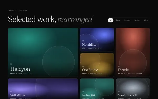 light
light Bento Grid with Flip Filtering
A bento-style grid of nine mixed-span tiles is filtered by a pill bar; GSAP Flip records the layout, toggles visibility, then glides every surviving tile into its new slot while leaving tiles shrink away.
- gsap
- flip
 light
light Curtain + Logo Page Transition
Clicking a nav link closes six vertical slats over the page from the top, draws a monogram and wordmark with a 00→100 counter, swaps the content underneath, then opens the slats from the bottom as the new page rises in.
- gsap
- svg
 light
light Panel Wipe Page Transition
A three-page demo where every navigation runs one timeline: a surface panel and a lime panel wipe up from the bottom (0.8s power4.inOut, stagger 0.08), the page swaps beneath, then they exit upward as the new content rises in.
- gsap
 Featured medium
 Image Trail Following Cursor
Moving the pointer across a dark stage leaves a trail of grainy gradient tiles: every 40px of travel a new tile blooms under the cursor with a slight twist, hangs for 0.6s and dissolves, stacking above the last.
- gsap
- canvas2d