Animated Gradient Border Button
Three button variants share a 1px conic-gradient ring that orbits forever via a GSAP-tweened --angle; hovering triples the orbit speed, sweeps a highlight across the face and rolls the label up to a second copy. Active presses scale to 0.97.
- Buttons
- gsap
- css-only
- intermediate
- light perf
- mobile: full
- reduced-motion ✓
AI prompt
Recreate this effect with any AI tool
Paste into Claude, Cursor, v0, Lovable or Bolt. 1248 words of exact values — rewritten live as you tune the Playground.
### EFFECT: Animated Gradient Border Button
**What it does (visual):** Three pill/rounded buttons sit in a row on a dark page: a filled "Start a project" (light face, dark text), a transparent "View the reel" ghost, and a 10px-radius "Book a call" with a small arrow. Every button is wrapped by a 1.5px ring in which a bright `#d4ff3a` segment (about a quarter of the circumference, fading into a faint grey remainder) orbits clockwise continuously, one revolution every 3 seconds — the three rings are offset by a third of a turn so they never line up. On hover the orbit smoothly accelerates to 3× speed (one revolution every `3 / 3` s; the speed-up itself is eased over 0.4s), a soft diagonal highlight sweeps across the button face from right to left in 0.8s (sweep enabled: true), and the label rolls upward out of view while an identical copy (in the accent colour on the dark variants, same colour on the filled one) rolls up into its place in 0.5s. Leaving reverses the roll and eases the ring back down to the 3s orbit over 0.8s. Pressing scales the whole button to 0.97 for the duration of the press. On touch devices a tap performs the burst (ring speed-up, roll there and back, sweep) instead.

**Tech stack:**
- GSAP 3.13+ core only (no plugins).
- CDN: `<script src="https://cdn.jsdelivr.net/npm/gsap@3/dist/gsap.min.js"></script>` — npm: `import gsap from "gsap";`
- Modern CSS: `conic-gradient`, `mask-composite: exclude` (with `-webkit-mask-composite: xor`), `@property`, `color-mix()`.
- Fonts: a sans at 500 weight for labels (demo: Inter Tight), mono for captions.

**HTML structure:**
```html
<section class="gbb">
  <p class="gbb__eyebrow">Button · Gradient ring</p>
  <div class="gbb__row">
    <button class="gbb__btn gbb__btn--primary" type="button">
      <span class="gbb__text"><span class="gbb__roll">
        <span class="gbb__copy">Start a project</span>
        <span class="gbb__copy gbb__copy--alt" aria-hidden="true">Start a project</span>
      </span></span>
    </button>
    <button class="gbb__btn gbb__btn--ghost" type="button"> …same inner structure, "View the reel"… </button>
    <button class="gbb__btn gbb__btn--icon" type="button">
      …same inner structure, "Book a call"…
      <svg class="gbb__arrow" viewBox="0 0 16 16" width="16" height="16" aria-hidden="true"><path d="M2 8h11M9 3.5 13.5 8 9 12.5" fill="none" stroke="currentColor" stroke-width="1.4" stroke-linecap="round" stroke-linejoin="round"/></svg>
    </button>
  </div>
</section>
```

**CSS requirements:**
- Register the variables: `@property --angle { syntax: '<angle>'; inherits: false; initial-value: 0deg; }` and `@property --sweep { syntax: '<percentage>'; inherits: false; initial-value: 110%; }`.
- `.gbb__btn`: `--angle: 0deg; --sweep: 110%; --ring: 1.5px; --ring-a: var(--accent, #d4ff3a); --ring-b: color-mix(in srgb, var(--text) 22%, transparent); position: relative; isolation: isolate; display: inline-flex; align-items: center; gap: .6em; padding: .95em 1.6em; border-radius: 999px; background: var(--surface, #121212); color: var(--text); font-weight: 500; font-size: clamp(.9rem, 1.05vw, 1rem); line-height: 1; letter-spacing: -0.01em; transition: transform .15s ease, color .3s ease;`
- `.gbb__btn:active { transform: scale(.97); }` — `.gbb__btn:focus-visible { outline: 2px solid var(--accent); outline-offset: 4px; }`
- Ring — `.gbb__btn::before`: `content: ''; position: absolute; inset: 0; padding: var(--ring); border-radius: inherit; z-index: -1; pointer-events: none; background: conic-gradient(from var(--angle), var(--ring-b) 0deg, var(--ring-b) 200deg, var(--ring-a) 290deg, var(--ring-b) 360deg); -webkit-mask: linear-gradient(#000 0 0) content-box, linear-gradient(#000 0 0); mask: linear-gradient(#000 0 0) content-box, linear-gradient(#000 0 0); -webkit-mask-composite: xor; mask-composite: exclude;` — the two masks cancel everywhere except the 1.5px padding frame, so only the ring is painted and the face stays solid.
- Shimmer — `.gbb__btn::after`: `content: ''; position: absolute; inset: var(--ring); border-radius: inherit; z-index: -1; pointer-events: none; background-image: linear-gradient(115deg, transparent 38%, color-mix(in srgb, var(--text) 10%, transparent) 50%, transparent 62%); background-size: 260% 100%; background-position: var(--sweep) 0; background-repeat: no-repeat;`
- Rolling label — `.gbb__text { display: block; overflow: hidden; height: 1em; line-height: 1 }`, `.gbb__copy { display: block; height: 1em; line-height: 1; white-space: nowrap }`, `.gbb__copy--alt { color: var(--accent) }`.
- Variants: `--primary { background: var(--text); color: var(--bg); --ring-b: color-mix(in srgb, var(--text) 40%, transparent) }` with its alt copy in `var(--bg)` and a shimmer built from `var(--bg)` at 22%; `--ghost { background: transparent; --ring-b: color-mix(in srgb, var(--text) 18%, transparent) }`; `--icon { border-radius: 10px; --ring-a: var(--text); --ring-b: color-mix(in srgb, var(--accent) 35%, transparent) }` (inverted ring: light segment on a faint accent track).
- Under 768px the row becomes a column of full-width buttons (`width: min(100%, 320px)`).

**Animation spec (exact values):**
1. Ring orbit (one per button, created at load): `const spin = gsap.fromTo(btn, { '--angle': '0deg' }, { '--angle': '360deg', duration: 3, ease: 'none', repeat: -1 })` then `spin.progress(i / 3)` to desync the three rings. Store it on the element (`btn._spin`).
2. Hover enter (pointer devices only):
   - speed-up: `gsap.to(btn._spin, { timeScale: 3, duration: 0.4, ease: 'power2.out', overwrite: true })` → `3 / 3` s per orbit.
   - roll: `gsap.to(btn.querySelectorAll('.gbb__copy'), { yPercent: -100, duration: 0.5, ease: 'power3.inOut', overwrite: true })`.
   - shimmer (only if true): `gsap.fromTo(btn, { '--sweep': '110%' }, { '--sweep': '-60%', duration: 0.8, ease: 'power2.out', overwrite: 'auto' })` (the `::after` reads `--sweep` as its `background-position-x`).
3. Hover leave: `gsap.to(btn._spin, { timeScale: 1, duration: 0.8, ease: 'power2.inOut', overwrite: true })` and `gsap.to(copies, { yPercent: 0, duration: 0.5, ease: 'power3.inOut', overwrite: true })`. The shimmer is not reversed — it simply finishes.
4. Active: CSS `:active { transform: scale(.97) }` with `transition: transform .15s ease` (no GSAP, so it never fights the tweens).
5. Touch tap: timeline `to(spin, { timeScale: 3, duration: 0.3, ease: 'power2.out' })` then `to(spin, { timeScale: 1, duration: 1, ease: 'power2.inOut' }, 0.6)`; label roll `yPercent → -100` (0.5s) then back to `0` after a `+=0.6` hold; one shimmer sweep (if enabled).

**Interaction:** Hover → ring ×3 speed, highlight sweep (when true), label roll (0.5s). Leave → ring eases back (0.8s), label rolls back. Press → scale .97. Keyboard focus shows a 2px accent outline offset 4px. Tap on touch → burst sequence above.

**Responsive behavior:** `gsap.matchMedia()` with two contexts: `(hover: hover) and (pointer: fine)` attaches `pointerenter`/`pointerleave`; `(hover: none)` attaches the `click` burst instead. Under 768px the CSS stacks the buttons full-width; type size is fluid via `clamp()`.

**Accessibility:** The duplicate label copy is `aria-hidden="true"` so screen readers hear each label once. Under `prefers-reduced-motion: reduce` do not create the orbit tweens or hover listeners: set `--angle: 300deg` so the accent segment rests at the top-right as a static accent, and change hover to a simple colour change (`color: var(--accent)`). Focus state is always visible; the ring is decorative (`pointer-events: none` pseudo-elements).

**Performance rules:** The ring repaints the pseudo-element each frame (a 1.5px masked gradient — cheap), but three infinite tweens must be paused when invisible: listen for the host's `ml:pause`/`ml:resume` (or `visibilitychange`) and `pause()`/`resume()` every spin. Labels and press use `transform` only. `isolation: isolate` keeps the negative `z-index` pseudo-elements inside the button's stacking context. Everything is inside `gsap.context()` and reverted on unmount.

**Customization knobs:**
- `SPIN_DURATION` (3s) and `HOVER_TIMESCALE` (3 → `3 / 3` s on hover).
- Segment length/colour: the conic stops `200deg → 290deg → 360deg` and `--ring-a` (#d4ff3a) / `--ring-b`.
- `--ring` thickness (1.5px; 1.5px reads well on large CTAs, 1px on compact ones).
- `ROLL_DURATION` (0.5s, `power3.inOut`), `SWEEP_DURATION` (0.8s), shimmer on/off (true) and the highlight opacity (10% / 22%).
- `:active` scale (.97).

**Acceptance criteria:**
- [ ] Only a 1.5px ring shows the gradient; the button face is perfectly solid (no gradient bleed, no second element).
- [ ] At rest each ring completes one revolution in 3s with linear motion; the three rings are offset.
- [ ] Hover reaches 3× speed smoothly (no snap), the highlight sweeps right-to-left in 0.8s (when enabled), and the label rolls to its second copy in 0.5s; leaving reverses the roll and the speed.
- [ ] Pressing scales to .97; keyboard focus is visible.
- [ ] Reduced motion: static ring at 300deg, no roll, no sweep; rings pause when the tab is hidden.
- [ ] No console errors; labels never show both copies at once.Add this effect to my existing site/section: **Animated Gradient Border Button**. Keep my button markup, copy and colours; add `position: relative; isolation: isolate` and a `::before` ring painted with `conic-gradient(from var(--angle), <faint> 0deg 200deg, #d4ff3a 290deg, <faint> 360deg)`, masked to a 1.5px frame with `mask: linear-gradient(#000 0 0) content-box, linear-gradient(#000 0 0); mask-composite: exclude` (`padding: 1.5px`), plus a `::after` highlight (`linear-gradient(115deg, transparent 38%, 10% text-colour 50%, transparent 62%)`, `background-size: 260% 100%`, `background-position: var(--sweep) 0`). Register `@property --angle` and `--sweep`. With GSAP: `gsap.fromTo(btn, { '--angle': '0deg' }, { '--angle': '360deg', duration: 3, ease: 'none', repeat: -1 })`; on hover tween that tween's `timeScale` to 3 (0.4s `power2.out`), tween `--sweep` `110% → -60%` (0.8s `power2.out`; shimmer enabled: true), and roll two stacked label copies `yPercent → -100` (0.5s `power3.inOut`); on leave `timeScale → 1` (0.8s) and `yPercent → 0`. Add `:active { transform: scale(.97) }`. Use `gsap.matchMedia()` to attach hover only on `(hover: hover)`, pause the spins when hidden, respect `prefers-reduced-motion` with a static `--angle: 300deg`, and wrap in `gsap.context()`.### EFFECT (React / Next.js): Animated Gradient Border Button
Build **Animated Gradient Border Button** as a self-contained React component for a Next.js App Router project (also valid in Vite + React). Follow the specification below exactly; the vanilla reference implementation at the end is the source of truth for values and structure.
**Setup**
- `npm i gsap @gsap/react`
- File: `components/AnimatedGradientBorderButton.tsx`, first line `"use client";` (GSAP touches the DOM).
- Imports:
```tsx
"use client";
import { useRef } from "react";
import gsap from "gsap";
import { useGSAP } from "@gsap/react";
gsap.registerPlugin(useGSAP);
export default function AnimatedGradientBorderButton() {
const scope = useRef<HTMLDivElement>(null);
useGSAP(() => {
// 1. query elements inside `scope.current` (never document-wide)
// 2. wait for document.fonts.ready before any SplitText
// 3. build the timeline / ScrollTriggers exactly as in the specification
// 4. return nothing — useGSAP reverts everything automatically on unmount
}, { scope });
return (
<div ref={scope} className="gbb">
{/* markup from the HTML structure section, class → className */}
</div>
);
}
```
**React-specific rules**
- Everything GSAP-related lives inside `useGSAP(() => {...}, { scope })`; it handles cleanup (`ctx.revert()`) on unmount and in React Strict Mode double-invocation.
- Use refs or `gsap.utils.selector(scope)` instead of `document.querySelector`.
- Event listeners added inside useGSAP must use `contextSafe` (`const { contextSafe } = useGSAP({ scope })`) so their tweens are reverted too.
- ScrollTrigger: call `ScrollTrigger.refresh()` after images/fonts load; if the page uses Lenis, sync it once at the app root (`lenis.on('scroll', ScrollTrigger.update)`).
- Styles: copy the CSS requirements into a CSS Module (`AnimatedGradientBorderButton.module.css`) or Tailwind; keep the class names so the spec maps 1:1.
- Respect `prefers-reduced-motion` with `gsap.matchMedia()` as in the spec.
---
### EFFECT: Animated Gradient Border Button
**What it does (visual):** Three pill/rounded buttons sit in a row on a dark page: a filled "Start a project" (light face, dark text), a transparent "View the reel" ghost, and a 10px-radius "Book a call" with a small arrow. Every button is wrapped by a 1.5px ring in which a bright `#d4ff3a` segment (about a quarter of the circumference, fading into a faint grey remainder) orbits clockwise continuously, one revolution every 3 seconds — the three rings are offset by a third of a turn so they never line up. On hover the orbit smoothly accelerates to 3× speed (one revolution every `3 / 3` s; the speed-up itself is eased over 0.4s), a soft diagonal highlight sweeps across the button face from right to left in 0.8s (sweep enabled: true), and the label rolls upward out of view while an identical copy (in the accent colour on the dark variants, same colour on the filled one) rolls up into its place in 0.5s. Leaving reverses the roll and eases the ring back down to the 3s orbit over 0.8s. Pressing scales the whole button to 0.97 for the duration of the press. On touch devices a tap performs the burst (ring speed-up, roll there and back, sweep) instead.
**Tech stack:**
- GSAP 3.13+ core only (no plugins).
- CDN: `<script src="https://cdn.jsdelivr.net/npm/gsap@3/dist/gsap.min.js"></script>` — npm: `import gsap from "gsap";`
- Modern CSS: `conic-gradient`, `mask-composite: exclude` (with `-webkit-mask-composite: xor`), `@property`, `color-mix()`.
- Fonts: a sans at 500 weight for labels (demo: Inter Tight), mono for captions.
**HTML structure:**
```html
<section class="gbb">
<p class="gbb__eyebrow">Button · Gradient ring</p>
<div class="gbb__row">
<button class="gbb__btn gbb__btn--primary" type="button">
<span class="gbb__text"><span class="gbb__roll">
<span class="gbb__copy">Start a project</span>
<span class="gbb__copy gbb__copy--alt" aria-hidden="true">Start a project</span>
</span></span>
</button>
<button class="gbb__btn gbb__btn--ghost" type="button"> …same inner structure, "View the reel"… </button>
<button class="gbb__btn gbb__btn--icon" type="button">
…same inner structure, "Book a call"…
<svg class="gbb__arrow" viewBox="0 0 16 16" width="16" height="16" aria-hidden="true"><path d="M2 8h11M9 3.5 13.5 8 9 12.5" fill="none" stroke="currentColor" stroke-width="1.4" stroke-linecap="round" stroke-linejoin="round"/></svg>
</button>
</div>
</section>
```
**CSS requirements:**
- Register the variables: `@property --angle { syntax: '<angle>'; inherits: false; initial-value: 0deg; }` and `@property --sweep { syntax: '<percentage>'; inherits: false; initial-value: 110%; }`.
- `.gbb__btn`: `--angle: 0deg; --sweep: 110%; --ring: 1.5px; --ring-a: var(--accent, #d4ff3a); --ring-b: color-mix(in srgb, var(--text) 22%, transparent); position: relative; isolation: isolate; display: inline-flex; align-items: center; gap: .6em; padding: .95em 1.6em; border-radius: 999px; background: var(--surface, #121212); color: var(--text); font-weight: 500; font-size: clamp(.9rem, 1.05vw, 1rem); line-height: 1; letter-spacing: -0.01em; transition: transform .15s ease, color .3s ease;`
- `.gbb__btn:active { transform: scale(.97); }` — `.gbb__btn:focus-visible { outline: 2px solid var(--accent); outline-offset: 4px; }`
- Ring — `.gbb__btn::before`: `content: ''; position: absolute; inset: 0; padding: var(--ring); border-radius: inherit; z-index: -1; pointer-events: none; background: conic-gradient(from var(--angle), var(--ring-b) 0deg, var(--ring-b) 200deg, var(--ring-a) 290deg, var(--ring-b) 360deg); -webkit-mask: linear-gradient(#000 0 0) content-box, linear-gradient(#000 0 0); mask: linear-gradient(#000 0 0) content-box, linear-gradient(#000 0 0); -webkit-mask-composite: xor; mask-composite: exclude;` — the two masks cancel everywhere except the 1.5px padding frame, so only the ring is painted and the face stays solid.
- Shimmer — `.gbb__btn::after`: `content: ''; position: absolute; inset: var(--ring); border-radius: inherit; z-index: -1; pointer-events: none; background-image: linear-gradient(115deg, transparent 38%, color-mix(in srgb, var(--text) 10%, transparent) 50%, transparent 62%); background-size: 260% 100%; background-position: var(--sweep) 0; background-repeat: no-repeat;`
- Rolling label — `.gbb__text { display: block; overflow: hidden; height: 1em; line-height: 1 }`, `.gbb__copy { display: block; height: 1em; line-height: 1; white-space: nowrap }`, `.gbb__copy--alt { color: var(--accent) }`.
- Variants: `--primary { background: var(--text); color: var(--bg); --ring-b: color-mix(in srgb, var(--text) 40%, transparent) }` with its alt copy in `var(--bg)` and a shimmer built from `var(--bg)` at 22%; `--ghost { background: transparent; --ring-b: color-mix(in srgb, var(--text) 18%, transparent) }`; `--icon { border-radius: 10px; --ring-a: var(--text); --ring-b: color-mix(in srgb, var(--accent) 35%, transparent) }` (inverted ring: light segment on a faint accent track).
- Under 768px the row becomes a column of full-width buttons (`width: min(100%, 320px)`).
**Animation spec (exact values):**
1. Ring orbit (one per button, created at load): `const spin = gsap.fromTo(btn, { '--angle': '0deg' }, { '--angle': '360deg', duration: 3, ease: 'none', repeat: -1 })` then `spin.progress(i / 3)` to desync the three rings. Store it on the element (`btn._spin`).
2. Hover enter (pointer devices only):
- speed-up: `gsap.to(btn._spin, { timeScale: 3, duration: 0.4, ease: 'power2.out', overwrite: true })` → `3 / 3` s per orbit.
- roll: `gsap.to(btn.querySelectorAll('.gbb__copy'), { yPercent: -100, duration: 0.5, ease: 'power3.inOut', overwrite: true })`.
- shimmer (only if true): `gsap.fromTo(btn, { '--sweep': '110%' }, { '--sweep': '-60%', duration: 0.8, ease: 'power2.out', overwrite: 'auto' })` (the `::after` reads `--sweep` as its `background-position-x`).
3. Hover leave: `gsap.to(btn._spin, { timeScale: 1, duration: 0.8, ease: 'power2.inOut', overwrite: true })` and `gsap.to(copies, { yPercent: 0, duration: 0.5, ease: 'power3.inOut', overwrite: true })`. The shimmer is not reversed — it simply finishes.
4. Active: CSS `:active { transform: scale(.97) }` with `transition: transform .15s ease` (no GSAP, so it never fights the tweens).
5. Touch tap: timeline `to(spin, { timeScale: 3, duration: 0.3, ease: 'power2.out' })` then `to(spin, { timeScale: 1, duration: 1, ease: 'power2.inOut' }, 0.6)`; label roll `yPercent → -100` (0.5s) then back to `0` after a `+=0.6` hold; one shimmer sweep (if enabled).
**Interaction:** Hover → ring ×3 speed, highlight sweep (when true), label roll (0.5s). Leave → ring eases back (0.8s), label rolls back. Press → scale .97. Keyboard focus shows a 2px accent outline offset 4px. Tap on touch → burst sequence above.
**Responsive behavior:** `gsap.matchMedia()` with two contexts: `(hover: hover) and (pointer: fine)` attaches `pointerenter`/`pointerleave`; `(hover: none)` attaches the `click` burst instead. Under 768px the CSS stacks the buttons full-width; type size is fluid via `clamp()`.
**Accessibility:** The duplicate label copy is `aria-hidden="true"` so screen readers hear each label once. Under `prefers-reduced-motion: reduce` do not create the orbit tweens or hover listeners: set `--angle: 300deg` so the accent segment rests at the top-right as a static accent, and change hover to a simple colour change (`color: var(--accent)`). Focus state is always visible; the ring is decorative (`pointer-events: none` pseudo-elements).
**Performance rules:** The ring repaints the pseudo-element each frame (a 1.5px masked gradient — cheap), but three infinite tweens must be paused when invisible: listen for the host's `ml:pause`/`ml:resume` (or `visibilitychange`) and `pause()`/`resume()` every spin. Labels and press use `transform` only. `isolation: isolate` keeps the negative `z-index` pseudo-elements inside the button's stacking context. Everything is inside `gsap.context()` and reverted on unmount.
**Customization knobs:**
- `SPIN_DURATION` (3s) and `HOVER_TIMESCALE` (3 → `3 / 3` s on hover).
- Segment length/colour: the conic stops `200deg → 290deg → 360deg` and `--ring-a` (#d4ff3a) / `--ring-b`.
- `--ring` thickness (1.5px; 1.5px reads well on large CTAs, 1px on compact ones).
- `ROLL_DURATION` (0.5s, `power3.inOut`), `SWEEP_DURATION` (0.8s), shimmer on/off (true) and the highlight opacity (10% / 22%).
- `:active` scale (.97).
**Acceptance criteria:**
- [ ] Only a 1.5px ring shows the gradient; the button face is perfectly solid (no gradient bleed, no second element).
- [ ] At rest each ring completes one revolution in 3s with linear motion; the three rings are offset.
- [ ] Hover reaches 3× speed smoothly (no snap), the highlight sweeps right-to-left in 0.8s (when enabled), and the label rolls to its second copy in 0.5s; leaving reverses the roll and the speed.
- [ ] Pressing scales to .97; keyboard focus is visible.
- [ ] Reduced motion: static ring at 300deg, no roll, no sweep; rings pause when the tab is hidden.
- [ ] No console errors; labels never show both copies at once.
---
**Reference implementation (vanilla, converts 1:1 — same class names, same values):**
```html
<section class="gbb">
<p class="gbb__eyebrow">Button · Gradient ring</p>
<div class="gbb__row">
<button class="gbb__btn gbb__btn--primary" type="button">
<span class="gbb__text"><span class="gbb__roll"><span class="gbb__copy">Start a project</span><span class="gbb__copy gbb__copy--alt" aria-hidden="true">Start a project</span></span></span>
</button>
<button class="gbb__btn gbb__btn--ghost" type="button">
<span class="gbb__text"><span class="gbb__roll"><span class="gbb__copy">View the reel</span><span class="gbb__copy gbb__copy--alt" aria-hidden="true">View the reel</span></span></span>
</button>
<button class="gbb__btn gbb__btn--icon" type="button">
<span class="gbb__text"><span class="gbb__roll"><span class="gbb__copy">Book a call</span><span class="gbb__copy gbb__copy--alt" aria-hidden="true">Book a call</span></span></span>
<svg class="gbb__arrow" viewBox="0 0 16 16" width="16" height="16" aria-hidden="true"><path d="M2 8h11M9 3.5 13.5 8 9 12.5" fill="none" stroke="currentColor" stroke-width="1.4" stroke-linecap="round" stroke-linejoin="round"/></svg>
</button>
</div>
<p class="gbb__caption">Hover: the ring speeds up ×3, a highlight sweeps, the label rolls. Press: scale .97.</p>
</section>
```
```css
@property --angle { syntax: '<angle>'; inherits: false; initial-value: 0deg; }
@property --sweep { syntax: '<percentage>'; inherits: false; initial-value: 110%; }
.gbb { --gbb-accent: var(--knob-accent, var(--accent)); min-height: 100vh; display: grid; place-content: center; justify-items: center; gap: clamp(1.5rem, 3vw, 2.5rem); padding: 8vw 6vw; background: var(--bg); color: var(--text); }
.gbb__eyebrow, .gbb__caption { font-family: var(--font-mono); font-size: 11px; text-transform: uppercase; letter-spacing: .14em; color: var(--muted); text-align: center; }
.gbb__caption { max-width: 34ch; line-height: 1.7; text-transform: none; letter-spacing: .02em; font-size: 12px; }
.gbb__row { display: flex; flex-wrap: wrap; justify-content: center; align-items: center; gap: clamp(.75rem, 2vw, 1.25rem); }
/* ---------- base button ---------- */
.gbb__btn {
--angle: 0deg;
--sweep: 110%;
--ring: var(--knob-ring, 1.5px);
--ring-a: var(--gbb-accent);
--ring-b: color-mix(in srgb, var(--text) 22%, transparent);
position: relative; isolation: isolate; display: inline-flex; align-items: center; gap: .6em;
padding: 1.05em 1.9em; border-radius: 999px; background: var(--surface); color: var(--text);
font-family: var(--font-sans); font-size: clamp(1rem, 1.35vw, 1.25rem); font-weight: 500; letter-spacing: -0.01em; line-height: 1;
transform: scale(1); transition: transform .15s ease, color .3s ease;
-webkit-tap-highlight-color: transparent;
}
.gbb__btn:active { transform: scale(.97); }
.gbb__btn:focus-visible { outline: 2px solid var(--gbb-accent); outline-offset: 4px; }
/* the orbiting ring: a conic gradient masked to a 1px frame */
.gbb__btn::before {
content: ''; position: absolute; inset: 0; padding: var(--ring); border-radius: inherit; pointer-events: none; z-index: -1;
background: conic-gradient(from var(--angle), var(--ring-b) 0deg, var(--ring-b) 200deg, var(--ring-a) 290deg, var(--ring-b) 360deg);
-webkit-mask: linear-gradient(#000 0 0) content-box, linear-gradient(#000 0 0);
mask: linear-gradient(#000 0 0) content-box, linear-gradient(#000 0 0);
-webkit-mask-composite: xor; mask-composite: exclude;
}
/* the shimmer: a diagonal highlight parked off to the right, swept on hover by GSAP (background-position) */
.gbb__btn::after {
content: ''; position: absolute; inset: var(--ring); border-radius: inherit; pointer-events: none; z-index: -1;
background-image: linear-gradient(115deg, transparent 38%, color-mix(in srgb, var(--text) 10%, transparent) 50%, transparent 62%);
background-size: 260% 100%; background-position: var(--sweep) 0; background-repeat: no-repeat;
}
/* rolling label: two stacked copies in a clipped box */
.gbb__text { display: block; overflow: hidden; height: 1em; line-height: 1; }
.gbb__roll { display: block; }
.gbb__copy { display: block; height: 1em; line-height: 1; white-space: nowrap; }
.gbb__copy--alt { color: var(--gbb-accent); }
.gbb__arrow { flex: 0 0 auto; }
/* ---------- variants ---------- */
.gbb__btn--primary { background: var(--text); color: var(--bg); --ring-b: color-mix(in srgb, var(--text) 40%, transparent); }
.gbb__btn--primary .gbb__copy--alt { color: var(--bg); }
.gbb__btn--primary::after { background-image: linear-gradient(115deg, transparent 38%, color-mix(in srgb, var(--bg) 22%, transparent) 50%, transparent 62%); }
.gbb__btn--ghost { background: transparent; --ring-b: color-mix(in srgb, var(--text) 18%, transparent); }
.gbb__btn--icon { border-radius: 10px; padding-right: 1.25em; --ring-a: var(--text); --ring-b: color-mix(in srgb, var(--gbb-accent) 35%, transparent); }
.gbb__btn--icon .gbb__copy--alt { color: var(--text); }
@media (max-width: 767px) {
.gbb__row { flex-direction: column; align-items: stretch; width: min(100%, 320px); }
.gbb__btn { justify-content: center; }
}
/* static ring, no roll, no shimmer */
@media (prefers-reduced-motion: reduce) {
.gbb__btn { --angle: 300deg; }
.gbb__btn:hover { color: var(--gbb-accent); }
.gbb__btn--primary:hover { color: var(--bg); }
}
```
```js
// Animated Gradient Border Button — GSAP tweens --angle for a conic ring; hover speeds it up, sweeps a shimmer and rolls the label.
// Defaults — overridable from the MOTION/LAB Playground via MotionLab.knob()
const DEFAULTS = { spinDuration: 3, hoverTimescale: 3, rollDuration: 0.5, ringWidth: 1.5, shimmer: true, accent: '#d4ff3a' };
const K = (id) => window.MotionLab?.knob(id, DEFAULTS[id]) ?? DEFAULTS[id];
const SWEEP_DURATION = 0.8;
const reduced = matchMedia('(prefers-reduced-motion: reduce)').matches;
const section = document.querySelector('.gbb');
const buttons = gsap.utils.toArray('.gbb__btn');
let ctx, ac;
function build() {
ctx?.revert();
ac?.abort();
ac = new AbortController();
section.style.setProperty('--knob-accent', K('accent'));
section.style.setProperty('--knob-ring', K('ringWidth') + 'px');
const SPIN_DURATION = K('spinDuration'); // seconds per orbit at rest
const HOVER_TIMESCALE = K('hoverTimescale'); // ×3 → 1s per orbit on hover (defaults)
const ROLL_DURATION = K('rollDuration');
const shimmerOn = K('shimmer');
const spins = [];
// The shimmer lives on ::after and reads --sweep for its background-position; tween the variable.
const sweep = (btn) => {
if (!shimmerOn) return;
gsap.fromTo(btn, { '--sweep': '110%' }, { '--sweep': '-60%', duration: SWEEP_DURATION, ease: 'power2.out', overwrite: 'auto' });
};
ctx = gsap.context(() => {
if (reduced) {
gsap.set(buttons, { '--angle': '300deg' });
return;
}
buttons.forEach((btn, i) => {
const spin = gsap.fromTo(btn, { '--angle': '0deg' }, { '--angle': '360deg', duration: SPIN_DURATION, ease: 'none', repeat: -1 });
spin.progress(i / buttons.length); // desync the three rings
spins.push(spin);
btn._spin = spin;
btn._copies = btn.querySelectorAll('.gbb__copy');
});
const mm = gsap.matchMedia();
// Pointer devices: hover state
mm.add('(hover: hover) and (pointer: fine)', () => {
const enter = (e) => {
const btn = e.currentTarget;
gsap.to(btn._spin, { timeScale: HOVER_TIMESCALE, duration: 0.4, ease: 'power2.out', overwrite: true });
gsap.to(btn._copies, { yPercent: -100, duration: ROLL_DURATION, ease: 'power3.inOut', overwrite: true });
sweep(btn);
};
const leave = (e) => {
const btn = e.currentTarget;
gsap.to(btn._spin, { timeScale: 1, duration: 0.8, ease: 'power2.inOut', overwrite: true });
gsap.to(btn._copies, { yPercent: 0, duration: ROLL_DURATION, ease: 'power3.inOut', overwrite: true });
};
buttons.forEach((btn) => { btn.addEventListener('pointerenter', enter, { signal: ac.signal }); btn.addEventListener('pointerleave', leave, { signal: ac.signal }); });
return () => buttons.forEach((btn) => { btn.removeEventListener('pointerenter', enter); btn.removeEventListener('pointerleave', leave); });
});
// Touch: a tap gives the ring a burst and rolls the label there and back
mm.add('(hover: none)', () => {
const tap = (e) => {
const btn = e.currentTarget;
gsap.timeline()
.to(btn._spin, { timeScale: HOVER_TIMESCALE, duration: 0.3, ease: 'power2.out' })
.to(btn._spin, { timeScale: 1, duration: 1, ease: 'power2.inOut' }, 0.6);
gsap.timeline()
.to(btn._copies, { yPercent: -100, duration: ROLL_DURATION, ease: 'power3.inOut' })
.to(btn._copies, { yPercent: 0, duration: ROLL_DURATION, ease: 'power3.inOut' }, '+=0.6');
sweep(btn);
};
buttons.forEach((btn) => btn.addEventListener('click', tap, { signal: ac.signal }));
return () => buttons.forEach((btn) => btn.removeEventListener('click', tap));
});
// Infinite rings must go quiet when the demo is off-screen or the tab is hidden
const pause = () => spins.forEach((s) => s.pause());
const resume = () => spins.forEach((s) => s.resume());
window.addEventListener('ml:pause', pause, { signal: ac.signal });
window.addEventListener('ml:resume', resume, { signal: ac.signal });
});
}
build();
// Playground: rebuild with the new values
window.addEventListener('ml:knobs', build);
window.MotionLab?.onCleanup(() => { ctx?.revert(); ac?.abort(); });
```
### EFFECT (single HTML file): Animated Gradient Border Button
Produce **one self-contained `index.html`** (inline `<style>` and `<script type="module">`, no build step) that implements **Animated Gradient Border Button** exactly as specified below. Libraries load from jsDelivr:

```html
<!doctype html>
<html lang="en">
<head>
  <meta charset="utf-8">
  <meta name="viewport" content="width=device-width, initial-scale=1">
  <title>Animated Gradient Border Button</title>
  <link href="https://fonts.googleapis.com/css2?family=Fraunces:ital,opsz,wght@0,9..144,300..600;1,9..144,300..600&family=Inter+Tight:wght@300..700&family=JetBrains+Mono:wght@400;500&display=swap" rel="stylesheet">
  <style>
    :root{--bg:#0a0a0a;--surface:#121212;--line:rgba(255,255,255,.08);--text:#ededed;--muted:#8a8a8a;--accent:#d4ff3a;--font-display:"Fraunces",Georgia,serif;--font-sans:"Inter Tight",system-ui,sans-serif;--font-mono:"JetBrains Mono",ui-monospace,monospace}
    *,*::before,*::after{box-sizing:border-box;margin:0;padding:0}
    body{background:var(--bg);color:var(--text);font-family:var(--font-sans);-webkit-font-smoothing:antialiased;overflow-x:hidden}
    /* + the CSS requirements below */
  </style>
  <script src="https://cdn.jsdelivr.net/npm/gsap@3/dist/gsap.min.js"></script>
</head>
<body>
  <!-- markup from the HTML structure section -->
  <script type="module">
    // the JS from the animation spec (window.MotionLab is optional — keep the ?. guards or remove them)
  </script>
</body>
</html>
```

The file must open directly from a local server (`npx serve .`) with zero console errors, work at 375px and 1440px, and honour `prefers-reduced-motion`.

---

### EFFECT: Animated Gradient Border Button
**What it does (visual):** Three pill/rounded buttons sit in a row on a dark page: a filled "Start a project" (light face, dark text), a transparent "View the reel" ghost, and a 10px-radius "Book a call" with a small arrow. Every button is wrapped by a 1.5px ring in which a bright `#d4ff3a` segment (about a quarter of the circumference, fading into a faint grey remainder) orbits clockwise continuously, one revolution every 3 seconds — the three rings are offset by a third of a turn so they never line up. On hover the orbit smoothly accelerates to 3× speed (one revolution every `3 / 3` s; the speed-up itself is eased over 0.4s), a soft diagonal highlight sweeps across the button face from right to left in 0.8s (sweep enabled: true), and the label rolls upward out of view while an identical copy (in the accent colour on the dark variants, same colour on the filled one) rolls up into its place in 0.5s. Leaving reverses the roll and eases the ring back down to the 3s orbit over 0.8s. Pressing scales the whole button to 0.97 for the duration of the press. On touch devices a tap performs the burst (ring speed-up, roll there and back, sweep) instead.

**Tech stack:**
- GSAP 3.13+ core only (no plugins).
- CDN: `<script src="https://cdn.jsdelivr.net/npm/gsap@3/dist/gsap.min.js"></script>` — npm: `import gsap from "gsap";`
- Modern CSS: `conic-gradient`, `mask-composite: exclude` (with `-webkit-mask-composite: xor`), `@property`, `color-mix()`.
- Fonts: a sans at 500 weight for labels (demo: Inter Tight), mono for captions.

**HTML structure:**
```html
<section class="gbb">
  <p class="gbb__eyebrow">Button · Gradient ring</p>
  <div class="gbb__row">
    <button class="gbb__btn gbb__btn--primary" type="button">
      <span class="gbb__text"><span class="gbb__roll">
        <span class="gbb__copy">Start a project</span>
        <span class="gbb__copy gbb__copy--alt" aria-hidden="true">Start a project</span>
      </span></span>
    </button>
    <button class="gbb__btn gbb__btn--ghost" type="button"> …same inner structure, "View the reel"… </button>
    <button class="gbb__btn gbb__btn--icon" type="button">
      …same inner structure, "Book a call"…
      <svg class="gbb__arrow" viewBox="0 0 16 16" width="16" height="16" aria-hidden="true"><path d="M2 8h11M9 3.5 13.5 8 9 12.5" fill="none" stroke="currentColor" stroke-width="1.4" stroke-linecap="round" stroke-linejoin="round"/></svg>
    </button>
  </div>
</section>
```

**CSS requirements:**
- Register the variables: `@property --angle { syntax: '<angle>'; inherits: false; initial-value: 0deg; }` and `@property --sweep { syntax: '<percentage>'; inherits: false; initial-value: 110%; }`.
- `.gbb__btn`: `--angle: 0deg; --sweep: 110%; --ring: 1.5px; --ring-a: var(--accent, #d4ff3a); --ring-b: color-mix(in srgb, var(--text) 22%, transparent); position: relative; isolation: isolate; display: inline-flex; align-items: center; gap: .6em; padding: .95em 1.6em; border-radius: 999px; background: var(--surface, #121212); color: var(--text); font-weight: 500; font-size: clamp(.9rem, 1.05vw, 1rem); line-height: 1; letter-spacing: -0.01em; transition: transform .15s ease, color .3s ease;`
- `.gbb__btn:active { transform: scale(.97); }` — `.gbb__btn:focus-visible { outline: 2px solid var(--accent); outline-offset: 4px; }`
- Ring — `.gbb__btn::before`: `content: ''; position: absolute; inset: 0; padding: var(--ring); border-radius: inherit; z-index: -1; pointer-events: none; background: conic-gradient(from var(--angle), var(--ring-b) 0deg, var(--ring-b) 200deg, var(--ring-a) 290deg, var(--ring-b) 360deg); -webkit-mask: linear-gradient(#000 0 0) content-box, linear-gradient(#000 0 0); mask: linear-gradient(#000 0 0) content-box, linear-gradient(#000 0 0); -webkit-mask-composite: xor; mask-composite: exclude;` — the two masks cancel everywhere except the 1.5px padding frame, so only the ring is painted and the face stays solid.
- Shimmer — `.gbb__btn::after`: `content: ''; position: absolute; inset: var(--ring); border-radius: inherit; z-index: -1; pointer-events: none; background-image: linear-gradient(115deg, transparent 38%, color-mix(in srgb, var(--text) 10%, transparent) 50%, transparent 62%); background-size: 260% 100%; background-position: var(--sweep) 0; background-repeat: no-repeat;`
- Rolling label — `.gbb__text { display: block; overflow: hidden; height: 1em; line-height: 1 }`, `.gbb__copy { display: block; height: 1em; line-height: 1; white-space: nowrap }`, `.gbb__copy--alt { color: var(--accent) }`.
- Variants: `--primary { background: var(--text); color: var(--bg); --ring-b: color-mix(in srgb, var(--text) 40%, transparent) }` with its alt copy in `var(--bg)` and a shimmer built from `var(--bg)` at 22%; `--ghost { background: transparent; --ring-b: color-mix(in srgb, var(--text) 18%, transparent) }`; `--icon { border-radius: 10px; --ring-a: var(--text); --ring-b: color-mix(in srgb, var(--accent) 35%, transparent) }` (inverted ring: light segment on a faint accent track).
- Under 768px the row becomes a column of full-width buttons (`width: min(100%, 320px)`).

**Animation spec (exact values):**
1. Ring orbit (one per button, created at load): `const spin = gsap.fromTo(btn, { '--angle': '0deg' }, { '--angle': '360deg', duration: 3, ease: 'none', repeat: -1 })` then `spin.progress(i / 3)` to desync the three rings. Store it on the element (`btn._spin`).
2. Hover enter (pointer devices only):
   - speed-up: `gsap.to(btn._spin, { timeScale: 3, duration: 0.4, ease: 'power2.out', overwrite: true })` → `3 / 3` s per orbit.
   - roll: `gsap.to(btn.querySelectorAll('.gbb__copy'), { yPercent: -100, duration: 0.5, ease: 'power3.inOut', overwrite: true })`.
   - shimmer (only if true): `gsap.fromTo(btn, { '--sweep': '110%' }, { '--sweep': '-60%', duration: 0.8, ease: 'power2.out', overwrite: 'auto' })` (the `::after` reads `--sweep` as its `background-position-x`).
3. Hover leave: `gsap.to(btn._spin, { timeScale: 1, duration: 0.8, ease: 'power2.inOut', overwrite: true })` and `gsap.to(copies, { yPercent: 0, duration: 0.5, ease: 'power3.inOut', overwrite: true })`. The shimmer is not reversed — it simply finishes.
4. Active: CSS `:active { transform: scale(.97) }` with `transition: transform .15s ease` (no GSAP, so it never fights the tweens).
5. Touch tap: timeline `to(spin, { timeScale: 3, duration: 0.3, ease: 'power2.out' })` then `to(spin, { timeScale: 1, duration: 1, ease: 'power2.inOut' }, 0.6)`; label roll `yPercent → -100` (0.5s) then back to `0` after a `+=0.6` hold; one shimmer sweep (if enabled).

**Interaction:** Hover → ring ×3 speed, highlight sweep (when true), label roll (0.5s). Leave → ring eases back (0.8s), label rolls back. Press → scale .97. Keyboard focus shows a 2px accent outline offset 4px. Tap on touch → burst sequence above.

**Responsive behavior:** `gsap.matchMedia()` with two contexts: `(hover: hover) and (pointer: fine)` attaches `pointerenter`/`pointerleave`; `(hover: none)` attaches the `click` burst instead. Under 768px the CSS stacks the buttons full-width; type size is fluid via `clamp()`.

**Accessibility:** The duplicate label copy is `aria-hidden="true"` so screen readers hear each label once. Under `prefers-reduced-motion: reduce` do not create the orbit tweens or hover listeners: set `--angle: 300deg` so the accent segment rests at the top-right as a static accent, and change hover to a simple colour change (`color: var(--accent)`). Focus state is always visible; the ring is decorative (`pointer-events: none` pseudo-elements).

**Performance rules:** The ring repaints the pseudo-element each frame (a 1.5px masked gradient — cheap), but three infinite tweens must be paused when invisible: listen for the host's `ml:pause`/`ml:resume` (or `visibilitychange`) and `pause()`/`resume()` every spin. Labels and press use `transform` only. `isolation: isolate` keeps the negative `z-index` pseudo-elements inside the button's stacking context. Everything is inside `gsap.context()` and reverted on unmount.

**Customization knobs:**
- `SPIN_DURATION` (3s) and `HOVER_TIMESCALE` (3 → `3 / 3` s on hover).
- Segment length/colour: the conic stops `200deg → 290deg → 360deg` and `--ring-a` (#d4ff3a) / `--ring-b`.
- `--ring` thickness (1.5px; 1.5px reads well on large CTAs, 1px on compact ones).
- `ROLL_DURATION` (0.5s, `power3.inOut`), `SWEEP_DURATION` (0.8s), shimmer on/off (true) and the highlight opacity (10% / 22%).
- `:active` scale (.97).

**Acceptance criteria:**
- [ ] Only a 1.5px ring shows the gradient; the button face is perfectly solid (no gradient bleed, no second element).
- [ ] At rest each ring completes one revolution in 3s with linear motion; the three rings are offset.
- [ ] Hover reaches 3× speed smoothly (no snap), the highlight sweeps right-to-left in 0.8s (when enabled), and the label rolls to its second copy in 0.5s; leaving reverses the roll and the speed.
- [ ] Pressing scales to .97; keyboard focus is visible.
- [ ] Reduced motion: static ring at 300deg, no roll, no sweep; rings pause when the tab is hidden.
- [ ] No console errors; labels never show both copies at once.

---

**Reference implementation (use these exact values and class names):**

```html
<section class="gbb">
  <p class="gbb__eyebrow">Button · Gradient ring</p>
  <div class="gbb__row">
    <button class="gbb__btn gbb__btn--primary" type="button">
      <span class="gbb__text"><span class="gbb__roll"><span class="gbb__copy">Start a project</span><span class="gbb__copy gbb__copy--alt" aria-hidden="true">Start a project</span></span></span>
    </button>
    <button class="gbb__btn gbb__btn--ghost" type="button">
      <span class="gbb__text"><span class="gbb__roll"><span class="gbb__copy">View the reel</span><span class="gbb__copy gbb__copy--alt" aria-hidden="true">View the reel</span></span></span>
    </button>
    <button class="gbb__btn gbb__btn--icon" type="button">
      <span class="gbb__text"><span class="gbb__roll"><span class="gbb__copy">Book a call</span><span class="gbb__copy gbb__copy--alt" aria-hidden="true">Book a call</span></span></span>
      <svg class="gbb__arrow" viewBox="0 0 16 16" width="16" height="16" aria-hidden="true"><path d="M2 8h11M9 3.5 13.5 8 9 12.5" fill="none" stroke="currentColor" stroke-width="1.4" stroke-linecap="round" stroke-linejoin="round"/></svg>
    </button>
  </div>
  <p class="gbb__caption">Hover: the ring speeds up ×3, a highlight sweeps, the label rolls. Press: scale .97.</p>
</section>
```

```css
@property --angle { syntax: '<angle>'; inherits: false; initial-value: 0deg; }
@property --sweep { syntax: '<percentage>'; inherits: false; initial-value: 110%; }

.gbb { --gbb-accent: var(--knob-accent, var(--accent)); min-height: 100vh; display: grid; place-content: center; justify-items: center; gap: clamp(1.5rem, 3vw, 2.5rem); padding: 8vw 6vw; background: var(--bg); color: var(--text); }
.gbb__eyebrow, .gbb__caption { font-family: var(--font-mono); font-size: 11px; text-transform: uppercase; letter-spacing: .14em; color: var(--muted); text-align: center; }
.gbb__caption { max-width: 34ch; line-height: 1.7; text-transform: none; letter-spacing: .02em; font-size: 12px; }
.gbb__row { display: flex; flex-wrap: wrap; justify-content: center; align-items: center; gap: clamp(.75rem, 2vw, 1.25rem); }

/* ---------- base button ---------- */
.gbb__btn {
  --angle: 0deg;
  --sweep: 110%;
  --ring: var(--knob-ring, 1.5px);
  --ring-a: var(--gbb-accent);
  --ring-b: color-mix(in srgb, var(--text) 22%, transparent);
  position: relative; isolation: isolate; display: inline-flex; align-items: center; gap: .6em;
  padding: 1.05em 1.9em; border-radius: 999px; background: var(--surface); color: var(--text);
  font-family: var(--font-sans); font-size: clamp(1rem, 1.35vw, 1.25rem); font-weight: 500; letter-spacing: -0.01em; line-height: 1;
  transform: scale(1); transition: transform .15s ease, color .3s ease;
  -webkit-tap-highlight-color: transparent;
}
.gbb__btn:active { transform: scale(.97); }
.gbb__btn:focus-visible { outline: 2px solid var(--gbb-accent); outline-offset: 4px; }

/* the orbiting ring: a conic gradient masked to a 1px frame */
.gbb__btn::before {
  content: ''; position: absolute; inset: 0; padding: var(--ring); border-radius: inherit; pointer-events: none; z-index: -1;
  background: conic-gradient(from var(--angle), var(--ring-b) 0deg, var(--ring-b) 200deg, var(--ring-a) 290deg, var(--ring-b) 360deg);
  -webkit-mask: linear-gradient(#000 0 0) content-box, linear-gradient(#000 0 0);
  mask: linear-gradient(#000 0 0) content-box, linear-gradient(#000 0 0);
  -webkit-mask-composite: xor; mask-composite: exclude;
}
/* the shimmer: a diagonal highlight parked off to the right, swept on hover by GSAP (background-position) */
.gbb__btn::after {
  content: ''; position: absolute; inset: var(--ring); border-radius: inherit; pointer-events: none; z-index: -1;
  background-image: linear-gradient(115deg, transparent 38%, color-mix(in srgb, var(--text) 10%, transparent) 50%, transparent 62%);
  background-size: 260% 100%; background-position: var(--sweep) 0; background-repeat: no-repeat;
}

/* rolling label: two stacked copies in a clipped box */
.gbb__text { display: block; overflow: hidden; height: 1em; line-height: 1; }
.gbb__roll { display: block; }
.gbb__copy { display: block; height: 1em; line-height: 1; white-space: nowrap; }
.gbb__copy--alt { color: var(--gbb-accent); }
.gbb__arrow { flex: 0 0 auto; }

/* ---------- variants ---------- */
.gbb__btn--primary { background: var(--text); color: var(--bg); --ring-b: color-mix(in srgb, var(--text) 40%, transparent); }
.gbb__btn--primary .gbb__copy--alt { color: var(--bg); }
.gbb__btn--primary::after { background-image: linear-gradient(115deg, transparent 38%, color-mix(in srgb, var(--bg) 22%, transparent) 50%, transparent 62%); }
.gbb__btn--ghost { background: transparent; --ring-b: color-mix(in srgb, var(--text) 18%, transparent); }
.gbb__btn--icon { border-radius: 10px; padding-right: 1.25em; --ring-a: var(--text); --ring-b: color-mix(in srgb, var(--gbb-accent) 35%, transparent); }
.gbb__btn--icon .gbb__copy--alt { color: var(--text); }

@media (max-width: 767px) {
  .gbb__row { flex-direction: column; align-items: stretch; width: min(100%, 320px); }
  .gbb__btn { justify-content: center; }
}

/* static ring, no roll, no shimmer */
@media (prefers-reduced-motion: reduce) {
  .gbb__btn { --angle: 300deg; }
  .gbb__btn:hover { color: var(--gbb-accent); }
  .gbb__btn--primary:hover { color: var(--bg); }
}
```

```js
// Animated Gradient Border Button — GSAP tweens --angle for a conic ring; hover speeds it up, sweeps a shimmer and rolls the label.

// Defaults — overridable from the MOTION/LAB Playground via MotionLab.knob()
const DEFAULTS = { spinDuration: 3, hoverTimescale: 3, rollDuration: 0.5, ringWidth: 1.5, shimmer: true, accent: '#d4ff3a' };
const K = (id) => window.MotionLab?.knob(id, DEFAULTS[id]) ?? DEFAULTS[id];

const SWEEP_DURATION = 0.8;

const reduced = matchMedia('(prefers-reduced-motion: reduce)').matches;
const section = document.querySelector('.gbb');
const buttons = gsap.utils.toArray('.gbb__btn');

let ctx, ac;
function build() {
  ctx?.revert();
  ac?.abort();
  ac = new AbortController();
  section.style.setProperty('--knob-accent', K('accent'));
  section.style.setProperty('--knob-ring', K('ringWidth') + 'px');
  const SPIN_DURATION = K('spinDuration');     // seconds per orbit at rest
  const HOVER_TIMESCALE = K('hoverTimescale'); // ×3 → 1s per orbit on hover (defaults)
  const ROLL_DURATION = K('rollDuration');
  const shimmerOn = K('shimmer');
  const spins = [];

  // The shimmer lives on ::after and reads --sweep for its background-position; tween the variable.
  const sweep = (btn) => {
    if (!shimmerOn) return;
    gsap.fromTo(btn, { '--sweep': '110%' }, { '--sweep': '-60%', duration: SWEEP_DURATION, ease: 'power2.out', overwrite: 'auto' });
  };

  ctx = gsap.context(() => {
    if (reduced) {
      gsap.set(buttons, { '--angle': '300deg' });
      return;
    }

    buttons.forEach((btn, i) => {
      const spin = gsap.fromTo(btn, { '--angle': '0deg' }, { '--angle': '360deg', duration: SPIN_DURATION, ease: 'none', repeat: -1 });
      spin.progress(i / buttons.length); // desync the three rings
      spins.push(spin);
      btn._spin = spin;
      btn._copies = btn.querySelectorAll('.gbb__copy');
    });

    const mm = gsap.matchMedia();

    // Pointer devices: hover state
    mm.add('(hover: hover) and (pointer: fine)', () => {
      const enter = (e) => {
        const btn = e.currentTarget;
        gsap.to(btn._spin, { timeScale: HOVER_TIMESCALE, duration: 0.4, ease: 'power2.out', overwrite: true });
        gsap.to(btn._copies, { yPercent: -100, duration: ROLL_DURATION, ease: 'power3.inOut', overwrite: true });
        sweep(btn);
      };
      const leave = (e) => {
        const btn = e.currentTarget;
        gsap.to(btn._spin, { timeScale: 1, duration: 0.8, ease: 'power2.inOut', overwrite: true });
        gsap.to(btn._copies, { yPercent: 0, duration: ROLL_DURATION, ease: 'power3.inOut', overwrite: true });
      };
      buttons.forEach((btn) => { btn.addEventListener('pointerenter', enter, { signal: ac.signal }); btn.addEventListener('pointerleave', leave, { signal: ac.signal }); });
      return () => buttons.forEach((btn) => { btn.removeEventListener('pointerenter', enter); btn.removeEventListener('pointerleave', leave); });
    });

    // Touch: a tap gives the ring a burst and rolls the label there and back
    mm.add('(hover: none)', () => {
      const tap = (e) => {
        const btn = e.currentTarget;
        gsap.timeline()
          .to(btn._spin, { timeScale: HOVER_TIMESCALE, duration: 0.3, ease: 'power2.out' })
          .to(btn._spin, { timeScale: 1, duration: 1, ease: 'power2.inOut' }, 0.6);
        gsap.timeline()
          .to(btn._copies, { yPercent: -100, duration: ROLL_DURATION, ease: 'power3.inOut' })
          .to(btn._copies, { yPercent: 0, duration: ROLL_DURATION, ease: 'power3.inOut' }, '+=0.6');
        sweep(btn);
      };
      buttons.forEach((btn) => btn.addEventListener('click', tap, { signal: ac.signal }));
      return () => buttons.forEach((btn) => btn.removeEventListener('click', tap));
    });

    // Infinite rings must go quiet when the demo is off-screen or the tab is hidden
    const pause = () => spins.forEach((s) => s.pause());
    const resume = () => spins.forEach((s) => s.resume());
    window.addEventListener('ml:pause', pause, { signal: ac.signal });
    window.addEventListener('ml:resume', resume, { signal: ac.signal });
  });
}
build();

// Playground: rebuild with the new values
window.addEventListener('ml:knobs', build);
window.MotionLab?.onCleanup(() => { ctx?.revert(); ac?.abort(); });
```
### EFFECT (Framer & Webflow notes): Animated Gradient Border Button

**Framer**
- Implement as a **Code Component** (Assets → Code → New component) when the effect owns its own markup (hero, gallery, section), or as a **Code Override** when it should animate existing Framer layers.
- Code Component: paste the React version (`"use client"` is not needed in Framer; keep `useGSAP` with a `scope` ref). Install `gsap` and `@gsap/react` from the package panel. Expose the customization knobs as `addPropertyControls` (numbers/colors/enums) so they are editable on the canvas.
- Code Override: `export function withAnimatedGradientBorderButton(Component) { return (props) => { const ref = useRef(null); useGSAP(() => { /* spec */ }, { scope: ref }); return <Component ref={ref} {...props} /> } }` and apply it to the layer in the right-hand panel.
- Framer already smooth-scrolls; do **not** add Lenis.
- Preview in the Framer preview window, not the canvas (GSAP runs at runtime only).

**Webflow**
- Build the markup in the Designer with **exactly the class names from the HTML structure section** (prefix `gbb`), so the script finds the elements.
- Styles: either recreate the CSS requirements as Webflow classes or paste the CSS in **Page settings → Custom code → Inside <head>** inside `<style>`.
- Scripts: **Page settings → Before </body>**:
```html
<script src="https://cdn.jsdelivr.net/npm/gsap@3/dist/gsap.min.js"></script>
<script type="module">
  // paste the JS from the animation spec; remove the optional window.MotionLab?.… lines
</script>
```
- Native alternative: parts that are pure show/hide, fade or move can be Webflow Interactions (IX2); keep the timeline sequencing in code — IX2 cannot do stagger/ease control at this precision.
- Custom code only runs on the **published** site or in Preview, never on the Designer canvas.
- Webflow's own smooth scroll is off by default; if you add Lenis, sync it: `lenis.on('scroll', ScrollTrigger.update)`.

---

### EFFECT: Animated Gradient Border Button
**What it does (visual):** Three pill/rounded buttons sit in a row on a dark page: a filled "Start a project" (light face, dark text), a transparent "View the reel" ghost, and a 10px-radius "Book a call" with a small arrow. Every button is wrapped by a 1.5px ring in which a bright `#d4ff3a` segment (about a quarter of the circumference, fading into a faint grey remainder) orbits clockwise continuously, one revolution every 3 seconds — the three rings are offset by a third of a turn so they never line up. On hover the orbit smoothly accelerates to 3× speed (one revolution every `3 / 3` s; the speed-up itself is eased over 0.4s), a soft diagonal highlight sweeps across the button face from right to left in 0.8s (sweep enabled: true), and the label rolls upward out of view while an identical copy (in the accent colour on the dark variants, same colour on the filled one) rolls up into its place in 0.5s. Leaving reverses the roll and eases the ring back down to the 3s orbit over 0.8s. Pressing scales the whole button to 0.97 for the duration of the press. On touch devices a tap performs the burst (ring speed-up, roll there and back, sweep) instead.

**Tech stack:**
- GSAP 3.13+ core only (no plugins).
- CDN: `<script src="https://cdn.jsdelivr.net/npm/gsap@3/dist/gsap.min.js"></script>` — npm: `import gsap from "gsap";`
- Modern CSS: `conic-gradient`, `mask-composite: exclude` (with `-webkit-mask-composite: xor`), `@property`, `color-mix()`.
- Fonts: a sans at 500 weight for labels (demo: Inter Tight), mono for captions.

**HTML structure:**
```html
<section class="gbb">
  <p class="gbb__eyebrow">Button · Gradient ring</p>
  <div class="gbb__row">
    <button class="gbb__btn gbb__btn--primary" type="button">
      <span class="gbb__text"><span class="gbb__roll">
        <span class="gbb__copy">Start a project</span>
        <span class="gbb__copy gbb__copy--alt" aria-hidden="true">Start a project</span>
      </span></span>
    </button>
    <button class="gbb__btn gbb__btn--ghost" type="button"> …same inner structure, "View the reel"… </button>
    <button class="gbb__btn gbb__btn--icon" type="button">
      …same inner structure, "Book a call"…
      <svg class="gbb__arrow" viewBox="0 0 16 16" width="16" height="16" aria-hidden="true"><path d="M2 8h11M9 3.5 13.5 8 9 12.5" fill="none" stroke="currentColor" stroke-width="1.4" stroke-linecap="round" stroke-linejoin="round"/></svg>
    </button>
  </div>
</section>
```

**CSS requirements:**
- Register the variables: `@property --angle { syntax: '<angle>'; inherits: false; initial-value: 0deg; }` and `@property --sweep { syntax: '<percentage>'; inherits: false; initial-value: 110%; }`.
- `.gbb__btn`: `--angle: 0deg; --sweep: 110%; --ring: 1.5px; --ring-a: var(--accent, #d4ff3a); --ring-b: color-mix(in srgb, var(--text) 22%, transparent); position: relative; isolation: isolate; display: inline-flex; align-items: center; gap: .6em; padding: .95em 1.6em; border-radius: 999px; background: var(--surface, #121212); color: var(--text); font-weight: 500; font-size: clamp(.9rem, 1.05vw, 1rem); line-height: 1; letter-spacing: -0.01em; transition: transform .15s ease, color .3s ease;`
- `.gbb__btn:active { transform: scale(.97); }` — `.gbb__btn:focus-visible { outline: 2px solid var(--accent); outline-offset: 4px; }`
- Ring — `.gbb__btn::before`: `content: ''; position: absolute; inset: 0; padding: var(--ring); border-radius: inherit; z-index: -1; pointer-events: none; background: conic-gradient(from var(--angle), var(--ring-b) 0deg, var(--ring-b) 200deg, var(--ring-a) 290deg, var(--ring-b) 360deg); -webkit-mask: linear-gradient(#000 0 0) content-box, linear-gradient(#000 0 0); mask: linear-gradient(#000 0 0) content-box, linear-gradient(#000 0 0); -webkit-mask-composite: xor; mask-composite: exclude;` — the two masks cancel everywhere except the 1.5px padding frame, so only the ring is painted and the face stays solid.
- Shimmer — `.gbb__btn::after`: `content: ''; position: absolute; inset: var(--ring); border-radius: inherit; z-index: -1; pointer-events: none; background-image: linear-gradient(115deg, transparent 38%, color-mix(in srgb, var(--text) 10%, transparent) 50%, transparent 62%); background-size: 260% 100%; background-position: var(--sweep) 0; background-repeat: no-repeat;`
- Rolling label — `.gbb__text { display: block; overflow: hidden; height: 1em; line-height: 1 }`, `.gbb__copy { display: block; height: 1em; line-height: 1; white-space: nowrap }`, `.gbb__copy--alt { color: var(--accent) }`.
- Variants: `--primary { background: var(--text); color: var(--bg); --ring-b: color-mix(in srgb, var(--text) 40%, transparent) }` with its alt copy in `var(--bg)` and a shimmer built from `var(--bg)` at 22%; `--ghost { background: transparent; --ring-b: color-mix(in srgb, var(--text) 18%, transparent) }`; `--icon { border-radius: 10px; --ring-a: var(--text); --ring-b: color-mix(in srgb, var(--accent) 35%, transparent) }` (inverted ring: light segment on a faint accent track).
- Under 768px the row becomes a column of full-width buttons (`width: min(100%, 320px)`).

**Animation spec (exact values):**
1. Ring orbit (one per button, created at load): `const spin = gsap.fromTo(btn, { '--angle': '0deg' }, { '--angle': '360deg', duration: 3, ease: 'none', repeat: -1 })` then `spin.progress(i / 3)` to desync the three rings. Store it on the element (`btn._spin`).
2. Hover enter (pointer devices only):
   - speed-up: `gsap.to(btn._spin, { timeScale: 3, duration: 0.4, ease: 'power2.out', overwrite: true })` → `3 / 3` s per orbit.
   - roll: `gsap.to(btn.querySelectorAll('.gbb__copy'), { yPercent: -100, duration: 0.5, ease: 'power3.inOut', overwrite: true })`.
   - shimmer (only if true): `gsap.fromTo(btn, { '--sweep': '110%' }, { '--sweep': '-60%', duration: 0.8, ease: 'power2.out', overwrite: 'auto' })` (the `::after` reads `--sweep` as its `background-position-x`).
3. Hover leave: `gsap.to(btn._spin, { timeScale: 1, duration: 0.8, ease: 'power2.inOut', overwrite: true })` and `gsap.to(copies, { yPercent: 0, duration: 0.5, ease: 'power3.inOut', overwrite: true })`. The shimmer is not reversed — it simply finishes.
4. Active: CSS `:active { transform: scale(.97) }` with `transition: transform .15s ease` (no GSAP, so it never fights the tweens).
5. Touch tap: timeline `to(spin, { timeScale: 3, duration: 0.3, ease: 'power2.out' })` then `to(spin, { timeScale: 1, duration: 1, ease: 'power2.inOut' }, 0.6)`; label roll `yPercent → -100` (0.5s) then back to `0` after a `+=0.6` hold; one shimmer sweep (if enabled).

**Interaction:** Hover → ring ×3 speed, highlight sweep (when true), label roll (0.5s). Leave → ring eases back (0.8s), label rolls back. Press → scale .97. Keyboard focus shows a 2px accent outline offset 4px. Tap on touch → burst sequence above.

**Responsive behavior:** `gsap.matchMedia()` with two contexts: `(hover: hover) and (pointer: fine)` attaches `pointerenter`/`pointerleave`; `(hover: none)` attaches the `click` burst instead. Under 768px the CSS stacks the buttons full-width; type size is fluid via `clamp()`.

**Accessibility:** The duplicate label copy is `aria-hidden="true"` so screen readers hear each label once. Under `prefers-reduced-motion: reduce` do not create the orbit tweens or hover listeners: set `--angle: 300deg` so the accent segment rests at the top-right as a static accent, and change hover to a simple colour change (`color: var(--accent)`). Focus state is always visible; the ring is decorative (`pointer-events: none` pseudo-elements).

**Performance rules:** The ring repaints the pseudo-element each frame (a 1.5px masked gradient — cheap), but three infinite tweens must be paused when invisible: listen for the host's `ml:pause`/`ml:resume` (or `visibilitychange`) and `pause()`/`resume()` every spin. Labels and press use `transform` only. `isolation: isolate` keeps the negative `z-index` pseudo-elements inside the button's stacking context. Everything is inside `gsap.context()` and reverted on unmount.

**Customization knobs:**
- `SPIN_DURATION` (3s) and `HOVER_TIMESCALE` (3 → `3 / 3` s on hover).
- Segment length/colour: the conic stops `200deg → 290deg → 360deg` and `--ring-a` (#d4ff3a) / `--ring-b`.
- `--ring` thickness (1.5px; 1.5px reads well on large CTAs, 1px on compact ones).
- `ROLL_DURATION` (0.5s, `power3.inOut`), `SWEEP_DURATION` (0.8s), shimmer on/off (true) and the highlight opacity (10% / 22%).
- `:active` scale (.97).

**Acceptance criteria:**
- [ ] Only a 1.5px ring shows the gradient; the button face is perfectly solid (no gradient bleed, no second element).
- [ ] At rest each ring completes one revolution in 3s with linear motion; the three rings are offset.
- [ ] Hover reaches 3× speed smoothly (no snap), the highlight sweeps right-to-left in 0.8s (when enabled), and the label rolls to its second copy in 0.5s; leaving reverses the roll and the speed.
- [ ] Pressing scales to .97; keyboard focus is visible.
- [ ] Reduced motion: static ring at 300deg, no roll, no sweep; rings pause when the tab is hidden.
- [ ] No console errors; labels never show both copies at once.
Source
Full source code
<section class="gbb">
  <p class="gbb__eyebrow">Button · Gradient ring</p>
  <div class="gbb__row">
    <button class="gbb__btn gbb__btn--primary" type="button">
      <span class="gbb__text"><span class="gbb__roll"><span class="gbb__copy">Start a project</span><span class="gbb__copy gbb__copy--alt" aria-hidden="true">Start a project</span></span></span>
    </button>
    <button class="gbb__btn gbb__btn--ghost" type="button">
      <span class="gbb__text"><span class="gbb__roll"><span class="gbb__copy">View the reel</span><span class="gbb__copy gbb__copy--alt" aria-hidden="true">View the reel</span></span></span>
    </button>
    <button class="gbb__btn gbb__btn--icon" type="button">
      <span class="gbb__text"><span class="gbb__roll"><span class="gbb__copy">Book a call</span><span class="gbb__copy gbb__copy--alt" aria-hidden="true">Book a call</span></span></span>
      <svg class="gbb__arrow" viewBox="0 0 16 16" width="16" height="16" aria-hidden="true"><path d="M2 8h11M9 3.5 13.5 8 9 12.5" fill="none" stroke="currentColor" stroke-width="1.4" stroke-linecap="round" stroke-linejoin="round"/></svg>
    </button>
  </div>
  <p class="gbb__caption">Hover: the ring speeds up ×3, a highlight sweeps, the label rolls. Press: scale .97.</p>
</section>
@property --angle { syntax: '<angle>'; inherits: false; initial-value: 0deg; }
@property --sweep { syntax: '<percentage>'; inherits: false; initial-value: 110%; }

.gbb { --gbb-accent: var(--knob-accent, var(--accent)); min-height: 100vh; display: grid; place-content: center; justify-items: center; gap: clamp(1.5rem, 3vw, 2.5rem); padding: 8vw 6vw; background: var(--bg); color: var(--text); }
.gbb__eyebrow, .gbb__caption { font-family: var(--font-mono); font-size: 11px; text-transform: uppercase; letter-spacing: .14em; color: var(--muted); text-align: center; }
.gbb__caption { max-width: 34ch; line-height: 1.7; text-transform: none; letter-spacing: .02em; font-size: 12px; }
.gbb__row { display: flex; flex-wrap: wrap; justify-content: center; align-items: center; gap: clamp(.75rem, 2vw, 1.25rem); }

/* ---------- base button ---------- */
.gbb__btn {
  --angle: 0deg;
  --sweep: 110%;
  --ring: var(--knob-ring, 1.5px);
  --ring-a: var(--gbb-accent);
  --ring-b: color-mix(in srgb, var(--text) 22%, transparent);
  position: relative; isolation: isolate; display: inline-flex; align-items: center; gap: .6em;
  padding: 1.05em 1.9em; border-radius: 999px; background: var(--surface); color: var(--text);
  font-family: var(--font-sans); font-size: clamp(1rem, 1.35vw, 1.25rem); font-weight: 500; letter-spacing: -0.01em; line-height: 1;
  transform: scale(1); transition: transform .15s ease, color .3s ease;
  -webkit-tap-highlight-color: transparent;
}
.gbb__btn:active { transform: scale(.97); }
.gbb__btn:focus-visible { outline: 2px solid var(--gbb-accent); outline-offset: 4px; }

/* the orbiting ring: a conic gradient masked to a 1px frame */
.gbb__btn::before {
  content: ''; position: absolute; inset: 0; padding: var(--ring); border-radius: inherit; pointer-events: none; z-index: -1;
  background: conic-gradient(from var(--angle), var(--ring-b) 0deg, var(--ring-b) 200deg, var(--ring-a) 290deg, var(--ring-b) 360deg);
  -webkit-mask: linear-gradient(#000 0 0) content-box, linear-gradient(#000 0 0);
  mask: linear-gradient(#000 0 0) content-box, linear-gradient(#000 0 0);
  -webkit-mask-composite: xor; mask-composite: exclude;
}
/* the shimmer: a diagonal highlight parked off to the right, swept on hover by GSAP (background-position) */
.gbb__btn::after {
  content: ''; position: absolute; inset: var(--ring); border-radius: inherit; pointer-events: none; z-index: -1;
  background-image: linear-gradient(115deg, transparent 38%, color-mix(in srgb, var(--text) 10%, transparent) 50%, transparent 62%);
  background-size: 260% 100%; background-position: var(--sweep) 0; background-repeat: no-repeat;
}

/* rolling label: two stacked copies in a clipped box */
.gbb__text { display: block; overflow: hidden; height: 1em; line-height: 1; }
.gbb__roll { display: block; }
.gbb__copy { display: block; height: 1em; line-height: 1; white-space: nowrap; }
.gbb__copy--alt { color: var(--gbb-accent); }
.gbb__arrow { flex: 0 0 auto; }

/* ---------- variants ---------- */
.gbb__btn--primary { background: var(--text); color: var(--bg); --ring-b: color-mix(in srgb, var(--text) 40%, transparent); }
.gbb__btn--primary .gbb__copy--alt { color: var(--bg); }
.gbb__btn--primary::after { background-image: linear-gradient(115deg, transparent 38%, color-mix(in srgb, var(--bg) 22%, transparent) 50%, transparent 62%); }
.gbb__btn--ghost { background: transparent; --ring-b: color-mix(in srgb, var(--text) 18%, transparent); }
.gbb__btn--icon { border-radius: 10px; padding-right: 1.25em; --ring-a: var(--text); --ring-b: color-mix(in srgb, var(--gbb-accent) 35%, transparent); }
.gbb__btn--icon .gbb__copy--alt { color: var(--text); }

@media (max-width: 767px) {
  .gbb__row { flex-direction: column; align-items: stretch; width: min(100%, 320px); }
  .gbb__btn { justify-content: center; }
}

/* static ring, no roll, no shimmer */
@media (prefers-reduced-motion: reduce) {
  .gbb__btn { --angle: 300deg; }
  .gbb__btn:hover { color: var(--gbb-accent); }
  .gbb__btn--primary:hover { color: var(--bg); }
}
// Animated Gradient Border Button — GSAP tweens --angle for a conic ring; hover speeds it up, sweeps a shimmer and rolls the label.

// Defaults — overridable from the MOTION/LAB Playground via MotionLab.knob()
const DEFAULTS = { spinDuration: 3, hoverTimescale: 3, rollDuration: 0.5, ringWidth: 1.5, shimmer: true, accent: '#d4ff3a' };
const K = (id) => window.MotionLab?.knob(id, DEFAULTS[id]) ?? DEFAULTS[id];

const SWEEP_DURATION = 0.8;

const reduced = matchMedia('(prefers-reduced-motion: reduce)').matches;
const section = document.querySelector('.gbb');
const buttons = gsap.utils.toArray('.gbb__btn');

let ctx, ac;
function build() {
  ctx?.revert();
  ac?.abort();
  ac = new AbortController();
  section.style.setProperty('--knob-accent', K('accent'));
  section.style.setProperty('--knob-ring', K('ringWidth') + 'px');
  const SPIN_DURATION = K('spinDuration');     // seconds per orbit at rest
  const HOVER_TIMESCALE = K('hoverTimescale'); // ×3 → 1s per orbit on hover (defaults)
  const ROLL_DURATION = K('rollDuration');
  const shimmerOn = K('shimmer');
  const spins = [];

  // The shimmer lives on ::after and reads --sweep for its background-position; tween the variable.
  const sweep = (btn) => {
    if (!shimmerOn) return;
    gsap.fromTo(btn, { '--sweep': '110%' }, { '--sweep': '-60%', duration: SWEEP_DURATION, ease: 'power2.out', overwrite: 'auto' });
  };

  ctx = gsap.context(() => {
    if (reduced) {
      gsap.set(buttons, { '--angle': '300deg' });
      return;
    }

    buttons.forEach((btn, i) => {
      const spin = gsap.fromTo(btn, { '--angle': '0deg' }, { '--angle': '360deg', duration: SPIN_DURATION, ease: 'none', repeat: -1 });
      spin.progress(i / buttons.length); // desync the three rings
      spins.push(spin);
      btn._spin = spin;
      btn._copies = btn.querySelectorAll('.gbb__copy');
    });

    const mm = gsap.matchMedia();

    // Pointer devices: hover state
    mm.add('(hover: hover) and (pointer: fine)', () => {
      const enter = (e) => {
        const btn = e.currentTarget;
        gsap.to(btn._spin, { timeScale: HOVER_TIMESCALE, duration: 0.4, ease: 'power2.out', overwrite: true });
        gsap.to(btn._copies, { yPercent: -100, duration: ROLL_DURATION, ease: 'power3.inOut', overwrite: true });
        sweep(btn);
      };
      const leave = (e) => {
        const btn = e.currentTarget;
        gsap.to(btn._spin, { timeScale: 1, duration: 0.8, ease: 'power2.inOut', overwrite: true });
        gsap.to(btn._copies, { yPercent: 0, duration: ROLL_DURATION, ease: 'power3.inOut', overwrite: true });
      };
      buttons.forEach((btn) => { btn.addEventListener('pointerenter', enter, { signal: ac.signal }); btn.addEventListener('pointerleave', leave, { signal: ac.signal }); });
      return () => buttons.forEach((btn) => { btn.removeEventListener('pointerenter', enter); btn.removeEventListener('pointerleave', leave); });
    });

    // Touch: a tap gives the ring a burst and rolls the label there and back
    mm.add('(hover: none)', () => {
      const tap = (e) => {
        const btn = e.currentTarget;
        gsap.timeline()
          .to(btn._spin, { timeScale: HOVER_TIMESCALE, duration: 0.3, ease: 'power2.out' })
          .to(btn._spin, { timeScale: 1, duration: 1, ease: 'power2.inOut' }, 0.6);
        gsap.timeline()
          .to(btn._copies, { yPercent: -100, duration: ROLL_DURATION, ease: 'power3.inOut' })
          .to(btn._copies, { yPercent: 0, duration: ROLL_DURATION, ease: 'power3.inOut' }, '+=0.6');
        sweep(btn);
      };
      buttons.forEach((btn) => btn.addEventListener('click', tap, { signal: ac.signal }));
      return () => buttons.forEach((btn) => btn.removeEventListener('click', tap));
    });

    // Infinite rings must go quiet when the demo is off-screen or the tab is hidden
    const pause = () => spins.forEach((s) => s.pause());
    const resume = () => spins.forEach((s) => s.resume());
    window.addEventListener('ml:pause', pause, { signal: ac.signal });
    window.addEventListener('ml:resume', resume, { signal: ac.signal });
  });
}
build();

// Playground: rebuild with the new values
window.addEventListener('ml:knobs', build);
window.MotionLab?.onCleanup(() => { ctx?.revert(); ac?.abort(); });
 light
light Magnetic Button
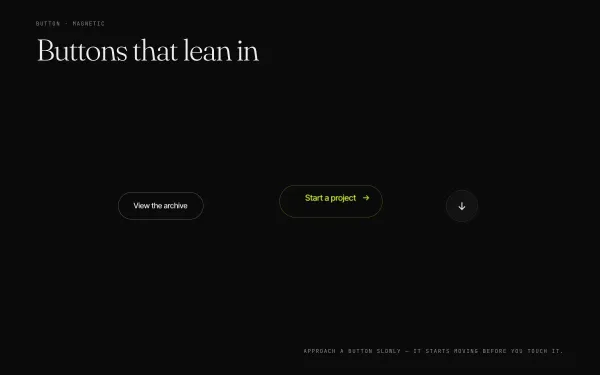
Three pill buttons attract toward the pointer inside an invisible radius, their labels leading slightly for parallax, flood with colour from the entry point, and spring back with an elastic snap on leave.
- gsap
 light
light Toast Notification Micro-interaction
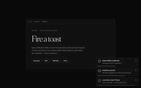
Four triggers spawn stacked toasts bottom-right: each slides in from x 40 with a back.out overshoot while earlier toasts shift up via Flip, an icon draws itself with DrawSVG, a hairline counts down 4s (pausing on hover) and dismissal re-flows the stack.
- gsap
- flip
- svg
 Featured WebGL
 Liquid Hover Distortion (WebGL)
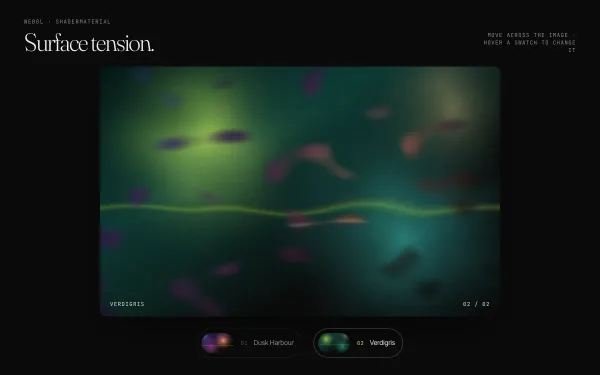
A Three.js plane shows a procedurally painted image that warps like liquid under the pointer (noise UV displacement weighted by distance and speed, with a velocity-driven RGB split); hovering a swatch melts it into a second image.
- threejs
- glsl
- gsap
- canvas2d
 Featured light
 Scramble / Decode Text
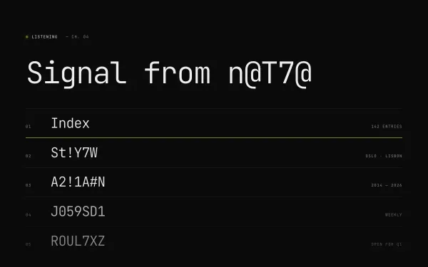
A mono headline and five nav-style rows decode from random glyphs (A–Z, 0–9, #@%&!) into real words on load and re-scramble on hover, while a status line decodes a new word every three seconds.
- gsap