Accordion with Smooth Height
Five hairline-ruled FAQ items open with a true height-from-zero-to-auto tween; the plus rotates into a cross, the copy slides up a beat later, the index turns lime and the previously open item closes at the same time.
- Layout
- gsap
- beginner
- light perf
- mobile: full
- reduced-motion ✓
AI prompt
Recreate this effect with any AI tool
Paste into Claude, Cursor, v0, Lovable or Bolt. 1287 words of exact values — rewritten live as you tune the Playground.
### EFFECT: Accordion with Smooth Height
**What it does (visual):** A two-column section: on the left a sticky intro (mono eyebrow, a large light serif heading "Questions, answered", a short muted lead); on the right a list of five FAQ rows separated by 1px hairlines. Each row is a full-width button: a small mono index ("01"…"05"), the question in a light serif, and a 2rem circular outline containing a thin "+" on the right. The first item is open on load: its index glows in the accent colour (#d4ff3a), the icon shows an "×", and its answer sits below the question in muted copy. Clicking a closed row makes its panel grow from 0 to its natural height over 0.6s with a smooth `power3.inOut` ease — no jump at the end — while the "+" rotates 45° into an "×" and, 0.15s in, the answer slides up 10px and fades in. In the same instant the previously open row collapses (its copy fades out in 0.25s, its height shrinks to 0 in 0.6s, its icon rotates back) so the list never has two panels open (unless multiple-open is enabled: false) and the total height changes smoothly. Clicking the open row closes it, leaving all five folded. Hovering a question tints it #d4ff3a and brightens the icon ring.

**Tech stack:**
- GSAP 3.13+ core only (no plugins).
- CDN: `<script src="https://cdn.jsdelivr.net/npm/gsap@3/dist/gsap.min.js"></script>`
- npm: `npm i gsap` → `import gsap from "gsap";`

**HTML structure:**
```html
<section class="acc">
  <div class="acc__intro">
    <p class="acc__eyebrow">Layout · height: auto</p>
    <h1 class="acc__title">Questions, <em>answered</em></h1>
    <p class="acc__lead">Everything we are asked before a studio engagement begins.</p>
  </div>
  <div class="acc__list">
    <div class="acc__item is-open">
      <h2 class="acc__h">
        <button class="acc__trigger" type="button" id="acc-t1" aria-expanded="true" aria-controls="acc-p1">
          <span class="acc__index">01</span>
          <span class="acc__q">How does a project usually start?</span>
          <span class="acc__icon" aria-hidden="true"><i></i><i></i></span>
        </button>
      </h2>
      <div class="acc__panel" id="acc-p1" role="region" aria-labelledby="acc-t1">
        <div class="acc__body"><p>With a two-week discovery sprint…</p></div>
      </div>
    </div>
    <!-- 4 more .acc__item (ids acc-t2/acc-p2 … acc-t5/acc-p5, aria-expanded="false") -->
  </div>
</section>
```
The padding lives on `.acc__body`, never on `.acc__panel`, so the panel can genuinely be 0px tall when closed.

**CSS requirements:**
- `.acc`: `min-height: 100vh; max-width: 1400px; margin-inline: auto; padding: clamp(2.5rem, 7vw, 6rem) clamp(1rem, 5vw, 4rem); display: grid; grid-template-columns: minmax(0, 5fr) minmax(0, 7fr); gap: clamp(2rem, 6vw, 6rem); align-items: start;`
- `.acc__intro`: `position: sticky; top: clamp(2rem, 7vw, 6rem);`
- `.acc__title`: display serif, `font-weight: 300; font-size: clamp(2.5rem, 5.5vw, 5rem); letter-spacing: -0.04em; line-height: .95;` `<em>` italic in `var(--muted)`. `.acc__lead`: `max-width: 36ch; color: var(--muted); line-height: 1.55`.
- `.acc__list { border-top: 1px solid var(--line) }`, `.acc__item { border-bottom: 1px solid var(--line) }`.
- `.acc__trigger`: `display: grid; grid-template-columns: 3.5rem minmax(0, 1fr) 2rem; align-items: center; gap: clamp(.75rem, 2vw, 1.5rem); width: 100%; padding: clamp(1.1rem, 2vw, 1.6rem) 0; text-align: left; color: var(--text); background: none; border: 0;`
- `.acc__index`: mono 11px, `letter-spacing: .12em; color: var(--muted); transition: color .4s;` — `.acc__item.is-open .acc__index { color: var(--accent) }`.
- `.acc__q`: display serif 300, `font-size: clamp(1.25rem, 2.4vw, 2rem); letter-spacing: -0.03em; line-height: 1.1; transition: color .3s;` hover → `var(--accent)`.
- `.acc__icon`: `position: relative; width: 2rem; height: 2rem; border: 1px solid var(--line); border-radius: 50%;` each `<i>`: `position: absolute; left: 50%; top: 50%; width: 11px; height: 1px; background: var(--text); transform: translate(-50%, -50%);` second `<i>` additionally `rotate(90deg)`. Hover → `border-color: var(--text)`.
- `.acc__panel { height: 0; overflow: hidden; }` and `.acc__item.is-open .acc__panel { height: auto; }` — the class owns the resting state, JS only owns the transition.
- `.acc__body { padding: 0 2rem clamp(1.25rem, 2.5vw, 2rem) 3.5rem; }` `p { max-width: 58ch; color: var(--muted); line-height: 1.6; }`
- Focus: `.acc__trigger:focus-visible { outline: 2px solid var(--accent); outline-offset: 4px; border-radius: 4px; }`
- Accent colour (open index, hover tint, focus ring): `--accent: #d4ff3a`.

**Animation spec (exact values):**
1. Initial state (`gsap.set`, per item): open item → `panel { height: 'auto' }`, `body { y: 0, opacity: 1 }`, `icon { rotate: 45 }`; closed items → `panel { height: 0 }`, `body { y: 10, opacity: 0 }`, `icon { rotate: 0 }`.
2. Intro (not under reduced motion): `gsap.from('.acc__intro > *', { y: 24, opacity: 0, duration: 0.9, ease: 'power3.out', stagger: 0.08, delay: 0.05 })` and `gsap.from(items, { y: 16, opacity: 0, duration: 0.8, ease: 'power3.out', stagger: 0.06, delay: 0.2, clearProps: 'transform' })`.
3. `open(item)` — add `.is-open`, set `aria-expanded="true"`, then a timeline (`defaults: { overwrite: 'auto' }`):
   - `tl.to(panel, { height: 'auto', duration: 0.6, ease: 'power3.inOut', clearProps: 'height' }, 0)` — target the panel, `height 0 → auto`, inline height cleared on complete so the open panel reflows on resize.
   - `tl.to(icon, { rotate: 45, duration: 0.5, ease: 'power3.inOut' }, 0)` — plus → cross.
   - `tl.fromTo(body, { y: 10, opacity: 0 }, { y: 0, opacity: 1, duration: 0.4, ease: 'power2.out' }, 0.15)` — copy slides up, starting 0.15s in.
4. `close(item)` — first `gsap.set(panel, { height: panel.offsetHeight })` (pin the current px height so removing the class does not snap it to 0), then remove `.is-open`, set `aria-expanded="false"`, then:
   - `tl.to(body, { opacity: 0, y: 10, duration: 0.25, ease: 'power2.in' }, 0)`
   - `tl.to(icon, { rotate: 0, duration: 0.5, ease: 'power3.inOut' }, 0)`
   - `tl.to(panel, { height: 0, duration: 0.6, ease: 'power3.inOut' }, 0)`
5. `toggle(item)`: if it is already open → `close(item)`; else — unless multiple panels may stay open (`MULTI_OPEN = false`) — `close()` every currently open item and `open(item)` in the same call so both tweens run simultaneously.
6. The index colour change is a CSS transition (`color .4s`) driven by the `.is-open` class.

**Interaction:** Click toggles; one item open at a time (or several when `MULTI_OPEN` is false). Hover tints the question #d4ff3a and the icon ring to `var(--text)` over 0.3s. Keyboard: Enter/Space activate (native button), ArrowDown/ArrowUp move focus between triggers (wrapping), Home/End jump to first/last.

**Responsive behavior:** Under 768px the section becomes a single column (`grid-template-columns: 1fr; gap: 2.5rem`), the intro is no longer sticky, the trigger grid tightens to `2.25rem minmax(0,1fr) 1.75rem`, the icon shrinks to 1.75rem and `.acc__body` padding becomes `0 0 … 2.25rem`. All sizes are `clamp()`-based so the layout holds at 375px. No `gsap.matchMedia()` branch is required: the animation reads measured heights, so it is identical on touch.

**Accessibility:** The pattern is the WAI-ARIA disclosure: each trigger is a `<button>` inside an `<h2>`, with `aria-expanded` and `aria-controls` pointing at a panel that has `role="region"` and `aria-labelledby` back to the button. Under `prefers-reduced-motion: reduce` every open/close is an instant `gsap.set` (height `auto`/`0`, opacity `1`/`0`, rotate `45`/`0`) and the CSS transitions on index, question and icon are disabled. Focus ring is a 2px `--accent` outline.

**Performance rules:** `height` is the one non-transform property, animated only on the small panel element with `overflow: hidden` — the cost is a single layout per frame for 0.6s, acceptable for a disclosure. Everything else is `transform`/`opacity`. `overwrite: 'auto'` prevents stacked tweens on rapid clicks. All tweens are created inside `gsap.context()` and `ctx.revert()` is called on unmount.

**Customization knobs:**
- `OPEN_DURATION` (0.6) and `EASE` (`power3.inOut`) — the breathing speed; `expo.inOut` is snappier.
- Body delay (0.15) and travel (`y: 10`).
- Icon rotation (45°) — use 135° for a spin-and-cross.
- `MULTI_OPEN` (false) — when true, opening an item no longer closes the others.
- Index highlight colour (`--accent`: #d4ff3a).

**Acceptance criteria:**
- [ ] On load exactly one item is open with a #d4ff3a index and an "×" icon; the others are 0px tall.
- [ ] Opening tweens height from 0 to natural height in 0.6s with no end jump; the copy begins fading 0.15s after the panel starts.
- [ ] The previously open item closes at the same moment the new one opens (unless `MULTI_OPEN` is true).
- [ ] After opening, resizing the window reflows the open panel (no fixed inline height remains).
- [ ] `aria-expanded` always reflects state; arrow keys move focus between questions.
- [ ] Reduced motion: toggles are instant; no console errors.Add this effect to my existing site/section: **Accordion with Smooth Height**. Keep my FAQ markup and copy; make each question a `<button>` with `aria-expanded`/`aria-controls` and wrap each answer in a `.acc__panel` (`height: 0; overflow: hidden`) containing a padded `.acc__body`. With GSAP, open with a timeline: `panel height → 'auto'` (0.6s, `power3.inOut`, `clearProps: 'height'`), icon `rotate 0 → 45` (0.5s, `power3.inOut`), body `fromTo { y: 10, opacity: 0 } → { y: 0, opacity: 1 }` (0.4s, `power2.out`, at position 0.15). Close with body `opacity → 0, y → 10` (0.25s), icon `rotate → 0` (0.5s) and `height → 0` (0.6s, `power3.inOut`), all at position 0. Close the previously open item in the same call as opening the new one (skip that when multiple-open = false is true). Toggle an `.is-open` class for the #d4ff3a index colour, respect `prefers-reduced-motion` with instant `gsap.set`, wrap everything in `gsap.context()` and revert on unmount. Do not change my fonts or colours outside the container.### EFFECT (React / Next.js): Accordion with Smooth Height
Build **Accordion with Smooth Height** as a self-contained React component for a Next.js App Router project (also valid in Vite + React). Follow the specification below exactly; the vanilla reference implementation at the end is the source of truth for values and structure.
**Setup**
- `npm i gsap @gsap/react`
- File: `components/AccordionWithSmoothHeight.tsx`, first line `"use client";` (GSAP touches the DOM).
- Imports:
```tsx
"use client";
import { useRef } from "react";
import gsap from "gsap";
import { useGSAP } from "@gsap/react";
gsap.registerPlugin(useGSAP);
export default function AccordionWithSmoothHeight() {
const scope = useRef<HTMLDivElement>(null);
useGSAP(() => {
// 1. query elements inside `scope.current` (never document-wide)
// 2. wait for document.fonts.ready before any SplitText
// 3. build the timeline / ScrollTriggers exactly as in the specification
// 4. return nothing — useGSAP reverts everything automatically on unmount
}, { scope });
return (
<div ref={scope} className="acc">
{/* markup from the HTML structure section, class → className */}
</div>
);
}
```
**React-specific rules**
- Everything GSAP-related lives inside `useGSAP(() => {...}, { scope })`; it handles cleanup (`ctx.revert()`) on unmount and in React Strict Mode double-invocation.
- Use refs or `gsap.utils.selector(scope)` instead of `document.querySelector`.
- Event listeners added inside useGSAP must use `contextSafe` (`const { contextSafe } = useGSAP({ scope })`) so their tweens are reverted too.
- ScrollTrigger: call `ScrollTrigger.refresh()` after images/fonts load; if the page uses Lenis, sync it once at the app root (`lenis.on('scroll', ScrollTrigger.update)`).
- Styles: copy the CSS requirements into a CSS Module (`AccordionWithSmoothHeight.module.css`) or Tailwind; keep the class names so the spec maps 1:1.
- Respect `prefers-reduced-motion` with `gsap.matchMedia()` as in the spec.
---
### EFFECT: Accordion with Smooth Height
**What it does (visual):** A two-column section: on the left a sticky intro (mono eyebrow, a large light serif heading "Questions, answered", a short muted lead); on the right a list of five FAQ rows separated by 1px hairlines. Each row is a full-width button: a small mono index ("01"…"05"), the question in a light serif, and a 2rem circular outline containing a thin "+" on the right. The first item is open on load: its index glows in the accent colour (#d4ff3a), the icon shows an "×", and its answer sits below the question in muted copy. Clicking a closed row makes its panel grow from 0 to its natural height over 0.6s with a smooth `power3.inOut` ease — no jump at the end — while the "+" rotates 45° into an "×" and, 0.15s in, the answer slides up 10px and fades in. In the same instant the previously open row collapses (its copy fades out in 0.25s, its height shrinks to 0 in 0.6s, its icon rotates back) so the list never has two panels open (unless multiple-open is enabled: false) and the total height changes smoothly. Clicking the open row closes it, leaving all five folded. Hovering a question tints it #d4ff3a and brightens the icon ring.
**Tech stack:**
- GSAP 3.13+ core only (no plugins).
- CDN: `<script src="https://cdn.jsdelivr.net/npm/gsap@3/dist/gsap.min.js"></script>`
- npm: `npm i gsap` → `import gsap from "gsap";`
**HTML structure:**
```html
<section class="acc">
<div class="acc__intro">
<p class="acc__eyebrow">Layout · height: auto</p>
<h1 class="acc__title">Questions, <em>answered</em></h1>
<p class="acc__lead">Everything we are asked before a studio engagement begins.</p>
</div>
<div class="acc__list">
<div class="acc__item is-open">
<h2 class="acc__h">
<button class="acc__trigger" type="button" id="acc-t1" aria-expanded="true" aria-controls="acc-p1">
<span class="acc__index">01</span>
<span class="acc__q">How does a project usually start?</span>
<span class="acc__icon" aria-hidden="true"><i></i><i></i></span>
</button>
</h2>
<div class="acc__panel" id="acc-p1" role="region" aria-labelledby="acc-t1">
<div class="acc__body"><p>With a two-week discovery sprint…</p></div>
</div>
</div>
<!-- 4 more .acc__item (ids acc-t2/acc-p2 … acc-t5/acc-p5, aria-expanded="false") -->
</div>
</section>
```
The padding lives on `.acc__body`, never on `.acc__panel`, so the panel can genuinely be 0px tall when closed.
**CSS requirements:**
- `.acc`: `min-height: 100vh; max-width: 1400px; margin-inline: auto; padding: clamp(2.5rem, 7vw, 6rem) clamp(1rem, 5vw, 4rem); display: grid; grid-template-columns: minmax(0, 5fr) minmax(0, 7fr); gap: clamp(2rem, 6vw, 6rem); align-items: start;`
- `.acc__intro`: `position: sticky; top: clamp(2rem, 7vw, 6rem);`
- `.acc__title`: display serif, `font-weight: 300; font-size: clamp(2.5rem, 5.5vw, 5rem); letter-spacing: -0.04em; line-height: .95;` `<em>` italic in `var(--muted)`. `.acc__lead`: `max-width: 36ch; color: var(--muted); line-height: 1.55`.
- `.acc__list { border-top: 1px solid var(--line) }`, `.acc__item { border-bottom: 1px solid var(--line) }`.
- `.acc__trigger`: `display: grid; grid-template-columns: 3.5rem minmax(0, 1fr) 2rem; align-items: center; gap: clamp(.75rem, 2vw, 1.5rem); width: 100%; padding: clamp(1.1rem, 2vw, 1.6rem) 0; text-align: left; color: var(--text); background: none; border: 0;`
- `.acc__index`: mono 11px, `letter-spacing: .12em; color: var(--muted); transition: color .4s;` — `.acc__item.is-open .acc__index { color: var(--accent) }`.
- `.acc__q`: display serif 300, `font-size: clamp(1.25rem, 2.4vw, 2rem); letter-spacing: -0.03em; line-height: 1.1; transition: color .3s;` hover → `var(--accent)`.
- `.acc__icon`: `position: relative; width: 2rem; height: 2rem; border: 1px solid var(--line); border-radius: 50%;` each `<i>`: `position: absolute; left: 50%; top: 50%; width: 11px; height: 1px; background: var(--text); transform: translate(-50%, -50%);` second `<i>` additionally `rotate(90deg)`. Hover → `border-color: var(--text)`.
- `.acc__panel { height: 0; overflow: hidden; }` and `.acc__item.is-open .acc__panel { height: auto; }` — the class owns the resting state, JS only owns the transition.
- `.acc__body { padding: 0 2rem clamp(1.25rem, 2.5vw, 2rem) 3.5rem; }` `p { max-width: 58ch; color: var(--muted); line-height: 1.6; }`
- Focus: `.acc__trigger:focus-visible { outline: 2px solid var(--accent); outline-offset: 4px; border-radius: 4px; }`
- Accent colour (open index, hover tint, focus ring): `--accent: #d4ff3a`.
**Animation spec (exact values):**
1. Initial state (`gsap.set`, per item): open item → `panel { height: 'auto' }`, `body { y: 0, opacity: 1 }`, `icon { rotate: 45 }`; closed items → `panel { height: 0 }`, `body { y: 10, opacity: 0 }`, `icon { rotate: 0 }`.
2. Intro (not under reduced motion): `gsap.from('.acc__intro > *', { y: 24, opacity: 0, duration: 0.9, ease: 'power3.out', stagger: 0.08, delay: 0.05 })` and `gsap.from(items, { y: 16, opacity: 0, duration: 0.8, ease: 'power3.out', stagger: 0.06, delay: 0.2, clearProps: 'transform' })`.
3. `open(item)` — add `.is-open`, set `aria-expanded="true"`, then a timeline (`defaults: { overwrite: 'auto' }`):
- `tl.to(panel, { height: 'auto', duration: 0.6, ease: 'power3.inOut', clearProps: 'height' }, 0)` — target the panel, `height 0 → auto`, inline height cleared on complete so the open panel reflows on resize.
- `tl.to(icon, { rotate: 45, duration: 0.5, ease: 'power3.inOut' }, 0)` — plus → cross.
- `tl.fromTo(body, { y: 10, opacity: 0 }, { y: 0, opacity: 1, duration: 0.4, ease: 'power2.out' }, 0.15)` — copy slides up, starting 0.15s in.
4. `close(item)` — first `gsap.set(panel, { height: panel.offsetHeight })` (pin the current px height so removing the class does not snap it to 0), then remove `.is-open`, set `aria-expanded="false"`, then:
- `tl.to(body, { opacity: 0, y: 10, duration: 0.25, ease: 'power2.in' }, 0)`
- `tl.to(icon, { rotate: 0, duration: 0.5, ease: 'power3.inOut' }, 0)`
- `tl.to(panel, { height: 0, duration: 0.6, ease: 'power3.inOut' }, 0)`
5. `toggle(item)`: if it is already open → `close(item)`; else — unless multiple panels may stay open (`MULTI_OPEN = false`) — `close()` every currently open item and `open(item)` in the same call so both tweens run simultaneously.
6. The index colour change is a CSS transition (`color .4s`) driven by the `.is-open` class.
**Interaction:** Click toggles; one item open at a time (or several when `MULTI_OPEN` is false). Hover tints the question #d4ff3a and the icon ring to `var(--text)` over 0.3s. Keyboard: Enter/Space activate (native button), ArrowDown/ArrowUp move focus between triggers (wrapping), Home/End jump to first/last.
**Responsive behavior:** Under 768px the section becomes a single column (`grid-template-columns: 1fr; gap: 2.5rem`), the intro is no longer sticky, the trigger grid tightens to `2.25rem minmax(0,1fr) 1.75rem`, the icon shrinks to 1.75rem and `.acc__body` padding becomes `0 0 … 2.25rem`. All sizes are `clamp()`-based so the layout holds at 375px. No `gsap.matchMedia()` branch is required: the animation reads measured heights, so it is identical on touch.
**Accessibility:** The pattern is the WAI-ARIA disclosure: each trigger is a `<button>` inside an `<h2>`, with `aria-expanded` and `aria-controls` pointing at a panel that has `role="region"` and `aria-labelledby` back to the button. Under `prefers-reduced-motion: reduce` every open/close is an instant `gsap.set` (height `auto`/`0`, opacity `1`/`0`, rotate `45`/`0`) and the CSS transitions on index, question and icon are disabled. Focus ring is a 2px `--accent` outline.
**Performance rules:** `height` is the one non-transform property, animated only on the small panel element with `overflow: hidden` — the cost is a single layout per frame for 0.6s, acceptable for a disclosure. Everything else is `transform`/`opacity`. `overwrite: 'auto'` prevents stacked tweens on rapid clicks. All tweens are created inside `gsap.context()` and `ctx.revert()` is called on unmount.
**Customization knobs:**
- `OPEN_DURATION` (0.6) and `EASE` (`power3.inOut`) — the breathing speed; `expo.inOut` is snappier.
- Body delay (0.15) and travel (`y: 10`).
- Icon rotation (45°) — use 135° for a spin-and-cross.
- `MULTI_OPEN` (false) — when true, opening an item no longer closes the others.
- Index highlight colour (`--accent`: #d4ff3a).
**Acceptance criteria:**
- [ ] On load exactly one item is open with a #d4ff3a index and an "×" icon; the others are 0px tall.
- [ ] Opening tweens height from 0 to natural height in 0.6s with no end jump; the copy begins fading 0.15s after the panel starts.
- [ ] The previously open item closes at the same moment the new one opens (unless `MULTI_OPEN` is true).
- [ ] After opening, resizing the window reflows the open panel (no fixed inline height remains).
- [ ] `aria-expanded` always reflects state; arrow keys move focus between questions.
- [ ] Reduced motion: toggles are instant; no console errors.
---
**Reference implementation (vanilla, converts 1:1 — same class names, same values):**
```html
<section class="acc">
<div class="acc__intro">
<p class="acc__eyebrow">Layout · height: auto</p>
<h1 class="acc__title">Questions, <em>answered</em></h1>
<p class="acc__lead">Everything we are asked before a studio engagement begins. One panel open at a time; the rest stay folded.</p>
</div>
<div class="acc__list">
<div class="acc__item is-open">
<h2 class="acc__h"><button class="acc__trigger" type="button" id="acc-t1" aria-expanded="true" aria-controls="acc-p1"><span class="acc__index">01</span><span class="acc__q">How does a project usually start?</span><span class="acc__icon" aria-hidden="true"><i></i><i></i></span></button></h2>
<div class="acc__panel" id="acc-p1" role="region" aria-labelledby="acc-t1"><div class="acc__body"><p>With a two-week discovery sprint. We interview your team, audit what exists and return with a written point of view, a scope and a fixed price. If we are not the right studio, we say so then.</p></div></div>
</div>
<div class="acc__item">
<h2 class="acc__h"><button class="acc__trigger" type="button" id="acc-t2" aria-expanded="false" aria-controls="acc-p2"><span class="acc__index">02</span><span class="acc__q">What does a typical engagement cost?</span><span class="acc__icon" aria-hidden="true"><i></i><i></i></span></button></h2>
<div class="acc__panel" id="acc-p2" role="region" aria-labelledby="acc-t2"><div class="acc__body"><p>Identity programmes begin at a fixed fee, websites are quoted per sprint, and ongoing design partnership is a monthly retainer. Every proposal lists exactly what ships, so there are no surprises at the invoice stage.</p></div></div>
</div>
<div class="acc__item">
<h2 class="acc__h"><button class="acc__trigger" type="button" id="acc-t3" aria-expanded="false" aria-controls="acc-p3"><span class="acc__index">03</span><span class="acc__q">Who will I actually work with?</span><span class="acc__icon" aria-hidden="true"><i></i><i></i></span></button></h2>
<div class="acc__panel" id="acc-p3" role="region" aria-labelledby="acc-t3"><div class="acc__body"><p>The people in the pitch are the people on the project. A creative director, a designer and an engineer stay with you from kick-off to launch, and you have their direct lines.</p></div></div>
</div>
<div class="acc__item">
<h2 class="acc__h"><button class="acc__trigger" type="button" id="acc-t4" aria-expanded="false" aria-controls="acc-p4"><span class="acc__index">04</span><span class="acc__q">Do you build what you design?</span><span class="acc__icon" aria-hidden="true"><i></i><i></i></span></button></h2>
<div class="acc__panel" id="acc-p4" role="region" aria-labelledby="acc-t4"><div class="acc__body"><p>Yes. Motion, front-end and CMS integration are done in-house, which is why the launched site looks like the prototype. We hand over documented code, not a Figma file and good wishes.</p></div></div>
</div>
<div class="acc__item">
<h2 class="acc__h"><button class="acc__trigger" type="button" id="acc-t5" aria-expanded="false" aria-controls="acc-p5"><span class="acc__index">05</span><span class="acc__q">How long until launch?</span><span class="acc__icon" aria-hidden="true"><i></i><i></i></span></button></h2>
<div class="acc__panel" id="acc-p5" role="region" aria-labelledby="acc-t5"><div class="acc__body"><p>Most identity and website programmes run ten to fourteen weeks. Campaign work can move in days. We would rather tell you an honest date than a flattering one.</p></div></div>
</div>
</div>
</section>
```
```css
.acc { min-height: 100vh; max-width: 1400px; margin-inline: auto; padding: clamp(2.5rem, 7vw, 6rem) clamp(1rem, 5vw, 4rem); display: grid; grid-template-columns: minmax(0, 5fr) minmax(0, 7fr); gap: clamp(2rem, 6vw, 6rem); align-items: start; }
.acc__intro { position: sticky; top: clamp(2rem, 7vw, 6rem); }
.acc__eyebrow { font-family: var(--font-mono); font-size: 11px; text-transform: uppercase; letter-spacing: .14em; color: var(--muted); margin-bottom: 1.25rem; }
.acc__title { font-family: var(--font-display); font-weight: 300; font-size: clamp(2.5rem, 5.5vw, 5rem); letter-spacing: -0.04em; line-height: .95; }
.acc__title em { font-style: italic; color: var(--muted); }
.acc__lead { margin-top: 1.5rem; max-width: 36ch; color: var(--muted); font-size: clamp(.95rem, 1.1vw, 1.1rem); line-height: 1.55; }
.acc__list { border-top: 1px solid var(--line); }
.acc__item { border-bottom: 1px solid var(--line); }
.acc__h { font: inherit; }
.acc__trigger { display: grid; grid-template-columns: 3.5rem minmax(0, 1fr) 2rem; align-items: center; gap: clamp(.75rem, 2vw, 1.5rem); width: 100%; padding: clamp(1.1rem, 2vw, 1.6rem) 0; text-align: left; color: var(--text); }
.acc__trigger:focus-visible { outline: 2px solid var(--knob-accent, var(--accent)); outline-offset: 4px; border-radius: 4px; }
.acc__index { font-family: var(--font-mono); font-size: 11px; letter-spacing: .12em; color: var(--muted); transition: color .4s; }
.acc__item.is-open .acc__index { color: var(--knob-accent, var(--accent)); }
.acc__q { font-family: var(--font-display); font-weight: 300; font-size: clamp(1.25rem, 2.4vw, 2rem); letter-spacing: -0.03em; line-height: 1.1; transition: color .3s; }
.acc__trigger:hover .acc__q { color: var(--knob-accent, var(--accent)); }
.acc__icon { position: relative; width: 2rem; height: 2rem; justify-self: end; border: 1px solid var(--line); border-radius: 50%; transition: border-color .3s; }
.acc__trigger:hover .acc__icon { border-color: var(--text); }
.acc__icon i { position: absolute; left: 50%; top: 50%; width: 11px; height: 1px; background: var(--text); transform: translate(-50%, -50%); }
.acc__icon i:last-child { transform: translate(-50%, -50%) rotate(90deg); }
.acc__panel { height: 0; overflow: hidden; }
.acc__item.is-open .acc__panel { height: auto; }
.acc__body { padding: 0 2rem clamp(1.25rem, 2.5vw, 2rem) 3.5rem; }
.acc__body p { max-width: 58ch; color: var(--muted); font-size: clamp(.95rem, 1.1vw, 1.05rem); line-height: 1.6; }
@media (max-width: 767px) {
.acc { grid-template-columns: 1fr; gap: 2.5rem; }
.acc__intro { position: static; }
.acc__trigger { grid-template-columns: 2.25rem minmax(0, 1fr) 1.75rem; }
.acc__icon { width: 1.75rem; height: 1.75rem; }
.acc__body { padding-left: 2.25rem; padding-right: 0; }
}
@media (prefers-reduced-motion: reduce) {
.acc__index, .acc__q, .acc__icon { transition: none; }
}
```
```js
// Accordion with Smooth Height — height 0 → auto, plus → cross, copy slides up a beat later.
// Defaults — overridable from the MOTION/LAB Playground via MotionLab.knob()
const DEFAULTS = { duration: 0.6, ease: 'power3.inOut', bodyTravel: 10, iconRotate: 45, accent: '#d4ff3a', multiOpen: false };
const K = (id) => window.MotionLab?.knob(id, DEFAULTS[id]) ?? DEFAULTS[id];
const reduced = matchMedia('(prefers-reduced-motion: reduce)').matches;
const section = document.querySelector('.acc');
const items = gsap.utils.toArray('.acc__item');
const triggers = items.map((item) => item.querySelector('.acc__trigger'));
const isOpen = (item) => item.classList.contains('is-open'); // the class owns the resting state
let ctx;
function build() {
ctx?.revert();
section.style.setProperty('--knob-accent', K('accent'));
const OPEN_DURATION = K('duration');
const EASE = K('ease');
const TRAVEL = K('bodyTravel');
const ROTATE = K('iconRotate');
const MULTI = K('multiOpen');
ctx = gsap.context(() => {
const ac = new AbortController();
// Initial state: open items are fully visible, every other panel is collapsed.
items.forEach((item) => {
const panel = item.querySelector('.acc__panel');
const body = item.querySelector('.acc__body');
const icon = item.querySelector('.acc__icon');
const open = isOpen(item);
gsap.set(panel, { height: open ? 'auto' : 0 });
gsap.set(body, { y: open ? 0 : TRAVEL, opacity: open ? 1 : 0 });
gsap.set(icon, { rotate: open ? ROTATE : 0 });
});
if (!reduced) {
gsap.from('.acc__intro > *', { y: 24, opacity: 0, duration: 0.9, ease: 'power3.out', stagger: 0.08, delay: 0.05 });
gsap.from(items, { y: 16, opacity: 0, duration: 0.8, ease: 'power3.out', stagger: 0.06, delay: 0.2, clearProps: 'transform' });
}
function setExpanded(item, expanded) {
item.classList.toggle('is-open', expanded);
item.querySelector('.acc__trigger').setAttribute('aria-expanded', String(expanded));
}
function close(item) {
const panel = item.querySelector('.acc__panel');
const body = item.querySelector('.acc__body');
const icon = item.querySelector('.acc__icon');
gsap.set(panel, { height: panel.offsetHeight }); // pin the current px height before the class flips to 0
setExpanded(item, false);
if (reduced) { gsap.set(panel, { height: 0 }); gsap.set(body, { opacity: 0, y: TRAVEL }); gsap.set(icon, { rotate: 0 }); return; }
ctx.add(() => { // handler-created tweens are recorded in the context so a rebuild reverts them too
gsap.timeline({ defaults: { overwrite: 'auto' } })
.to(body, { opacity: 0, y: TRAVEL, duration: 0.25, ease: 'power2.in' }, 0)
.to(icon, { rotate: 0, duration: 0.5, ease: EASE }, 0)
.to(panel, { height: 0, duration: OPEN_DURATION, ease: EASE }, 0);
});
}
function open(item) {
const panel = item.querySelector('.acc__panel');
const body = item.querySelector('.acc__body');
const icon = item.querySelector('.acc__icon');
setExpanded(item, true);
if (reduced) { gsap.set(panel, { height: 'auto' }); gsap.set(body, { opacity: 1, y: 0 }); gsap.set(icon, { rotate: ROTATE }); return; }
ctx.add(() => {
gsap.timeline({ defaults: { overwrite: 'auto' } })
.to(panel, { height: 'auto', duration: OPEN_DURATION, ease: EASE, clearProps: 'height' }, 0)
.to(icon, { rotate: ROTATE, duration: 0.5, ease: EASE }, 0)
.fromTo(body, { y: TRAVEL, opacity: 0 }, { y: 0, opacity: 1, duration: 0.4, ease: 'power2.out' }, 0.15);
});
}
function toggle(item) {
if (isOpen(item)) { close(item); return; }
if (!MULTI) items.filter(isOpen).forEach(close); // simultaneous close
open(item);
}
triggers.forEach((btn, i) => {
btn.addEventListener('click', () => toggle(items[i]), { signal: ac.signal });
btn.addEventListener('keydown', (e) => {
const map = { ArrowDown: i + 1, ArrowUp: i - 1, Home: 0, End: triggers.length - 1 };
if (!(e.key in map)) return;
e.preventDefault();
triggers[gsap.utils.wrap(0, triggers.length, map[e.key])].focus();
}, { signal: ac.signal });
});
return () => ac.abort(); // listeners go with the context so rebuilds never stack handlers
});
}
build();
// Playground: rebuild with the new values (open/closed state survives — it lives in the classes)
window.addEventListener('ml:knobs', build);
window.MotionLab?.onCleanup(() => ctx?.revert());
```
### EFFECT (single HTML file): Accordion with Smooth Height
Produce **one self-contained `index.html`** (inline `<style>` and `<script type="module">`, no build step) that implements **Accordion with Smooth Height** exactly as specified below. Libraries load from jsDelivr:

```html
<!doctype html>
<html lang="en">
<head>
  <meta charset="utf-8">
  <meta name="viewport" content="width=device-width, initial-scale=1">
  <title>Accordion with Smooth Height</title>
  <link href="https://fonts.googleapis.com/css2?family=Fraunces:ital,opsz,wght@0,9..144,300..600;1,9..144,300..600&family=Inter+Tight:wght@300..700&family=JetBrains+Mono:wght@400;500&display=swap" rel="stylesheet">
  <style>
    :root{--bg:#0a0a0a;--surface:#121212;--line:rgba(255,255,255,.08);--text:#ededed;--muted:#8a8a8a;--accent:#d4ff3a;--font-display:"Fraunces",Georgia,serif;--font-sans:"Inter Tight",system-ui,sans-serif;--font-mono:"JetBrains Mono",ui-monospace,monospace}
    *,*::before,*::after{box-sizing:border-box;margin:0;padding:0}
    body{background:var(--bg);color:var(--text);font-family:var(--font-sans);-webkit-font-smoothing:antialiased;overflow-x:hidden}
    /* + the CSS requirements below */
  </style>
  <script src="https://cdn.jsdelivr.net/npm/gsap@3/dist/gsap.min.js"></script>
</head>
<body>
  <!-- markup from the HTML structure section -->
  <script type="module">
    // the JS from the animation spec (window.MotionLab is optional — keep the ?. guards or remove them)
  </script>
</body>
</html>
```

The file must open directly from a local server (`npx serve .`) with zero console errors, work at 375px and 1440px, and honour `prefers-reduced-motion`.

---

### EFFECT: Accordion with Smooth Height
**What it does (visual):** A two-column section: on the left a sticky intro (mono eyebrow, a large light serif heading "Questions, answered", a short muted lead); on the right a list of five FAQ rows separated by 1px hairlines. Each row is a full-width button: a small mono index ("01"…"05"), the question in a light serif, and a 2rem circular outline containing a thin "+" on the right. The first item is open on load: its index glows in the accent colour (#d4ff3a), the icon shows an "×", and its answer sits below the question in muted copy. Clicking a closed row makes its panel grow from 0 to its natural height over 0.6s with a smooth `power3.inOut` ease — no jump at the end — while the "+" rotates 45° into an "×" and, 0.15s in, the answer slides up 10px and fades in. In the same instant the previously open row collapses (its copy fades out in 0.25s, its height shrinks to 0 in 0.6s, its icon rotates back) so the list never has two panels open (unless multiple-open is enabled: false) and the total height changes smoothly. Clicking the open row closes it, leaving all five folded. Hovering a question tints it #d4ff3a and brightens the icon ring.

**Tech stack:**
- GSAP 3.13+ core only (no plugins).
- CDN: `<script src="https://cdn.jsdelivr.net/npm/gsap@3/dist/gsap.min.js"></script>`
- npm: `npm i gsap` → `import gsap from "gsap";`

**HTML structure:**
```html
<section class="acc">
  <div class="acc__intro">
    <p class="acc__eyebrow">Layout · height: auto</p>
    <h1 class="acc__title">Questions, <em>answered</em></h1>
    <p class="acc__lead">Everything we are asked before a studio engagement begins.</p>
  </div>
  <div class="acc__list">
    <div class="acc__item is-open">
      <h2 class="acc__h">
        <button class="acc__trigger" type="button" id="acc-t1" aria-expanded="true" aria-controls="acc-p1">
          <span class="acc__index">01</span>
          <span class="acc__q">How does a project usually start?</span>
          <span class="acc__icon" aria-hidden="true"><i></i><i></i></span>
        </button>
      </h2>
      <div class="acc__panel" id="acc-p1" role="region" aria-labelledby="acc-t1">
        <div class="acc__body"><p>With a two-week discovery sprint…</p></div>
      </div>
    </div>
    <!-- 4 more .acc__item (ids acc-t2/acc-p2 … acc-t5/acc-p5, aria-expanded="false") -->
  </div>
</section>
```
The padding lives on `.acc__body`, never on `.acc__panel`, so the panel can genuinely be 0px tall when closed.

**CSS requirements:**
- `.acc`: `min-height: 100vh; max-width: 1400px; margin-inline: auto; padding: clamp(2.5rem, 7vw, 6rem) clamp(1rem, 5vw, 4rem); display: grid; grid-template-columns: minmax(0, 5fr) minmax(0, 7fr); gap: clamp(2rem, 6vw, 6rem); align-items: start;`
- `.acc__intro`: `position: sticky; top: clamp(2rem, 7vw, 6rem);`
- `.acc__title`: display serif, `font-weight: 300; font-size: clamp(2.5rem, 5.5vw, 5rem); letter-spacing: -0.04em; line-height: .95;` `<em>` italic in `var(--muted)`. `.acc__lead`: `max-width: 36ch; color: var(--muted); line-height: 1.55`.
- `.acc__list { border-top: 1px solid var(--line) }`, `.acc__item { border-bottom: 1px solid var(--line) }`.
- `.acc__trigger`: `display: grid; grid-template-columns: 3.5rem minmax(0, 1fr) 2rem; align-items: center; gap: clamp(.75rem, 2vw, 1.5rem); width: 100%; padding: clamp(1.1rem, 2vw, 1.6rem) 0; text-align: left; color: var(--text); background: none; border: 0;`
- `.acc__index`: mono 11px, `letter-spacing: .12em; color: var(--muted); transition: color .4s;` — `.acc__item.is-open .acc__index { color: var(--accent) }`.
- `.acc__q`: display serif 300, `font-size: clamp(1.25rem, 2.4vw, 2rem); letter-spacing: -0.03em; line-height: 1.1; transition: color .3s;` hover → `var(--accent)`.
- `.acc__icon`: `position: relative; width: 2rem; height: 2rem; border: 1px solid var(--line); border-radius: 50%;` each `<i>`: `position: absolute; left: 50%; top: 50%; width: 11px; height: 1px; background: var(--text); transform: translate(-50%, -50%);` second `<i>` additionally `rotate(90deg)`. Hover → `border-color: var(--text)`.
- `.acc__panel { height: 0; overflow: hidden; }` and `.acc__item.is-open .acc__panel { height: auto; }` — the class owns the resting state, JS only owns the transition.
- `.acc__body { padding: 0 2rem clamp(1.25rem, 2.5vw, 2rem) 3.5rem; }` `p { max-width: 58ch; color: var(--muted); line-height: 1.6; }`
- Focus: `.acc__trigger:focus-visible { outline: 2px solid var(--accent); outline-offset: 4px; border-radius: 4px; }`
- Accent colour (open index, hover tint, focus ring): `--accent: #d4ff3a`.

**Animation spec (exact values):**
1. Initial state (`gsap.set`, per item): open item → `panel { height: 'auto' }`, `body { y: 0, opacity: 1 }`, `icon { rotate: 45 }`; closed items → `panel { height: 0 }`, `body { y: 10, opacity: 0 }`, `icon { rotate: 0 }`.
2. Intro (not under reduced motion): `gsap.from('.acc__intro > *', { y: 24, opacity: 0, duration: 0.9, ease: 'power3.out', stagger: 0.08, delay: 0.05 })` and `gsap.from(items, { y: 16, opacity: 0, duration: 0.8, ease: 'power3.out', stagger: 0.06, delay: 0.2, clearProps: 'transform' })`.
3. `open(item)` — add `.is-open`, set `aria-expanded="true"`, then a timeline (`defaults: { overwrite: 'auto' }`):
   - `tl.to(panel, { height: 'auto', duration: 0.6, ease: 'power3.inOut', clearProps: 'height' }, 0)` — target the panel, `height 0 → auto`, inline height cleared on complete so the open panel reflows on resize.
   - `tl.to(icon, { rotate: 45, duration: 0.5, ease: 'power3.inOut' }, 0)` — plus → cross.
   - `tl.fromTo(body, { y: 10, opacity: 0 }, { y: 0, opacity: 1, duration: 0.4, ease: 'power2.out' }, 0.15)` — copy slides up, starting 0.15s in.
4. `close(item)` — first `gsap.set(panel, { height: panel.offsetHeight })` (pin the current px height so removing the class does not snap it to 0), then remove `.is-open`, set `aria-expanded="false"`, then:
   - `tl.to(body, { opacity: 0, y: 10, duration: 0.25, ease: 'power2.in' }, 0)`
   - `tl.to(icon, { rotate: 0, duration: 0.5, ease: 'power3.inOut' }, 0)`
   - `tl.to(panel, { height: 0, duration: 0.6, ease: 'power3.inOut' }, 0)`
5. `toggle(item)`: if it is already open → `close(item)`; else — unless multiple panels may stay open (`MULTI_OPEN = false`) — `close()` every currently open item and `open(item)` in the same call so both tweens run simultaneously.
6. The index colour change is a CSS transition (`color .4s`) driven by the `.is-open` class.

**Interaction:** Click toggles; one item open at a time (or several when `MULTI_OPEN` is false). Hover tints the question #d4ff3a and the icon ring to `var(--text)` over 0.3s. Keyboard: Enter/Space activate (native button), ArrowDown/ArrowUp move focus between triggers (wrapping), Home/End jump to first/last.

**Responsive behavior:** Under 768px the section becomes a single column (`grid-template-columns: 1fr; gap: 2.5rem`), the intro is no longer sticky, the trigger grid tightens to `2.25rem minmax(0,1fr) 1.75rem`, the icon shrinks to 1.75rem and `.acc__body` padding becomes `0 0 … 2.25rem`. All sizes are `clamp()`-based so the layout holds at 375px. No `gsap.matchMedia()` branch is required: the animation reads measured heights, so it is identical on touch.

**Accessibility:** The pattern is the WAI-ARIA disclosure: each trigger is a `<button>` inside an `<h2>`, with `aria-expanded` and `aria-controls` pointing at a panel that has `role="region"` and `aria-labelledby` back to the button. Under `prefers-reduced-motion: reduce` every open/close is an instant `gsap.set` (height `auto`/`0`, opacity `1`/`0`, rotate `45`/`0`) and the CSS transitions on index, question and icon are disabled. Focus ring is a 2px `--accent` outline.

**Performance rules:** `height` is the one non-transform property, animated only on the small panel element with `overflow: hidden` — the cost is a single layout per frame for 0.6s, acceptable for a disclosure. Everything else is `transform`/`opacity`. `overwrite: 'auto'` prevents stacked tweens on rapid clicks. All tweens are created inside `gsap.context()` and `ctx.revert()` is called on unmount.

**Customization knobs:**
- `OPEN_DURATION` (0.6) and `EASE` (`power3.inOut`) — the breathing speed; `expo.inOut` is snappier.
- Body delay (0.15) and travel (`y: 10`).
- Icon rotation (45°) — use 135° for a spin-and-cross.
- `MULTI_OPEN` (false) — when true, opening an item no longer closes the others.
- Index highlight colour (`--accent`: #d4ff3a).

**Acceptance criteria:**
- [ ] On load exactly one item is open with a #d4ff3a index and an "×" icon; the others are 0px tall.
- [ ] Opening tweens height from 0 to natural height in 0.6s with no end jump; the copy begins fading 0.15s after the panel starts.
- [ ] The previously open item closes at the same moment the new one opens (unless `MULTI_OPEN` is true).
- [ ] After opening, resizing the window reflows the open panel (no fixed inline height remains).
- [ ] `aria-expanded` always reflects state; arrow keys move focus between questions.
- [ ] Reduced motion: toggles are instant; no console errors.

---

**Reference implementation (use these exact values and class names):**

```html
<section class="acc">
  <div class="acc__intro">
    <p class="acc__eyebrow">Layout · height: auto</p>
    <h1 class="acc__title">Questions, <em>answered</em></h1>
    <p class="acc__lead">Everything we are asked before a studio engagement begins. One panel open at a time; the rest stay folded.</p>
  </div>

  <div class="acc__list">
    <div class="acc__item is-open">
      <h2 class="acc__h"><button class="acc__trigger" type="button" id="acc-t1" aria-expanded="true" aria-controls="acc-p1"><span class="acc__index">01</span><span class="acc__q">How does a project usually start?</span><span class="acc__icon" aria-hidden="true"><i></i><i></i></span></button></h2>
      <div class="acc__panel" id="acc-p1" role="region" aria-labelledby="acc-t1"><div class="acc__body"><p>With a two-week discovery sprint. We interview your team, audit what exists and return with a written point of view, a scope and a fixed price. If we are not the right studio, we say so then.</p></div></div>
    </div>
    <div class="acc__item">
      <h2 class="acc__h"><button class="acc__trigger" type="button" id="acc-t2" aria-expanded="false" aria-controls="acc-p2"><span class="acc__index">02</span><span class="acc__q">What does a typical engagement cost?</span><span class="acc__icon" aria-hidden="true"><i></i><i></i></span></button></h2>
      <div class="acc__panel" id="acc-p2" role="region" aria-labelledby="acc-t2"><div class="acc__body"><p>Identity programmes begin at a fixed fee, websites are quoted per sprint, and ongoing design partnership is a monthly retainer. Every proposal lists exactly what ships, so there are no surprises at the invoice stage.</p></div></div>
    </div>
    <div class="acc__item">
      <h2 class="acc__h"><button class="acc__trigger" type="button" id="acc-t3" aria-expanded="false" aria-controls="acc-p3"><span class="acc__index">03</span><span class="acc__q">Who will I actually work with?</span><span class="acc__icon" aria-hidden="true"><i></i><i></i></span></button></h2>
      <div class="acc__panel" id="acc-p3" role="region" aria-labelledby="acc-t3"><div class="acc__body"><p>The people in the pitch are the people on the project. A creative director, a designer and an engineer stay with you from kick-off to launch, and you have their direct lines.</p></div></div>
    </div>
    <div class="acc__item">
      <h2 class="acc__h"><button class="acc__trigger" type="button" id="acc-t4" aria-expanded="false" aria-controls="acc-p4"><span class="acc__index">04</span><span class="acc__q">Do you build what you design?</span><span class="acc__icon" aria-hidden="true"><i></i><i></i></span></button></h2>
      <div class="acc__panel" id="acc-p4" role="region" aria-labelledby="acc-t4"><div class="acc__body"><p>Yes. Motion, front-end and CMS integration are done in-house, which is why the launched site looks like the prototype. We hand over documented code, not a Figma file and good wishes.</p></div></div>
    </div>
    <div class="acc__item">
      <h2 class="acc__h"><button class="acc__trigger" type="button" id="acc-t5" aria-expanded="false" aria-controls="acc-p5"><span class="acc__index">05</span><span class="acc__q">How long until launch?</span><span class="acc__icon" aria-hidden="true"><i></i><i></i></span></button></h2>
      <div class="acc__panel" id="acc-p5" role="region" aria-labelledby="acc-t5"><div class="acc__body"><p>Most identity and website programmes run ten to fourteen weeks. Campaign work can move in days. We would rather tell you an honest date than a flattering one.</p></div></div>
    </div>
  </div>
</section>
```

```css
.acc { min-height: 100vh; max-width: 1400px; margin-inline: auto; padding: clamp(2.5rem, 7vw, 6rem) clamp(1rem, 5vw, 4rem); display: grid; grid-template-columns: minmax(0, 5fr) minmax(0, 7fr); gap: clamp(2rem, 6vw, 6rem); align-items: start; }
.acc__intro { position: sticky; top: clamp(2rem, 7vw, 6rem); }
.acc__eyebrow { font-family: var(--font-mono); font-size: 11px; text-transform: uppercase; letter-spacing: .14em; color: var(--muted); margin-bottom: 1.25rem; }
.acc__title { font-family: var(--font-display); font-weight: 300; font-size: clamp(2.5rem, 5.5vw, 5rem); letter-spacing: -0.04em; line-height: .95; }
.acc__title em { font-style: italic; color: var(--muted); }
.acc__lead { margin-top: 1.5rem; max-width: 36ch; color: var(--muted); font-size: clamp(.95rem, 1.1vw, 1.1rem); line-height: 1.55; }

.acc__list { border-top: 1px solid var(--line); }
.acc__item { border-bottom: 1px solid var(--line); }
.acc__h { font: inherit; }
.acc__trigger { display: grid; grid-template-columns: 3.5rem minmax(0, 1fr) 2rem; align-items: center; gap: clamp(.75rem, 2vw, 1.5rem); width: 100%; padding: clamp(1.1rem, 2vw, 1.6rem) 0; text-align: left; color: var(--text); }
.acc__trigger:focus-visible { outline: 2px solid var(--knob-accent, var(--accent)); outline-offset: 4px; border-radius: 4px; }
.acc__index { font-family: var(--font-mono); font-size: 11px; letter-spacing: .12em; color: var(--muted); transition: color .4s; }
.acc__item.is-open .acc__index { color: var(--knob-accent, var(--accent)); }
.acc__q { font-family: var(--font-display); font-weight: 300; font-size: clamp(1.25rem, 2.4vw, 2rem); letter-spacing: -0.03em; line-height: 1.1; transition: color .3s; }
.acc__trigger:hover .acc__q { color: var(--knob-accent, var(--accent)); }
.acc__icon { position: relative; width: 2rem; height: 2rem; justify-self: end; border: 1px solid var(--line); border-radius: 50%; transition: border-color .3s; }
.acc__trigger:hover .acc__icon { border-color: var(--text); }
.acc__icon i { position: absolute; left: 50%; top: 50%; width: 11px; height: 1px; background: var(--text); transform: translate(-50%, -50%); }
.acc__icon i:last-child { transform: translate(-50%, -50%) rotate(90deg); }

.acc__panel { height: 0; overflow: hidden; }
.acc__item.is-open .acc__panel { height: auto; }
.acc__body { padding: 0 2rem clamp(1.25rem, 2.5vw, 2rem) 3.5rem; }
.acc__body p { max-width: 58ch; color: var(--muted); font-size: clamp(.95rem, 1.1vw, 1.05rem); line-height: 1.6; }

@media (max-width: 767px) {
  .acc { grid-template-columns: 1fr; gap: 2.5rem; }
  .acc__intro { position: static; }
  .acc__trigger { grid-template-columns: 2.25rem minmax(0, 1fr) 1.75rem; }
  .acc__icon { width: 1.75rem; height: 1.75rem; }
  .acc__body { padding-left: 2.25rem; padding-right: 0; }
}
@media (prefers-reduced-motion: reduce) {
  .acc__index, .acc__q, .acc__icon { transition: none; }
}
```

```js
// Accordion with Smooth Height — height 0 → auto, plus → cross, copy slides up a beat later.

// Defaults — overridable from the MOTION/LAB Playground via MotionLab.knob()
const DEFAULTS = { duration: 0.6, ease: 'power3.inOut', bodyTravel: 10, iconRotate: 45, accent: '#d4ff3a', multiOpen: false };
const K = (id) => window.MotionLab?.knob(id, DEFAULTS[id]) ?? DEFAULTS[id];

const reduced = matchMedia('(prefers-reduced-motion: reduce)').matches;
const section = document.querySelector('.acc');
const items = gsap.utils.toArray('.acc__item');
const triggers = items.map((item) => item.querySelector('.acc__trigger'));
const isOpen = (item) => item.classList.contains('is-open');   // the class owns the resting state

let ctx;
function build() {
  ctx?.revert();
  section.style.setProperty('--knob-accent', K('accent'));
  const OPEN_DURATION = K('duration');
  const EASE = K('ease');
  const TRAVEL = K('bodyTravel');
  const ROTATE = K('iconRotate');
  const MULTI = K('multiOpen');

  ctx = gsap.context(() => {
    const ac = new AbortController();

    // Initial state: open items are fully visible, every other panel is collapsed.
    items.forEach((item) => {
      const panel = item.querySelector('.acc__panel');
      const body = item.querySelector('.acc__body');
      const icon = item.querySelector('.acc__icon');
      const open = isOpen(item);
      gsap.set(panel, { height: open ? 'auto' : 0 });
      gsap.set(body, { y: open ? 0 : TRAVEL, opacity: open ? 1 : 0 });
      gsap.set(icon, { rotate: open ? ROTATE : 0 });
    });

    if (!reduced) {
      gsap.from('.acc__intro > *', { y: 24, opacity: 0, duration: 0.9, ease: 'power3.out', stagger: 0.08, delay: 0.05 });
      gsap.from(items, { y: 16, opacity: 0, duration: 0.8, ease: 'power3.out', stagger: 0.06, delay: 0.2, clearProps: 'transform' });
    }

    function setExpanded(item, expanded) {
      item.classList.toggle('is-open', expanded);
      item.querySelector('.acc__trigger').setAttribute('aria-expanded', String(expanded));
    }

    function close(item) {
      const panel = item.querySelector('.acc__panel');
      const body = item.querySelector('.acc__body');
      const icon = item.querySelector('.acc__icon');
      gsap.set(panel, { height: panel.offsetHeight });   // pin the current px height before the class flips to 0
      setExpanded(item, false);
      if (reduced) { gsap.set(panel, { height: 0 }); gsap.set(body, { opacity: 0, y: TRAVEL }); gsap.set(icon, { rotate: 0 }); return; }
      ctx.add(() => {   // handler-created tweens are recorded in the context so a rebuild reverts them too
        gsap.timeline({ defaults: { overwrite: 'auto' } })
          .to(body, { opacity: 0, y: TRAVEL, duration: 0.25, ease: 'power2.in' }, 0)
          .to(icon, { rotate: 0, duration: 0.5, ease: EASE }, 0)
          .to(panel, { height: 0, duration: OPEN_DURATION, ease: EASE }, 0);
      });
    }

    function open(item) {
      const panel = item.querySelector('.acc__panel');
      const body = item.querySelector('.acc__body');
      const icon = item.querySelector('.acc__icon');
      setExpanded(item, true);
      if (reduced) { gsap.set(panel, { height: 'auto' }); gsap.set(body, { opacity: 1, y: 0 }); gsap.set(icon, { rotate: ROTATE }); return; }
      ctx.add(() => {
        gsap.timeline({ defaults: { overwrite: 'auto' } })
          .to(panel, { height: 'auto', duration: OPEN_DURATION, ease: EASE, clearProps: 'height' }, 0)
          .to(icon, { rotate: ROTATE, duration: 0.5, ease: EASE }, 0)
          .fromTo(body, { y: TRAVEL, opacity: 0 }, { y: 0, opacity: 1, duration: 0.4, ease: 'power2.out' }, 0.15);
      });
    }

    function toggle(item) {
      if (isOpen(item)) { close(item); return; }
      if (!MULTI) items.filter(isOpen).forEach(close);     // simultaneous close
      open(item);
    }

    triggers.forEach((btn, i) => {
      btn.addEventListener('click', () => toggle(items[i]), { signal: ac.signal });
      btn.addEventListener('keydown', (e) => {
        const map = { ArrowDown: i + 1, ArrowUp: i - 1, Home: 0, End: triggers.length - 1 };
        if (!(e.key in map)) return;
        e.preventDefault();
        triggers[gsap.utils.wrap(0, triggers.length, map[e.key])].focus();
      }, { signal: ac.signal });
    });

    return () => ac.abort();   // listeners go with the context so rebuilds never stack handlers
  });
}
build();

// Playground: rebuild with the new values (open/closed state survives — it lives in the classes)
window.addEventListener('ml:knobs', build);
window.MotionLab?.onCleanup(() => ctx?.revert());
```
### EFFECT (Framer & Webflow notes): Accordion with Smooth Height

**Framer**
- Implement as a **Code Component** (Assets → Code → New component) when the effect owns its own markup (hero, gallery, section), or as a **Code Override** when it should animate existing Framer layers.
- Code Component: paste the React version (`"use client"` is not needed in Framer; keep `useGSAP` with a `scope` ref). Install `gsap` and `@gsap/react` from the package panel. Expose the customization knobs as `addPropertyControls` (numbers/colors/enums) so they are editable on the canvas.
- Code Override: `export function withAccordionwithSmoothHeight(Component) { return (props) => { const ref = useRef(null); useGSAP(() => { /* spec */ }, { scope: ref }); return <Component ref={ref} {...props} /> } }` and apply it to the layer in the right-hand panel.
- Framer already smooth-scrolls; do **not** add Lenis.
- Preview in the Framer preview window, not the canvas (GSAP runs at runtime only).

**Webflow**
- Build the markup in the Designer with **exactly the class names from the HTML structure section** (prefix `acc`), so the script finds the elements.
- Styles: either recreate the CSS requirements as Webflow classes or paste the CSS in **Page settings → Custom code → Inside <head>** inside `<style>`.
- Scripts: **Page settings → Before </body>**:
```html
<script src="https://cdn.jsdelivr.net/npm/gsap@3/dist/gsap.min.js"></script>
<script type="module">
  // paste the JS from the animation spec; remove the optional window.MotionLab?.… lines
</script>
```
- Native alternative: parts that are pure show/hide, fade or move can be Webflow Interactions (IX2); keep the timeline sequencing in code — IX2 cannot do stagger/ease control at this precision.
- Custom code only runs on the **published** site or in Preview, never on the Designer canvas.
- Webflow's own smooth scroll is off by default; if you add Lenis, sync it: `lenis.on('scroll', ScrollTrigger.update)`.

---

### EFFECT: Accordion with Smooth Height
**What it does (visual):** A two-column section: on the left a sticky intro (mono eyebrow, a large light serif heading "Questions, answered", a short muted lead); on the right a list of five FAQ rows separated by 1px hairlines. Each row is a full-width button: a small mono index ("01"…"05"), the question in a light serif, and a 2rem circular outline containing a thin "+" on the right. The first item is open on load: its index glows in the accent colour (#d4ff3a), the icon shows an "×", and its answer sits below the question in muted copy. Clicking a closed row makes its panel grow from 0 to its natural height over 0.6s with a smooth `power3.inOut` ease — no jump at the end — while the "+" rotates 45° into an "×" and, 0.15s in, the answer slides up 10px and fades in. In the same instant the previously open row collapses (its copy fades out in 0.25s, its height shrinks to 0 in 0.6s, its icon rotates back) so the list never has two panels open (unless multiple-open is enabled: false) and the total height changes smoothly. Clicking the open row closes it, leaving all five folded. Hovering a question tints it #d4ff3a and brightens the icon ring.

**Tech stack:**
- GSAP 3.13+ core only (no plugins).
- CDN: `<script src="https://cdn.jsdelivr.net/npm/gsap@3/dist/gsap.min.js"></script>`
- npm: `npm i gsap` → `import gsap from "gsap";`

**HTML structure:**
```html
<section class="acc">
  <div class="acc__intro">
    <p class="acc__eyebrow">Layout · height: auto</p>
    <h1 class="acc__title">Questions, <em>answered</em></h1>
    <p class="acc__lead">Everything we are asked before a studio engagement begins.</p>
  </div>
  <div class="acc__list">
    <div class="acc__item is-open">
      <h2 class="acc__h">
        <button class="acc__trigger" type="button" id="acc-t1" aria-expanded="true" aria-controls="acc-p1">
          <span class="acc__index">01</span>
          <span class="acc__q">How does a project usually start?</span>
          <span class="acc__icon" aria-hidden="true"><i></i><i></i></span>
        </button>
      </h2>
      <div class="acc__panel" id="acc-p1" role="region" aria-labelledby="acc-t1">
        <div class="acc__body"><p>With a two-week discovery sprint…</p></div>
      </div>
    </div>
    <!-- 4 more .acc__item (ids acc-t2/acc-p2 … acc-t5/acc-p5, aria-expanded="false") -->
  </div>
</section>
```
The padding lives on `.acc__body`, never on `.acc__panel`, so the panel can genuinely be 0px tall when closed.

**CSS requirements:**
- `.acc`: `min-height: 100vh; max-width: 1400px; margin-inline: auto; padding: clamp(2.5rem, 7vw, 6rem) clamp(1rem, 5vw, 4rem); display: grid; grid-template-columns: minmax(0, 5fr) minmax(0, 7fr); gap: clamp(2rem, 6vw, 6rem); align-items: start;`
- `.acc__intro`: `position: sticky; top: clamp(2rem, 7vw, 6rem);`
- `.acc__title`: display serif, `font-weight: 300; font-size: clamp(2.5rem, 5.5vw, 5rem); letter-spacing: -0.04em; line-height: .95;` `<em>` italic in `var(--muted)`. `.acc__lead`: `max-width: 36ch; color: var(--muted); line-height: 1.55`.
- `.acc__list { border-top: 1px solid var(--line) }`, `.acc__item { border-bottom: 1px solid var(--line) }`.
- `.acc__trigger`: `display: grid; grid-template-columns: 3.5rem minmax(0, 1fr) 2rem; align-items: center; gap: clamp(.75rem, 2vw, 1.5rem); width: 100%; padding: clamp(1.1rem, 2vw, 1.6rem) 0; text-align: left; color: var(--text); background: none; border: 0;`
- `.acc__index`: mono 11px, `letter-spacing: .12em; color: var(--muted); transition: color .4s;` — `.acc__item.is-open .acc__index { color: var(--accent) }`.
- `.acc__q`: display serif 300, `font-size: clamp(1.25rem, 2.4vw, 2rem); letter-spacing: -0.03em; line-height: 1.1; transition: color .3s;` hover → `var(--accent)`.
- `.acc__icon`: `position: relative; width: 2rem; height: 2rem; border: 1px solid var(--line); border-radius: 50%;` each `<i>`: `position: absolute; left: 50%; top: 50%; width: 11px; height: 1px; background: var(--text); transform: translate(-50%, -50%);` second `<i>` additionally `rotate(90deg)`. Hover → `border-color: var(--text)`.
- `.acc__panel { height: 0; overflow: hidden; }` and `.acc__item.is-open .acc__panel { height: auto; }` — the class owns the resting state, JS only owns the transition.
- `.acc__body { padding: 0 2rem clamp(1.25rem, 2.5vw, 2rem) 3.5rem; }` `p { max-width: 58ch; color: var(--muted); line-height: 1.6; }`
- Focus: `.acc__trigger:focus-visible { outline: 2px solid var(--accent); outline-offset: 4px; border-radius: 4px; }`
- Accent colour (open index, hover tint, focus ring): `--accent: #d4ff3a`.

**Animation spec (exact values):**
1. Initial state (`gsap.set`, per item): open item → `panel { height: 'auto' }`, `body { y: 0, opacity: 1 }`, `icon { rotate: 45 }`; closed items → `panel { height: 0 }`, `body { y: 10, opacity: 0 }`, `icon { rotate: 0 }`.
2. Intro (not under reduced motion): `gsap.from('.acc__intro > *', { y: 24, opacity: 0, duration: 0.9, ease: 'power3.out', stagger: 0.08, delay: 0.05 })` and `gsap.from(items, { y: 16, opacity: 0, duration: 0.8, ease: 'power3.out', stagger: 0.06, delay: 0.2, clearProps: 'transform' })`.
3. `open(item)` — add `.is-open`, set `aria-expanded="true"`, then a timeline (`defaults: { overwrite: 'auto' }`):
   - `tl.to(panel, { height: 'auto', duration: 0.6, ease: 'power3.inOut', clearProps: 'height' }, 0)` — target the panel, `height 0 → auto`, inline height cleared on complete so the open panel reflows on resize.
   - `tl.to(icon, { rotate: 45, duration: 0.5, ease: 'power3.inOut' }, 0)` — plus → cross.
   - `tl.fromTo(body, { y: 10, opacity: 0 }, { y: 0, opacity: 1, duration: 0.4, ease: 'power2.out' }, 0.15)` — copy slides up, starting 0.15s in.
4. `close(item)` — first `gsap.set(panel, { height: panel.offsetHeight })` (pin the current px height so removing the class does not snap it to 0), then remove `.is-open`, set `aria-expanded="false"`, then:
   - `tl.to(body, { opacity: 0, y: 10, duration: 0.25, ease: 'power2.in' }, 0)`
   - `tl.to(icon, { rotate: 0, duration: 0.5, ease: 'power3.inOut' }, 0)`
   - `tl.to(panel, { height: 0, duration: 0.6, ease: 'power3.inOut' }, 0)`
5. `toggle(item)`: if it is already open → `close(item)`; else — unless multiple panels may stay open (`MULTI_OPEN = false`) — `close()` every currently open item and `open(item)` in the same call so both tweens run simultaneously.
6. The index colour change is a CSS transition (`color .4s`) driven by the `.is-open` class.

**Interaction:** Click toggles; one item open at a time (or several when `MULTI_OPEN` is false). Hover tints the question #d4ff3a and the icon ring to `var(--text)` over 0.3s. Keyboard: Enter/Space activate (native button), ArrowDown/ArrowUp move focus between triggers (wrapping), Home/End jump to first/last.

**Responsive behavior:** Under 768px the section becomes a single column (`grid-template-columns: 1fr; gap: 2.5rem`), the intro is no longer sticky, the trigger grid tightens to `2.25rem minmax(0,1fr) 1.75rem`, the icon shrinks to 1.75rem and `.acc__body` padding becomes `0 0 … 2.25rem`. All sizes are `clamp()`-based so the layout holds at 375px. No `gsap.matchMedia()` branch is required: the animation reads measured heights, so it is identical on touch.

**Accessibility:** The pattern is the WAI-ARIA disclosure: each trigger is a `<button>` inside an `<h2>`, with `aria-expanded` and `aria-controls` pointing at a panel that has `role="region"` and `aria-labelledby` back to the button. Under `prefers-reduced-motion: reduce` every open/close is an instant `gsap.set` (height `auto`/`0`, opacity `1`/`0`, rotate `45`/`0`) and the CSS transitions on index, question and icon are disabled. Focus ring is a 2px `--accent` outline.

**Performance rules:** `height` is the one non-transform property, animated only on the small panel element with `overflow: hidden` — the cost is a single layout per frame for 0.6s, acceptable for a disclosure. Everything else is `transform`/`opacity`. `overwrite: 'auto'` prevents stacked tweens on rapid clicks. All tweens are created inside `gsap.context()` and `ctx.revert()` is called on unmount.

**Customization knobs:**
- `OPEN_DURATION` (0.6) and `EASE` (`power3.inOut`) — the breathing speed; `expo.inOut` is snappier.
- Body delay (0.15) and travel (`y: 10`).
- Icon rotation (45°) — use 135° for a spin-and-cross.
- `MULTI_OPEN` (false) — when true, opening an item no longer closes the others.
- Index highlight colour (`--accent`: #d4ff3a).

**Acceptance criteria:**
- [ ] On load exactly one item is open with a #d4ff3a index and an "×" icon; the others are 0px tall.
- [ ] Opening tweens height from 0 to natural height in 0.6s with no end jump; the copy begins fading 0.15s after the panel starts.
- [ ] The previously open item closes at the same moment the new one opens (unless `MULTI_OPEN` is true).
- [ ] After opening, resizing the window reflows the open panel (no fixed inline height remains).
- [ ] `aria-expanded` always reflects state; arrow keys move focus between questions.
- [ ] Reduced motion: toggles are instant; no console errors.
Source
Full source code
<section class="acc">
  <div class="acc__intro">
    <p class="acc__eyebrow">Layout · height: auto</p>
    <h1 class="acc__title">Questions, <em>answered</em></h1>
    <p class="acc__lead">Everything we are asked before a studio engagement begins. One panel open at a time; the rest stay folded.</p>
  </div>

  <div class="acc__list">
    <div class="acc__item is-open">
      <h2 class="acc__h"><button class="acc__trigger" type="button" id="acc-t1" aria-expanded="true" aria-controls="acc-p1"><span class="acc__index">01</span><span class="acc__q">How does a project usually start?</span><span class="acc__icon" aria-hidden="true"><i></i><i></i></span></button></h2>
      <div class="acc__panel" id="acc-p1" role="region" aria-labelledby="acc-t1"><div class="acc__body"><p>With a two-week discovery sprint. We interview your team, audit what exists and return with a written point of view, a scope and a fixed price. If we are not the right studio, we say so then.</p></div></div>
    </div>
    <div class="acc__item">
      <h2 class="acc__h"><button class="acc__trigger" type="button" id="acc-t2" aria-expanded="false" aria-controls="acc-p2"><span class="acc__index">02</span><span class="acc__q">What does a typical engagement cost?</span><span class="acc__icon" aria-hidden="true"><i></i><i></i></span></button></h2>
      <div class="acc__panel" id="acc-p2" role="region" aria-labelledby="acc-t2"><div class="acc__body"><p>Identity programmes begin at a fixed fee, websites are quoted per sprint, and ongoing design partnership is a monthly retainer. Every proposal lists exactly what ships, so there are no surprises at the invoice stage.</p></div></div>
    </div>
    <div class="acc__item">
      <h2 class="acc__h"><button class="acc__trigger" type="button" id="acc-t3" aria-expanded="false" aria-controls="acc-p3"><span class="acc__index">03</span><span class="acc__q">Who will I actually work with?</span><span class="acc__icon" aria-hidden="true"><i></i><i></i></span></button></h2>
      <div class="acc__panel" id="acc-p3" role="region" aria-labelledby="acc-t3"><div class="acc__body"><p>The people in the pitch are the people on the project. A creative director, a designer and an engineer stay with you from kick-off to launch, and you have their direct lines.</p></div></div>
    </div>
    <div class="acc__item">
      <h2 class="acc__h"><button class="acc__trigger" type="button" id="acc-t4" aria-expanded="false" aria-controls="acc-p4"><span class="acc__index">04</span><span class="acc__q">Do you build what you design?</span><span class="acc__icon" aria-hidden="true"><i></i><i></i></span></button></h2>
      <div class="acc__panel" id="acc-p4" role="region" aria-labelledby="acc-t4"><div class="acc__body"><p>Yes. Motion, front-end and CMS integration are done in-house, which is why the launched site looks like the prototype. We hand over documented code, not a Figma file and good wishes.</p></div></div>
    </div>
    <div class="acc__item">
      <h2 class="acc__h"><button class="acc__trigger" type="button" id="acc-t5" aria-expanded="false" aria-controls="acc-p5"><span class="acc__index">05</span><span class="acc__q">How long until launch?</span><span class="acc__icon" aria-hidden="true"><i></i><i></i></span></button></h2>
      <div class="acc__panel" id="acc-p5" role="region" aria-labelledby="acc-t5"><div class="acc__body"><p>Most identity and website programmes run ten to fourteen weeks. Campaign work can move in days. We would rather tell you an honest date than a flattering one.</p></div></div>
    </div>
  </div>
</section>
.acc { min-height: 100vh; max-width: 1400px; margin-inline: auto; padding: clamp(2.5rem, 7vw, 6rem) clamp(1rem, 5vw, 4rem); display: grid; grid-template-columns: minmax(0, 5fr) minmax(0, 7fr); gap: clamp(2rem, 6vw, 6rem); align-items: start; }
.acc__intro { position: sticky; top: clamp(2rem, 7vw, 6rem); }
.acc__eyebrow { font-family: var(--font-mono); font-size: 11px; text-transform: uppercase; letter-spacing: .14em; color: var(--muted); margin-bottom: 1.25rem; }
.acc__title { font-family: var(--font-display); font-weight: 300; font-size: clamp(2.5rem, 5.5vw, 5rem); letter-spacing: -0.04em; line-height: .95; }
.acc__title em { font-style: italic; color: var(--muted); }
.acc__lead { margin-top: 1.5rem; max-width: 36ch; color: var(--muted); font-size: clamp(.95rem, 1.1vw, 1.1rem); line-height: 1.55; }

.acc__list { border-top: 1px solid var(--line); }
.acc__item { border-bottom: 1px solid var(--line); }
.acc__h { font: inherit; }
.acc__trigger { display: grid; grid-template-columns: 3.5rem minmax(0, 1fr) 2rem; align-items: center; gap: clamp(.75rem, 2vw, 1.5rem); width: 100%; padding: clamp(1.1rem, 2vw, 1.6rem) 0; text-align: left; color: var(--text); }
.acc__trigger:focus-visible { outline: 2px solid var(--knob-accent, var(--accent)); outline-offset: 4px; border-radius: 4px; }
.acc__index { font-family: var(--font-mono); font-size: 11px; letter-spacing: .12em; color: var(--muted); transition: color .4s; }
.acc__item.is-open .acc__index { color: var(--knob-accent, var(--accent)); }
.acc__q { font-family: var(--font-display); font-weight: 300; font-size: clamp(1.25rem, 2.4vw, 2rem); letter-spacing: -0.03em; line-height: 1.1; transition: color .3s; }
.acc__trigger:hover .acc__q { color: var(--knob-accent, var(--accent)); }
.acc__icon { position: relative; width: 2rem; height: 2rem; justify-self: end; border: 1px solid var(--line); border-radius: 50%; transition: border-color .3s; }
.acc__trigger:hover .acc__icon { border-color: var(--text); }
.acc__icon i { position: absolute; left: 50%; top: 50%; width: 11px; height: 1px; background: var(--text); transform: translate(-50%, -50%); }
.acc__icon i:last-child { transform: translate(-50%, -50%) rotate(90deg); }

.acc__panel { height: 0; overflow: hidden; }
.acc__item.is-open .acc__panel { height: auto; }
.acc__body { padding: 0 2rem clamp(1.25rem, 2.5vw, 2rem) 3.5rem; }
.acc__body p { max-width: 58ch; color: var(--muted); font-size: clamp(.95rem, 1.1vw, 1.05rem); line-height: 1.6; }

@media (max-width: 767px) {
  .acc { grid-template-columns: 1fr; gap: 2.5rem; }
  .acc__intro { position: static; }
  .acc__trigger { grid-template-columns: 2.25rem minmax(0, 1fr) 1.75rem; }
  .acc__icon { width: 1.75rem; height: 1.75rem; }
  .acc__body { padding-left: 2.25rem; padding-right: 0; }
}
@media (prefers-reduced-motion: reduce) {
  .acc__index, .acc__q, .acc__icon { transition: none; }
}
// Accordion with Smooth Height — height 0 → auto, plus → cross, copy slides up a beat later.

// Defaults — overridable from the MOTION/LAB Playground via MotionLab.knob()
const DEFAULTS = { duration: 0.6, ease: 'power3.inOut', bodyTravel: 10, iconRotate: 45, accent: '#d4ff3a', multiOpen: false };
const K = (id) => window.MotionLab?.knob(id, DEFAULTS[id]) ?? DEFAULTS[id];

const reduced = matchMedia('(prefers-reduced-motion: reduce)').matches;
const section = document.querySelector('.acc');
const items = gsap.utils.toArray('.acc__item');
const triggers = items.map((item) => item.querySelector('.acc__trigger'));
const isOpen = (item) => item.classList.contains('is-open');   // the class owns the resting state

let ctx;
function build() {
  ctx?.revert();
  section.style.setProperty('--knob-accent', K('accent'));
  const OPEN_DURATION = K('duration');
  const EASE = K('ease');
  const TRAVEL = K('bodyTravel');
  const ROTATE = K('iconRotate');
  const MULTI = K('multiOpen');

  ctx = gsap.context(() => {
    const ac = new AbortController();

    // Initial state: open items are fully visible, every other panel is collapsed.
    items.forEach((item) => {
      const panel = item.querySelector('.acc__panel');
      const body = item.querySelector('.acc__body');
      const icon = item.querySelector('.acc__icon');
      const open = isOpen(item);
      gsap.set(panel, { height: open ? 'auto' : 0 });
      gsap.set(body, { y: open ? 0 : TRAVEL, opacity: open ? 1 : 0 });
      gsap.set(icon, { rotate: open ? ROTATE : 0 });
    });

    if (!reduced) {
      gsap.from('.acc__intro > *', { y: 24, opacity: 0, duration: 0.9, ease: 'power3.out', stagger: 0.08, delay: 0.05 });
      gsap.from(items, { y: 16, opacity: 0, duration: 0.8, ease: 'power3.out', stagger: 0.06, delay: 0.2, clearProps: 'transform' });
    }

    function setExpanded(item, expanded) {
      item.classList.toggle('is-open', expanded);
      item.querySelector('.acc__trigger').setAttribute('aria-expanded', String(expanded));
    }

    function close(item) {
      const panel = item.querySelector('.acc__panel');
      const body = item.querySelector('.acc__body');
      const icon = item.querySelector('.acc__icon');
      gsap.set(panel, { height: panel.offsetHeight });   // pin the current px height before the class flips to 0
      setExpanded(item, false);
      if (reduced) { gsap.set(panel, { height: 0 }); gsap.set(body, { opacity: 0, y: TRAVEL }); gsap.set(icon, { rotate: 0 }); return; }
      ctx.add(() => {   // handler-created tweens are recorded in the context so a rebuild reverts them too
        gsap.timeline({ defaults: { overwrite: 'auto' } })
          .to(body, { opacity: 0, y: TRAVEL, duration: 0.25, ease: 'power2.in' }, 0)
          .to(icon, { rotate: 0, duration: 0.5, ease: EASE }, 0)
          .to(panel, { height: 0, duration: OPEN_DURATION, ease: EASE }, 0);
      });
    }

    function open(item) {
      const panel = item.querySelector('.acc__panel');
      const body = item.querySelector('.acc__body');
      const icon = item.querySelector('.acc__icon');
      setExpanded(item, true);
      if (reduced) { gsap.set(panel, { height: 'auto' }); gsap.set(body, { opacity: 1, y: 0 }); gsap.set(icon, { rotate: ROTATE }); return; }
      ctx.add(() => {
        gsap.timeline({ defaults: { overwrite: 'auto' } })
          .to(panel, { height: 'auto', duration: OPEN_DURATION, ease: EASE, clearProps: 'height' }, 0)
          .to(icon, { rotate: ROTATE, duration: 0.5, ease: EASE }, 0)
          .fromTo(body, { y: TRAVEL, opacity: 0 }, { y: 0, opacity: 1, duration: 0.4, ease: 'power2.out' }, 0.15);
      });
    }

    function toggle(item) {
      if (isOpen(item)) { close(item); return; }
      if (!MULTI) items.filter(isOpen).forEach(close);     // simultaneous close
      open(item);
    }

    triggers.forEach((btn, i) => {
      btn.addEventListener('click', () => toggle(items[i]), { signal: ac.signal });
      btn.addEventListener('keydown', (e) => {
        const map = { ArrowDown: i + 1, ArrowUp: i - 1, Home: 0, End: triggers.length - 1 };
        if (!(e.key in map)) return;
        e.preventDefault();
        triggers[gsap.utils.wrap(0, triggers.length, map[e.key])].focus();
      }, { signal: ac.signal });
    });

    return () => ac.abort();   // listeners go with the context so rebuilds never stack handlers
  });
}
build();

// Playground: rebuild with the new values (open/closed state survives — it lives in the classes)
window.addEventListener('ml:knobs', build);
window.MotionLab?.onCleanup(() => ctx?.revert());
 light
light Before / After Drag Slider
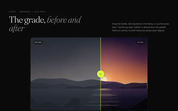
A 16:10 comparison frame with a warm graded 'after' and a flat, desaturated 'before' derived from it on canvas; a lime Draggable handle clips the top layer, with keyboard, click-to-jump and an intro sweep to 60% and back.
- gsap
- canvas2d
 light
light Bento Grid with Flip Filtering
A bento-style grid of nine mixed-span tiles is filtered by a pill bar; GSAP Flip records the layout, toggles visibility, then glides every surviving tile into its new slot while leaving tiles shrink away.
- gsap
- flip
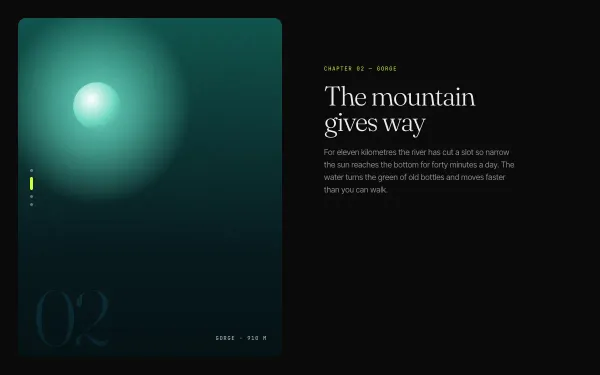 light
light Sticky Split-Screen Storytelling
A two-column feature: the left visual column is sticky for the whole section while four text chapters scroll by on the right; each chapter crossing the centre swaps the visual with a directional crossfade and lights its progress dot.
- gsap
- scrolltrigger
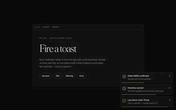 light
light Toast Notification Micro-interaction
Four triggers spawn stacked toasts bottom-right: each slides in from x 40 with a back.out overshoot while earlier toasts shift up via Flip, an icon draws itself with DrawSVG, a hairline counts down 4s (pausing on hover) and dismissal re-flows the stack.
- gsap
- flip
- svg