3D Tilt Card with Glare
Three product cards lean toward the pointer up to ±12° with quickTo-smoothed rotation, layered translateZ depth on image, title and badge, a specular glare that follows the pointer and a soft shadow that slides the opposite way; they relax flat on leave.
- Hover
- gsap
- intermediate
- light perf
- mobile: degraded
- reduced-motion ✓
AI prompt
Recreate this effect with any AI tool
Paste into Claude, Cursor, v0, Lovable or Bolt. 1486 words of exact values — rewritten live as you tune the Playground.
### EFFECT: 3D Tilt Card with Glare
**What it does (visual):** Three product cards sit in a row on a dark page under a small serif headline. Each card is a rounded rectangle with a gradient product image, a pill badge in the top-left corner of the image, a serif product name, a one-line description and a row of outlined mono chips. When the pointer enters a card, the card begins to lean toward the pointer in 3D: pointing at the top edge tips the top toward you, pointing at the right edge tips the right side toward you, up to ±12° on each axis. The motion is smoothed (every pointer move eases to its new angle over 0.5s with a decelerating curve) so the card feels like it has mass. Inside the card the layers sit at different depths: the image floats 30px in front of the card face, the title 50px, the badge 60px, so as the card turns they slide against each other with a subtle parallax. A soft white highlight (a large, very soft radial spot) appears at the pointer position at 0.35 opacity and follows it, like a light source reflecting off glossy stock. Underneath, a blurred dark shadow slides up to 24px in the *opposite* direction to the raised corner — tilt the right side toward you and the shadow drifts left — which sells the lift. When the pointer leaves, the card eases back to flat over 0.8s with the `power3.out` curve, the glare fades out over 0.5s and the shadow returns to centre. On touch devices nothing tracks; instead each card slowly rocks ±3°/±4° in a 3.2s sine loop, offset by 0.6s per card, with the glare drifting across.

**Tech stack:**
- GSAP 3.13+ core (`quickTo`, `matchMedia`). No plugins.
- CDN: `<script src="https://cdn.jsdelivr.net/npm/gsap@3/dist/gsap.min.js"></script>`
- npm: `npm i gsap` → `import gsap from "gsap";`
- Fonts: variable serif for the title and product names (demo uses Fraunces 300), a sans for descriptions, a mono for badge/chips.

**HTML structure:**
```html
<section class="tcg">
  <header class="tcg__head">
    <p class="tcg__eyebrow">Hover · 3D tilt + glare</p>
    <h1 class="tcg__title">Objects that lean toward you.</h1>
  </header>
  <div class="tcg__grid">
    <article class="tcg__item">
      <div class="tcg__shadow" aria-hidden="true"></div>
      <div class="tcg__card" tabindex="0" aria-label="Nocturne — closed-back studio headphones">
        <div class="tcg__media"><div class="tcg__art tcg__art--1"></div></div>
        <span class="tcg__badge">New</span>
        <div class="tcg__body">
          <h2 class="tcg__name">Nocturne</h2>
          <p class="tcg__desc">Closed-back studio headphones, tuned flat.</p>
          <ul class="tcg__chips"><li>Audio</li><li>2026</li><li>€389</li></ul>
        </div>
        <div class="tcg__glare" aria-hidden="true"><div class="tcg__glare-spot"></div></div>
      </div>
    </article>
    <!-- two more .tcg__item (Meridian, Lumen) -->
  </div>
</section>
```

**CSS requirements:**
- `.tcg__grid`: `display: grid; grid-template-columns: repeat(3, minmax(0, 1fr)); gap: clamp(1rem, 2.6vw, 2rem); max-width: 1100px; margin: 0 auto;`
- `.tcg__item`: `position: relative; perspective: 1000px;` (perspective on the wrapper, one per card).
- `.tcg__card`: `position: relative; display: flex; flex-direction: column; gap: 1rem; padding: 1.1rem; border-radius: 20px; background: var(--surface, #121212); border: 1px solid var(--line, rgba(255,255,255,.08)); transform-style: preserve-3d; will-change: transform;` — **never** `overflow: hidden` here (it would flatten the 3D context).
- `.tcg__media`: `position: relative; aspect-ratio: 4/3; border-radius: 12px; overflow: hidden; transform: translateZ(30px);` — `.tcg__art` inside is `position: absolute; inset: -6%; width: 112%; height: 112%;` (oversized so the depth parallax never shows an edge) painted with two radial gradients over a 160° linear gradient (e.g. `#5a3fd1` + `#d14f8f` over `#15123a → #0a0a12`), plus an `::after` grain layer (inline SVG `feTurbulence` data-URI, `mix-blend-mode: overlay; opacity: .55`).
- `.tcg__badge`: `position: absolute; top: 1.75rem; left: 1.75rem; padding: .35em .8em; border-radius: 999px; background: rgba(10,10,10,.72); color: #fff; font: 10px mono uppercase; letter-spacing: .12em; transform: translateZ(60px);` — `.tcg__badge--accent { background: var(--accent, #d4ff3a); color: #0A0A0A; }` for the highlighted card.
- `.tcg__body`: `transform: translateZ(20px);` and `.tcg__name`: serif 300, `font-size: clamp(1.6rem, 2.4vw, 2.1rem); letter-spacing: -0.03em; transform: translateZ(30px);` (total 50px in front of the face). Chips: `font-size: 10px; border: 1px solid var(--line); border-radius: 999px; padding: .4em .7em; color: var(--muted);`
- `.tcg__glare`: `position: absolute; inset: 0; border-radius: inherit; overflow: hidden; pointer-events: none; transform: translateZ(70px);`
- `.tcg__glare-spot`: `position: absolute; left: -50%; top: -50%; width: 200%; height: 200%; background: radial-gradient(circle at center, rgba(255,255,255,.95) 0%, rgba(255,255,255,.35) 18%, rgba(255,255,255,0) 50%); mix-blend-mode: soft-light; opacity: 0; will-change: transform, opacity;` — moving it by `xPercent/yPercent` is pure transform.
- `.tcg__shadow`: `position: absolute; inset: 10% 6% -4%; border-radius: 28px; background: rgba(0,0,0,.7); filter: blur(26px); opacity: .55; transform: translateY(14px); will-change: transform;` — it sits behind the card in DOM order.
- Light theme (`[data-theme="light"]`): shadow `rgba(20,20,20,.35)`, glare `mix-blend-mode: overlay`.

**Animation spec (exact values):**
1. Per card, create smoothers: `const q = (t, p) => gsap.quickTo(t, p, { duration: 0.5, ease: 'power2.out' })` → `rotX = q(card, 'rotationX')`, `rotY = q(card, 'rotationY')`, `spotX = q(spot, 'xPercent')`, `spotY = q(spot, 'yPercent')`, `shX = q(shadow, 'x')`, `shY = q(shadow, 'y')`.
2. `pointerenter`: kill any running leave timeline; cache `bounds = card.getBoundingClientRect()`; re-seed every quickTo with the live value so it does not jump: `rotX(gsap.getProperty(card, 'rotationX'), gsap.getProperty(card, 'rotationX'))` (same for rotY, shX, shY); `gsap.to(spot, { opacity: 0.35, duration: 0.4, ease: 'power2.out', overwrite: true })`.
3. `pointermove`: `px = clamp((clientX - bounds.left) / bounds.width, 0, 1)`, `py` likewise. Then
   - `rotX((py - 0.5) * 2 * 12)` → range −12° … +12° (top edge toward the viewer when `py = 0`).
   - `rotY((0.5 - px) * 2 * 12)` → right edge toward the viewer when `px = 1`.
   - `spotX((px - 0.5) * 50)`, `spotY((py - 0.5) * 50)` — the spot is 200% of the card, so 50% of its own width equals one card width; its centre lands exactly under the pointer.
   - `shX(-(px - 0.5) * 2 * 24)`, `shY(14 - (py - 0.5) * 2 * 24)` — shadow slides up to 24px against the tilt (14px is its resting vertical offset).
4. `pointerleave`: pause the four position quickTo tweens (`fn.tween.pause()`), then one timeline:
   - `.to(card, { rotationX: 0, rotationY: 0, duration: 0.8, ease: 'power3.out' }, 0)`
   - `.to(shadow, { x: 0, y: 14, duration: 0.8, ease: 'power3.out' }, 0)`
   - `.to(spot, { opacity: 0, duration: 0.5, ease: 'power2.out' }, 0)`
5. Entrance (decorative): `gsap.from('.tcg__eyebrow, .tcg__title', { y: 24, opacity: 0, duration: 1, ease: 'power3.out', stagger: 0.08 })` and `gsap.from('.tcg__item', { y: 40, opacity: 0, duration: 1.1, ease: 'power3.out', stagger: 0.08, delay: 0.15 })`.
6. Depth is static CSS (`translateZ` 20/30/50/60/70px); the parallax comes for free from the card's rotation under `perspective: 1000px`.

**Interaction:** Hover anywhere on a card → tilt follows with 0.5s `power2.out` smoothing; glare fades in 0.4s to 0.35. Leave → 0.8s `power3.out` settle to flat, glare out in 0.5s. Keyboard focus (`tabindex="0"`) runs the enter handler (glare on, lift ready) and blur runs the leave handler; `:focus-visible` shows a 2px accent ring (`box-shadow: 0 0 0 2px var(--bg), 0 0 0 4px var(--accent, #d4ff3a)`).

**Responsive behavior:** `gsap.matchMedia()` with two branches: `(hover: hover) and (pointer: fine)` → the live tilt above. `(hover: none), (pointer: coarse)` → no pointer tracking; each card gets `gsap.timeline({ repeat: -1, yoyo: true, delay: i * 0.6, defaults: { duration: 3.2, ease: 'sine.inOut' } })` with `.fromTo(card, { rotationX: 3, rotationY: -4 }, { rotationX: -3, rotationY: 4 }, 0)` (both scaled by `12 / 12`), `.fromTo(spot, { xPercent: -14, yPercent: -10, opacity: .18 }, { xPercent: 14, yPercent: 10, opacity: .26 }, 0)` and `.fromTo(shadow, { x: 8, y: 20 }, { x: -8, y: 8 }, 0)`. Under 768px the grid becomes a single column (`max-width: 420px`).

**Accessibility:** `prefers-reduced-motion: reduce` → no rotation at all (the move handler returns after computing the pointer position), no idle float, no entrance tween; the glare rests at a static `opacity: .18` so the cards still read as glossy. Cards are focusable with a visible ring and carry an `aria-label` summarising the product; the shadow and glare are `aria-hidden`.

**Performance rules:** Only `transform` and `opacity` are animated (`rotationX/Y`, `xPercent/yPercent`, `x/y`). `quickTo` reuses one tween per property, so pointer moves allocate nothing. `will-change: transform` is limited to the card, the shadow and the glare spot. `getBoundingClientRect` is read once on enter, not per move. Everything is created inside `gsap.context()` and reverted on unmount; the `matchMedia` branches clean themselves up on breakpoint change.

**Customization knobs:**
- `MAX_TILT` (12) — degrees per axis; 8 is restrained, 18 is playful.
- `SHADOW_SHIFT` (24) — how far the shadow counter-slides.
- `GLARE_OPACITY` (0.35) — highlight strength; the gradient stops in `.tcg__glare-spot` control its softness.
- `translateZ` values (20/30/50/60/70px) — depth separation.
- quickTo `duration` (0.5) — follow lag; the leave `duration` (0.8) and ease (`power3.out`) — settle time and character (`elastic.out(1, 0.5)` wobbles back).
- Accent (`#d4ff3a`) — the highlighted badge and focus ring.

**Acceptance criteria:**
- [ ] Cards are flat at rest; the pointer side tips toward the viewer, never beyond ±12°.
- [ ] Image, title and badge visibly parallax against each other while tilting.
- [ ] The highlight is centred under the pointer and fades 0→0.35; the shadow moves opposite to the raised corner.
- [ ] Leaving returns to flat in ~0.8s with no snap; re-entering mid-return does not jump.
- [ ] Touch devices show the slow idle float; reduced-motion users see static cards with a faint glare.
- [ ] No layout shift, no console errors.Add this effect to my existing site/section: **3D Tilt Card with Glare**. Wrap each of my existing cards in a `.tcg__item` with `perspective: 1000px`, give the card `transform-style: preserve-3d` (no `overflow: hidden` on it), add a `.tcg__glare > .tcg__glare-spot` overlay (200% radial white spot, `mix-blend-mode: soft-light`, `opacity: 0`, `translateZ(70px)`) and a blurred `.tcg__shadow` sibling behind it; push my image/title/badge forward with `translateZ` 30/50/60px. With GSAP, create `quickTo` smoothers (`duration: 0.5, ease: 'power2.out'`) for the card's `rotationX`/`rotationY`, the spot's `xPercent`/`yPercent` and the shadow's `x`/`y`; on `pointermove` set `rotationX = (py - .5) * 2 * 12`, `rotationY = (.5 - px) * 2 * 12`, spot `= (p - .5) * 50`, shadow `= -(p - .5) * 2 * 24`; fade the spot to `0.35` on enter and back on leave; on leave pause the smoothers and tween back to flat with `duration: 0.8, ease: 'power3.out'`, re-seeding the smoothers with live values on the next enter. Use `gsap.matchMedia()` so coarse pointers get a slow `sine.inOut` idle float instead, respect `prefers-reduced-motion` (no rotation), scope everything in `gsap.context()` and revert on unmount. Keep my markup, colours and fonts.### EFFECT (React / Next.js): 3D Tilt Card with Glare
Build **3D Tilt Card with Glare** as a self-contained React component for a Next.js App Router project (also valid in Vite + React). Follow the specification below exactly; the vanilla reference implementation at the end is the source of truth for values and structure.
**Setup**
- `npm i gsap @gsap/react`
- File: `components/3DTiltCardWithGlare.tsx`, first line `"use client";` (GSAP touches the DOM).
- Imports:
```tsx
"use client";
import { useRef } from "react";
import gsap from "gsap";
import { useGSAP } from "@gsap/react";
gsap.registerPlugin(useGSAP);
export default function 3DTiltCardWithGlare() {
const scope = useRef<HTMLDivElement>(null);
useGSAP(() => {
// 1. query elements inside `scope.current` (never document-wide)
// 2. wait for document.fonts.ready before any SplitText
// 3. build the timeline / ScrollTriggers exactly as in the specification
// 4. return nothing — useGSAP reverts everything automatically on unmount
}, { scope });
return (
<div ref={scope} className="tcg">
{/* markup from the HTML structure section, class → className */}
</div>
);
}
```
**React-specific rules**
- Everything GSAP-related lives inside `useGSAP(() => {...}, { scope })`; it handles cleanup (`ctx.revert()`) on unmount and in React Strict Mode double-invocation.
- Use refs or `gsap.utils.selector(scope)` instead of `document.querySelector`.
- Event listeners added inside useGSAP must use `contextSafe` (`const { contextSafe } = useGSAP({ scope })`) so their tweens are reverted too.
- ScrollTrigger: call `ScrollTrigger.refresh()` after images/fonts load; if the page uses Lenis, sync it once at the app root (`lenis.on('scroll', ScrollTrigger.update)`).
- Styles: copy the CSS requirements into a CSS Module (`3DTiltCardWithGlare.module.css`) or Tailwind; keep the class names so the spec maps 1:1.
- Respect `prefers-reduced-motion` with `gsap.matchMedia()` as in the spec.
---
### EFFECT: 3D Tilt Card with Glare
**What it does (visual):** Three product cards sit in a row on a dark page under a small serif headline. Each card is a rounded rectangle with a gradient product image, a pill badge in the top-left corner of the image, a serif product name, a one-line description and a row of outlined mono chips. When the pointer enters a card, the card begins to lean toward the pointer in 3D: pointing at the top edge tips the top toward you, pointing at the right edge tips the right side toward you, up to ±12° on each axis. The motion is smoothed (every pointer move eases to its new angle over 0.5s with a decelerating curve) so the card feels like it has mass. Inside the card the layers sit at different depths: the image floats 30px in front of the card face, the title 50px, the badge 60px, so as the card turns they slide against each other with a subtle parallax. A soft white highlight (a large, very soft radial spot) appears at the pointer position at 0.35 opacity and follows it, like a light source reflecting off glossy stock. Underneath, a blurred dark shadow slides up to 24px in the *opposite* direction to the raised corner — tilt the right side toward you and the shadow drifts left — which sells the lift. When the pointer leaves, the card eases back to flat over 0.8s with the `power3.out` curve, the glare fades out over 0.5s and the shadow returns to centre. On touch devices nothing tracks; instead each card slowly rocks ±3°/±4° in a 3.2s sine loop, offset by 0.6s per card, with the glare drifting across.
**Tech stack:**
- GSAP 3.13+ core (`quickTo`, `matchMedia`). No plugins.
- CDN: `<script src="https://cdn.jsdelivr.net/npm/gsap@3/dist/gsap.min.js"></script>`
- npm: `npm i gsap` → `import gsap from "gsap";`
- Fonts: variable serif for the title and product names (demo uses Fraunces 300), a sans for descriptions, a mono for badge/chips.
**HTML structure:**
```html
<section class="tcg">
<header class="tcg__head">
<p class="tcg__eyebrow">Hover · 3D tilt + glare</p>
<h1 class="tcg__title">Objects that lean toward you.</h1>
</header>
<div class="tcg__grid">
<article class="tcg__item">
<div class="tcg__shadow" aria-hidden="true"></div>
<div class="tcg__card" tabindex="0" aria-label="Nocturne — closed-back studio headphones">
<div class="tcg__media"><div class="tcg__art tcg__art--1"></div></div>
<span class="tcg__badge">New</span>
<div class="tcg__body">
<h2 class="tcg__name">Nocturne</h2>
<p class="tcg__desc">Closed-back studio headphones, tuned flat.</p>
<ul class="tcg__chips"><li>Audio</li><li>2026</li><li>€389</li></ul>
</div>
<div class="tcg__glare" aria-hidden="true"><div class="tcg__glare-spot"></div></div>
</div>
</article>
<!-- two more .tcg__item (Meridian, Lumen) -->
</div>
</section>
```
**CSS requirements:**
- `.tcg__grid`: `display: grid; grid-template-columns: repeat(3, minmax(0, 1fr)); gap: clamp(1rem, 2.6vw, 2rem); max-width: 1100px; margin: 0 auto;`
- `.tcg__item`: `position: relative; perspective: 1000px;` (perspective on the wrapper, one per card).
- `.tcg__card`: `position: relative; display: flex; flex-direction: column; gap: 1rem; padding: 1.1rem; border-radius: 20px; background: var(--surface, #121212); border: 1px solid var(--line, rgba(255,255,255,.08)); transform-style: preserve-3d; will-change: transform;` — **never** `overflow: hidden` here (it would flatten the 3D context).
- `.tcg__media`: `position: relative; aspect-ratio: 4/3; border-radius: 12px; overflow: hidden; transform: translateZ(30px);` — `.tcg__art` inside is `position: absolute; inset: -6%; width: 112%; height: 112%;` (oversized so the depth parallax never shows an edge) painted with two radial gradients over a 160° linear gradient (e.g. `#5a3fd1` + `#d14f8f` over `#15123a → #0a0a12`), plus an `::after` grain layer (inline SVG `feTurbulence` data-URI, `mix-blend-mode: overlay; opacity: .55`).
- `.tcg__badge`: `position: absolute; top: 1.75rem; left: 1.75rem; padding: .35em .8em; border-radius: 999px; background: rgba(10,10,10,.72); color: #fff; font: 10px mono uppercase; letter-spacing: .12em; transform: translateZ(60px);` — `.tcg__badge--accent { background: var(--accent, #d4ff3a); color: #0A0A0A; }` for the highlighted card.
- `.tcg__body`: `transform: translateZ(20px);` and `.tcg__name`: serif 300, `font-size: clamp(1.6rem, 2.4vw, 2.1rem); letter-spacing: -0.03em; transform: translateZ(30px);` (total 50px in front of the face). Chips: `font-size: 10px; border: 1px solid var(--line); border-radius: 999px; padding: .4em .7em; color: var(--muted);`
- `.tcg__glare`: `position: absolute; inset: 0; border-radius: inherit; overflow: hidden; pointer-events: none; transform: translateZ(70px);`
- `.tcg__glare-spot`: `position: absolute; left: -50%; top: -50%; width: 200%; height: 200%; background: radial-gradient(circle at center, rgba(255,255,255,.95) 0%, rgba(255,255,255,.35) 18%, rgba(255,255,255,0) 50%); mix-blend-mode: soft-light; opacity: 0; will-change: transform, opacity;` — moving it by `xPercent/yPercent` is pure transform.
- `.tcg__shadow`: `position: absolute; inset: 10% 6% -4%; border-radius: 28px; background: rgba(0,0,0,.7); filter: blur(26px); opacity: .55; transform: translateY(14px); will-change: transform;` — it sits behind the card in DOM order.
- Light theme (`[data-theme="light"]`): shadow `rgba(20,20,20,.35)`, glare `mix-blend-mode: overlay`.
**Animation spec (exact values):**
1. Per card, create smoothers: `const q = (t, p) => gsap.quickTo(t, p, { duration: 0.5, ease: 'power2.out' })` → `rotX = q(card, 'rotationX')`, `rotY = q(card, 'rotationY')`, `spotX = q(spot, 'xPercent')`, `spotY = q(spot, 'yPercent')`, `shX = q(shadow, 'x')`, `shY = q(shadow, 'y')`.
2. `pointerenter`: kill any running leave timeline; cache `bounds = card.getBoundingClientRect()`; re-seed every quickTo with the live value so it does not jump: `rotX(gsap.getProperty(card, 'rotationX'), gsap.getProperty(card, 'rotationX'))` (same for rotY, shX, shY); `gsap.to(spot, { opacity: 0.35, duration: 0.4, ease: 'power2.out', overwrite: true })`.
3. `pointermove`: `px = clamp((clientX - bounds.left) / bounds.width, 0, 1)`, `py` likewise. Then
- `rotX((py - 0.5) * 2 * 12)` → range −12° … +12° (top edge toward the viewer when `py = 0`).
- `rotY((0.5 - px) * 2 * 12)` → right edge toward the viewer when `px = 1`.
- `spotX((px - 0.5) * 50)`, `spotY((py - 0.5) * 50)` — the spot is 200% of the card, so 50% of its own width equals one card width; its centre lands exactly under the pointer.
- `shX(-(px - 0.5) * 2 * 24)`, `shY(14 - (py - 0.5) * 2 * 24)` — shadow slides up to 24px against the tilt (14px is its resting vertical offset).
4. `pointerleave`: pause the four position quickTo tweens (`fn.tween.pause()`), then one timeline:
- `.to(card, { rotationX: 0, rotationY: 0, duration: 0.8, ease: 'power3.out' }, 0)`
- `.to(shadow, { x: 0, y: 14, duration: 0.8, ease: 'power3.out' }, 0)`
- `.to(spot, { opacity: 0, duration: 0.5, ease: 'power2.out' }, 0)`
5. Entrance (decorative): `gsap.from('.tcg__eyebrow, .tcg__title', { y: 24, opacity: 0, duration: 1, ease: 'power3.out', stagger: 0.08 })` and `gsap.from('.tcg__item', { y: 40, opacity: 0, duration: 1.1, ease: 'power3.out', stagger: 0.08, delay: 0.15 })`.
6. Depth is static CSS (`translateZ` 20/30/50/60/70px); the parallax comes for free from the card's rotation under `perspective: 1000px`.
**Interaction:** Hover anywhere on a card → tilt follows with 0.5s `power2.out` smoothing; glare fades in 0.4s to 0.35. Leave → 0.8s `power3.out` settle to flat, glare out in 0.5s. Keyboard focus (`tabindex="0"`) runs the enter handler (glare on, lift ready) and blur runs the leave handler; `:focus-visible` shows a 2px accent ring (`box-shadow: 0 0 0 2px var(--bg), 0 0 0 4px var(--accent, #d4ff3a)`).
**Responsive behavior:** `gsap.matchMedia()` with two branches: `(hover: hover) and (pointer: fine)` → the live tilt above. `(hover: none), (pointer: coarse)` → no pointer tracking; each card gets `gsap.timeline({ repeat: -1, yoyo: true, delay: i * 0.6, defaults: { duration: 3.2, ease: 'sine.inOut' } })` with `.fromTo(card, { rotationX: 3, rotationY: -4 }, { rotationX: -3, rotationY: 4 }, 0)` (both scaled by `12 / 12`), `.fromTo(spot, { xPercent: -14, yPercent: -10, opacity: .18 }, { xPercent: 14, yPercent: 10, opacity: .26 }, 0)` and `.fromTo(shadow, { x: 8, y: 20 }, { x: -8, y: 8 }, 0)`. Under 768px the grid becomes a single column (`max-width: 420px`).
**Accessibility:** `prefers-reduced-motion: reduce` → no rotation at all (the move handler returns after computing the pointer position), no idle float, no entrance tween; the glare rests at a static `opacity: .18` so the cards still read as glossy. Cards are focusable with a visible ring and carry an `aria-label` summarising the product; the shadow and glare are `aria-hidden`.
**Performance rules:** Only `transform` and `opacity` are animated (`rotationX/Y`, `xPercent/yPercent`, `x/y`). `quickTo` reuses one tween per property, so pointer moves allocate nothing. `will-change: transform` is limited to the card, the shadow and the glare spot. `getBoundingClientRect` is read once on enter, not per move. Everything is created inside `gsap.context()` and reverted on unmount; the `matchMedia` branches clean themselves up on breakpoint change.
**Customization knobs:**
- `MAX_TILT` (12) — degrees per axis; 8 is restrained, 18 is playful.
- `SHADOW_SHIFT` (24) — how far the shadow counter-slides.
- `GLARE_OPACITY` (0.35) — highlight strength; the gradient stops in `.tcg__glare-spot` control its softness.
- `translateZ` values (20/30/50/60/70px) — depth separation.
- quickTo `duration` (0.5) — follow lag; the leave `duration` (0.8) and ease (`power3.out`) — settle time and character (`elastic.out(1, 0.5)` wobbles back).
- Accent (`#d4ff3a`) — the highlighted badge and focus ring.
**Acceptance criteria:**
- [ ] Cards are flat at rest; the pointer side tips toward the viewer, never beyond ±12°.
- [ ] Image, title and badge visibly parallax against each other while tilting.
- [ ] The highlight is centred under the pointer and fades 0→0.35; the shadow moves opposite to the raised corner.
- [ ] Leaving returns to flat in ~0.8s with no snap; re-entering mid-return does not jump.
- [ ] Touch devices show the slow idle float; reduced-motion users see static cards with a faint glare.
- [ ] No layout shift, no console errors.
---
**Reference implementation (vanilla, converts 1:1 — same class names, same values):**
```html
<section class="tcg">
<header class="tcg__head">
<p class="tcg__eyebrow">Hover · 3D tilt + glare</p>
<h1 class="tcg__title">Objects that lean toward you.</h1>
</header>
<div class="tcg__grid">
<article class="tcg__item">
<div class="tcg__shadow" aria-hidden="true"></div>
<div class="tcg__card" tabindex="0" aria-label="Nocturne — closed-back studio headphones">
<div class="tcg__media"><div class="tcg__art tcg__art--1"></div></div>
<span class="tcg__badge">New</span>
<div class="tcg__body">
<h2 class="tcg__name">Nocturne</h2>
<p class="tcg__desc">Closed-back studio headphones, tuned flat.</p>
<ul class="tcg__chips" role="list"><li>Audio</li><li>2026</li><li>€389</li></ul>
</div>
<div class="tcg__glare" aria-hidden="true"><div class="tcg__glare-spot"></div></div>
</div>
</article>
<article class="tcg__item">
<div class="tcg__shadow" aria-hidden="true"></div>
<div class="tcg__card" tabindex="0" aria-label="Meridian — solar field watch">
<div class="tcg__media"><div class="tcg__art tcg__art--2"></div></div>
<span class="tcg__badge tcg__badge--accent">Limited</span>
<div class="tcg__body">
<h2 class="tcg__name">Meridian</h2>
<p class="tcg__desc">Solar field watch with a sapphire dome.</p>
<ul class="tcg__chips" role="list"><li>Wear</li><li>2026</li><li>€640</li></ul>
</div>
<div class="tcg__glare" aria-hidden="true"><div class="tcg__glare-spot"></div></div>
</div>
</article>
<article class="tcg__item">
<div class="tcg__shadow" aria-hidden="true"></div>
<div class="tcg__card" tabindex="0" aria-label="Lumen — portable reading lamp">
<div class="tcg__media"><div class="tcg__art tcg__art--3"></div></div>
<span class="tcg__badge">Restock</span>
<div class="tcg__body">
<h2 class="tcg__name">Lumen</h2>
<p class="tcg__desc">Portable reading lamp, 2700K, forty hours.</p>
<ul class="tcg__chips" role="list"><li>Light</li><li>2025</li><li>€180</li></ul>
</div>
<div class="tcg__glare" aria-hidden="true"><div class="tcg__glare-spot"></div></div>
</div>
</article>
</div>
<p class="tcg__hint">Move across a card · on touch the cards drift on their own</p>
</section>
```
```css
.tcg { min-height: 100vh; display: grid; grid-template-rows: auto 1fr auto; gap: clamp(1.5rem, 3vw, 2.5rem); padding: clamp(1.5rem, 4vw, 3.5rem) clamp(1.25rem, 5vw, 3.75rem); }
.tcg__eyebrow { font-family: var(--font-mono); font-size: 11px; text-transform: uppercase; letter-spacing: .12em; color: var(--muted); margin-bottom: .9rem; }
.tcg__title { font-family: var(--font-display); font-weight: 300; font-variation-settings: 'opsz' 144, 'SOFT' 30; font-size: clamp(2.2rem, 4.6vw, 4.2rem); line-height: .95; letter-spacing: -0.04em; }
.tcg__hint { font-family: var(--font-mono); font-size: 11px; text-transform: uppercase; letter-spacing: .1em; color: var(--muted); text-align: center; }
.tcg__grid { display: grid; grid-template-columns: repeat(3, minmax(0, 1fr)); gap: clamp(1rem, 2.6vw, 2rem); align-content: center; max-width: 1100px; width: 100%; margin: 0 auto; }
.tcg__item { position: relative; perspective: 1000px; }
/* the card itself must stay preserve-3d: NO overflow hidden here */
.tcg__card {
position: relative; display: flex; flex-direction: column; gap: 1rem; padding: 1.1rem; border-radius: 20px;
background: var(--surface); border: 1px solid var(--line); color: var(--text);
transform-style: preserve-3d; will-change: transform; outline: none;
}
.tcg__card:focus-visible { box-shadow: 0 0 0 2px var(--bg), 0 0 0 4px var(--knob-accent, var(--accent)); }
.tcg__media { position: relative; aspect-ratio: 4 / 3; border-radius: 12px; overflow: hidden; transform: translateZ(30px); background: #0a0a0a; }
.tcg__art { position: absolute; inset: -6%; width: 112%; height: 112%; }
.tcg__art::after { content: ''; position: absolute; inset: 0; background-image: url("data:image/svg+xml,%3Csvg xmlns='http://www.w3.org/2000/svg' width='160' height='160'%3E%3Cfilter id='n'%3E%3CfeTurbulence type='fractalNoise' baseFrequency='.9' numOctaves='2' stitchTiles='stitch'/%3E%3CfeColorMatrix values='0 0 0 0 1 0 0 0 0 1 0 0 0 0 1 0 0 0 .18 0'/%3E%3C/filter%3E%3Crect width='160' height='160' filter='url(%23n)'/%3E%3C/svg%3E"); background-size: 160px; mix-blend-mode: overlay; opacity: .55; }
.tcg__art--1 { background: radial-gradient(90% 70% at 72% 28%, #5a3fd1 0%, transparent 60%), radial-gradient(70% 60% at 18% 80%, #d14f8f 0%, transparent 60%), linear-gradient(160deg, #15123a 0%, #0a0a12 100%); }
.tcg__art--2 { background: radial-gradient(80% 70% at 30% 25%, #c9a24a 0%, transparent 58%), radial-gradient(70% 70% at 80% 85%, #2c6b5a 0%, transparent 60%), linear-gradient(160deg, #1f1a10 0%, #0b0b0a 100%); }
.tcg__art--3 { background: radial-gradient(80% 60% at 65% 30%, #ff9f5a 0%, transparent 58%), radial-gradient(60% 60% at 15% 70%, #2b6cb0 0%, transparent 60%), linear-gradient(160deg, #221410 0%, #0a0a0a 100%); }
.tcg__badge { position: absolute; top: 1.75rem; left: 1.75rem; padding: .35em .8em; border-radius: 999px; background: rgba(10,10,10,.72); color: #fff; font-family: var(--font-mono); font-size: 10px; text-transform: uppercase; letter-spacing: .12em; backdrop-filter: blur(6px); transform: translateZ(60px); }
.tcg__badge--accent { background: var(--knob-accent, var(--accent)); color: #0A0A0A; }
.tcg__body { display: grid; gap: .5rem; padding: .25rem .25rem .4rem; transform: translateZ(20px); }
.tcg__name { font-family: var(--font-display); font-weight: 300; font-size: clamp(1.6rem, 2.4vw, 2.1rem); letter-spacing: -0.03em; line-height: 1; transform: translateZ(30px); }
.tcg__desc { color: var(--muted); font-size: .9rem; line-height: 1.45; }
.tcg__chips { list-style: none; display: flex; flex-wrap: wrap; gap: .4rem; margin-top: .35rem; }
.tcg__chips li { font-family: var(--font-mono); font-size: 10px; text-transform: uppercase; letter-spacing: .1em; padding: .4em .7em; border: 1px solid var(--line); border-radius: 999px; color: var(--muted); }
.tcg__glare { position: absolute; inset: 0; border-radius: inherit; overflow: hidden; pointer-events: none; transform: translateZ(70px); }
.tcg__glare-spot { position: absolute; left: -50%; top: -50%; width: 200%; height: 200%; background: radial-gradient(circle at center, rgba(255,255,255,.95) 0%, rgba(255,255,255,.35) 18%, rgba(255,255,255,0) 50%); mix-blend-mode: soft-light; opacity: 0; will-change: transform, opacity; }
.tcg__shadow { position: absolute; inset: 10% 6% -4%; border-radius: 28px; background: rgba(0,0,0,.7); filter: blur(26px); opacity: .55; transform: translateY(14px); will-change: transform; }
:root[data-theme="light"] .tcg__shadow { background: rgba(20,20,20,.35); }
:root[data-theme="light"] .tcg__glare-spot { mix-blend-mode: overlay; }
@media (max-width: 767px) {
.tcg__grid { grid-template-columns: 1fr; max-width: 420px; }
}
@media (prefers-reduced-motion: reduce) {
.tcg__card, .tcg__shadow, .tcg__glare-spot { will-change: auto; }
.tcg__glare-spot { opacity: .18; }
}
```
```js
// 3D Tilt Card with Glare — cards lean toward the pointer with layered depth, a tracking highlight and a counter-shifting shadow.
// Defaults — overridable from the MOTION/LAB Playground via MotionLab.knob()
const DEFAULTS = { maxTilt: 12, follow: 0.5, settleEase: 'power3.out', shadowShift: 24, glare: 0.35, accent: '#d4ff3a' };
const K = (id) => window.MotionLab?.knob(id, DEFAULTS[id]) ?? DEFAULTS[id];
const reduced = matchMedia('(prefers-reduced-motion: reduce)').matches;
const section = document.querySelector('.tcg');
const items = gsap.utils.toArray('.tcg__item');
// Entrance lives in its own context so a Playground rebuild never replays it.
const introCtx = gsap.context(() => {
if (reduced) return;
gsap.from('.tcg__eyebrow, .tcg__title', { y: 24, opacity: 0, duration: 1, ease: 'power3.out', stagger: 0.08 });
gsap.from(items, { y: 40, opacity: 0, duration: 1.1, ease: 'power3.out', stagger: 0.08, delay: 0.15 });
});
let ctx;
const cleanups = [];
function build() {
cleanups.splice(0).forEach((fn) => fn());
ctx?.revert();
section.style.setProperty('--knob-accent', K('accent'));
const MAX_TILT = K('maxTilt');
const FOLLOW = K('follow');
const SETTLE_EASE = K('settleEase');
const SHADOW_SHIFT = K('shadowShift');
const GLARE_OPACITY = K('glare');
ctx = gsap.context(() => {
const mm = gsap.matchMedia();
// Pointer devices: live tilt
mm.add('(hover: hover) and (pointer: fine)', () => {
items.forEach((item) => {
const card = item.querySelector('.tcg__card');
const spot = item.querySelector('.tcg__glare-spot');
const shadow = item.querySelector('.tcg__shadow');
const q = (target, prop) => gsap.quickTo(target, prop, { duration: reduced ? 0 : FOLLOW, ease: 'power2.out' });
const rotX = q(card, 'rotationX'), rotY = q(card, 'rotationY');
const spotX = q(spot, 'xPercent'), spotY = q(spot, 'yPercent');
const shX = q(shadow, 'x'), shY = q(shadow, 'y');
let leaveTween, bounds;
const onEnter = () => {
leaveTween?.kill();
bounds = card.getBoundingClientRect();
// quickTo interpolates from its own last value — hand it the live DOM value so there is no jump after the leave tween
rotX(gsap.getProperty(card, 'rotationX'), gsap.getProperty(card, 'rotationX'));
rotY(gsap.getProperty(card, 'rotationY'), gsap.getProperty(card, 'rotationY'));
shX(gsap.getProperty(shadow, 'x'), gsap.getProperty(shadow, 'x'));
shY(gsap.getProperty(shadow, 'y'), gsap.getProperty(shadow, 'y'));
if (!reduced) gsap.to(spot, { opacity: GLARE_OPACITY, duration: 0.4, ease: 'power2.out', overwrite: true });
};
const onMove = (e) => {
if (!bounds) bounds = card.getBoundingClientRect();
const px = gsap.utils.clamp(0, 1, (e.clientX - bounds.left) / bounds.width);
const py = gsap.utils.clamp(0, 1, (e.clientY - bounds.top) / bounds.height);
if (reduced) return; // reduced motion: glare only, no rotation
rotX((py - 0.5) * 2 * MAX_TILT); // pointer at the top → top edge comes toward the viewer
rotY((0.5 - px) * 2 * MAX_TILT); // pointer at the right → right edge comes toward the viewer
spotX((px - 0.5) * 50); // spot is 200% wide, so 50% of its width = one card width
spotY((py - 0.5) * 50);
shX(-(px - 0.5) * 2 * SHADOW_SHIFT); // shadow slides away from the raised side
shY(14 - (py - 0.5) * 2 * SHADOW_SHIFT);
};
const onLeave = () => {
bounds = null;
[rotX, rotY, shX, shY].forEach((fn) => fn.tween.pause());
leaveTween = gsap.timeline()
.to(card, { rotationX: 0, rotationY: 0, duration: 0.8, ease: SETTLE_EASE }, 0)
.to(shadow, { x: 0, y: 14, duration: 0.8, ease: SETTLE_EASE }, 0)
.to(spot, { opacity: 0, duration: 0.5, ease: 'power2.out' }, 0);
};
card.addEventListener('pointerenter', onEnter);
card.addEventListener('pointermove', onMove);
card.addEventListener('pointerleave', onLeave);
card.addEventListener('focus', onEnter);
card.addEventListener('blur', onLeave);
cleanups.push(() => {
card.removeEventListener('pointerenter', onEnter);
card.removeEventListener('pointermove', onMove);
card.removeEventListener('pointerleave', onLeave);
card.removeEventListener('focus', onEnter);
card.removeEventListener('blur', onLeave);
});
});
});
// Touch / coarse pointers: a gentle idle float so the depth still reads (amplitude follows the tilt knob)
mm.add('(hover: none), (pointer: coarse)', () => {
if (reduced) return;
const s = MAX_TILT / 12, g = GLARE_OPACITY / 0.35;
items.forEach((item, i) => {
const card = item.querySelector('.tcg__card');
const spot = item.querySelector('.tcg__glare-spot');
const shadow = item.querySelector('.tcg__shadow');
const tl = gsap.timeline({ repeat: -1, yoyo: true, delay: i * 0.6, defaults: { duration: 3.2, ease: 'sine.inOut' } });
tl.fromTo(card, { rotationX: 3 * s, rotationY: -4 * s }, { rotationX: -3 * s, rotationY: 4 * s }, 0)
.fromTo(spot, { xPercent: -14, yPercent: -10, opacity: 0.18 * g }, { xPercent: 14, yPercent: 10, opacity: 0.26 * g }, 0)
.fromTo(shadow, { x: 8, y: 20 }, { x: -8, y: 8 }, 0);
});
});
});
}
build();
// Playground: rebuild with the new values
window.addEventListener('ml:knobs', build);
window.MotionLab?.onCleanup(() => { cleanups.forEach((fn) => fn()); ctx?.revert(); introCtx.revert(); });
```
### EFFECT (single HTML file): 3D Tilt Card with Glare
Produce **one self-contained `index.html`** (inline `<style>` and `<script type="module">`, no build step) that implements **3D Tilt Card with Glare** exactly as specified below. Libraries load from jsDelivr:

```html
<!doctype html>
<html lang="en">
<head>
  <meta charset="utf-8">
  <meta name="viewport" content="width=device-width, initial-scale=1">
  <title>3D Tilt Card with Glare</title>
  <link href="https://fonts.googleapis.com/css2?family=Fraunces:ital,opsz,wght@0,9..144,300..600;1,9..144,300..600&family=Inter+Tight:wght@300..700&family=JetBrains+Mono:wght@400;500&display=swap" rel="stylesheet">
  <style>
    :root{--bg:#0a0a0a;--surface:#121212;--line:rgba(255,255,255,.08);--text:#ededed;--muted:#8a8a8a;--accent:#d4ff3a;--font-display:"Fraunces",Georgia,serif;--font-sans:"Inter Tight",system-ui,sans-serif;--font-mono:"JetBrains Mono",ui-monospace,monospace}
    *,*::before,*::after{box-sizing:border-box;margin:0;padding:0}
    body{background:var(--bg);color:var(--text);font-family:var(--font-sans);-webkit-font-smoothing:antialiased;overflow-x:hidden}
    /* + the CSS requirements below */
  </style>
  <script src="https://cdn.jsdelivr.net/npm/gsap@3/dist/gsap.min.js"></script>
</head>
<body>
  <!-- markup from the HTML structure section -->
  <script type="module">
    // the JS from the animation spec (window.MotionLab is optional — keep the ?. guards or remove them)
  </script>
</body>
</html>
```

The file must open directly from a local server (`npx serve .`) with zero console errors, work at 375px and 1440px, and honour `prefers-reduced-motion`.

---

### EFFECT: 3D Tilt Card with Glare
**What it does (visual):** Three product cards sit in a row on a dark page under a small serif headline. Each card is a rounded rectangle with a gradient product image, a pill badge in the top-left corner of the image, a serif product name, a one-line description and a row of outlined mono chips. When the pointer enters a card, the card begins to lean toward the pointer in 3D: pointing at the top edge tips the top toward you, pointing at the right edge tips the right side toward you, up to ±12° on each axis. The motion is smoothed (every pointer move eases to its new angle over 0.5s with a decelerating curve) so the card feels like it has mass. Inside the card the layers sit at different depths: the image floats 30px in front of the card face, the title 50px, the badge 60px, so as the card turns they slide against each other with a subtle parallax. A soft white highlight (a large, very soft radial spot) appears at the pointer position at 0.35 opacity and follows it, like a light source reflecting off glossy stock. Underneath, a blurred dark shadow slides up to 24px in the *opposite* direction to the raised corner — tilt the right side toward you and the shadow drifts left — which sells the lift. When the pointer leaves, the card eases back to flat over 0.8s with the `power3.out` curve, the glare fades out over 0.5s and the shadow returns to centre. On touch devices nothing tracks; instead each card slowly rocks ±3°/±4° in a 3.2s sine loop, offset by 0.6s per card, with the glare drifting across.

**Tech stack:**
- GSAP 3.13+ core (`quickTo`, `matchMedia`). No plugins.
- CDN: `<script src="https://cdn.jsdelivr.net/npm/gsap@3/dist/gsap.min.js"></script>`
- npm: `npm i gsap` → `import gsap from "gsap";`
- Fonts: variable serif for the title and product names (demo uses Fraunces 300), a sans for descriptions, a mono for badge/chips.

**HTML structure:**
```html
<section class="tcg">
  <header class="tcg__head">
    <p class="tcg__eyebrow">Hover · 3D tilt + glare</p>
    <h1 class="tcg__title">Objects that lean toward you.</h1>
  </header>
  <div class="tcg__grid">
    <article class="tcg__item">
      <div class="tcg__shadow" aria-hidden="true"></div>
      <div class="tcg__card" tabindex="0" aria-label="Nocturne — closed-back studio headphones">
        <div class="tcg__media"><div class="tcg__art tcg__art--1"></div></div>
        <span class="tcg__badge">New</span>
        <div class="tcg__body">
          <h2 class="tcg__name">Nocturne</h2>
          <p class="tcg__desc">Closed-back studio headphones, tuned flat.</p>
          <ul class="tcg__chips"><li>Audio</li><li>2026</li><li>€389</li></ul>
        </div>
        <div class="tcg__glare" aria-hidden="true"><div class="tcg__glare-spot"></div></div>
      </div>
    </article>
    <!-- two more .tcg__item (Meridian, Lumen) -->
  </div>
</section>
```

**CSS requirements:**
- `.tcg__grid`: `display: grid; grid-template-columns: repeat(3, minmax(0, 1fr)); gap: clamp(1rem, 2.6vw, 2rem); max-width: 1100px; margin: 0 auto;`
- `.tcg__item`: `position: relative; perspective: 1000px;` (perspective on the wrapper, one per card).
- `.tcg__card`: `position: relative; display: flex; flex-direction: column; gap: 1rem; padding: 1.1rem; border-radius: 20px; background: var(--surface, #121212); border: 1px solid var(--line, rgba(255,255,255,.08)); transform-style: preserve-3d; will-change: transform;` — **never** `overflow: hidden` here (it would flatten the 3D context).
- `.tcg__media`: `position: relative; aspect-ratio: 4/3; border-radius: 12px; overflow: hidden; transform: translateZ(30px);` — `.tcg__art` inside is `position: absolute; inset: -6%; width: 112%; height: 112%;` (oversized so the depth parallax never shows an edge) painted with two radial gradients over a 160° linear gradient (e.g. `#5a3fd1` + `#d14f8f` over `#15123a → #0a0a12`), plus an `::after` grain layer (inline SVG `feTurbulence` data-URI, `mix-blend-mode: overlay; opacity: .55`).
- `.tcg__badge`: `position: absolute; top: 1.75rem; left: 1.75rem; padding: .35em .8em; border-radius: 999px; background: rgba(10,10,10,.72); color: #fff; font: 10px mono uppercase; letter-spacing: .12em; transform: translateZ(60px);` — `.tcg__badge--accent { background: var(--accent, #d4ff3a); color: #0A0A0A; }` for the highlighted card.
- `.tcg__body`: `transform: translateZ(20px);` and `.tcg__name`: serif 300, `font-size: clamp(1.6rem, 2.4vw, 2.1rem); letter-spacing: -0.03em; transform: translateZ(30px);` (total 50px in front of the face). Chips: `font-size: 10px; border: 1px solid var(--line); border-radius: 999px; padding: .4em .7em; color: var(--muted);`
- `.tcg__glare`: `position: absolute; inset: 0; border-radius: inherit; overflow: hidden; pointer-events: none; transform: translateZ(70px);`
- `.tcg__glare-spot`: `position: absolute; left: -50%; top: -50%; width: 200%; height: 200%; background: radial-gradient(circle at center, rgba(255,255,255,.95) 0%, rgba(255,255,255,.35) 18%, rgba(255,255,255,0) 50%); mix-blend-mode: soft-light; opacity: 0; will-change: transform, opacity;` — moving it by `xPercent/yPercent` is pure transform.
- `.tcg__shadow`: `position: absolute; inset: 10% 6% -4%; border-radius: 28px; background: rgba(0,0,0,.7); filter: blur(26px); opacity: .55; transform: translateY(14px); will-change: transform;` — it sits behind the card in DOM order.
- Light theme (`[data-theme="light"]`): shadow `rgba(20,20,20,.35)`, glare `mix-blend-mode: overlay`.

**Animation spec (exact values):**
1. Per card, create smoothers: `const q = (t, p) => gsap.quickTo(t, p, { duration: 0.5, ease: 'power2.out' })` → `rotX = q(card, 'rotationX')`, `rotY = q(card, 'rotationY')`, `spotX = q(spot, 'xPercent')`, `spotY = q(spot, 'yPercent')`, `shX = q(shadow, 'x')`, `shY = q(shadow, 'y')`.
2. `pointerenter`: kill any running leave timeline; cache `bounds = card.getBoundingClientRect()`; re-seed every quickTo with the live value so it does not jump: `rotX(gsap.getProperty(card, 'rotationX'), gsap.getProperty(card, 'rotationX'))` (same for rotY, shX, shY); `gsap.to(spot, { opacity: 0.35, duration: 0.4, ease: 'power2.out', overwrite: true })`.
3. `pointermove`: `px = clamp((clientX - bounds.left) / bounds.width, 0, 1)`, `py` likewise. Then
   - `rotX((py - 0.5) * 2 * 12)` → range −12° … +12° (top edge toward the viewer when `py = 0`).
   - `rotY((0.5 - px) * 2 * 12)` → right edge toward the viewer when `px = 1`.
   - `spotX((px - 0.5) * 50)`, `spotY((py - 0.5) * 50)` — the spot is 200% of the card, so 50% of its own width equals one card width; its centre lands exactly under the pointer.
   - `shX(-(px - 0.5) * 2 * 24)`, `shY(14 - (py - 0.5) * 2 * 24)` — shadow slides up to 24px against the tilt (14px is its resting vertical offset).
4. `pointerleave`: pause the four position quickTo tweens (`fn.tween.pause()`), then one timeline:
   - `.to(card, { rotationX: 0, rotationY: 0, duration: 0.8, ease: 'power3.out' }, 0)`
   - `.to(shadow, { x: 0, y: 14, duration: 0.8, ease: 'power3.out' }, 0)`
   - `.to(spot, { opacity: 0, duration: 0.5, ease: 'power2.out' }, 0)`
5. Entrance (decorative): `gsap.from('.tcg__eyebrow, .tcg__title', { y: 24, opacity: 0, duration: 1, ease: 'power3.out', stagger: 0.08 })` and `gsap.from('.tcg__item', { y: 40, opacity: 0, duration: 1.1, ease: 'power3.out', stagger: 0.08, delay: 0.15 })`.
6. Depth is static CSS (`translateZ` 20/30/50/60/70px); the parallax comes for free from the card's rotation under `perspective: 1000px`.

**Interaction:** Hover anywhere on a card → tilt follows with 0.5s `power2.out` smoothing; glare fades in 0.4s to 0.35. Leave → 0.8s `power3.out` settle to flat, glare out in 0.5s. Keyboard focus (`tabindex="0"`) runs the enter handler (glare on, lift ready) and blur runs the leave handler; `:focus-visible` shows a 2px accent ring (`box-shadow: 0 0 0 2px var(--bg), 0 0 0 4px var(--accent, #d4ff3a)`).

**Responsive behavior:** `gsap.matchMedia()` with two branches: `(hover: hover) and (pointer: fine)` → the live tilt above. `(hover: none), (pointer: coarse)` → no pointer tracking; each card gets `gsap.timeline({ repeat: -1, yoyo: true, delay: i * 0.6, defaults: { duration: 3.2, ease: 'sine.inOut' } })` with `.fromTo(card, { rotationX: 3, rotationY: -4 }, { rotationX: -3, rotationY: 4 }, 0)` (both scaled by `12 / 12`), `.fromTo(spot, { xPercent: -14, yPercent: -10, opacity: .18 }, { xPercent: 14, yPercent: 10, opacity: .26 }, 0)` and `.fromTo(shadow, { x: 8, y: 20 }, { x: -8, y: 8 }, 0)`. Under 768px the grid becomes a single column (`max-width: 420px`).

**Accessibility:** `prefers-reduced-motion: reduce` → no rotation at all (the move handler returns after computing the pointer position), no idle float, no entrance tween; the glare rests at a static `opacity: .18` so the cards still read as glossy. Cards are focusable with a visible ring and carry an `aria-label` summarising the product; the shadow and glare are `aria-hidden`.

**Performance rules:** Only `transform` and `opacity` are animated (`rotationX/Y`, `xPercent/yPercent`, `x/y`). `quickTo` reuses one tween per property, so pointer moves allocate nothing. `will-change: transform` is limited to the card, the shadow and the glare spot. `getBoundingClientRect` is read once on enter, not per move. Everything is created inside `gsap.context()` and reverted on unmount; the `matchMedia` branches clean themselves up on breakpoint change.

**Customization knobs:**
- `MAX_TILT` (12) — degrees per axis; 8 is restrained, 18 is playful.
- `SHADOW_SHIFT` (24) — how far the shadow counter-slides.
- `GLARE_OPACITY` (0.35) — highlight strength; the gradient stops in `.tcg__glare-spot` control its softness.
- `translateZ` values (20/30/50/60/70px) — depth separation.
- quickTo `duration` (0.5) — follow lag; the leave `duration` (0.8) and ease (`power3.out`) — settle time and character (`elastic.out(1, 0.5)` wobbles back).
- Accent (`#d4ff3a`) — the highlighted badge and focus ring.

**Acceptance criteria:**
- [ ] Cards are flat at rest; the pointer side tips toward the viewer, never beyond ±12°.
- [ ] Image, title and badge visibly parallax against each other while tilting.
- [ ] The highlight is centred under the pointer and fades 0→0.35; the shadow moves opposite to the raised corner.
- [ ] Leaving returns to flat in ~0.8s with no snap; re-entering mid-return does not jump.
- [ ] Touch devices show the slow idle float; reduced-motion users see static cards with a faint glare.
- [ ] No layout shift, no console errors.

---

**Reference implementation (use these exact values and class names):**

```html
<section class="tcg">
  <header class="tcg__head">
    <p class="tcg__eyebrow">Hover · 3D tilt + glare</p>
    <h1 class="tcg__title">Objects that lean toward you.</h1>
  </header>

  <div class="tcg__grid">
    <article class="tcg__item">
      <div class="tcg__shadow" aria-hidden="true"></div>
      <div class="tcg__card" tabindex="0" aria-label="Nocturne — closed-back studio headphones">
        <div class="tcg__media"><div class="tcg__art tcg__art--1"></div></div>
        <span class="tcg__badge">New</span>
        <div class="tcg__body">
          <h2 class="tcg__name">Nocturne</h2>
          <p class="tcg__desc">Closed-back studio headphones, tuned flat.</p>
          <ul class="tcg__chips" role="list"><li>Audio</li><li>2026</li><li>€389</li></ul>
        </div>
        <div class="tcg__glare" aria-hidden="true"><div class="tcg__glare-spot"></div></div>
      </div>
    </article>

    <article class="tcg__item">
      <div class="tcg__shadow" aria-hidden="true"></div>
      <div class="tcg__card" tabindex="0" aria-label="Meridian — solar field watch">
        <div class="tcg__media"><div class="tcg__art tcg__art--2"></div></div>
        <span class="tcg__badge tcg__badge--accent">Limited</span>
        <div class="tcg__body">
          <h2 class="tcg__name">Meridian</h2>
          <p class="tcg__desc">Solar field watch with a sapphire dome.</p>
          <ul class="tcg__chips" role="list"><li>Wear</li><li>2026</li><li>€640</li></ul>
        </div>
        <div class="tcg__glare" aria-hidden="true"><div class="tcg__glare-spot"></div></div>
      </div>
    </article>

    <article class="tcg__item">
      <div class="tcg__shadow" aria-hidden="true"></div>
      <div class="tcg__card" tabindex="0" aria-label="Lumen — portable reading lamp">
        <div class="tcg__media"><div class="tcg__art tcg__art--3"></div></div>
        <span class="tcg__badge">Restock</span>
        <div class="tcg__body">
          <h2 class="tcg__name">Lumen</h2>
          <p class="tcg__desc">Portable reading lamp, 2700K, forty hours.</p>
          <ul class="tcg__chips" role="list"><li>Light</li><li>2025</li><li>€180</li></ul>
        </div>
        <div class="tcg__glare" aria-hidden="true"><div class="tcg__glare-spot"></div></div>
      </div>
    </article>
  </div>

  <p class="tcg__hint">Move across a card · on touch the cards drift on their own</p>
</section>
```

```css
.tcg { min-height: 100vh; display: grid; grid-template-rows: auto 1fr auto; gap: clamp(1.5rem, 3vw, 2.5rem); padding: clamp(1.5rem, 4vw, 3.5rem) clamp(1.25rem, 5vw, 3.75rem); }
.tcg__eyebrow { font-family: var(--font-mono); font-size: 11px; text-transform: uppercase; letter-spacing: .12em; color: var(--muted); margin-bottom: .9rem; }
.tcg__title { font-family: var(--font-display); font-weight: 300; font-variation-settings: 'opsz' 144, 'SOFT' 30; font-size: clamp(2.2rem, 4.6vw, 4.2rem); line-height: .95; letter-spacing: -0.04em; }
.tcg__hint { font-family: var(--font-mono); font-size: 11px; text-transform: uppercase; letter-spacing: .1em; color: var(--muted); text-align: center; }

.tcg__grid { display: grid; grid-template-columns: repeat(3, minmax(0, 1fr)); gap: clamp(1rem, 2.6vw, 2rem); align-content: center; max-width: 1100px; width: 100%; margin: 0 auto; }
.tcg__item { position: relative; perspective: 1000px; }

/* the card itself must stay preserve-3d: NO overflow hidden here */
.tcg__card {
  position: relative; display: flex; flex-direction: column; gap: 1rem; padding: 1.1rem; border-radius: 20px;
  background: var(--surface); border: 1px solid var(--line); color: var(--text);
  transform-style: preserve-3d; will-change: transform; outline: none;
}
.tcg__card:focus-visible { box-shadow: 0 0 0 2px var(--bg), 0 0 0 4px var(--knob-accent, var(--accent)); }
.tcg__media { position: relative; aspect-ratio: 4 / 3; border-radius: 12px; overflow: hidden; transform: translateZ(30px); background: #0a0a0a; }
.tcg__art { position: absolute; inset: -6%; width: 112%; height: 112%; }
.tcg__art::after { content: ''; position: absolute; inset: 0; background-image: url("data:image/svg+xml,%3Csvg xmlns='http://www.w3.org/2000/svg' width='160' height='160'%3E%3Cfilter id='n'%3E%3CfeTurbulence type='fractalNoise' baseFrequency='.9' numOctaves='2' stitchTiles='stitch'/%3E%3CfeColorMatrix values='0 0 0 0 1 0 0 0 0 1 0 0 0 0 1 0 0 0 .18 0'/%3E%3C/filter%3E%3Crect width='160' height='160' filter='url(%23n)'/%3E%3C/svg%3E"); background-size: 160px; mix-blend-mode: overlay; opacity: .55; }
.tcg__art--1 { background: radial-gradient(90% 70% at 72% 28%, #5a3fd1 0%, transparent 60%), radial-gradient(70% 60% at 18% 80%, #d14f8f 0%, transparent 60%), linear-gradient(160deg, #15123a 0%, #0a0a12 100%); }
.tcg__art--2 { background: radial-gradient(80% 70% at 30% 25%, #c9a24a 0%, transparent 58%), radial-gradient(70% 70% at 80% 85%, #2c6b5a 0%, transparent 60%), linear-gradient(160deg, #1f1a10 0%, #0b0b0a 100%); }
.tcg__art--3 { background: radial-gradient(80% 60% at 65% 30%, #ff9f5a 0%, transparent 58%), radial-gradient(60% 60% at 15% 70%, #2b6cb0 0%, transparent 60%), linear-gradient(160deg, #221410 0%, #0a0a0a 100%); }

.tcg__badge { position: absolute; top: 1.75rem; left: 1.75rem; padding: .35em .8em; border-radius: 999px; background: rgba(10,10,10,.72); color: #fff; font-family: var(--font-mono); font-size: 10px; text-transform: uppercase; letter-spacing: .12em; backdrop-filter: blur(6px); transform: translateZ(60px); }
.tcg__badge--accent { background: var(--knob-accent, var(--accent)); color: #0A0A0A; }
.tcg__body { display: grid; gap: .5rem; padding: .25rem .25rem .4rem; transform: translateZ(20px); }
.tcg__name { font-family: var(--font-display); font-weight: 300; font-size: clamp(1.6rem, 2.4vw, 2.1rem); letter-spacing: -0.03em; line-height: 1; transform: translateZ(30px); }
.tcg__desc { color: var(--muted); font-size: .9rem; line-height: 1.45; }
.tcg__chips { list-style: none; display: flex; flex-wrap: wrap; gap: .4rem; margin-top: .35rem; }
.tcg__chips li { font-family: var(--font-mono); font-size: 10px; text-transform: uppercase; letter-spacing: .1em; padding: .4em .7em; border: 1px solid var(--line); border-radius: 999px; color: var(--muted); }

.tcg__glare { position: absolute; inset: 0; border-radius: inherit; overflow: hidden; pointer-events: none; transform: translateZ(70px); }
.tcg__glare-spot { position: absolute; left: -50%; top: -50%; width: 200%; height: 200%; background: radial-gradient(circle at center, rgba(255,255,255,.95) 0%, rgba(255,255,255,.35) 18%, rgba(255,255,255,0) 50%); mix-blend-mode: soft-light; opacity: 0; will-change: transform, opacity; }

.tcg__shadow { position: absolute; inset: 10% 6% -4%; border-radius: 28px; background: rgba(0,0,0,.7); filter: blur(26px); opacity: .55; transform: translateY(14px); will-change: transform; }
:root[data-theme="light"] .tcg__shadow { background: rgba(20,20,20,.35); }
:root[data-theme="light"] .tcg__glare-spot { mix-blend-mode: overlay; }

@media (max-width: 767px) {
  .tcg__grid { grid-template-columns: 1fr; max-width: 420px; }
}
@media (prefers-reduced-motion: reduce) {
  .tcg__card, .tcg__shadow, .tcg__glare-spot { will-change: auto; }
  .tcg__glare-spot { opacity: .18; }
}
```

```js
// 3D Tilt Card with Glare — cards lean toward the pointer with layered depth, a tracking highlight and a counter-shifting shadow.

// Defaults — overridable from the MOTION/LAB Playground via MotionLab.knob()
const DEFAULTS = { maxTilt: 12, follow: 0.5, settleEase: 'power3.out', shadowShift: 24, glare: 0.35, accent: '#d4ff3a' };
const K = (id) => window.MotionLab?.knob(id, DEFAULTS[id]) ?? DEFAULTS[id];

const reduced = matchMedia('(prefers-reduced-motion: reduce)').matches;
const section = document.querySelector('.tcg');
const items = gsap.utils.toArray('.tcg__item');

// Entrance lives in its own context so a Playground rebuild never replays it.
const introCtx = gsap.context(() => {
  if (reduced) return;
  gsap.from('.tcg__eyebrow, .tcg__title', { y: 24, opacity: 0, duration: 1, ease: 'power3.out', stagger: 0.08 });
  gsap.from(items, { y: 40, opacity: 0, duration: 1.1, ease: 'power3.out', stagger: 0.08, delay: 0.15 });
});

let ctx;
const cleanups = [];
function build() {
  cleanups.splice(0).forEach((fn) => fn());
  ctx?.revert();
  section.style.setProperty('--knob-accent', K('accent'));
  const MAX_TILT = K('maxTilt');
  const FOLLOW = K('follow');
  const SETTLE_EASE = K('settleEase');
  const SHADOW_SHIFT = K('shadowShift');
  const GLARE_OPACITY = K('glare');

  ctx = gsap.context(() => {
    const mm = gsap.matchMedia();

    // Pointer devices: live tilt
    mm.add('(hover: hover) and (pointer: fine)', () => {
      items.forEach((item) => {
        const card = item.querySelector('.tcg__card');
        const spot = item.querySelector('.tcg__glare-spot');
        const shadow = item.querySelector('.tcg__shadow');
        const q = (target, prop) => gsap.quickTo(target, prop, { duration: reduced ? 0 : FOLLOW, ease: 'power2.out' });
        const rotX = q(card, 'rotationX'), rotY = q(card, 'rotationY');
        const spotX = q(spot, 'xPercent'), spotY = q(spot, 'yPercent');
        const shX = q(shadow, 'x'), shY = q(shadow, 'y');
        let leaveTween, bounds;

        const onEnter = () => {
          leaveTween?.kill();
          bounds = card.getBoundingClientRect();
          // quickTo interpolates from its own last value — hand it the live DOM value so there is no jump after the leave tween
          rotX(gsap.getProperty(card, 'rotationX'), gsap.getProperty(card, 'rotationX'));
          rotY(gsap.getProperty(card, 'rotationY'), gsap.getProperty(card, 'rotationY'));
          shX(gsap.getProperty(shadow, 'x'), gsap.getProperty(shadow, 'x'));
          shY(gsap.getProperty(shadow, 'y'), gsap.getProperty(shadow, 'y'));
          if (!reduced) gsap.to(spot, { opacity: GLARE_OPACITY, duration: 0.4, ease: 'power2.out', overwrite: true });
        };
        const onMove = (e) => {
          if (!bounds) bounds = card.getBoundingClientRect();
          const px = gsap.utils.clamp(0, 1, (e.clientX - bounds.left) / bounds.width);
          const py = gsap.utils.clamp(0, 1, (e.clientY - bounds.top) / bounds.height);
          if (reduced) return; // reduced motion: glare only, no rotation
          rotX((py - 0.5) * 2 * MAX_TILT);       // pointer at the top → top edge comes toward the viewer
          rotY((0.5 - px) * 2 * MAX_TILT);       // pointer at the right → right edge comes toward the viewer
          spotX((px - 0.5) * 50);                // spot is 200% wide, so 50% of its width = one card width
          spotY((py - 0.5) * 50);
          shX(-(px - 0.5) * 2 * SHADOW_SHIFT);   // shadow slides away from the raised side
          shY(14 - (py - 0.5) * 2 * SHADOW_SHIFT);
        };
        const onLeave = () => {
          bounds = null;
          [rotX, rotY, shX, shY].forEach((fn) => fn.tween.pause());
          leaveTween = gsap.timeline()
            .to(card, { rotationX: 0, rotationY: 0, duration: 0.8, ease: SETTLE_EASE }, 0)
            .to(shadow, { x: 0, y: 14, duration: 0.8, ease: SETTLE_EASE }, 0)
            .to(spot, { opacity: 0, duration: 0.5, ease: 'power2.out' }, 0);
        };

        card.addEventListener('pointerenter', onEnter);
        card.addEventListener('pointermove', onMove);
        card.addEventListener('pointerleave', onLeave);
        card.addEventListener('focus', onEnter);
        card.addEventListener('blur', onLeave);
        cleanups.push(() => {
          card.removeEventListener('pointerenter', onEnter);
          card.removeEventListener('pointermove', onMove);
          card.removeEventListener('pointerleave', onLeave);
          card.removeEventListener('focus', onEnter);
          card.removeEventListener('blur', onLeave);
        });
      });
    });

    // Touch / coarse pointers: a gentle idle float so the depth still reads (amplitude follows the tilt knob)
    mm.add('(hover: none), (pointer: coarse)', () => {
      if (reduced) return;
      const s = MAX_TILT / 12, g = GLARE_OPACITY / 0.35;
      items.forEach((item, i) => {
        const card = item.querySelector('.tcg__card');
        const spot = item.querySelector('.tcg__glare-spot');
        const shadow = item.querySelector('.tcg__shadow');
        const tl = gsap.timeline({ repeat: -1, yoyo: true, delay: i * 0.6, defaults: { duration: 3.2, ease: 'sine.inOut' } });
        tl.fromTo(card, { rotationX: 3 * s, rotationY: -4 * s }, { rotationX: -3 * s, rotationY: 4 * s }, 0)
          .fromTo(spot, { xPercent: -14, yPercent: -10, opacity: 0.18 * g }, { xPercent: 14, yPercent: 10, opacity: 0.26 * g }, 0)
          .fromTo(shadow, { x: 8, y: 20 }, { x: -8, y: 8 }, 0);
      });
    });
  });
}
build();

// Playground: rebuild with the new values
window.addEventListener('ml:knobs', build);
window.MotionLab?.onCleanup(() => { cleanups.forEach((fn) => fn()); ctx?.revert(); introCtx.revert(); });
```
### EFFECT (Framer & Webflow notes): 3D Tilt Card with Glare

**Framer**
- Implement as a **Code Component** (Assets → Code → New component) when the effect owns its own markup (hero, gallery, section), or as a **Code Override** when it should animate existing Framer layers.
- Code Component: paste the React version (`"use client"` is not needed in Framer; keep `useGSAP` with a `scope` ref). Install `gsap` and `@gsap/react` from the package panel. Expose the customization knobs as `addPropertyControls` (numbers/colors/enums) so they are editable on the canvas.
- Code Override: `export function with3DTiltCardwithGlare(Component) { return (props) => { const ref = useRef(null); useGSAP(() => { /* spec */ }, { scope: ref }); return <Component ref={ref} {...props} /> } }` and apply it to the layer in the right-hand panel.
- Framer already smooth-scrolls; do **not** add Lenis.
- Preview in the Framer preview window, not the canvas (GSAP runs at runtime only).

**Webflow**
- Build the markup in the Designer with **exactly the class names from the HTML structure section** (prefix `tcg`), so the script finds the elements.
- Styles: either recreate the CSS requirements as Webflow classes or paste the CSS in **Page settings → Custom code → Inside <head>** inside `<style>`.
- Scripts: **Page settings → Before </body>**:
```html
<script src="https://cdn.jsdelivr.net/npm/gsap@3/dist/gsap.min.js"></script>
<script type="module">
  // paste the JS from the animation spec; remove the optional window.MotionLab?.… lines
</script>
```
- Native alternative: parts that are pure show/hide, fade or move can be Webflow Interactions (IX2); keep the timeline sequencing in code — IX2 cannot do stagger/ease control at this precision.
- Custom code only runs on the **published** site or in Preview, never on the Designer canvas.
- Webflow's own smooth scroll is off by default; if you add Lenis, sync it: `lenis.on('scroll', ScrollTrigger.update)`.

---

### EFFECT: 3D Tilt Card with Glare
**What it does (visual):** Three product cards sit in a row on a dark page under a small serif headline. Each card is a rounded rectangle with a gradient product image, a pill badge in the top-left corner of the image, a serif product name, a one-line description and a row of outlined mono chips. When the pointer enters a card, the card begins to lean toward the pointer in 3D: pointing at the top edge tips the top toward you, pointing at the right edge tips the right side toward you, up to ±12° on each axis. The motion is smoothed (every pointer move eases to its new angle over 0.5s with a decelerating curve) so the card feels like it has mass. Inside the card the layers sit at different depths: the image floats 30px in front of the card face, the title 50px, the badge 60px, so as the card turns they slide against each other with a subtle parallax. A soft white highlight (a large, very soft radial spot) appears at the pointer position at 0.35 opacity and follows it, like a light source reflecting off glossy stock. Underneath, a blurred dark shadow slides up to 24px in the *opposite* direction to the raised corner — tilt the right side toward you and the shadow drifts left — which sells the lift. When the pointer leaves, the card eases back to flat over 0.8s with the `power3.out` curve, the glare fades out over 0.5s and the shadow returns to centre. On touch devices nothing tracks; instead each card slowly rocks ±3°/±4° in a 3.2s sine loop, offset by 0.6s per card, with the glare drifting across.

**Tech stack:**
- GSAP 3.13+ core (`quickTo`, `matchMedia`). No plugins.
- CDN: `<script src="https://cdn.jsdelivr.net/npm/gsap@3/dist/gsap.min.js"></script>`
- npm: `npm i gsap` → `import gsap from "gsap";`
- Fonts: variable serif for the title and product names (demo uses Fraunces 300), a sans for descriptions, a mono for badge/chips.

**HTML structure:**
```html
<section class="tcg">
  <header class="tcg__head">
    <p class="tcg__eyebrow">Hover · 3D tilt + glare</p>
    <h1 class="tcg__title">Objects that lean toward you.</h1>
  </header>
  <div class="tcg__grid">
    <article class="tcg__item">
      <div class="tcg__shadow" aria-hidden="true"></div>
      <div class="tcg__card" tabindex="0" aria-label="Nocturne — closed-back studio headphones">
        <div class="tcg__media"><div class="tcg__art tcg__art--1"></div></div>
        <span class="tcg__badge">New</span>
        <div class="tcg__body">
          <h2 class="tcg__name">Nocturne</h2>
          <p class="tcg__desc">Closed-back studio headphones, tuned flat.</p>
          <ul class="tcg__chips"><li>Audio</li><li>2026</li><li>€389</li></ul>
        </div>
        <div class="tcg__glare" aria-hidden="true"><div class="tcg__glare-spot"></div></div>
      </div>
    </article>
    <!-- two more .tcg__item (Meridian, Lumen) -->
  </div>
</section>
```

**CSS requirements:**
- `.tcg__grid`: `display: grid; grid-template-columns: repeat(3, minmax(0, 1fr)); gap: clamp(1rem, 2.6vw, 2rem); max-width: 1100px; margin: 0 auto;`
- `.tcg__item`: `position: relative; perspective: 1000px;` (perspective on the wrapper, one per card).
- `.tcg__card`: `position: relative; display: flex; flex-direction: column; gap: 1rem; padding: 1.1rem; border-radius: 20px; background: var(--surface, #121212); border: 1px solid var(--line, rgba(255,255,255,.08)); transform-style: preserve-3d; will-change: transform;` — **never** `overflow: hidden` here (it would flatten the 3D context).
- `.tcg__media`: `position: relative; aspect-ratio: 4/3; border-radius: 12px; overflow: hidden; transform: translateZ(30px);` — `.tcg__art` inside is `position: absolute; inset: -6%; width: 112%; height: 112%;` (oversized so the depth parallax never shows an edge) painted with two radial gradients over a 160° linear gradient (e.g. `#5a3fd1` + `#d14f8f` over `#15123a → #0a0a12`), plus an `::after` grain layer (inline SVG `feTurbulence` data-URI, `mix-blend-mode: overlay; opacity: .55`).
- `.tcg__badge`: `position: absolute; top: 1.75rem; left: 1.75rem; padding: .35em .8em; border-radius: 999px; background: rgba(10,10,10,.72); color: #fff; font: 10px mono uppercase; letter-spacing: .12em; transform: translateZ(60px);` — `.tcg__badge--accent { background: var(--accent, #d4ff3a); color: #0A0A0A; }` for the highlighted card.
- `.tcg__body`: `transform: translateZ(20px);` and `.tcg__name`: serif 300, `font-size: clamp(1.6rem, 2.4vw, 2.1rem); letter-spacing: -0.03em; transform: translateZ(30px);` (total 50px in front of the face). Chips: `font-size: 10px; border: 1px solid var(--line); border-radius: 999px; padding: .4em .7em; color: var(--muted);`
- `.tcg__glare`: `position: absolute; inset: 0; border-radius: inherit; overflow: hidden; pointer-events: none; transform: translateZ(70px);`
- `.tcg__glare-spot`: `position: absolute; left: -50%; top: -50%; width: 200%; height: 200%; background: radial-gradient(circle at center, rgba(255,255,255,.95) 0%, rgba(255,255,255,.35) 18%, rgba(255,255,255,0) 50%); mix-blend-mode: soft-light; opacity: 0; will-change: transform, opacity;` — moving it by `xPercent/yPercent` is pure transform.
- `.tcg__shadow`: `position: absolute; inset: 10% 6% -4%; border-radius: 28px; background: rgba(0,0,0,.7); filter: blur(26px); opacity: .55; transform: translateY(14px); will-change: transform;` — it sits behind the card in DOM order.
- Light theme (`[data-theme="light"]`): shadow `rgba(20,20,20,.35)`, glare `mix-blend-mode: overlay`.

**Animation spec (exact values):**
1. Per card, create smoothers: `const q = (t, p) => gsap.quickTo(t, p, { duration: 0.5, ease: 'power2.out' })` → `rotX = q(card, 'rotationX')`, `rotY = q(card, 'rotationY')`, `spotX = q(spot, 'xPercent')`, `spotY = q(spot, 'yPercent')`, `shX = q(shadow, 'x')`, `shY = q(shadow, 'y')`.
2. `pointerenter`: kill any running leave timeline; cache `bounds = card.getBoundingClientRect()`; re-seed every quickTo with the live value so it does not jump: `rotX(gsap.getProperty(card, 'rotationX'), gsap.getProperty(card, 'rotationX'))` (same for rotY, shX, shY); `gsap.to(spot, { opacity: 0.35, duration: 0.4, ease: 'power2.out', overwrite: true })`.
3. `pointermove`: `px = clamp((clientX - bounds.left) / bounds.width, 0, 1)`, `py` likewise. Then
   - `rotX((py - 0.5) * 2 * 12)` → range −12° … +12° (top edge toward the viewer when `py = 0`).
   - `rotY((0.5 - px) * 2 * 12)` → right edge toward the viewer when `px = 1`.
   - `spotX((px - 0.5) * 50)`, `spotY((py - 0.5) * 50)` — the spot is 200% of the card, so 50% of its own width equals one card width; its centre lands exactly under the pointer.
   - `shX(-(px - 0.5) * 2 * 24)`, `shY(14 - (py - 0.5) * 2 * 24)` — shadow slides up to 24px against the tilt (14px is its resting vertical offset).
4. `pointerleave`: pause the four position quickTo tweens (`fn.tween.pause()`), then one timeline:
   - `.to(card, { rotationX: 0, rotationY: 0, duration: 0.8, ease: 'power3.out' }, 0)`
   - `.to(shadow, { x: 0, y: 14, duration: 0.8, ease: 'power3.out' }, 0)`
   - `.to(spot, { opacity: 0, duration: 0.5, ease: 'power2.out' }, 0)`
5. Entrance (decorative): `gsap.from('.tcg__eyebrow, .tcg__title', { y: 24, opacity: 0, duration: 1, ease: 'power3.out', stagger: 0.08 })` and `gsap.from('.tcg__item', { y: 40, opacity: 0, duration: 1.1, ease: 'power3.out', stagger: 0.08, delay: 0.15 })`.
6. Depth is static CSS (`translateZ` 20/30/50/60/70px); the parallax comes for free from the card's rotation under `perspective: 1000px`.

**Interaction:** Hover anywhere on a card → tilt follows with 0.5s `power2.out` smoothing; glare fades in 0.4s to 0.35. Leave → 0.8s `power3.out` settle to flat, glare out in 0.5s. Keyboard focus (`tabindex="0"`) runs the enter handler (glare on, lift ready) and blur runs the leave handler; `:focus-visible` shows a 2px accent ring (`box-shadow: 0 0 0 2px var(--bg), 0 0 0 4px var(--accent, #d4ff3a)`).

**Responsive behavior:** `gsap.matchMedia()` with two branches: `(hover: hover) and (pointer: fine)` → the live tilt above. `(hover: none), (pointer: coarse)` → no pointer tracking; each card gets `gsap.timeline({ repeat: -1, yoyo: true, delay: i * 0.6, defaults: { duration: 3.2, ease: 'sine.inOut' } })` with `.fromTo(card, { rotationX: 3, rotationY: -4 }, { rotationX: -3, rotationY: 4 }, 0)` (both scaled by `12 / 12`), `.fromTo(spot, { xPercent: -14, yPercent: -10, opacity: .18 }, { xPercent: 14, yPercent: 10, opacity: .26 }, 0)` and `.fromTo(shadow, { x: 8, y: 20 }, { x: -8, y: 8 }, 0)`. Under 768px the grid becomes a single column (`max-width: 420px`).

**Accessibility:** `prefers-reduced-motion: reduce` → no rotation at all (the move handler returns after computing the pointer position), no idle float, no entrance tween; the glare rests at a static `opacity: .18` so the cards still read as glossy. Cards are focusable with a visible ring and carry an `aria-label` summarising the product; the shadow and glare are `aria-hidden`.

**Performance rules:** Only `transform` and `opacity` are animated (`rotationX/Y`, `xPercent/yPercent`, `x/y`). `quickTo` reuses one tween per property, so pointer moves allocate nothing. `will-change: transform` is limited to the card, the shadow and the glare spot. `getBoundingClientRect` is read once on enter, not per move. Everything is created inside `gsap.context()` and reverted on unmount; the `matchMedia` branches clean themselves up on breakpoint change.

**Customization knobs:**
- `MAX_TILT` (12) — degrees per axis; 8 is restrained, 18 is playful.
- `SHADOW_SHIFT` (24) — how far the shadow counter-slides.
- `GLARE_OPACITY` (0.35) — highlight strength; the gradient stops in `.tcg__glare-spot` control its softness.
- `translateZ` values (20/30/50/60/70px) — depth separation.
- quickTo `duration` (0.5) — follow lag; the leave `duration` (0.8) and ease (`power3.out`) — settle time and character (`elastic.out(1, 0.5)` wobbles back).
- Accent (`#d4ff3a`) — the highlighted badge and focus ring.

**Acceptance criteria:**
- [ ] Cards are flat at rest; the pointer side tips toward the viewer, never beyond ±12°.
- [ ] Image, title and badge visibly parallax against each other while tilting.
- [ ] The highlight is centred under the pointer and fades 0→0.35; the shadow moves opposite to the raised corner.
- [ ] Leaving returns to flat in ~0.8s with no snap; re-entering mid-return does not jump.
- [ ] Touch devices show the slow idle float; reduced-motion users see static cards with a faint glare.
- [ ] No layout shift, no console errors.
Source
Full source code
<section class="tcg">
  <header class="tcg__head">
    <p class="tcg__eyebrow">Hover · 3D tilt + glare</p>
    <h1 class="tcg__title">Objects that lean toward you.</h1>
  </header>

  <div class="tcg__grid">
    <article class="tcg__item">
      <div class="tcg__shadow" aria-hidden="true"></div>
      <div class="tcg__card" tabindex="0" aria-label="Nocturne — closed-back studio headphones">
        <div class="tcg__media"><div class="tcg__art tcg__art--1"></div></div>
        <span class="tcg__badge">New</span>
        <div class="tcg__body">
          <h2 class="tcg__name">Nocturne</h2>
          <p class="tcg__desc">Closed-back studio headphones, tuned flat.</p>
          <ul class="tcg__chips" role="list"><li>Audio</li><li>2026</li><li>€389</li></ul>
        </div>
        <div class="tcg__glare" aria-hidden="true"><div class="tcg__glare-spot"></div></div>
      </div>
    </article>

    <article class="tcg__item">
      <div class="tcg__shadow" aria-hidden="true"></div>
      <div class="tcg__card" tabindex="0" aria-label="Meridian — solar field watch">
        <div class="tcg__media"><div class="tcg__art tcg__art--2"></div></div>
        <span class="tcg__badge tcg__badge--accent">Limited</span>
        <div class="tcg__body">
          <h2 class="tcg__name">Meridian</h2>
          <p class="tcg__desc">Solar field watch with a sapphire dome.</p>
          <ul class="tcg__chips" role="list"><li>Wear</li><li>2026</li><li>€640</li></ul>
        </div>
        <div class="tcg__glare" aria-hidden="true"><div class="tcg__glare-spot"></div></div>
      </div>
    </article>

    <article class="tcg__item">
      <div class="tcg__shadow" aria-hidden="true"></div>
      <div class="tcg__card" tabindex="0" aria-label="Lumen — portable reading lamp">
        <div class="tcg__media"><div class="tcg__art tcg__art--3"></div></div>
        <span class="tcg__badge">Restock</span>
        <div class="tcg__body">
          <h2 class="tcg__name">Lumen</h2>
          <p class="tcg__desc">Portable reading lamp, 2700K, forty hours.</p>
          <ul class="tcg__chips" role="list"><li>Light</li><li>2025</li><li>€180</li></ul>
        </div>
        <div class="tcg__glare" aria-hidden="true"><div class="tcg__glare-spot"></div></div>
      </div>
    </article>
  </div>

  <p class="tcg__hint">Move across a card · on touch the cards drift on their own</p>
</section>
.tcg { min-height: 100vh; display: grid; grid-template-rows: auto 1fr auto; gap: clamp(1.5rem, 3vw, 2.5rem); padding: clamp(1.5rem, 4vw, 3.5rem) clamp(1.25rem, 5vw, 3.75rem); }
.tcg__eyebrow { font-family: var(--font-mono); font-size: 11px; text-transform: uppercase; letter-spacing: .12em; color: var(--muted); margin-bottom: .9rem; }
.tcg__title { font-family: var(--font-display); font-weight: 300; font-variation-settings: 'opsz' 144, 'SOFT' 30; font-size: clamp(2.2rem, 4.6vw, 4.2rem); line-height: .95; letter-spacing: -0.04em; }
.tcg__hint { font-family: var(--font-mono); font-size: 11px; text-transform: uppercase; letter-spacing: .1em; color: var(--muted); text-align: center; }

.tcg__grid { display: grid; grid-template-columns: repeat(3, minmax(0, 1fr)); gap: clamp(1rem, 2.6vw, 2rem); align-content: center; max-width: 1100px; width: 100%; margin: 0 auto; }
.tcg__item { position: relative; perspective: 1000px; }

/* the card itself must stay preserve-3d: NO overflow hidden here */
.tcg__card {
  position: relative; display: flex; flex-direction: column; gap: 1rem; padding: 1.1rem; border-radius: 20px;
  background: var(--surface); border: 1px solid var(--line); color: var(--text);
  transform-style: preserve-3d; will-change: transform; outline: none;
}
.tcg__card:focus-visible { box-shadow: 0 0 0 2px var(--bg), 0 0 0 4px var(--knob-accent, var(--accent)); }
.tcg__media { position: relative; aspect-ratio: 4 / 3; border-radius: 12px; overflow: hidden; transform: translateZ(30px); background: #0a0a0a; }
.tcg__art { position: absolute; inset: -6%; width: 112%; height: 112%; }
.tcg__art::after { content: ''; position: absolute; inset: 0; background-image: url("data:image/svg+xml,%3Csvg xmlns='http://www.w3.org/2000/svg' width='160' height='160'%3E%3Cfilter id='n'%3E%3CfeTurbulence type='fractalNoise' baseFrequency='.9' numOctaves='2' stitchTiles='stitch'/%3E%3CfeColorMatrix values='0 0 0 0 1 0 0 0 0 1 0 0 0 0 1 0 0 0 .18 0'/%3E%3C/filter%3E%3Crect width='160' height='160' filter='url(%23n)'/%3E%3C/svg%3E"); background-size: 160px; mix-blend-mode: overlay; opacity: .55; }
.tcg__art--1 { background: radial-gradient(90% 70% at 72% 28%, #5a3fd1 0%, transparent 60%), radial-gradient(70% 60% at 18% 80%, #d14f8f 0%, transparent 60%), linear-gradient(160deg, #15123a 0%, #0a0a12 100%); }
.tcg__art--2 { background: radial-gradient(80% 70% at 30% 25%, #c9a24a 0%, transparent 58%), radial-gradient(70% 70% at 80% 85%, #2c6b5a 0%, transparent 60%), linear-gradient(160deg, #1f1a10 0%, #0b0b0a 100%); }
.tcg__art--3 { background: radial-gradient(80% 60% at 65% 30%, #ff9f5a 0%, transparent 58%), radial-gradient(60% 60% at 15% 70%, #2b6cb0 0%, transparent 60%), linear-gradient(160deg, #221410 0%, #0a0a0a 100%); }

.tcg__badge { position: absolute; top: 1.75rem; left: 1.75rem; padding: .35em .8em; border-radius: 999px; background: rgba(10,10,10,.72); color: #fff; font-family: var(--font-mono); font-size: 10px; text-transform: uppercase; letter-spacing: .12em; backdrop-filter: blur(6px); transform: translateZ(60px); }
.tcg__badge--accent { background: var(--knob-accent, var(--accent)); color: #0A0A0A; }
.tcg__body { display: grid; gap: .5rem; padding: .25rem .25rem .4rem; transform: translateZ(20px); }
.tcg__name { font-family: var(--font-display); font-weight: 300; font-size: clamp(1.6rem, 2.4vw, 2.1rem); letter-spacing: -0.03em; line-height: 1; transform: translateZ(30px); }
.tcg__desc { color: var(--muted); font-size: .9rem; line-height: 1.45; }
.tcg__chips { list-style: none; display: flex; flex-wrap: wrap; gap: .4rem; margin-top: .35rem; }
.tcg__chips li { font-family: var(--font-mono); font-size: 10px; text-transform: uppercase; letter-spacing: .1em; padding: .4em .7em; border: 1px solid var(--line); border-radius: 999px; color: var(--muted); }

.tcg__glare { position: absolute; inset: 0; border-radius: inherit; overflow: hidden; pointer-events: none; transform: translateZ(70px); }
.tcg__glare-spot { position: absolute; left: -50%; top: -50%; width: 200%; height: 200%; background: radial-gradient(circle at center, rgba(255,255,255,.95) 0%, rgba(255,255,255,.35) 18%, rgba(255,255,255,0) 50%); mix-blend-mode: soft-light; opacity: 0; will-change: transform, opacity; }

.tcg__shadow { position: absolute; inset: 10% 6% -4%; border-radius: 28px; background: rgba(0,0,0,.7); filter: blur(26px); opacity: .55; transform: translateY(14px); will-change: transform; }
:root[data-theme="light"] .tcg__shadow { background: rgba(20,20,20,.35); }
:root[data-theme="light"] .tcg__glare-spot { mix-blend-mode: overlay; }

@media (max-width: 767px) {
  .tcg__grid { grid-template-columns: 1fr; max-width: 420px; }
}
@media (prefers-reduced-motion: reduce) {
  .tcg__card, .tcg__shadow, .tcg__glare-spot { will-change: auto; }
  .tcg__glare-spot { opacity: .18; }
}
// 3D Tilt Card with Glare — cards lean toward the pointer with layered depth, a tracking highlight and a counter-shifting shadow.

// Defaults — overridable from the MOTION/LAB Playground via MotionLab.knob()
const DEFAULTS = { maxTilt: 12, follow: 0.5, settleEase: 'power3.out', shadowShift: 24, glare: 0.35, accent: '#d4ff3a' };
const K = (id) => window.MotionLab?.knob(id, DEFAULTS[id]) ?? DEFAULTS[id];

const reduced = matchMedia('(prefers-reduced-motion: reduce)').matches;
const section = document.querySelector('.tcg');
const items = gsap.utils.toArray('.tcg__item');

// Entrance lives in its own context so a Playground rebuild never replays it.
const introCtx = gsap.context(() => {
  if (reduced) return;
  gsap.from('.tcg__eyebrow, .tcg__title', { y: 24, opacity: 0, duration: 1, ease: 'power3.out', stagger: 0.08 });
  gsap.from(items, { y: 40, opacity: 0, duration: 1.1, ease: 'power3.out', stagger: 0.08, delay: 0.15 });
});

let ctx;
const cleanups = [];
function build() {
  cleanups.splice(0).forEach((fn) => fn());
  ctx?.revert();
  section.style.setProperty('--knob-accent', K('accent'));
  const MAX_TILT = K('maxTilt');
  const FOLLOW = K('follow');
  const SETTLE_EASE = K('settleEase');
  const SHADOW_SHIFT = K('shadowShift');
  const GLARE_OPACITY = K('glare');

  ctx = gsap.context(() => {
    const mm = gsap.matchMedia();

    // Pointer devices: live tilt
    mm.add('(hover: hover) and (pointer: fine)', () => {
      items.forEach((item) => {
        const card = item.querySelector('.tcg__card');
        const spot = item.querySelector('.tcg__glare-spot');
        const shadow = item.querySelector('.tcg__shadow');
        const q = (target, prop) => gsap.quickTo(target, prop, { duration: reduced ? 0 : FOLLOW, ease: 'power2.out' });
        const rotX = q(card, 'rotationX'), rotY = q(card, 'rotationY');
        const spotX = q(spot, 'xPercent'), spotY = q(spot, 'yPercent');
        const shX = q(shadow, 'x'), shY = q(shadow, 'y');
        let leaveTween, bounds;

        const onEnter = () => {
          leaveTween?.kill();
          bounds = card.getBoundingClientRect();
          // quickTo interpolates from its own last value — hand it the live DOM value so there is no jump after the leave tween
          rotX(gsap.getProperty(card, 'rotationX'), gsap.getProperty(card, 'rotationX'));
          rotY(gsap.getProperty(card, 'rotationY'), gsap.getProperty(card, 'rotationY'));
          shX(gsap.getProperty(shadow, 'x'), gsap.getProperty(shadow, 'x'));
          shY(gsap.getProperty(shadow, 'y'), gsap.getProperty(shadow, 'y'));
          if (!reduced) gsap.to(spot, { opacity: GLARE_OPACITY, duration: 0.4, ease: 'power2.out', overwrite: true });
        };
        const onMove = (e) => {
          if (!bounds) bounds = card.getBoundingClientRect();
          const px = gsap.utils.clamp(0, 1, (e.clientX - bounds.left) / bounds.width);
          const py = gsap.utils.clamp(0, 1, (e.clientY - bounds.top) / bounds.height);
          if (reduced) return; // reduced motion: glare only, no rotation
          rotX((py - 0.5) * 2 * MAX_TILT);       // pointer at the top → top edge comes toward the viewer
          rotY((0.5 - px) * 2 * MAX_TILT);       // pointer at the right → right edge comes toward the viewer
          spotX((px - 0.5) * 50);                // spot is 200% wide, so 50% of its width = one card width
          spotY((py - 0.5) * 50);
          shX(-(px - 0.5) * 2 * SHADOW_SHIFT);   // shadow slides away from the raised side
          shY(14 - (py - 0.5) * 2 * SHADOW_SHIFT);
        };
        const onLeave = () => {
          bounds = null;
          [rotX, rotY, shX, shY].forEach((fn) => fn.tween.pause());
          leaveTween = gsap.timeline()
            .to(card, { rotationX: 0, rotationY: 0, duration: 0.8, ease: SETTLE_EASE }, 0)
            .to(shadow, { x: 0, y: 14, duration: 0.8, ease: SETTLE_EASE }, 0)
            .to(spot, { opacity: 0, duration: 0.5, ease: 'power2.out' }, 0);
        };

        card.addEventListener('pointerenter', onEnter);
        card.addEventListener('pointermove', onMove);
        card.addEventListener('pointerleave', onLeave);
        card.addEventListener('focus', onEnter);
        card.addEventListener('blur', onLeave);
        cleanups.push(() => {
          card.removeEventListener('pointerenter', onEnter);
          card.removeEventListener('pointermove', onMove);
          card.removeEventListener('pointerleave', onLeave);
          card.removeEventListener('focus', onEnter);
          card.removeEventListener('blur', onLeave);
        });
      });
    });

    // Touch / coarse pointers: a gentle idle float so the depth still reads (amplitude follows the tilt knob)
    mm.add('(hover: none), (pointer: coarse)', () => {
      if (reduced) return;
      const s = MAX_TILT / 12, g = GLARE_OPACITY / 0.35;
      items.forEach((item, i) => {
        const card = item.querySelector('.tcg__card');
        const spot = item.querySelector('.tcg__glare-spot');
        const shadow = item.querySelector('.tcg__shadow');
        const tl = gsap.timeline({ repeat: -1, yoyo: true, delay: i * 0.6, defaults: { duration: 3.2, ease: 'sine.inOut' } });
        tl.fromTo(card, { rotationX: 3 * s, rotationY: -4 * s }, { rotationX: -3 * s, rotationY: 4 * s }, 0)
          .fromTo(spot, { xPercent: -14, yPercent: -10, opacity: 0.18 * g }, { xPercent: 14, yPercent: 10, opacity: 0.26 * g }, 0)
          .fromTo(shadow, { x: 8, y: 20 }, { x: -8, y: 8 }, 0);
      });
    });
  });
}
build();

// Playground: rebuild with the new values
window.addEventListener('ml:knobs', build);
window.MotionLab?.onCleanup(() => { cleanups.forEach((fn) => fn()); ctx?.revert(); introCtx.revert(); });
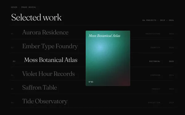 light
light Hover Image Reveal on List Items
An editorial index of six project rows; hovering a row unclips a floating image that follows the pointer with lag and tilts with its velocity, crossfades between rows, nudges the row text right and dims the others.
- gsap
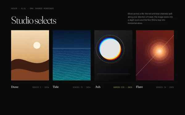 WebGL
WebGL RGB-Shift Image Hover
Four image tiles share one WebGL renderer; hovering a tile splits its red and blue channels along the pointer's direction (offset scales with velocity), zooms the UVs 1 → 1.08 over 0.8s and tears the first 150ms into glitched horizontal slices.
- threejs
- glsl
- gsap
- canvas2d
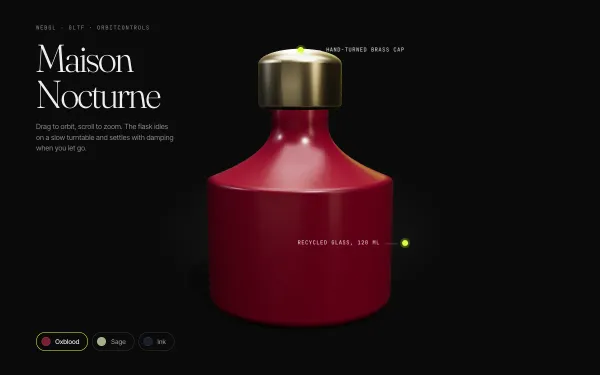 WebGL
WebGL Interactive 3D Product (GLTF) Rotate + Orbit
A GLB perfume flask idles on a slow turntable under a key/fill/rim studio rig with a soft contact shadow; drag to orbit with damping, pick a finish to tween the PBR colour, and labels track points on the model.
- threejs
- gsap
 light
light Parallax Depth Layers
A tall hero built from five depth layers — sky, far ridge, mid ridge, foreground and headline — each scrubbed at its own yPercent speed from a data-speed attribute, plus a lerped pointer parallax on desktop that tilts the scene toward the cursor.
- gsap
- scrolltrigger
- svg